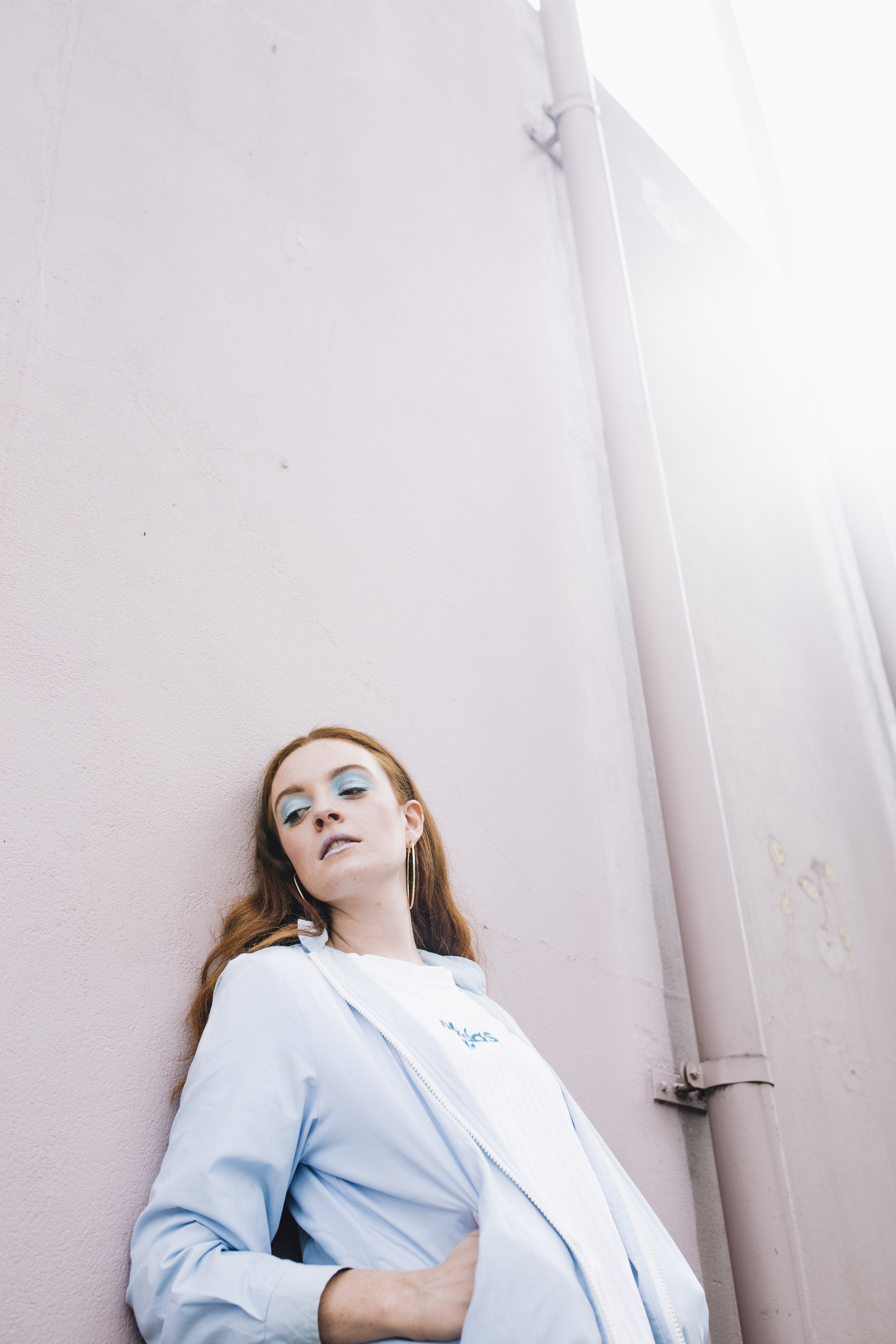
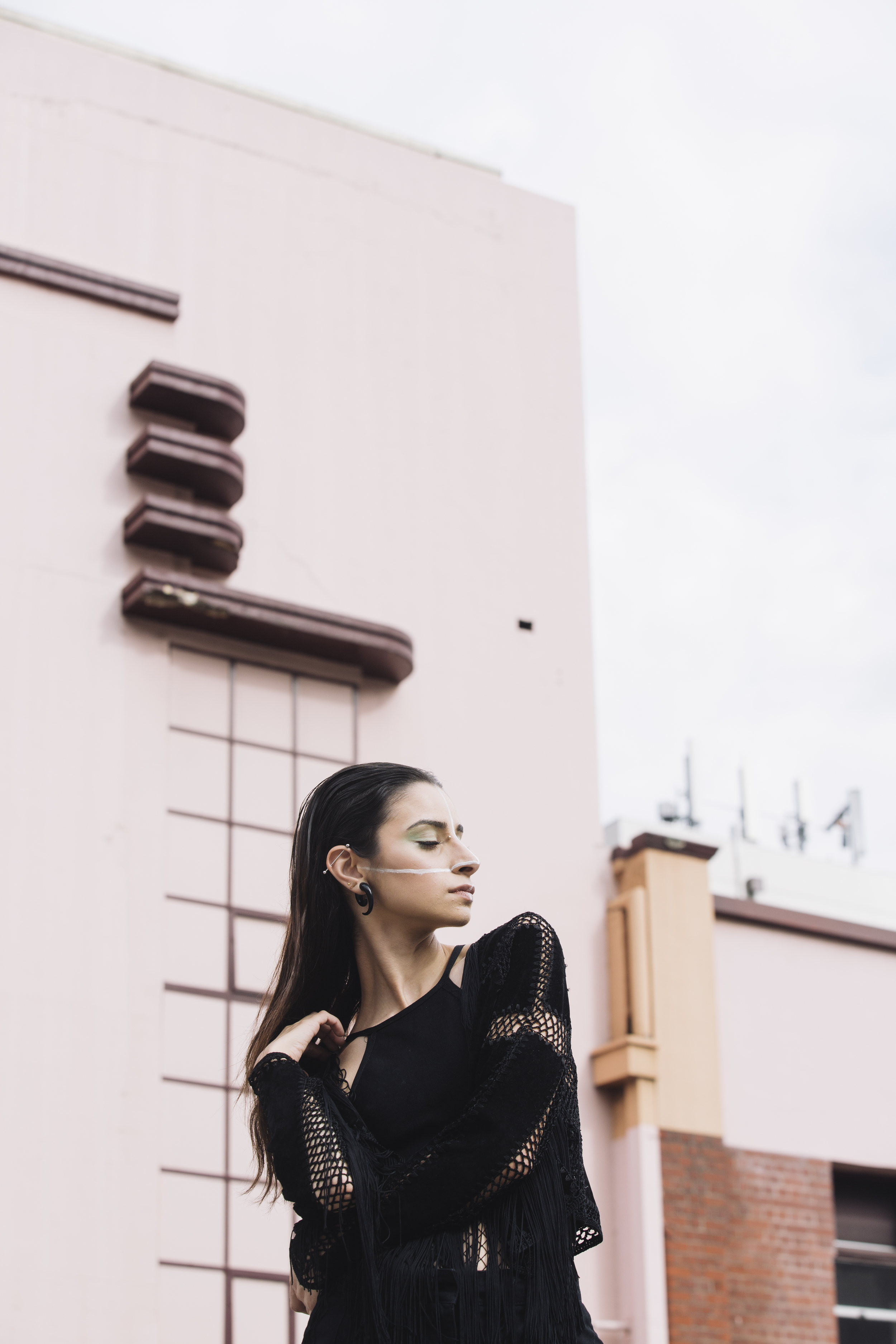
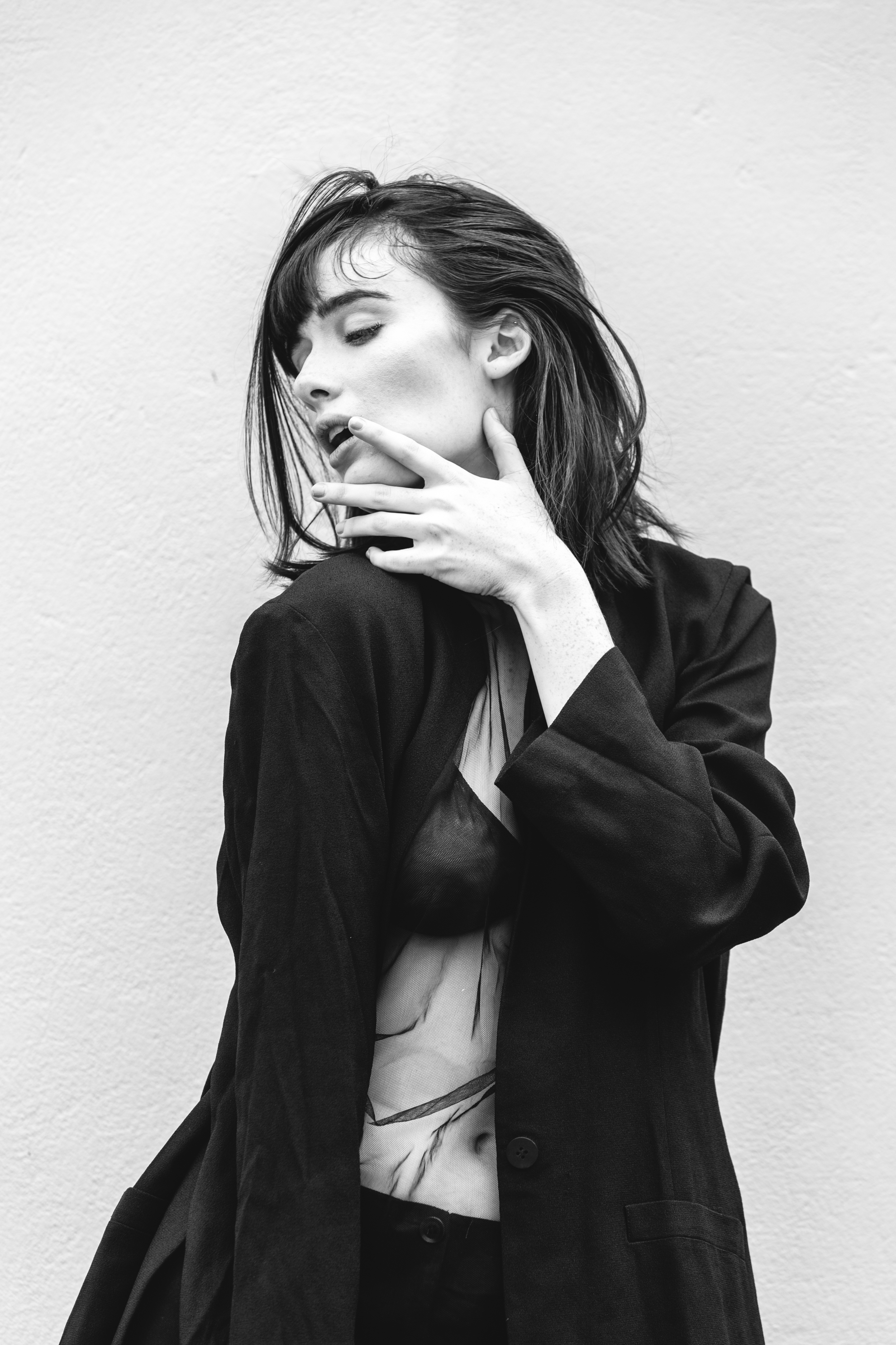
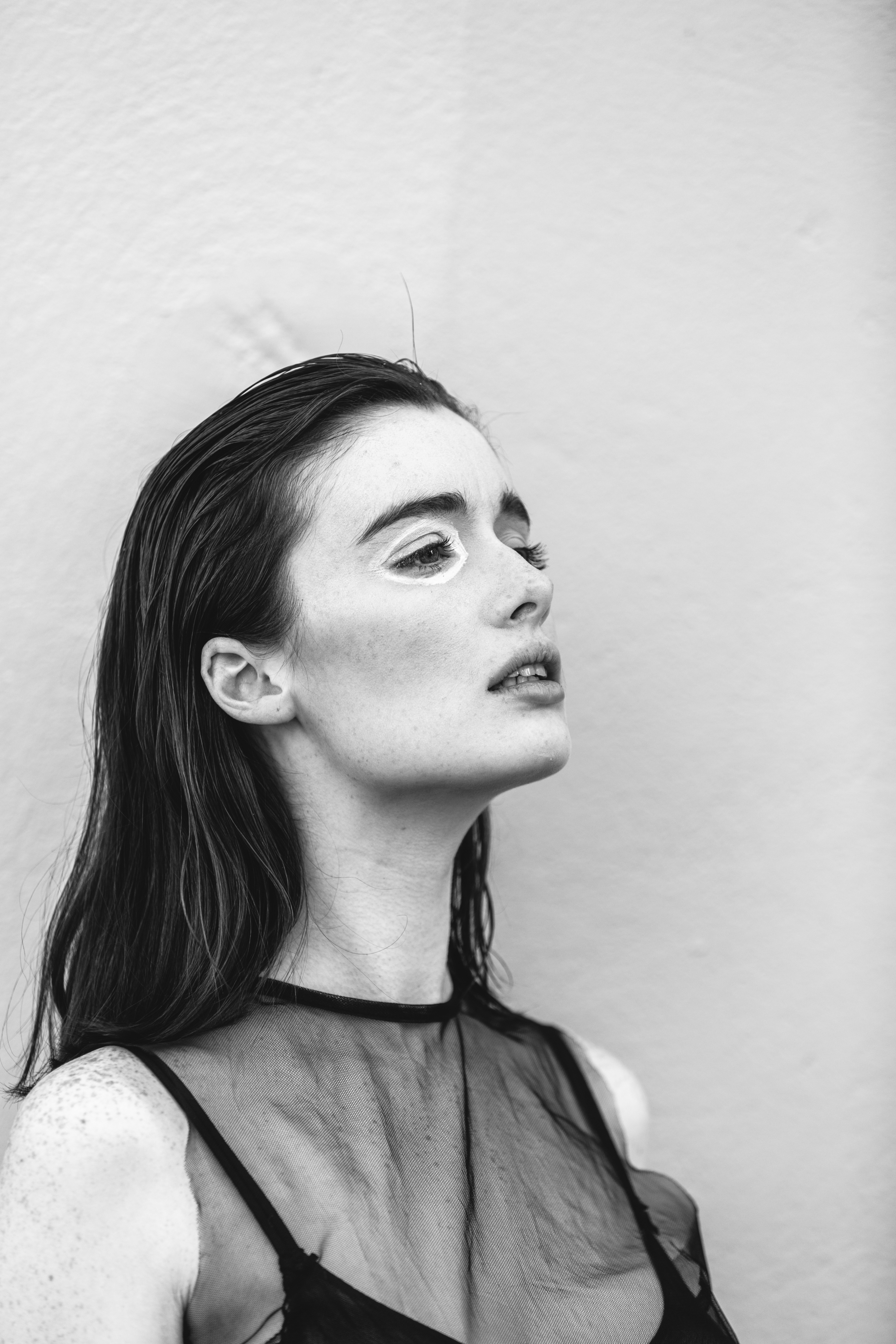
WINTER IN 35MM - PART 2
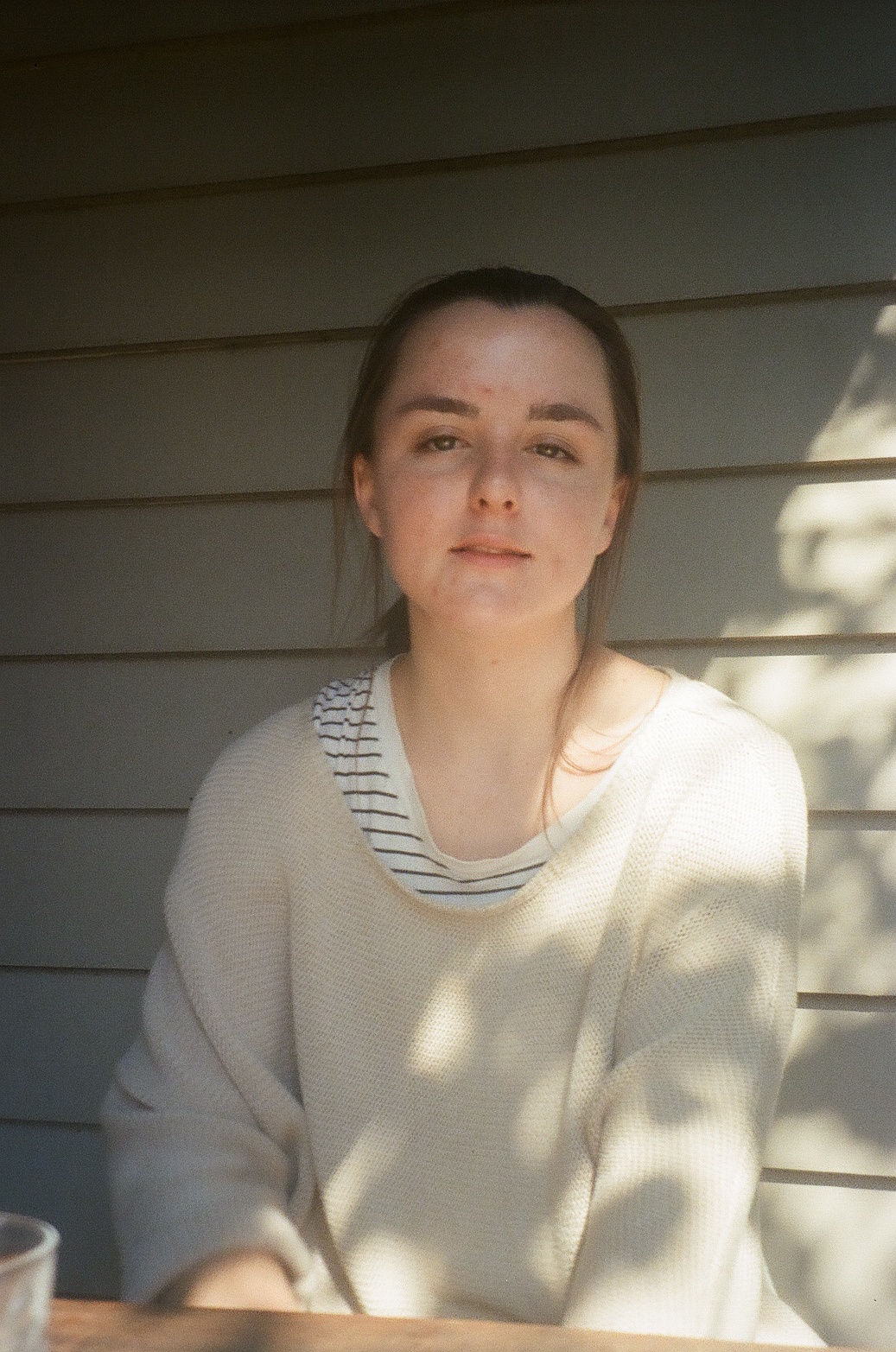
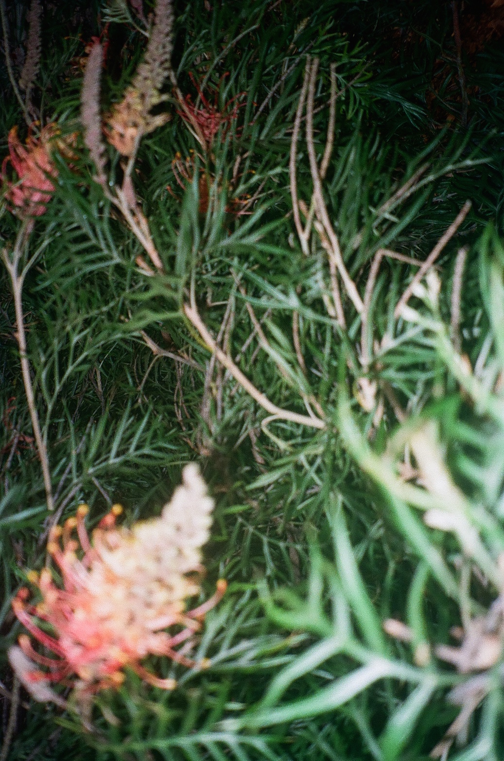
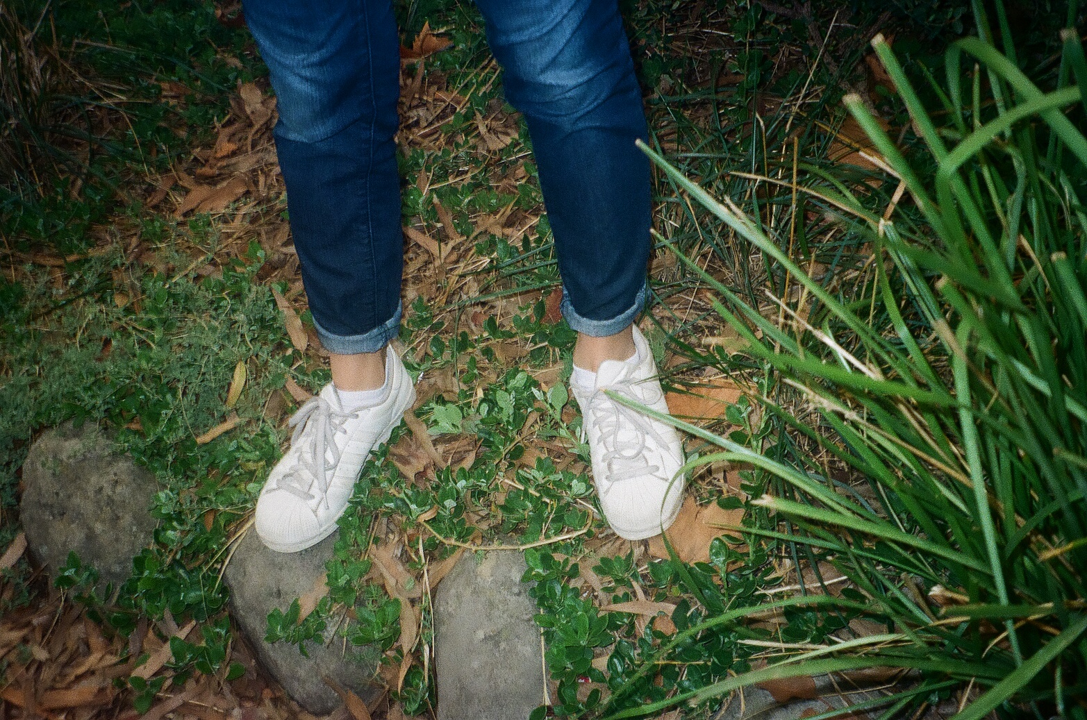
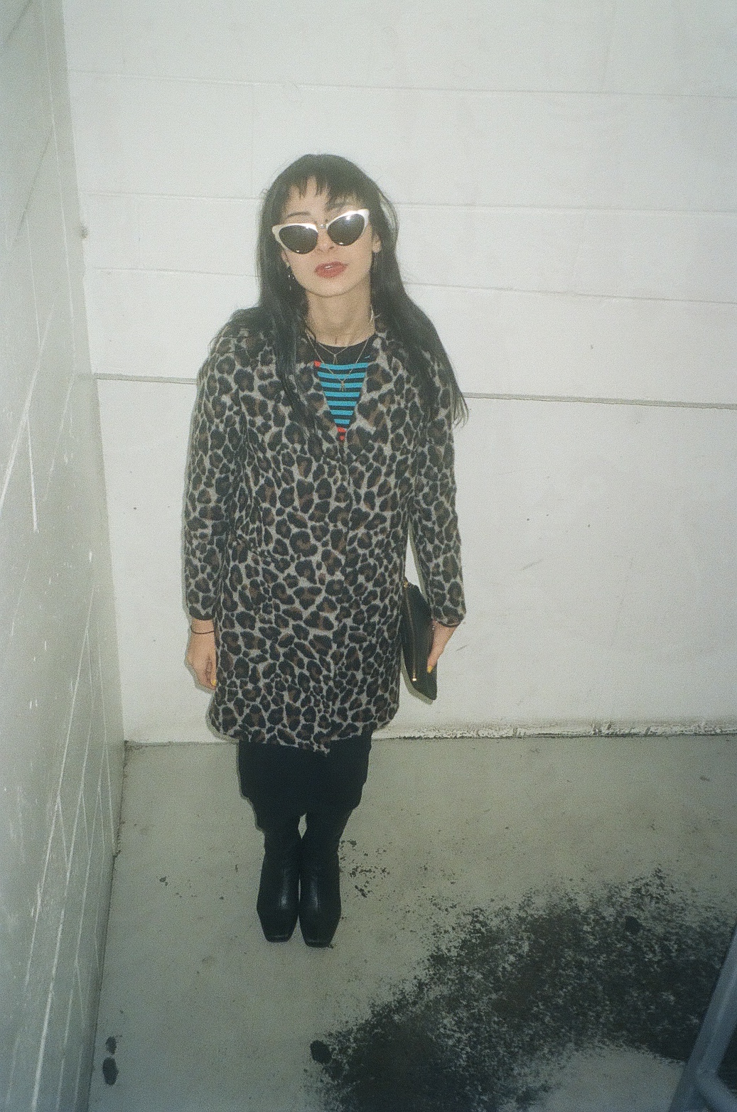
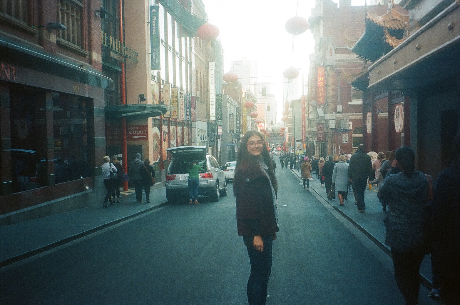
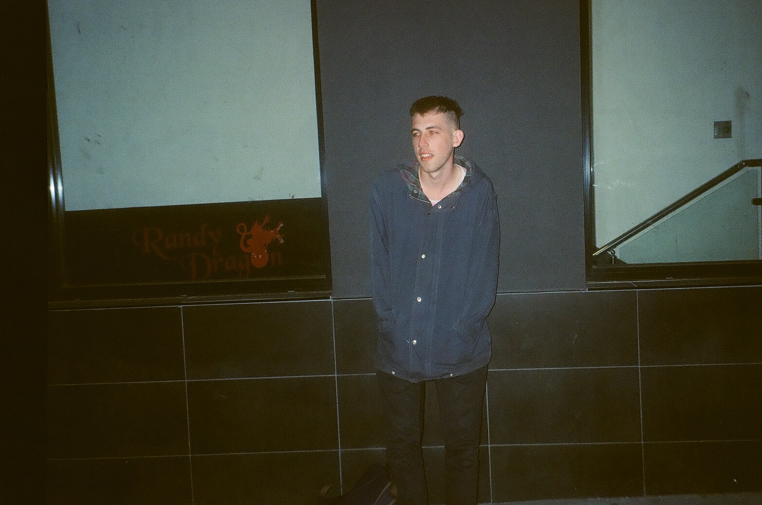
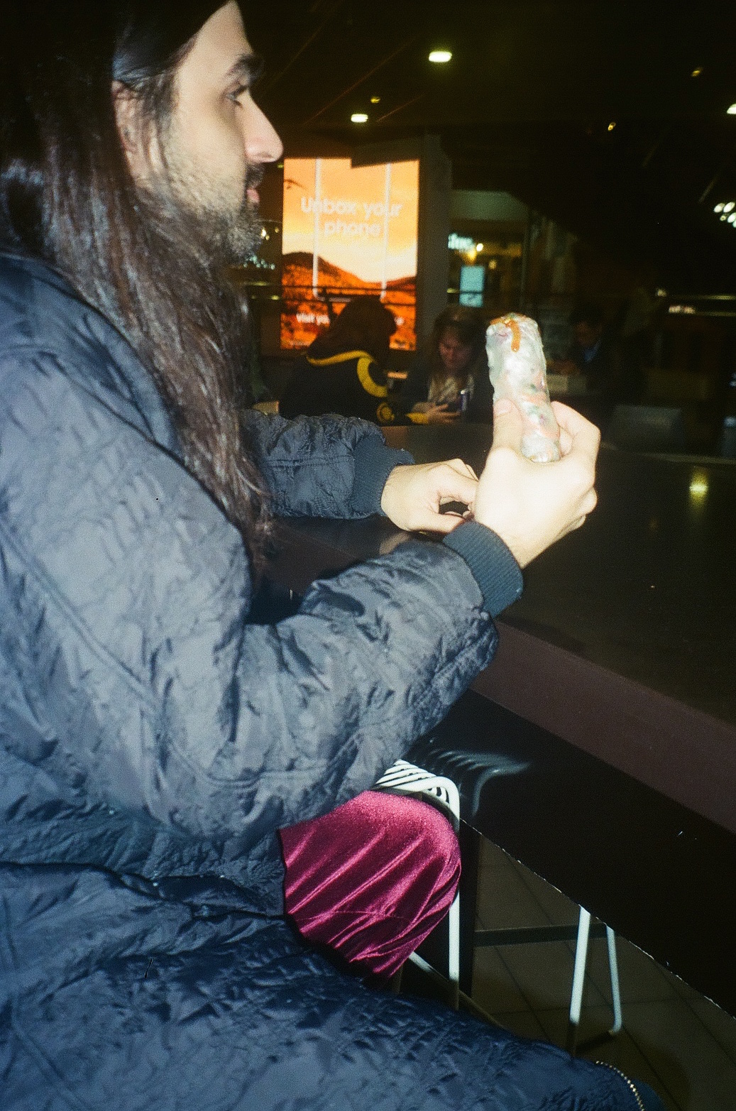
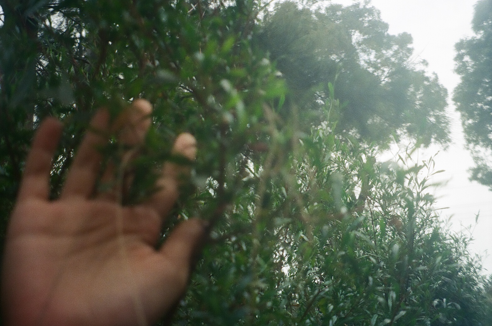
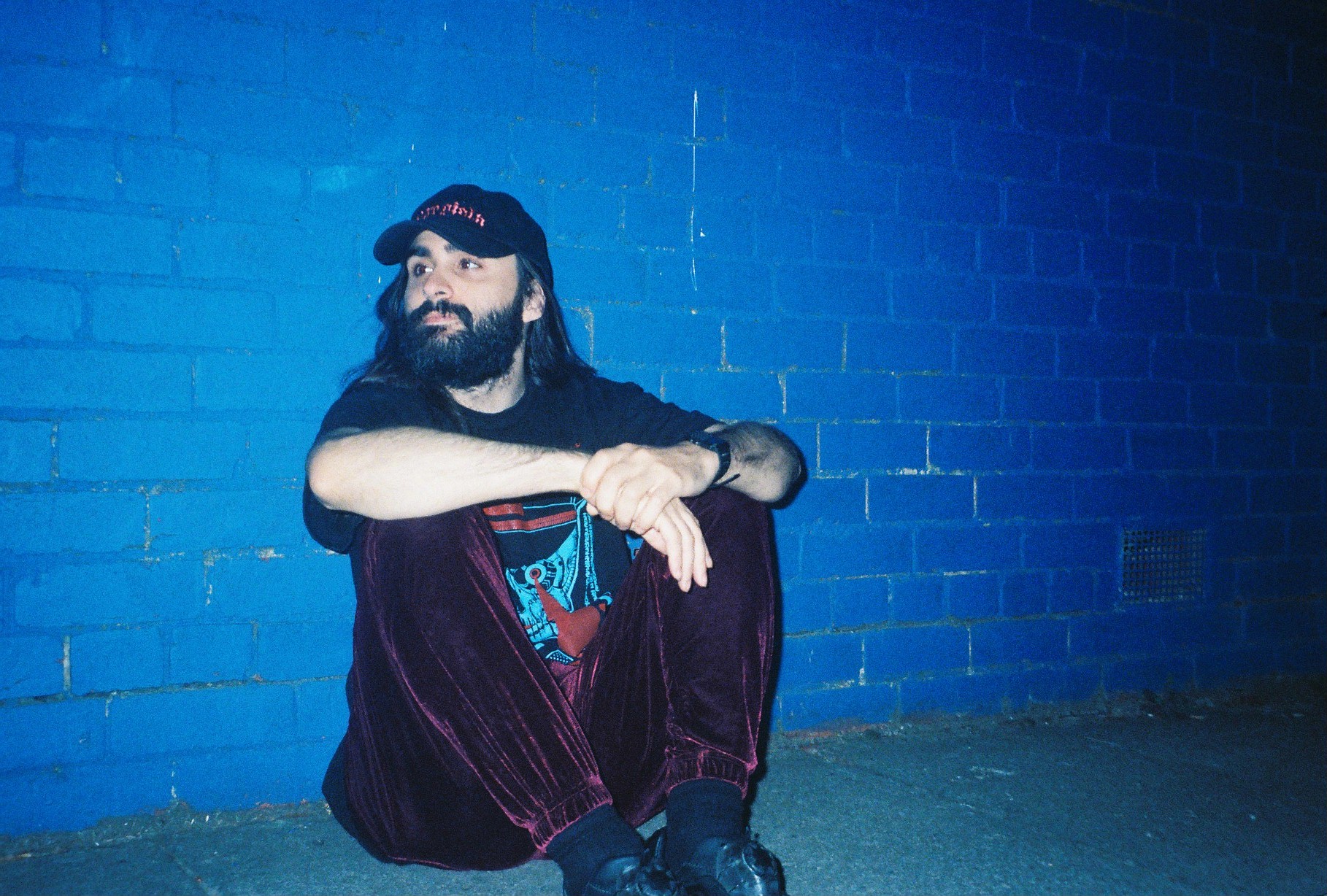
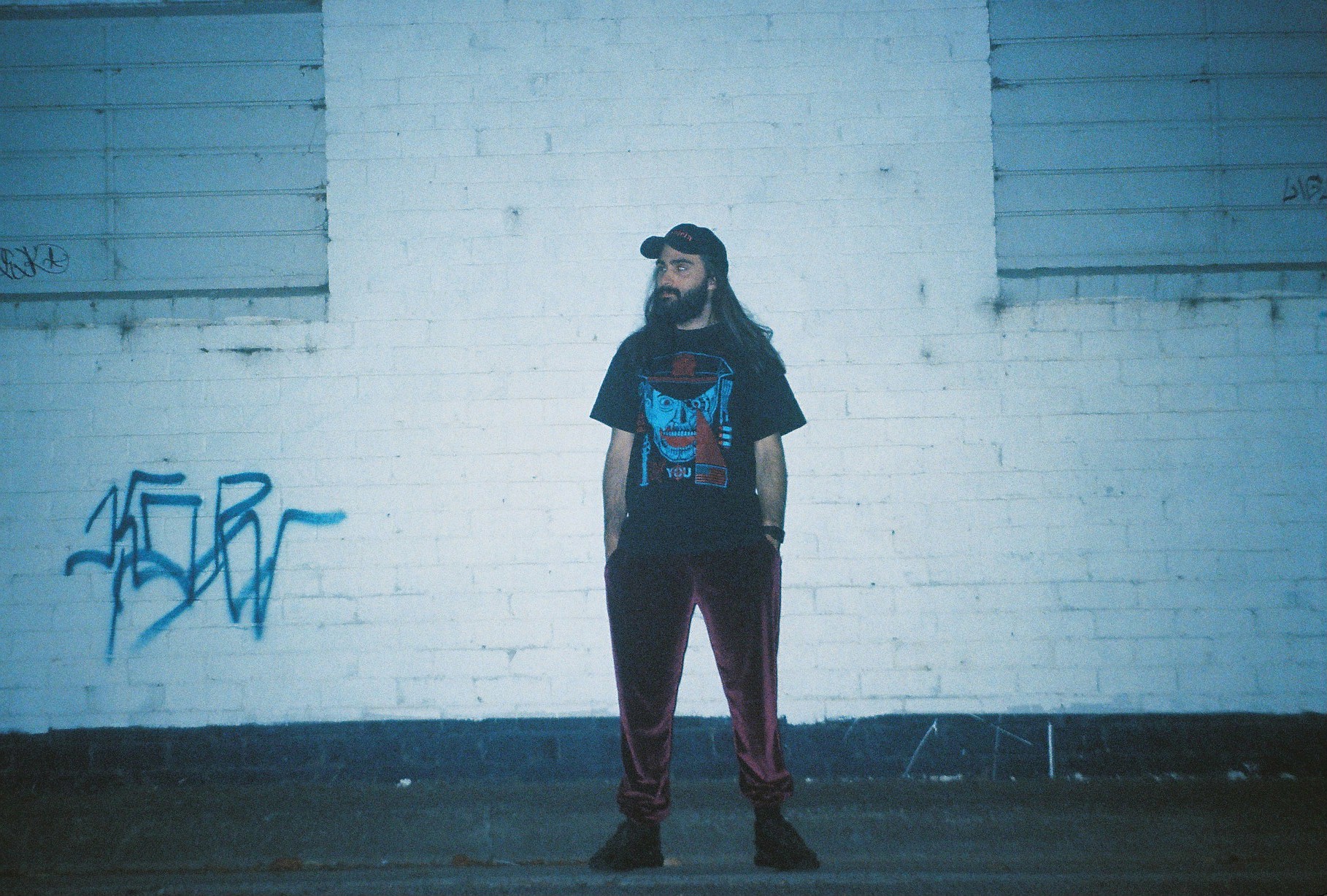
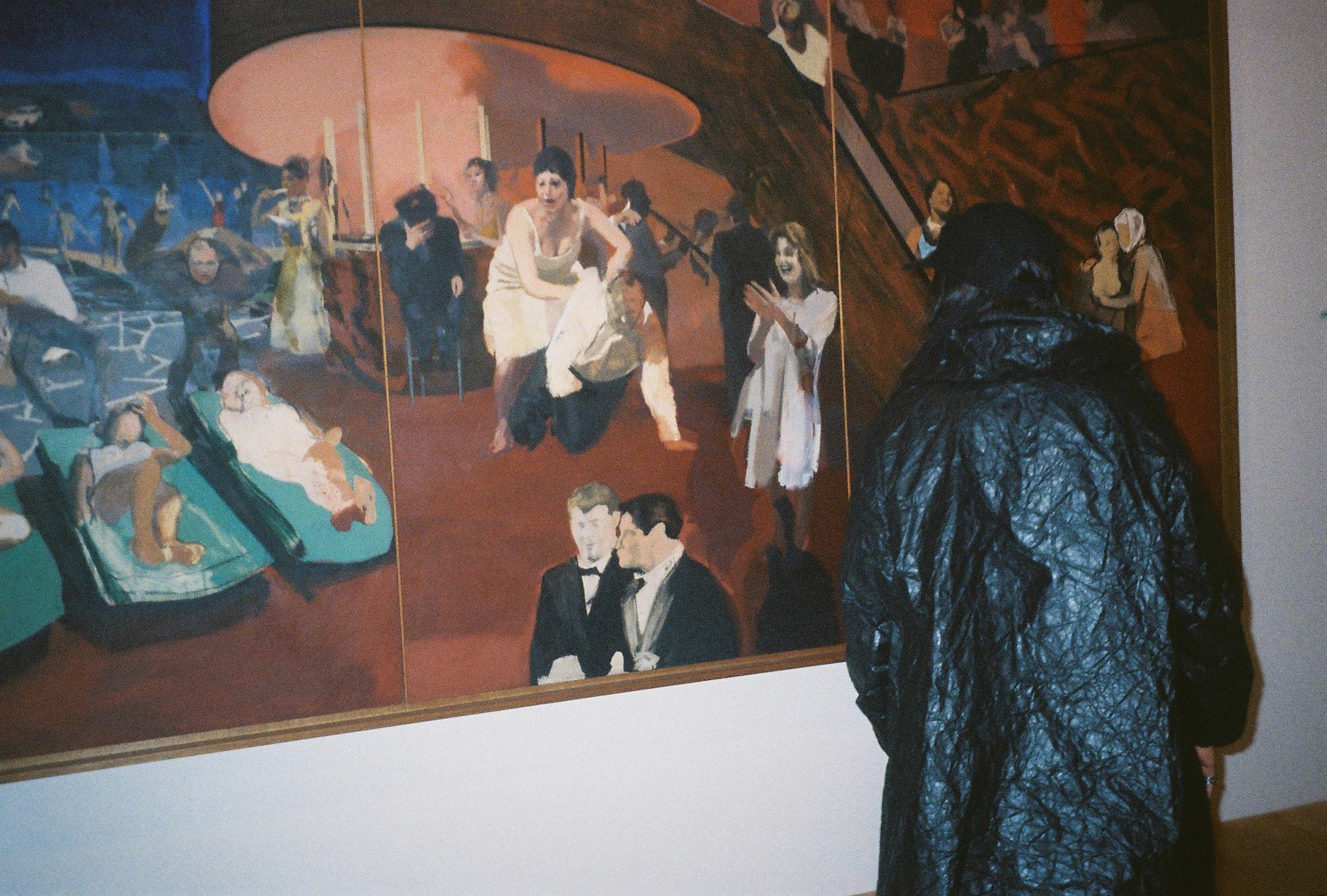
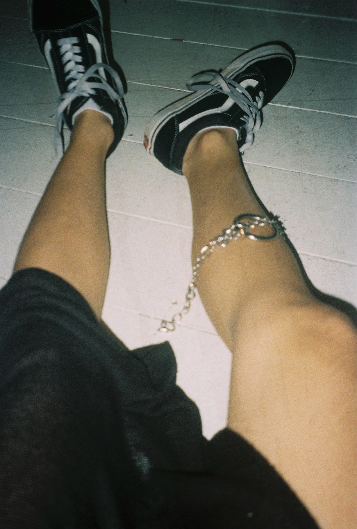
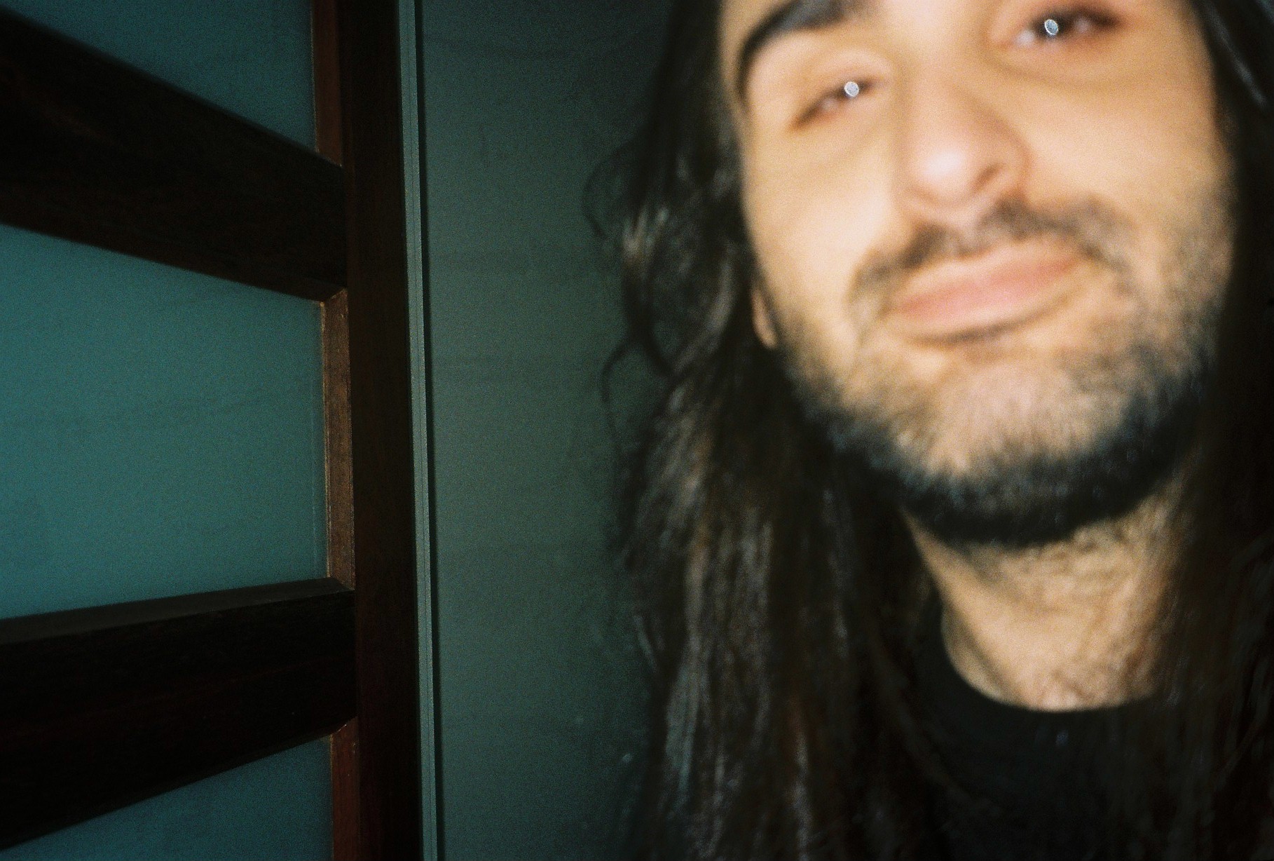
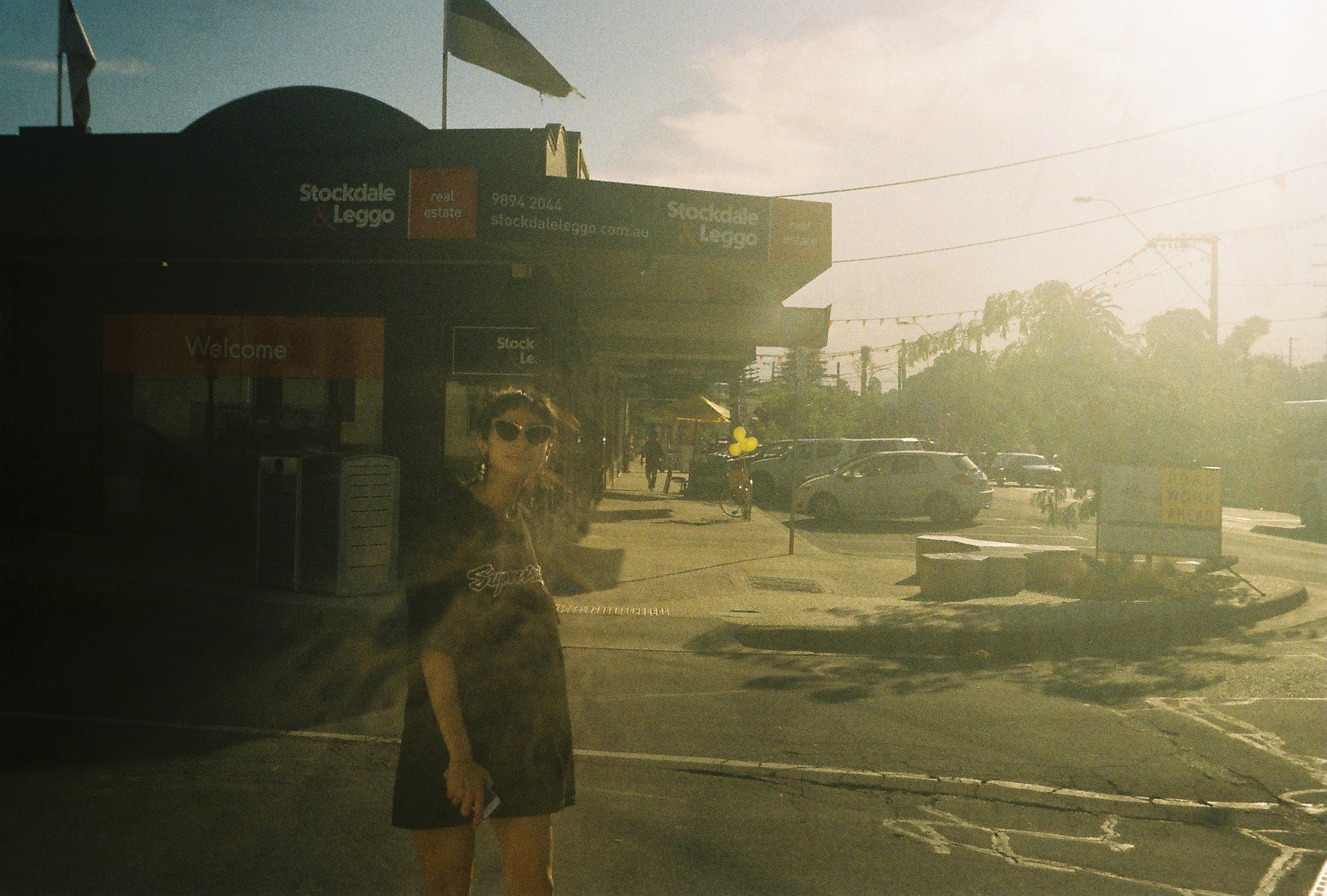
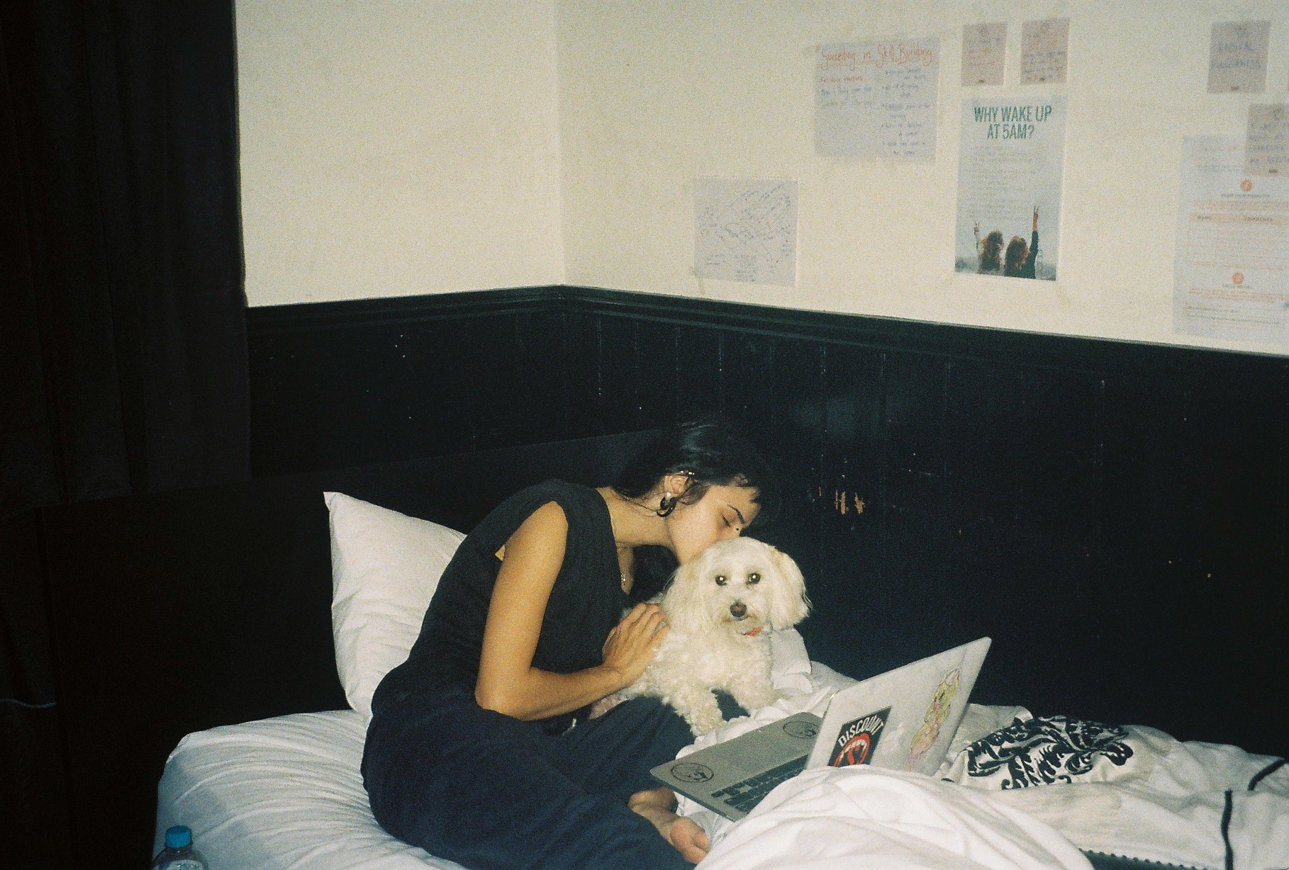
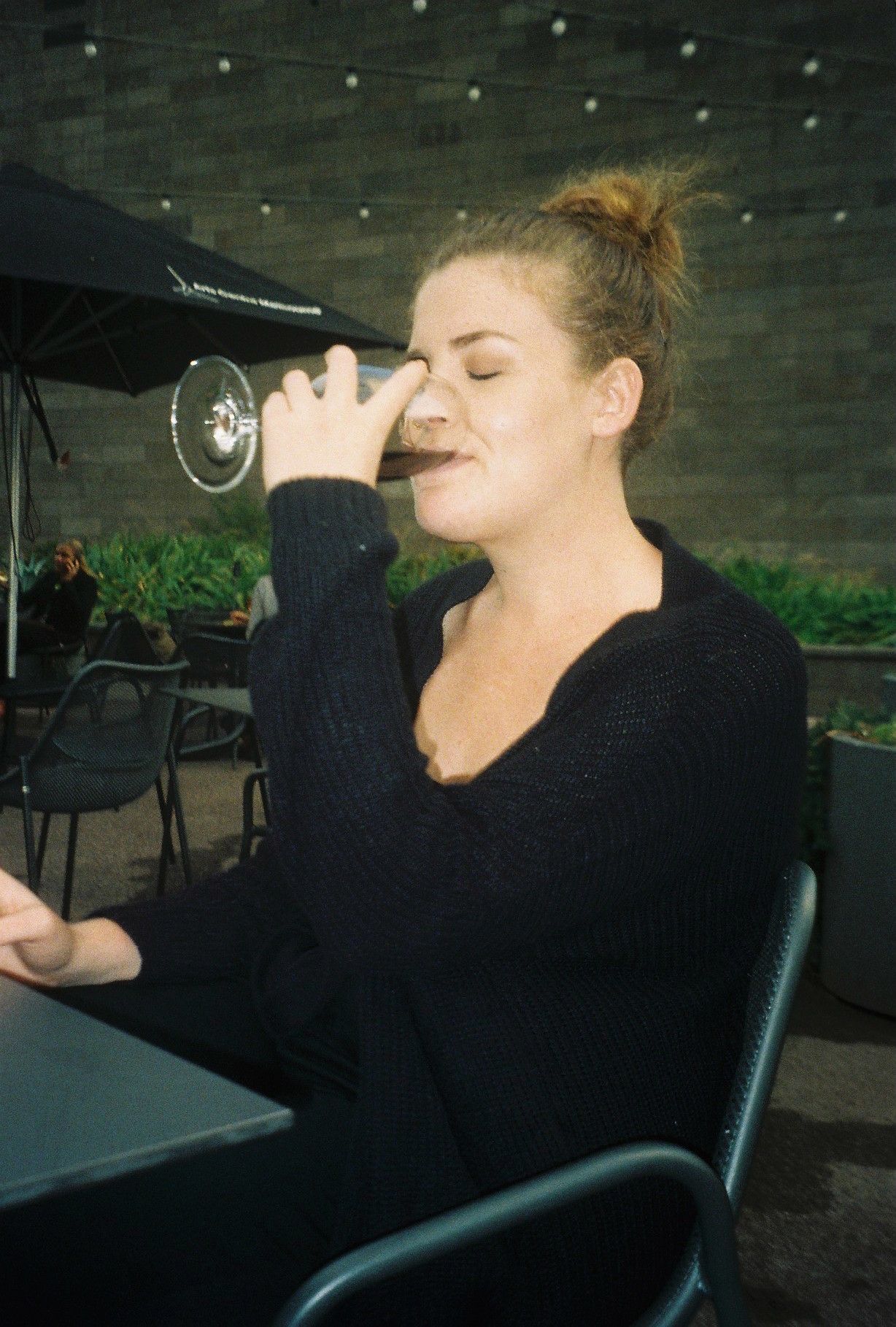
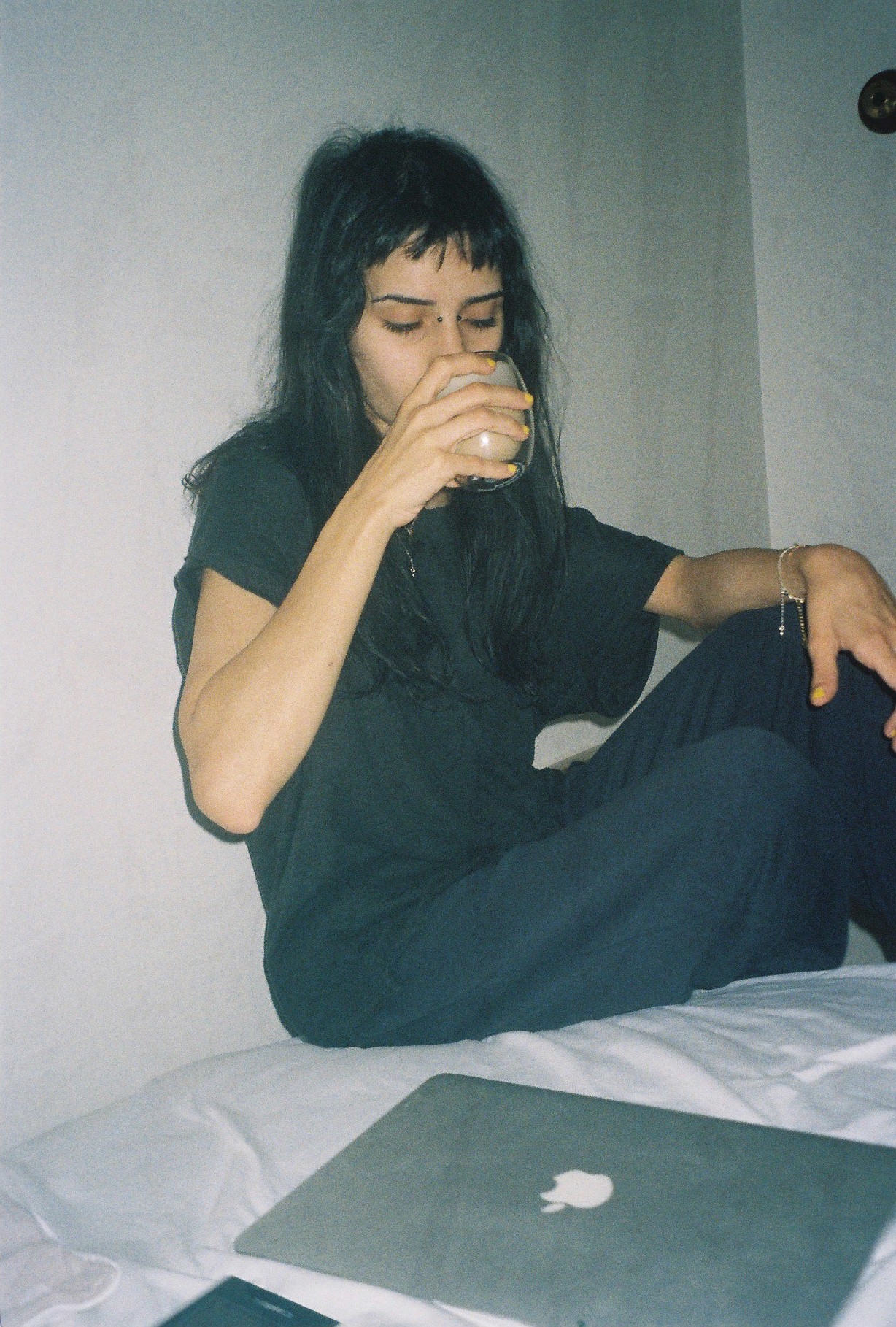
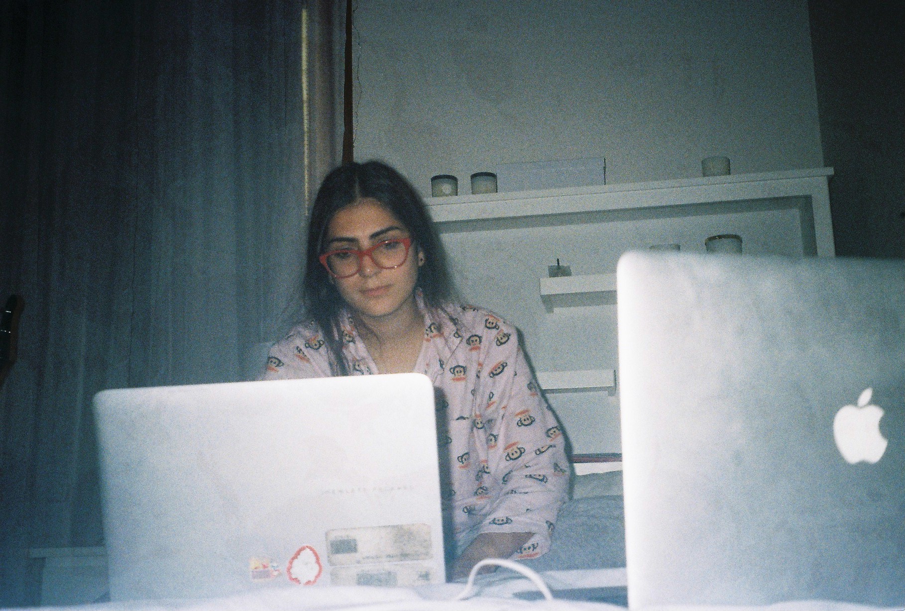
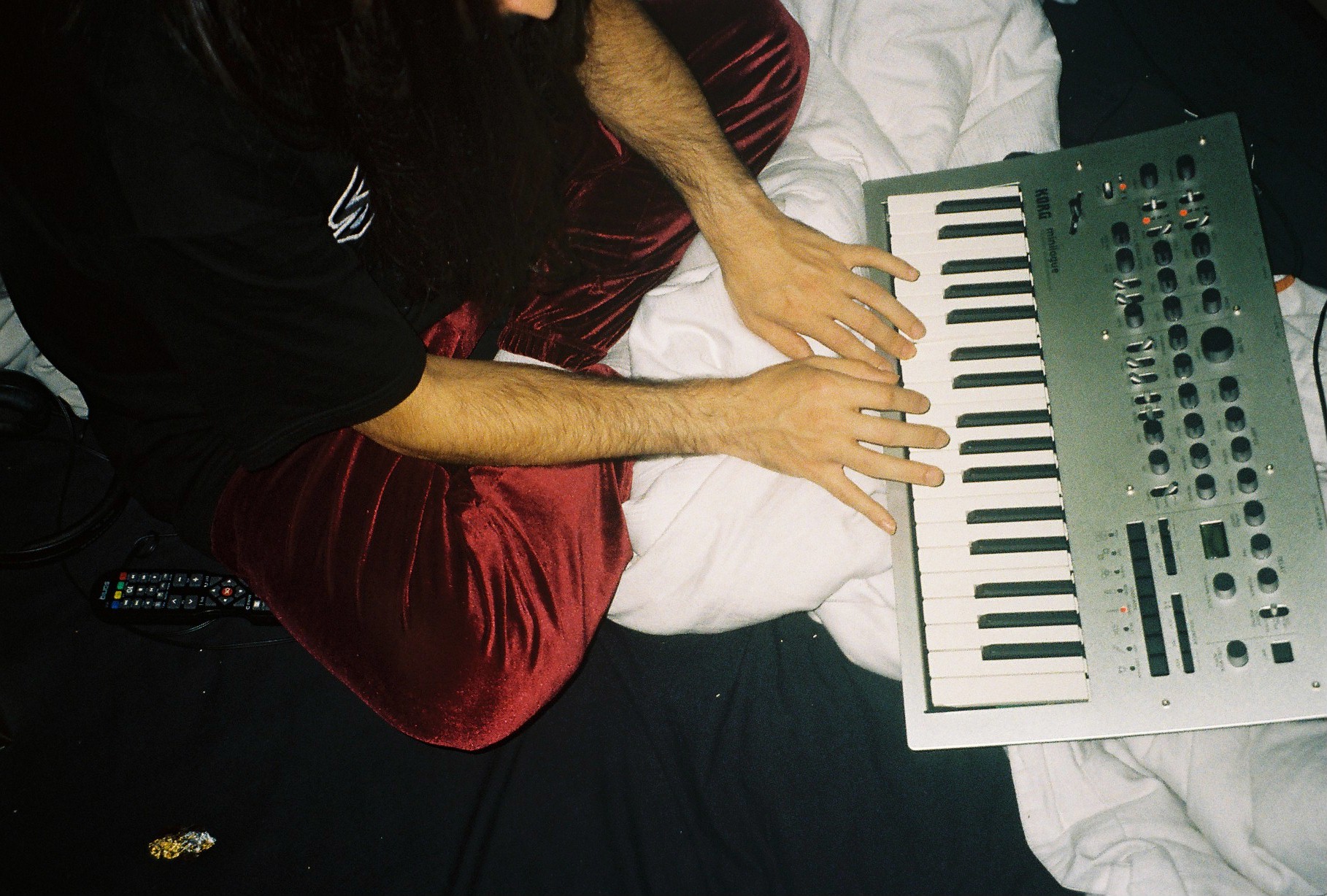
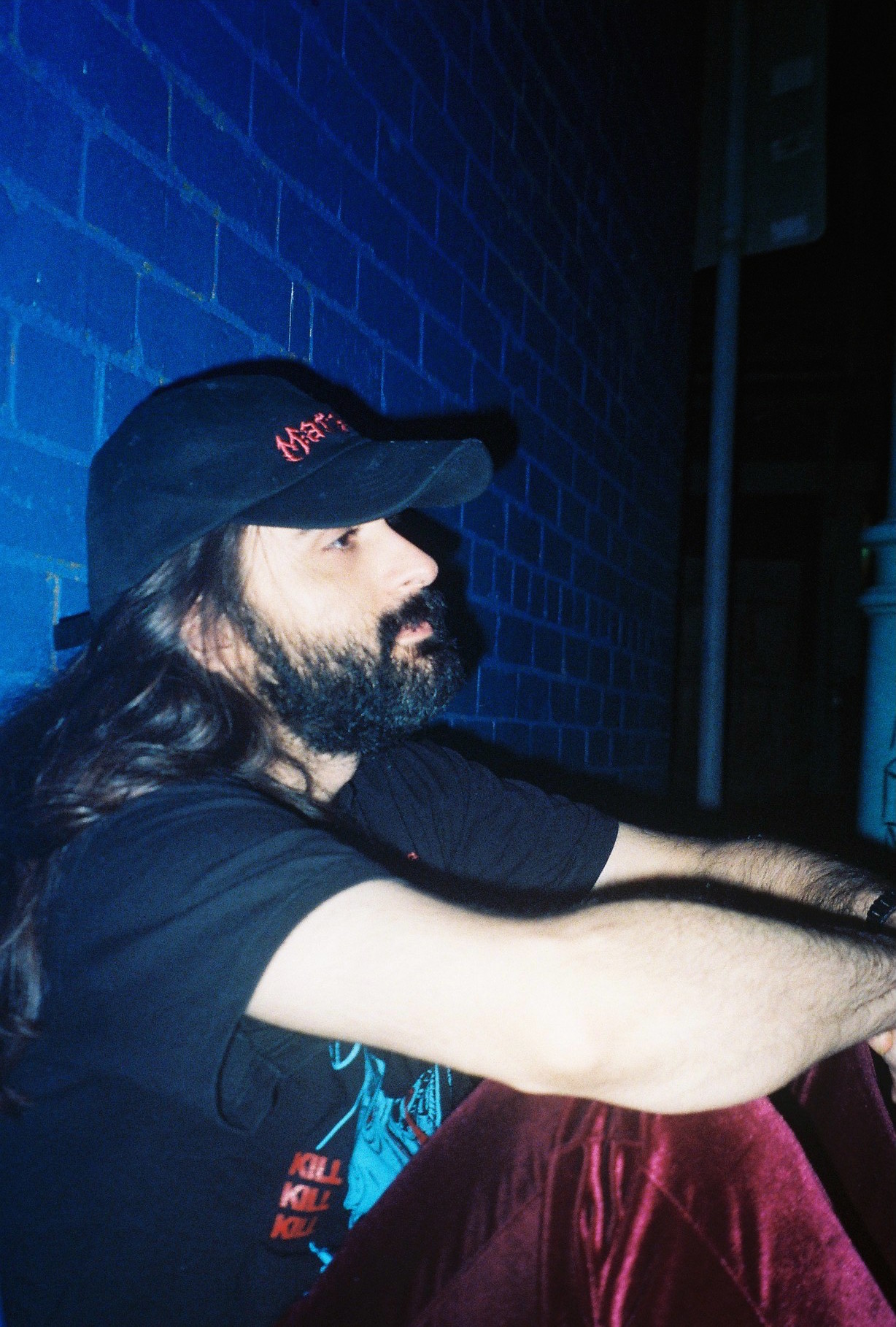
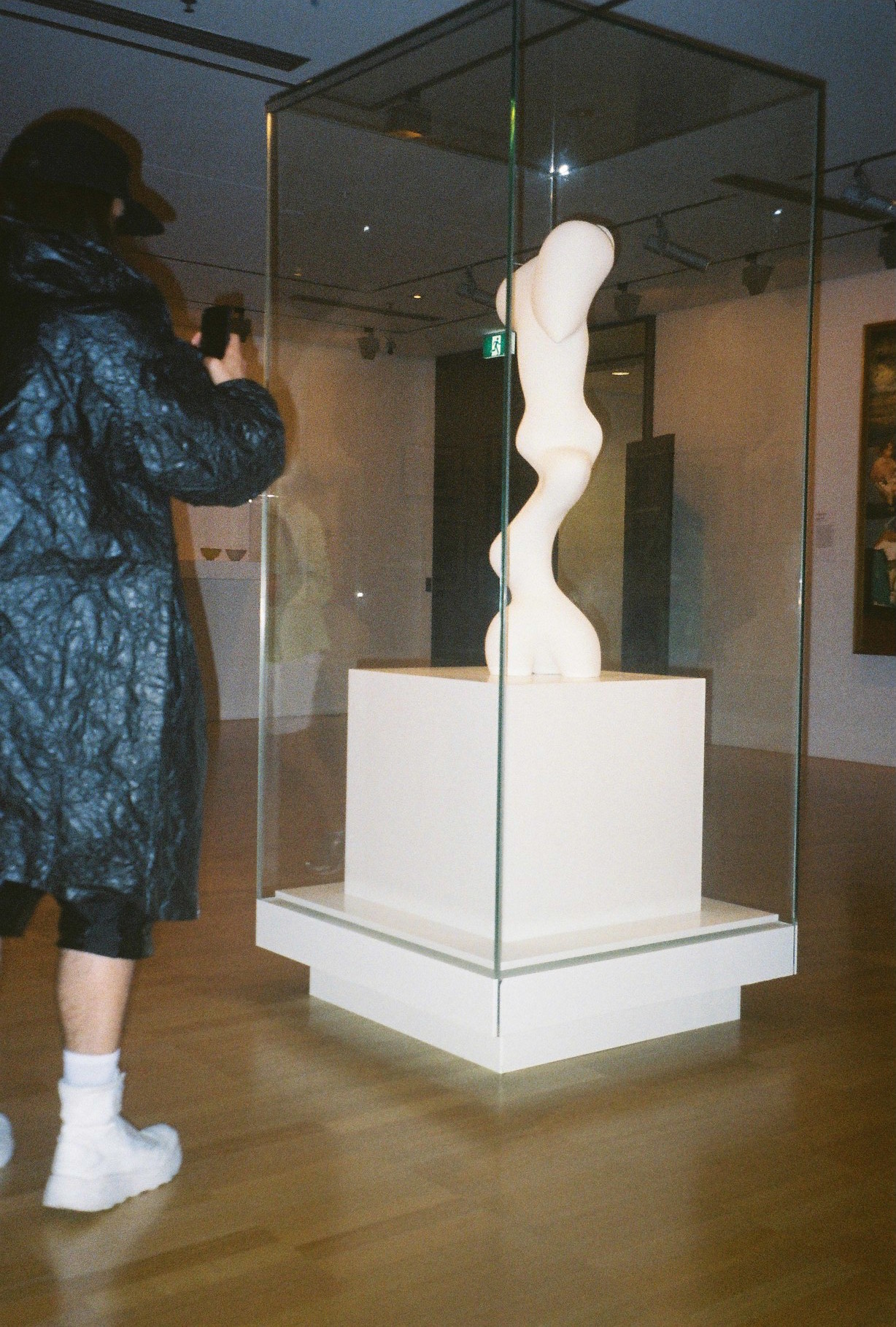
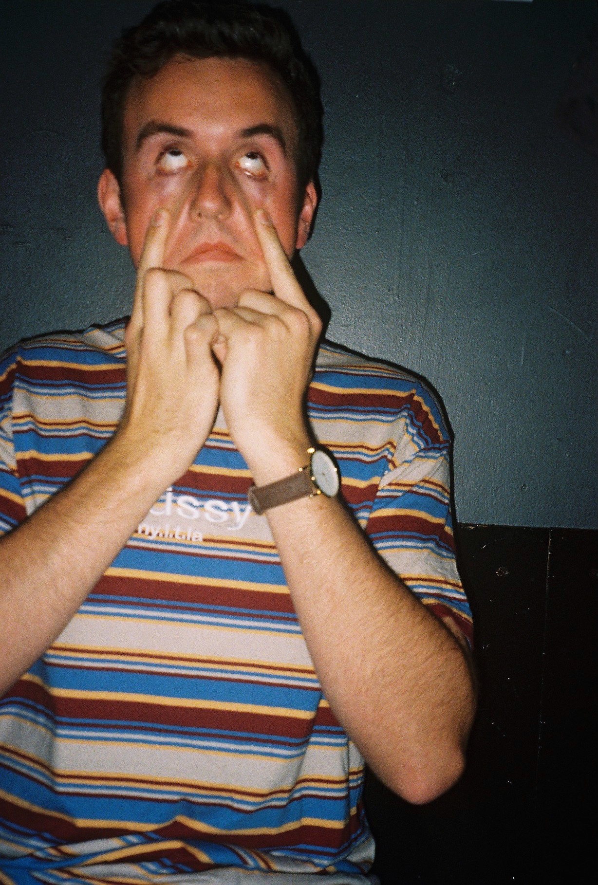
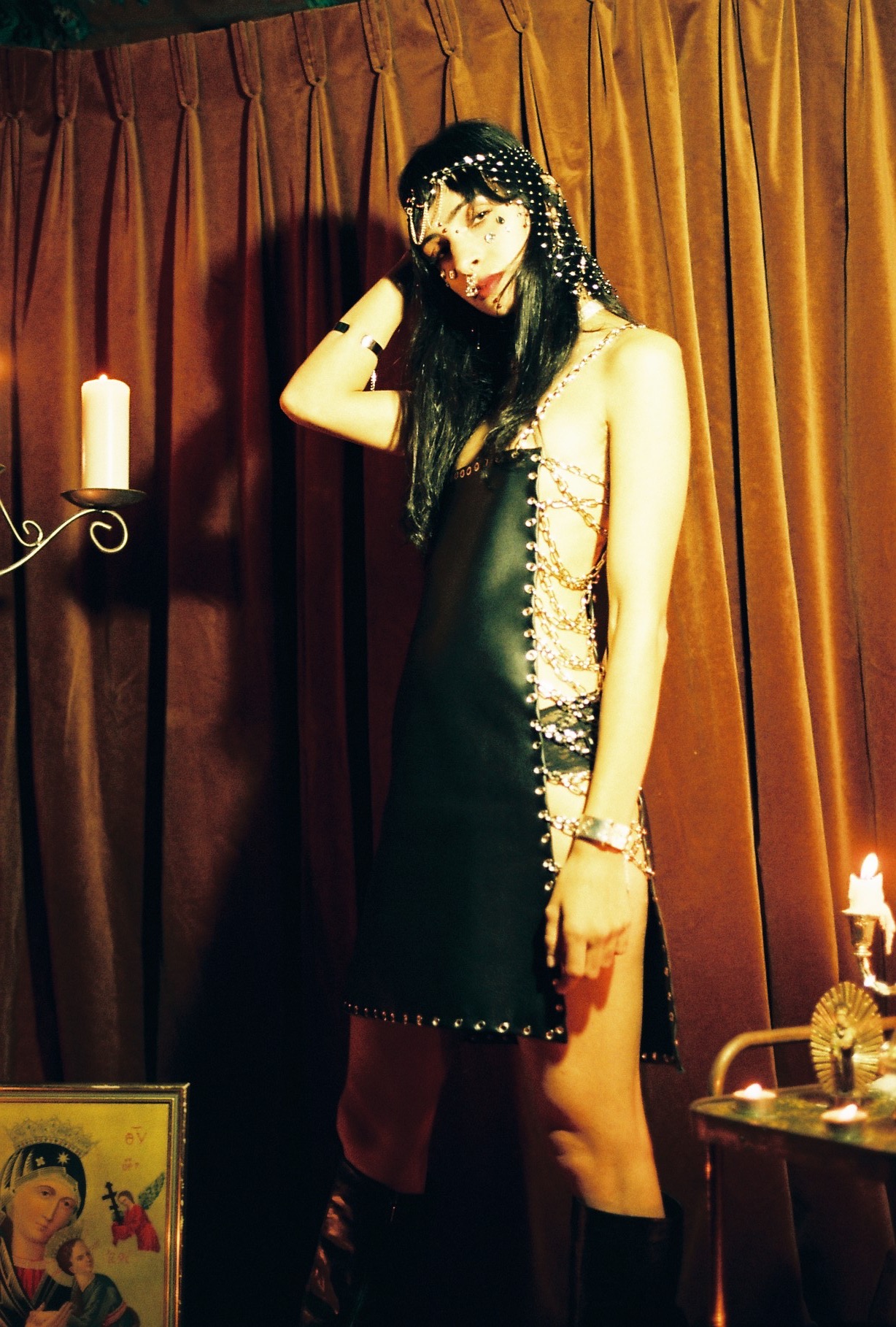
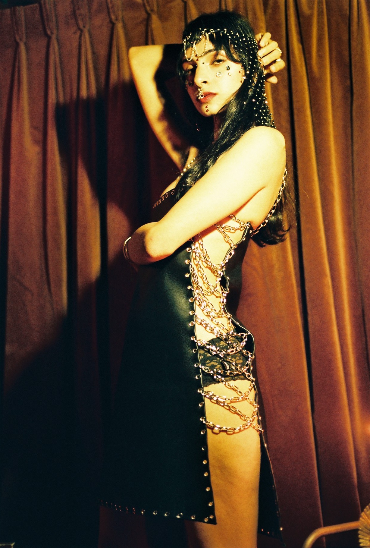
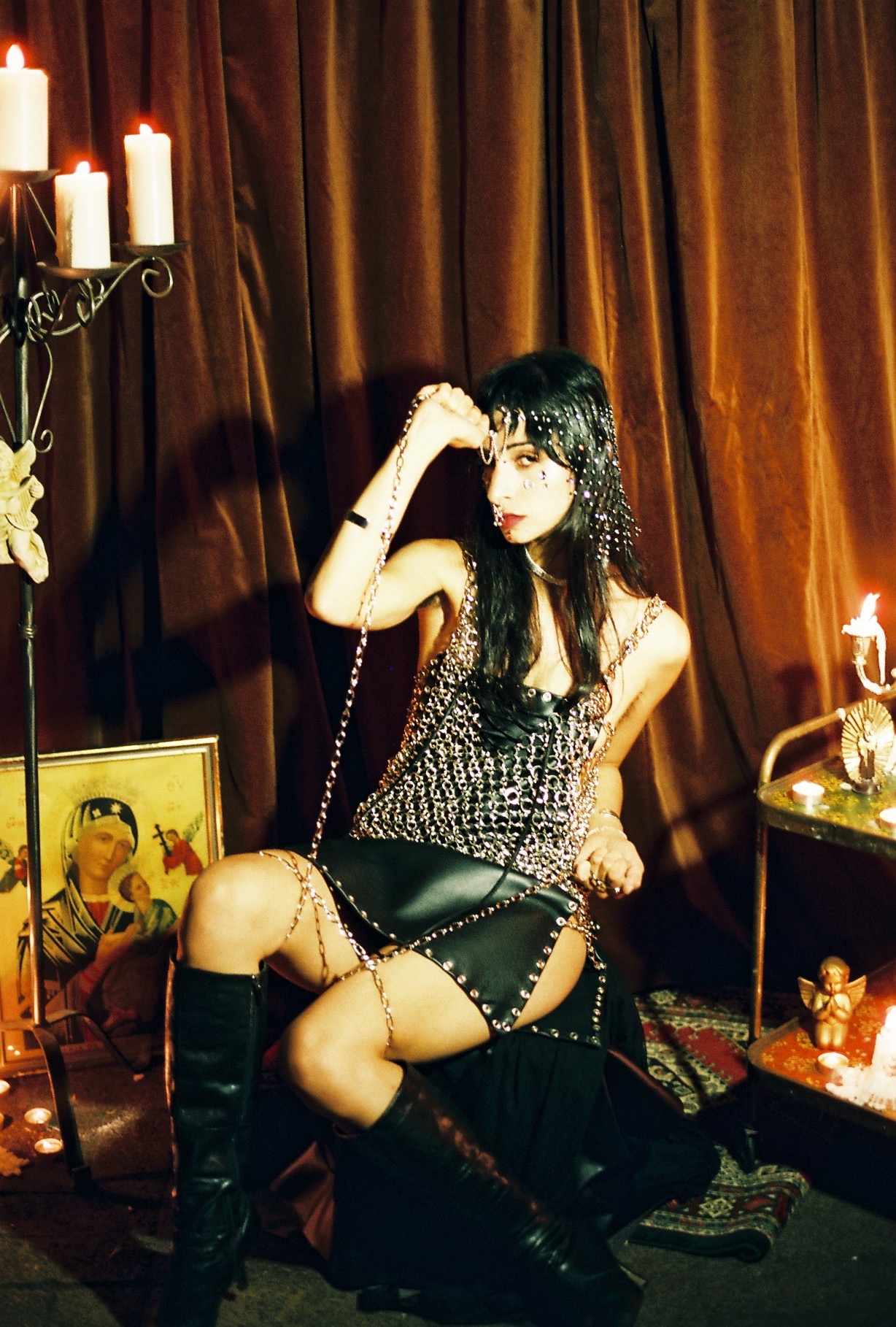
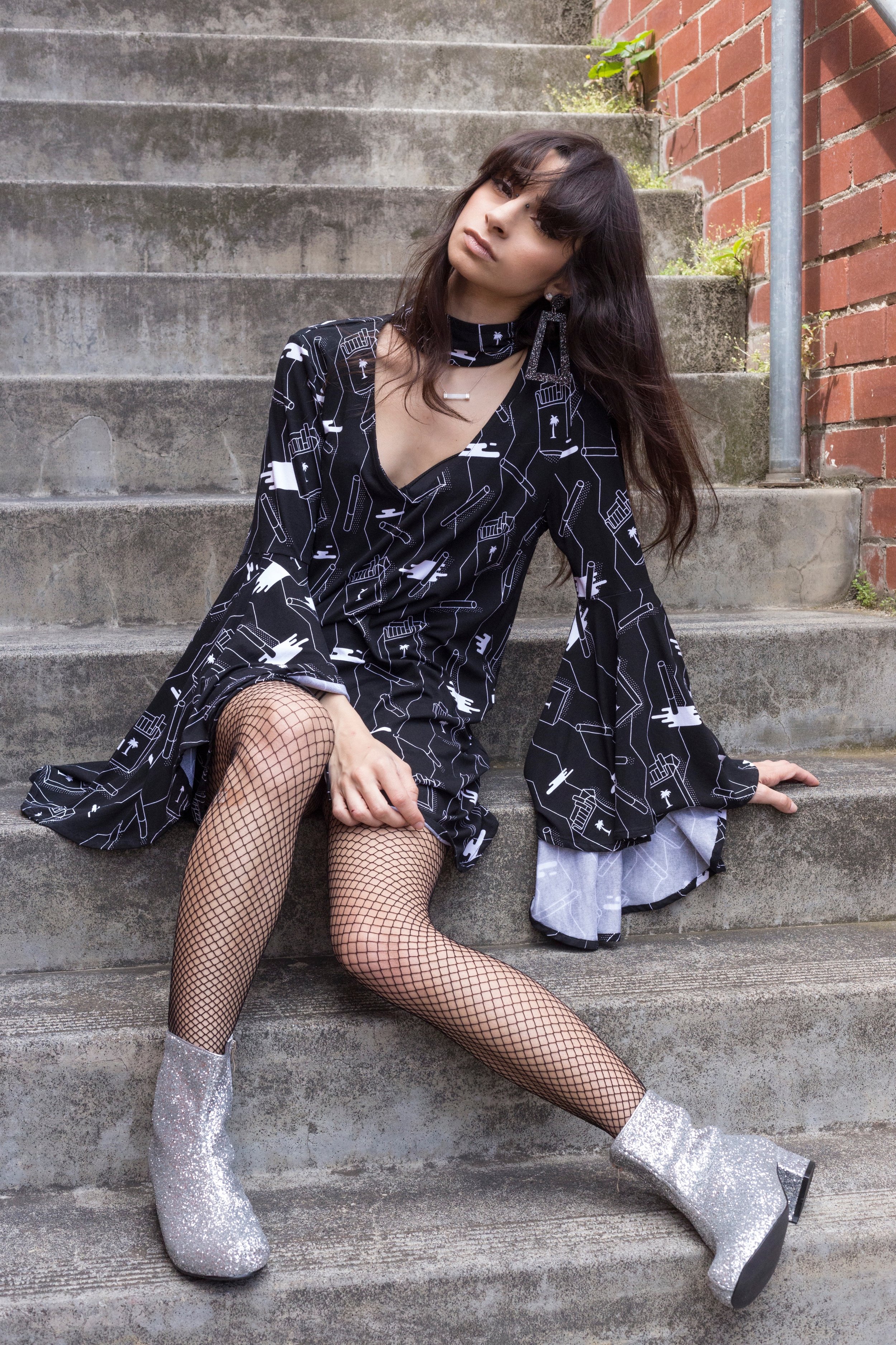
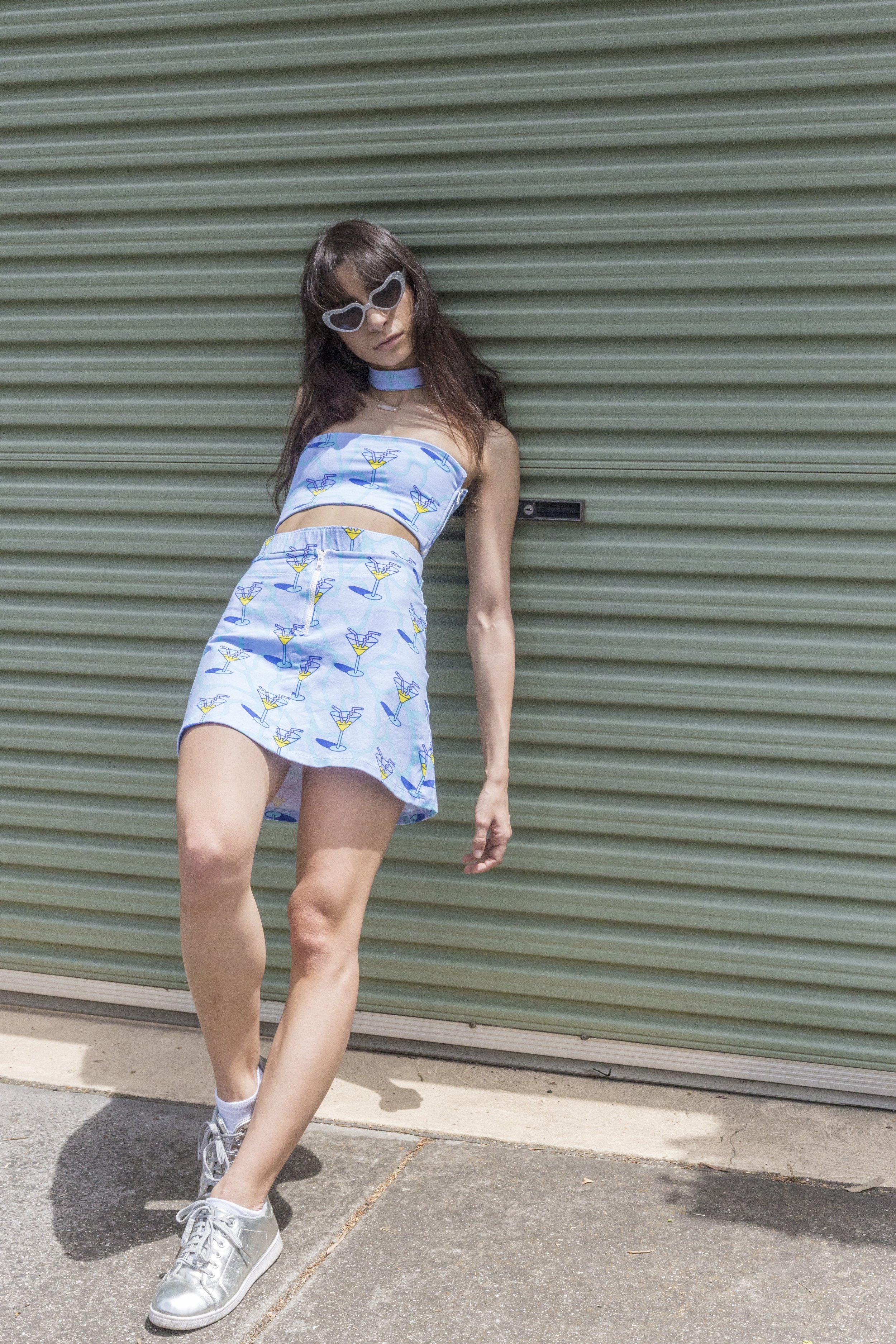
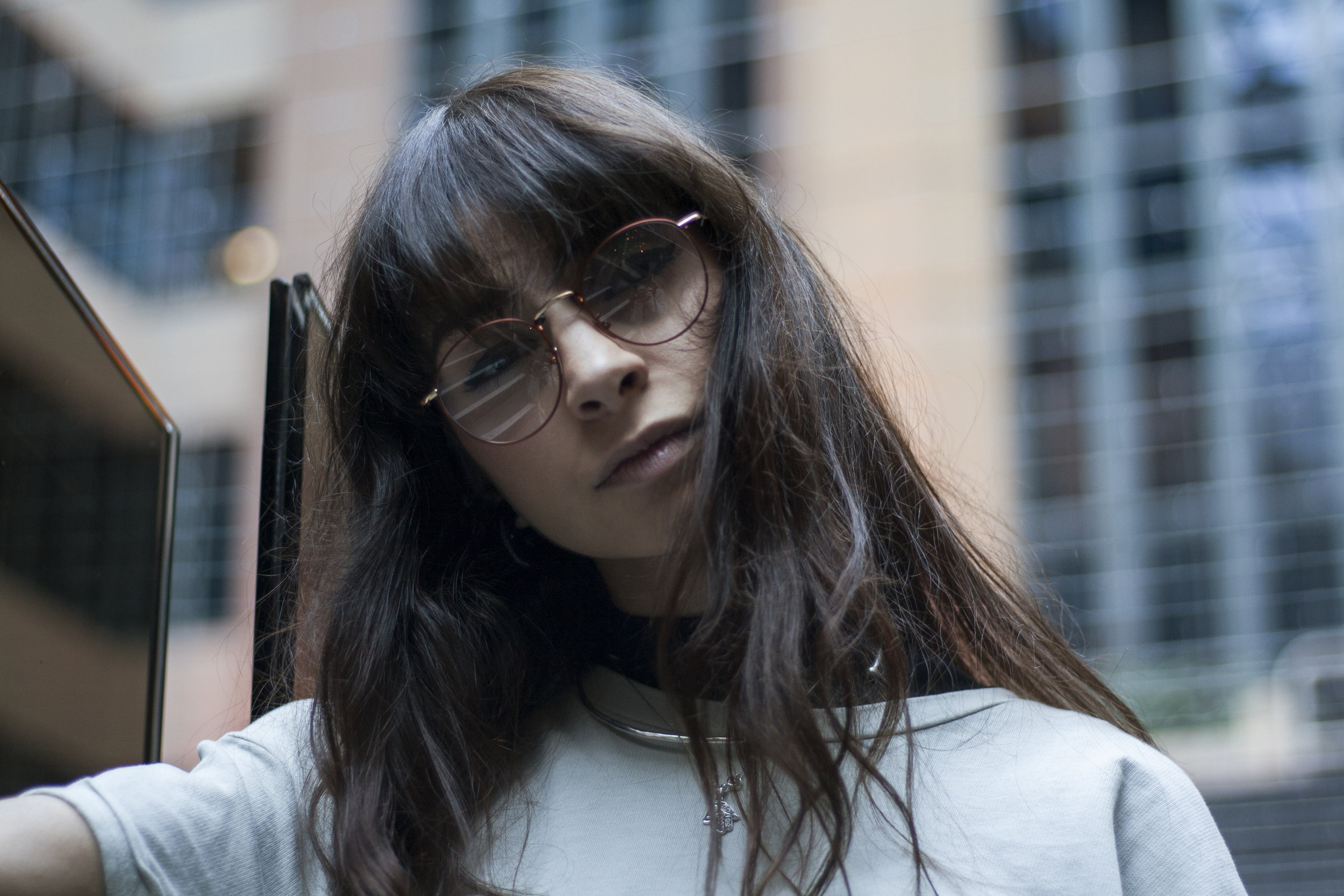
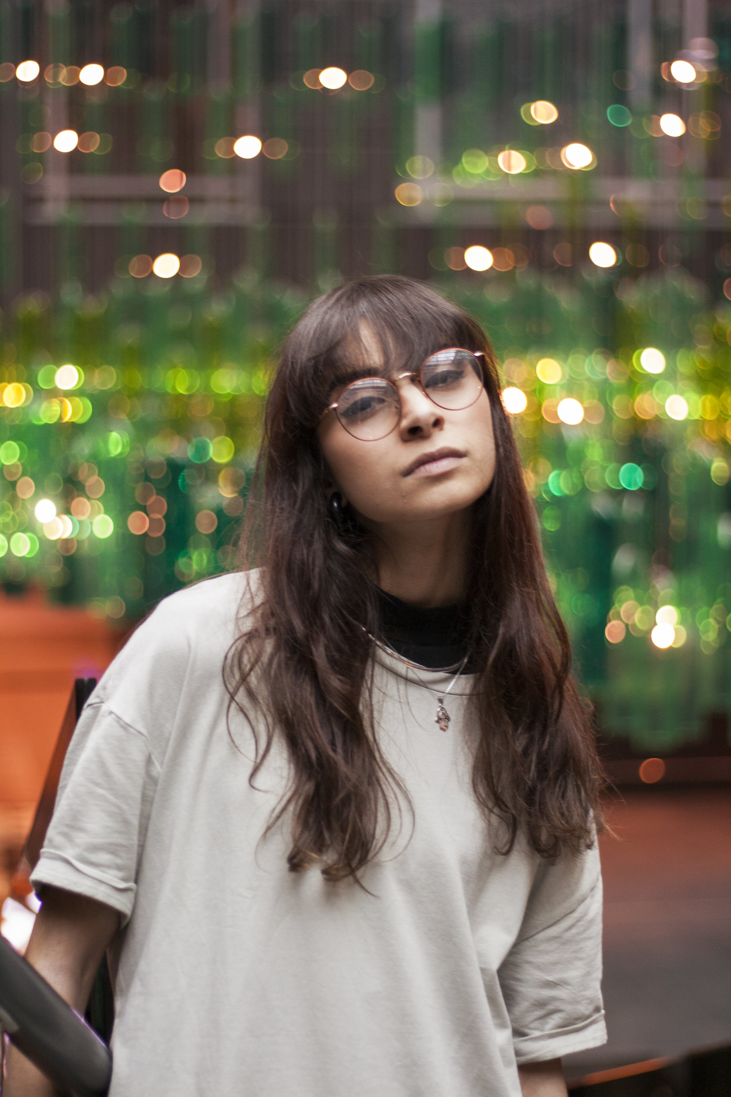
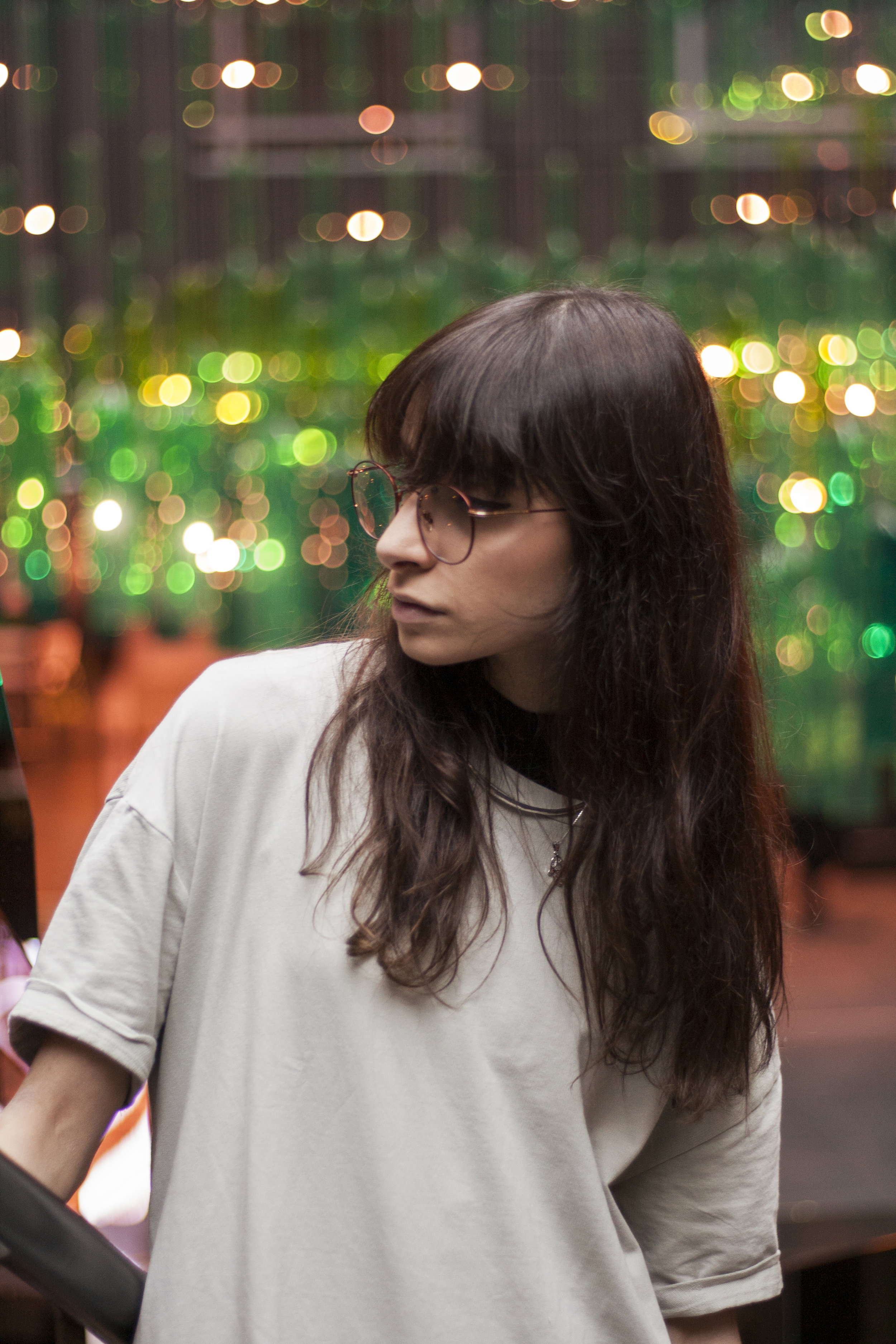
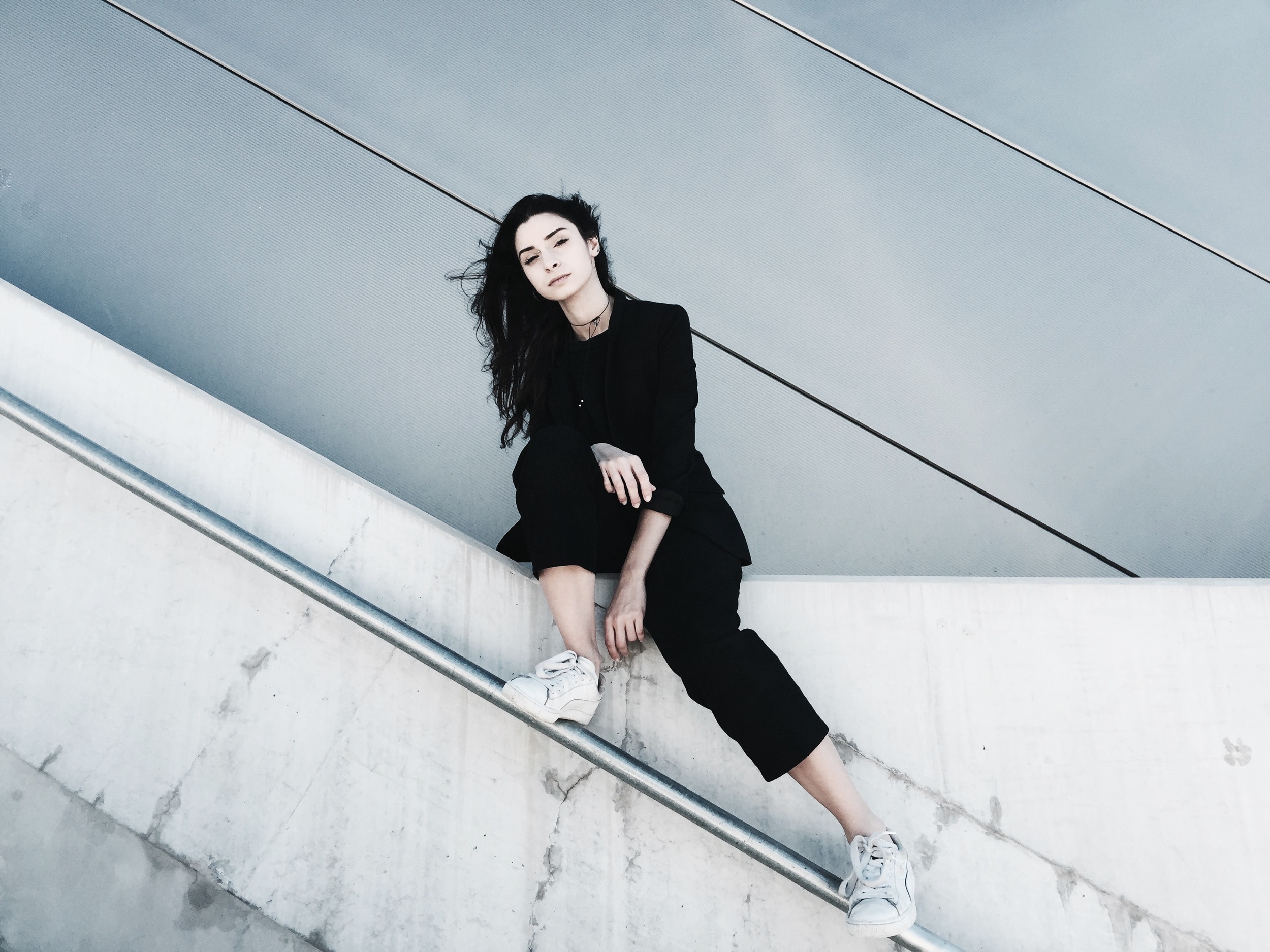
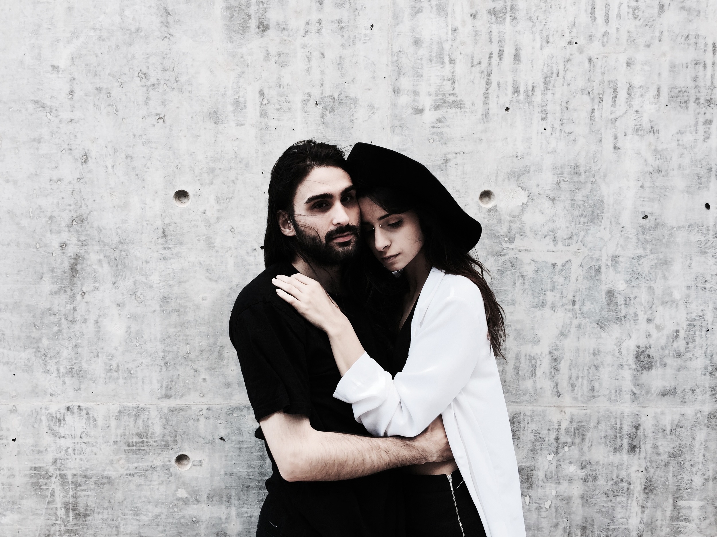
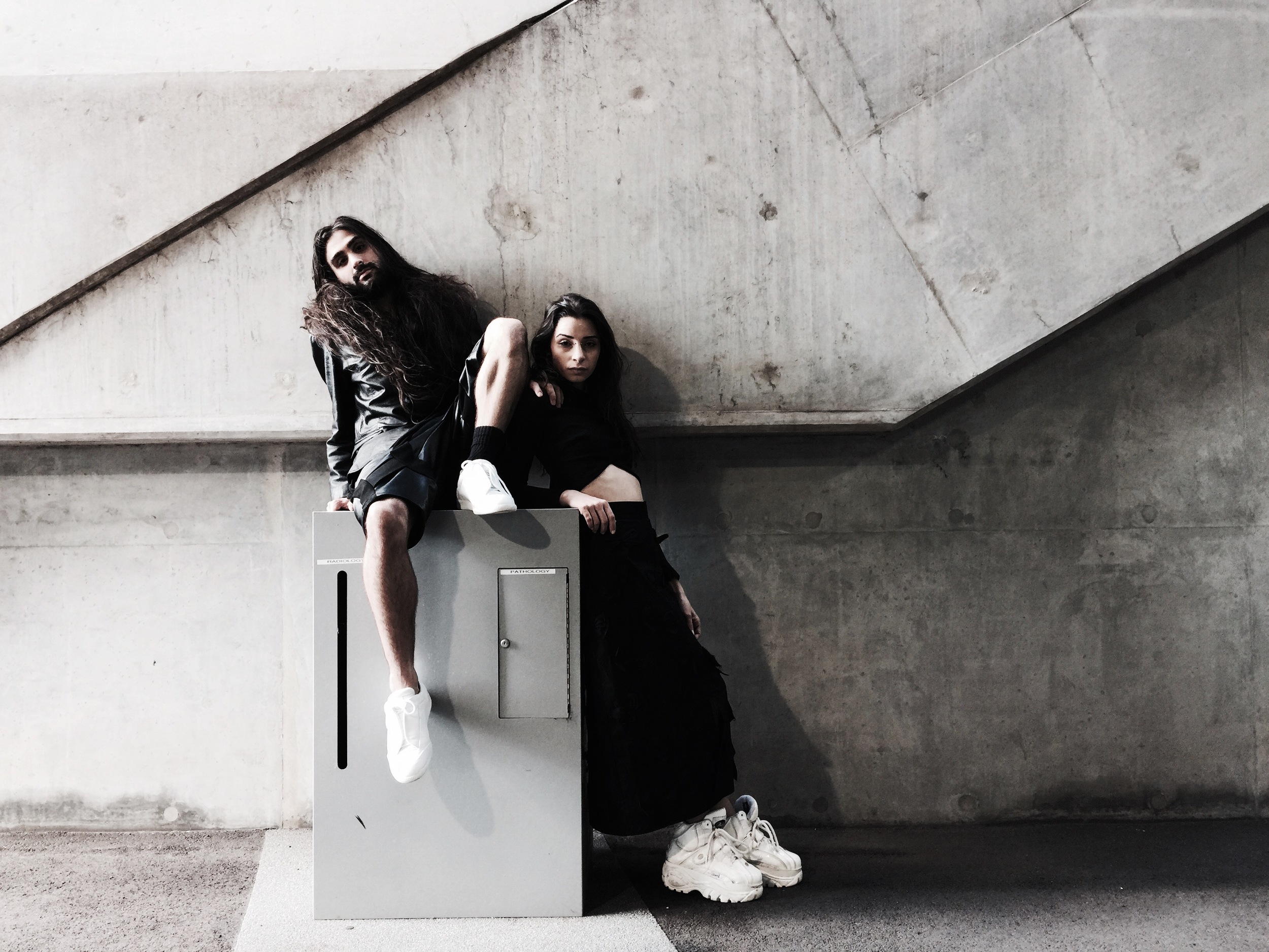
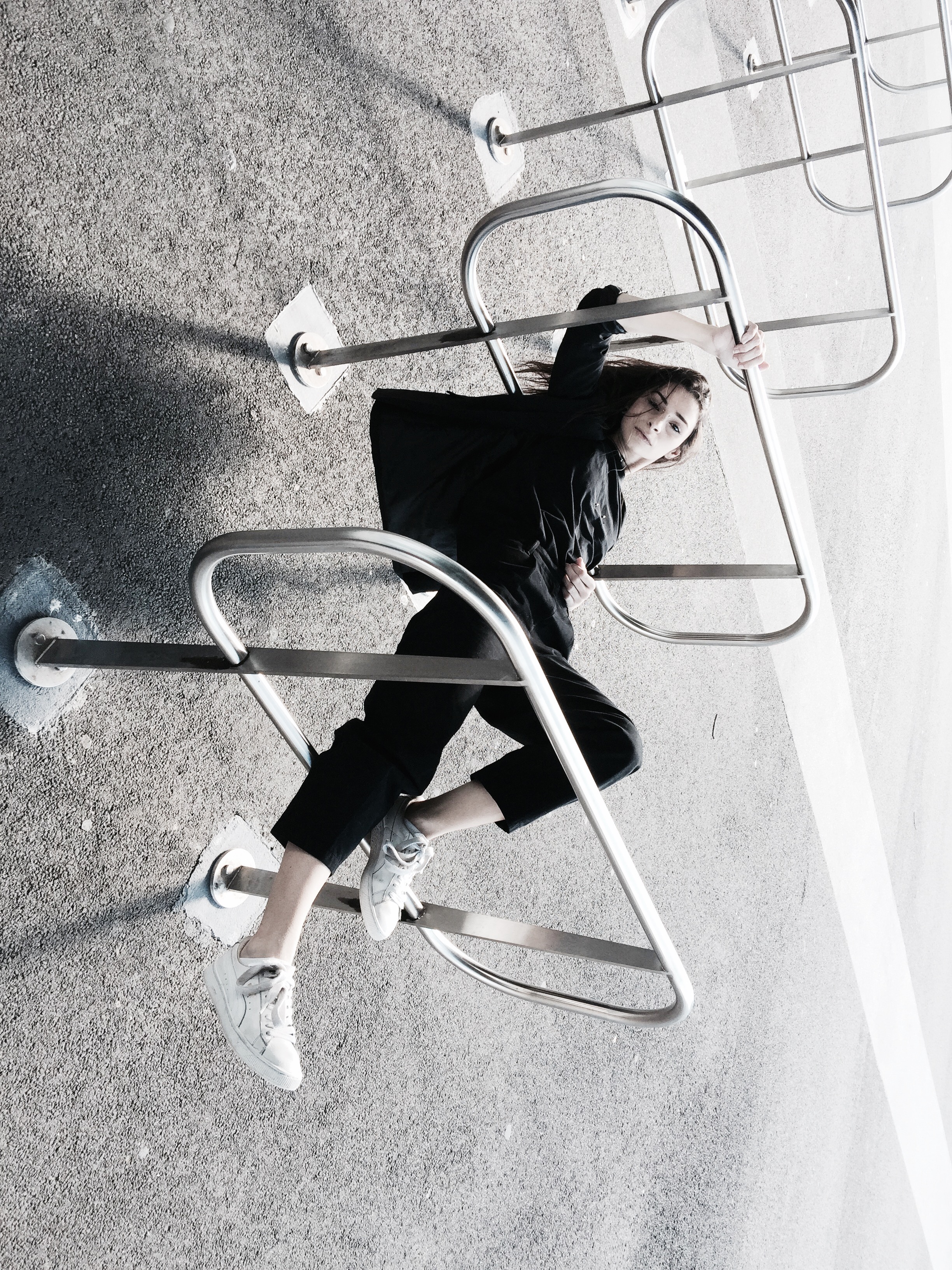
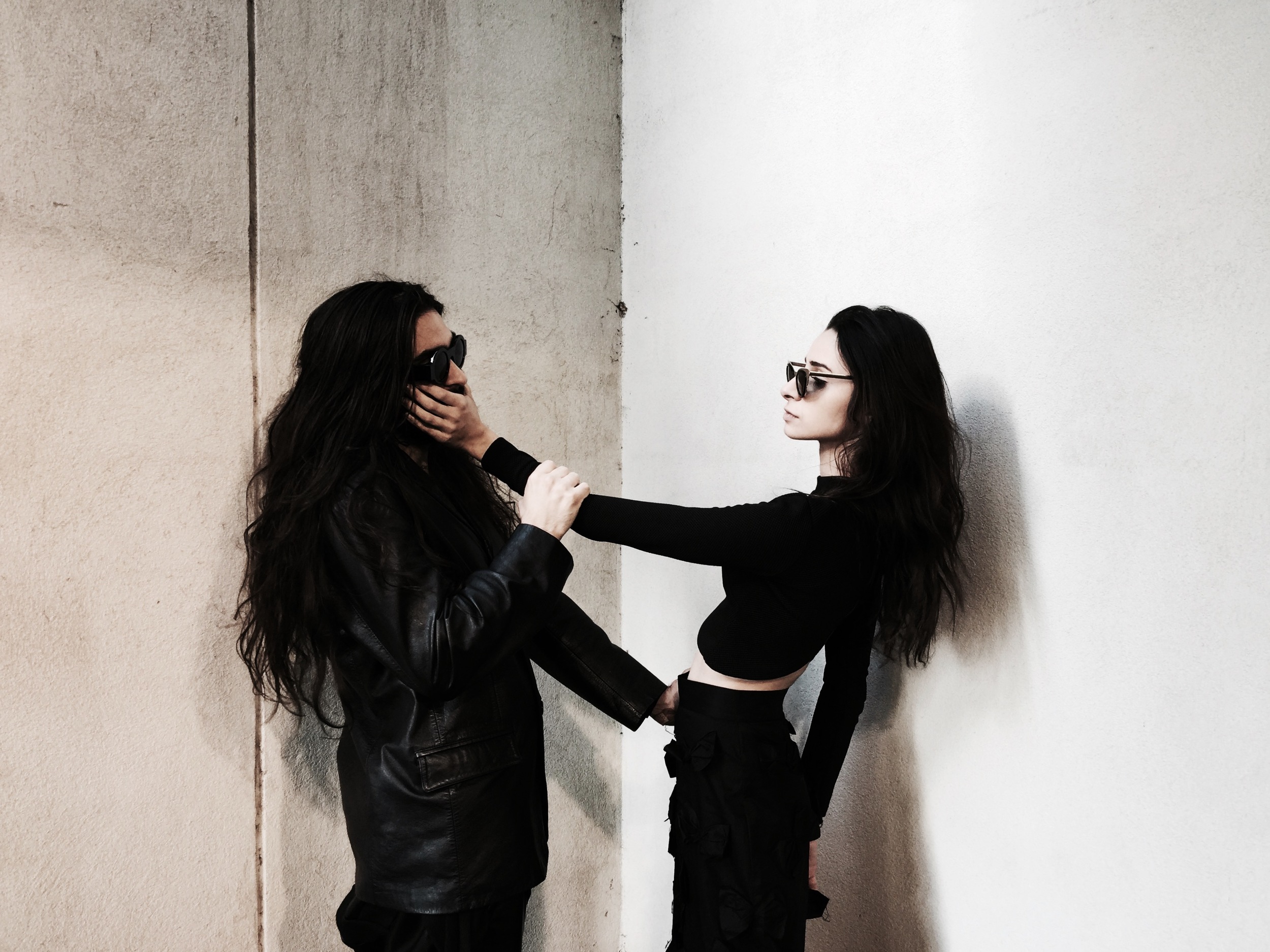
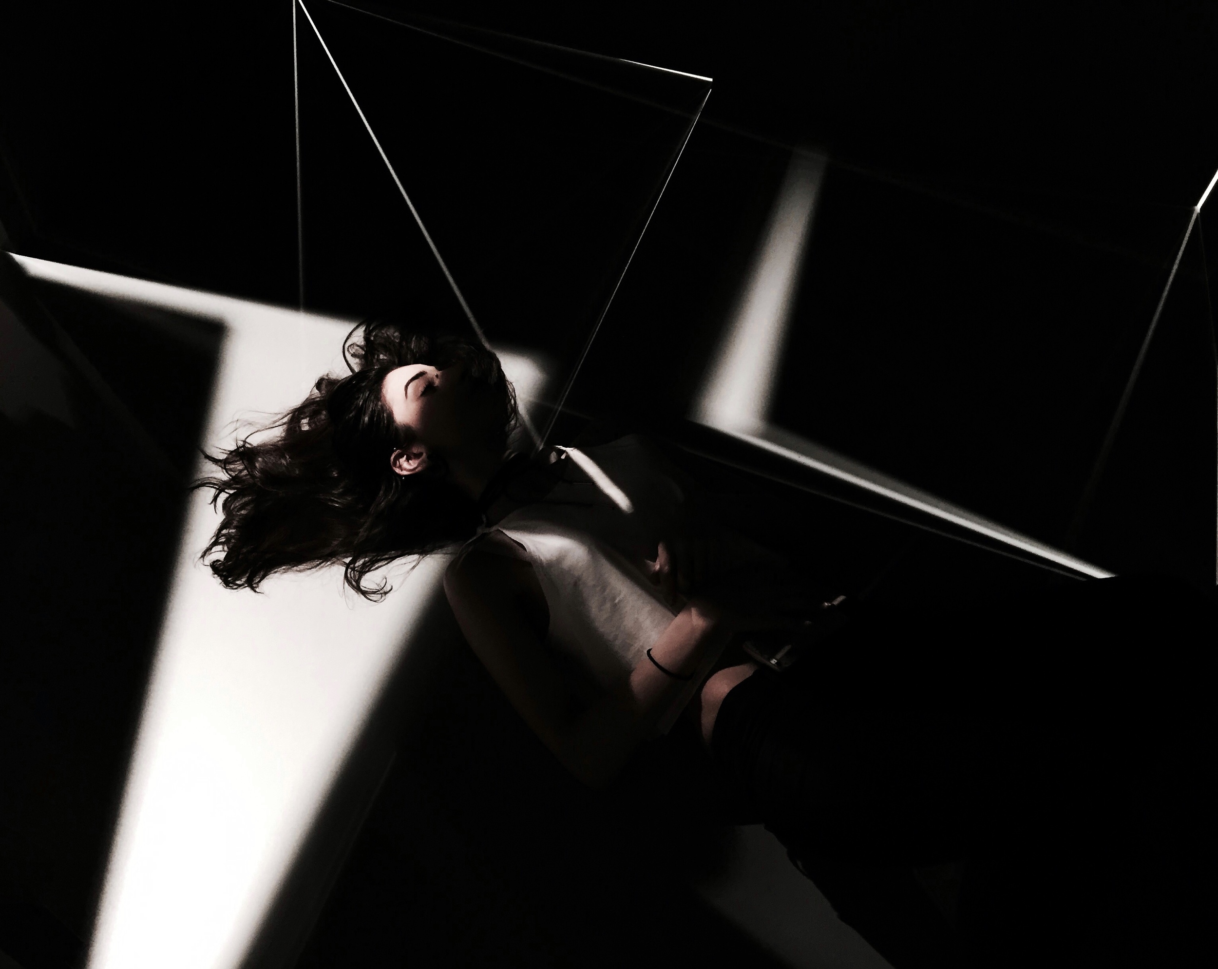
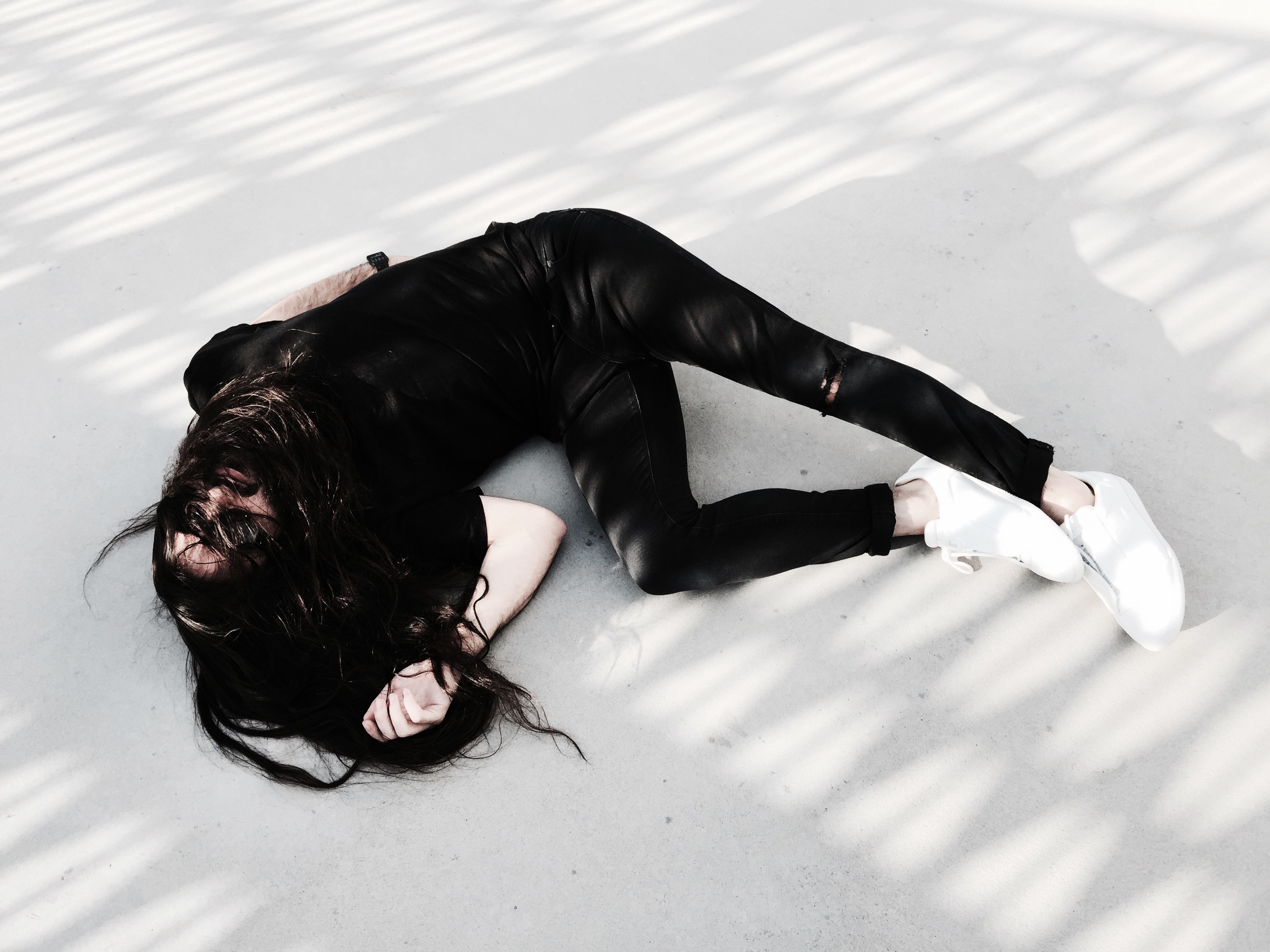
More photos from my first few rolls shooting on 35mm - I wanted to use these photos to capture two things; the people in my life who I loved to spend time with, and the feeling of being realistically immersed in nature.
The photo of myself was taken by Zoe.
I'm not a photographer - I just like documenting the world around me and my life.
These photos were from winter 2017 prior to my departure from Melbourne to Milan, shot on a Pentax Espio 60S.
WINTER IN 35MM - PART 1
My first time ever trying film photography, shooting 35mm - some selections from the first roll developed. I really enjoyed capturing what my life really looks like, rather than using it as just another medium to create an image from my imagination.
The photos of myself were taken by Paul and Zoe.
I'm not a photographer - I just like documenting the world around me and my life.
These photos were from winter 2017, prior to my departure from Melbourne to Milan.
CHATTING WITH LUCIANA ROSSIO
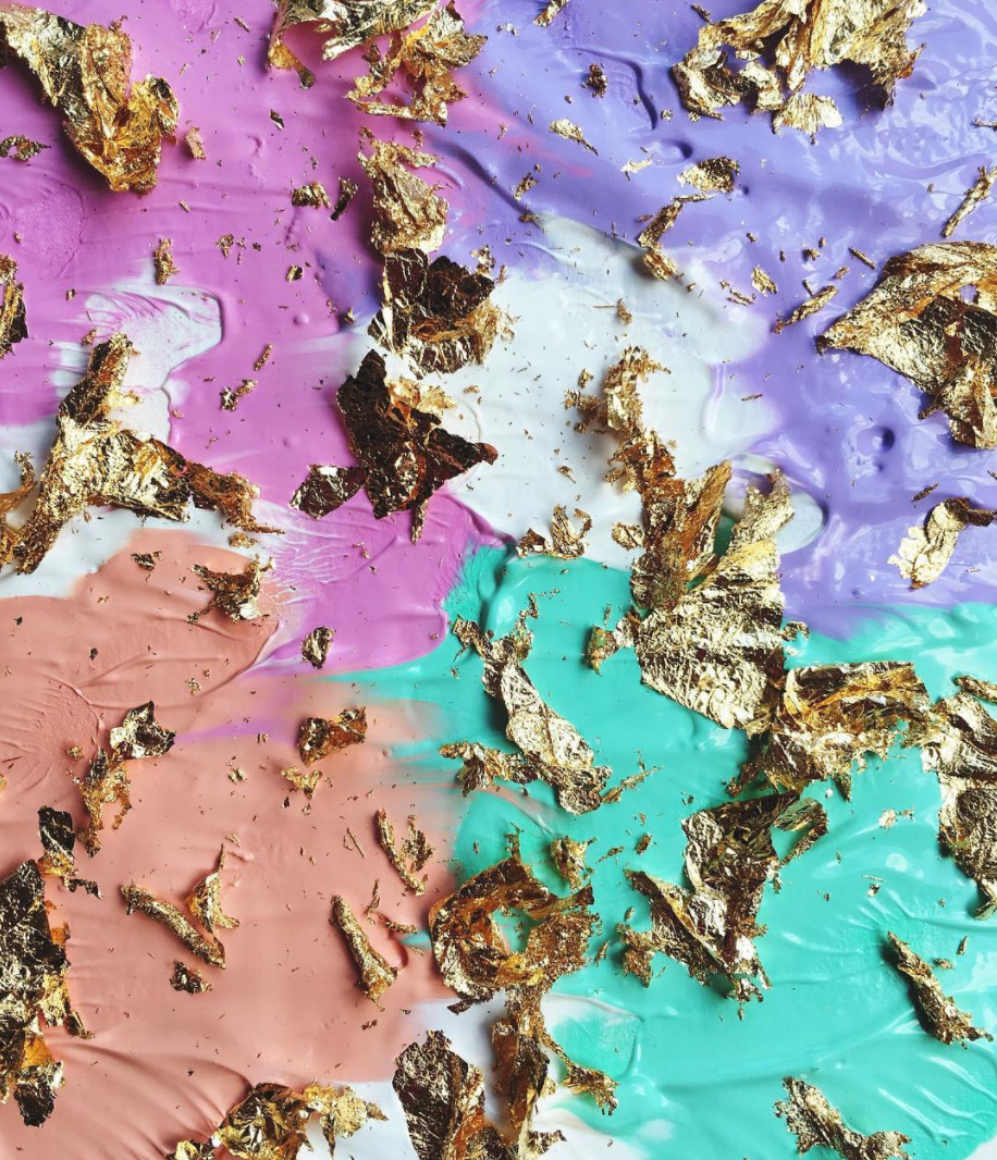
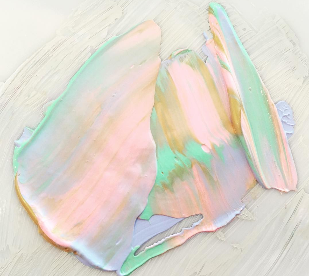
Luciana Rossio is the romantic moniker of Californian native Jennifer, whose paintings play with inviting colours and intriguing texture to create imaginative pieces that capture attention instantaneously.
Certainly a hidden gem of Instagram’s art community, Luciana’s feed is like diving head first into melting ice cream and never wanting to resurface.
Tell us a bit about who you are, where you're from, and how you first started becoming interested in creating art;
My name is Jennifer Roos & I create art under the name Luciana Rossio. I am originally from the desert in southern California, but have lived many different places as an adult including Southeast Asia. I'm currently living right outside of Washington, DC. I have created art & have been designing things since I was a child. As an adult I spent a lot of my time designing & working creatively in the fashion industry. When I moved to Southeast Asia I became quite bored creatively, So I decided it was time to paint again. And that was when Luciana Rossio was born.
What do you like to think about when creating your paintings? Describe your creative process;
My creative process is different every time. Travel is a huge inspiration for me & a great way to clear my mind. Color is also a huge inspiration for me. I often have more of an idea of the colors I want to use & just let the painting take shape as I start to paint the canvas. I also am very inspired by music & poetry, sometimes a painting is born just by a few lines in a song.
What are some of the main themes and ideas you try to convey with your work?
I think that art should be translated by the person enjoying it. I often hesitate to title work because I feel sometimes it takes away from the experience. For the most part I hope people feel something when looking at my art that in some way helps them or inspires them.
Who are some of the artists you look up to and are most inspired by?
Joan Mitchell, Vanessa Prager, Xu Zhen, Vincencia Blount
What are your hopes for the future with your artwork?
I hope to continue to make art that people enjoy, to spread love & inspire others.
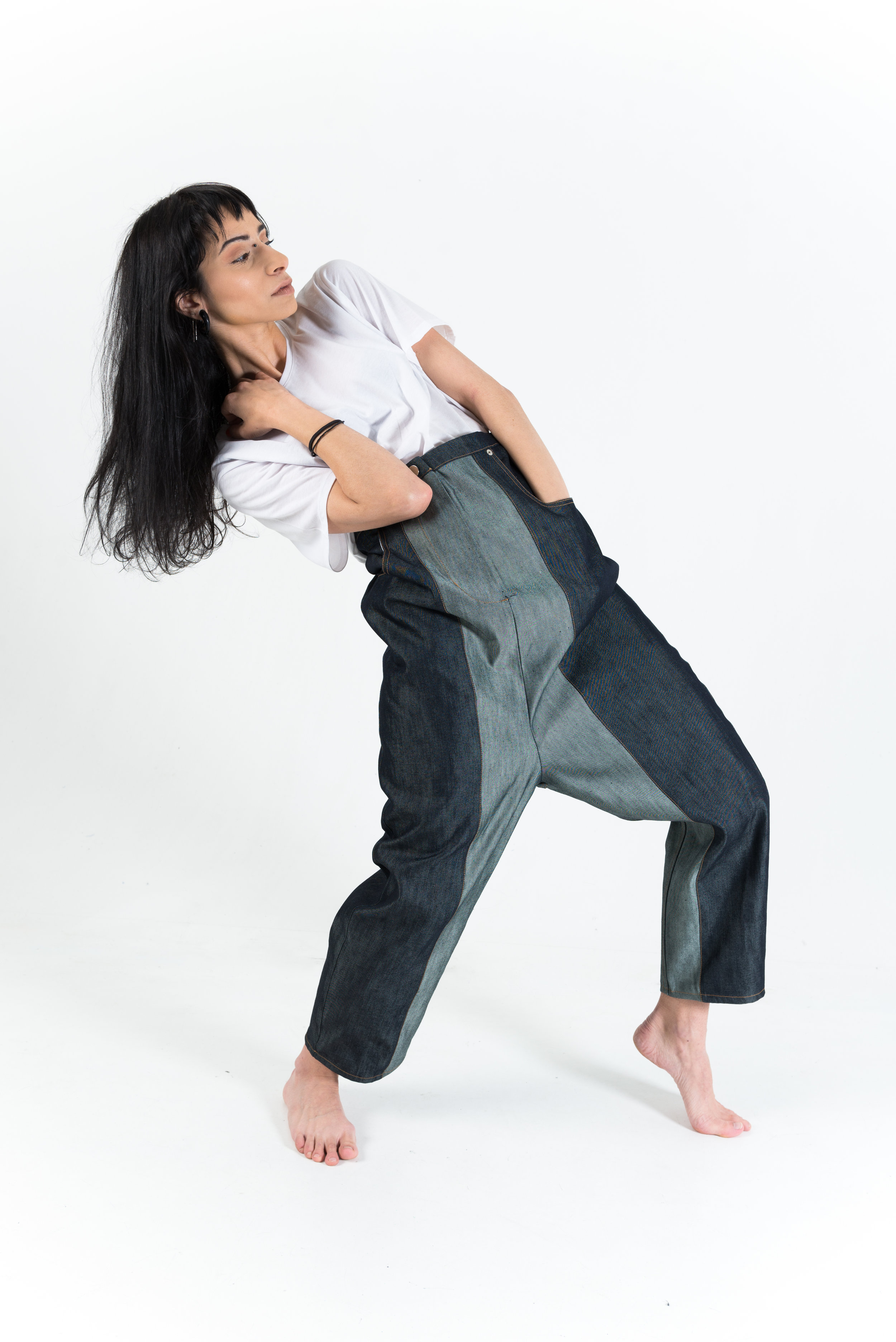
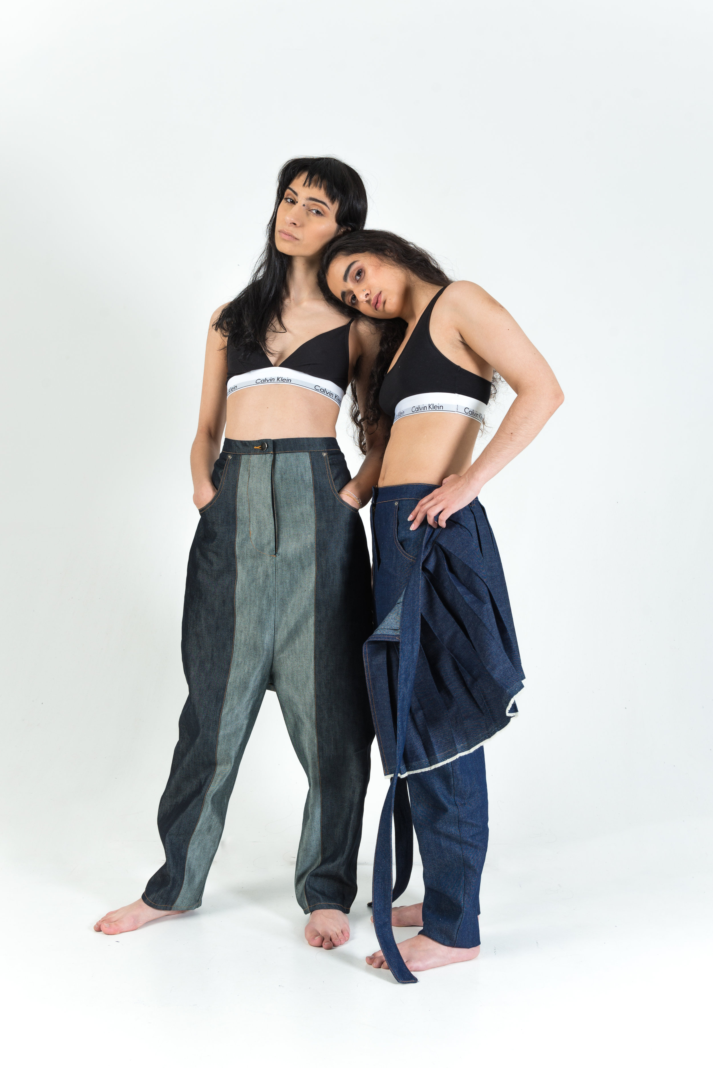
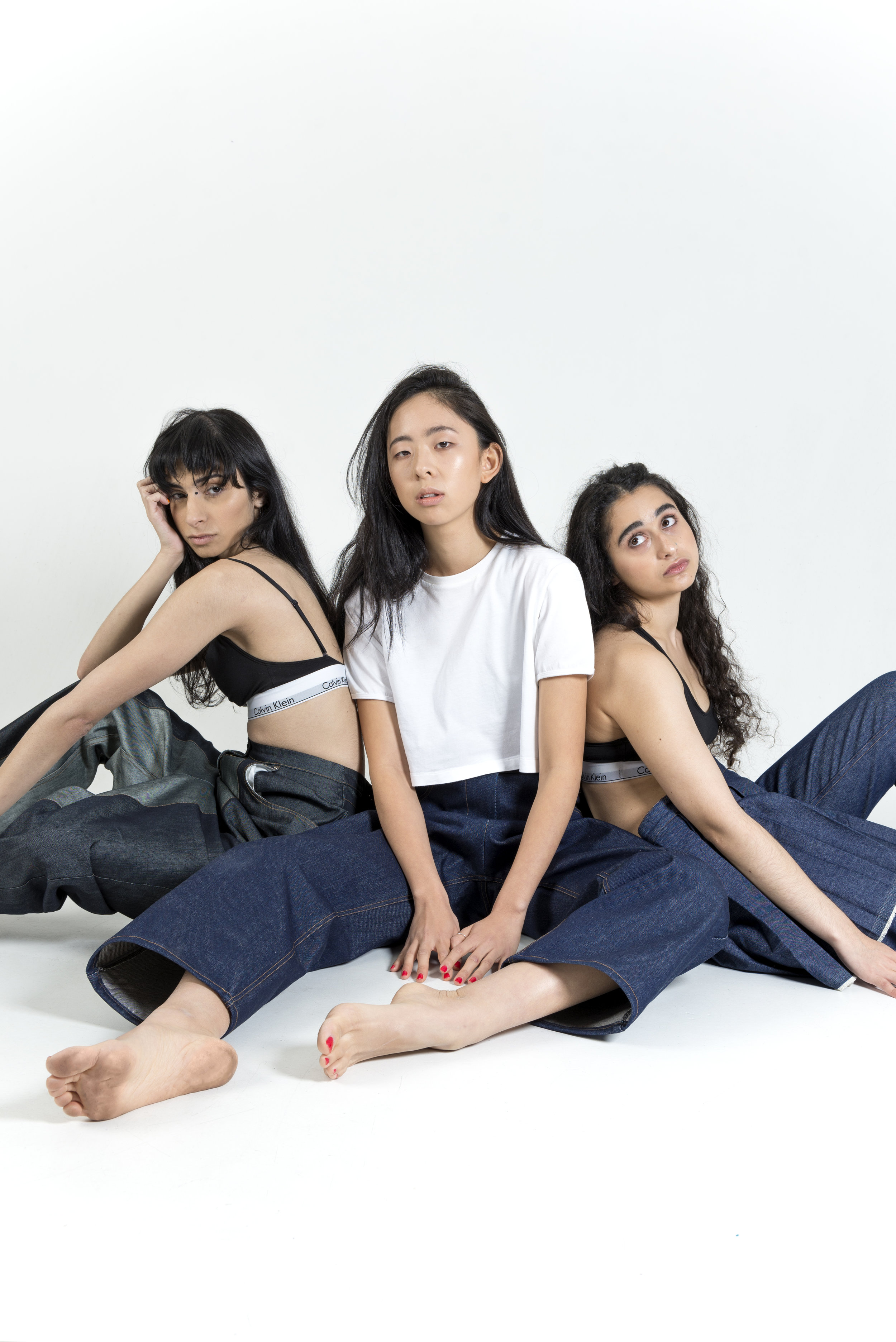
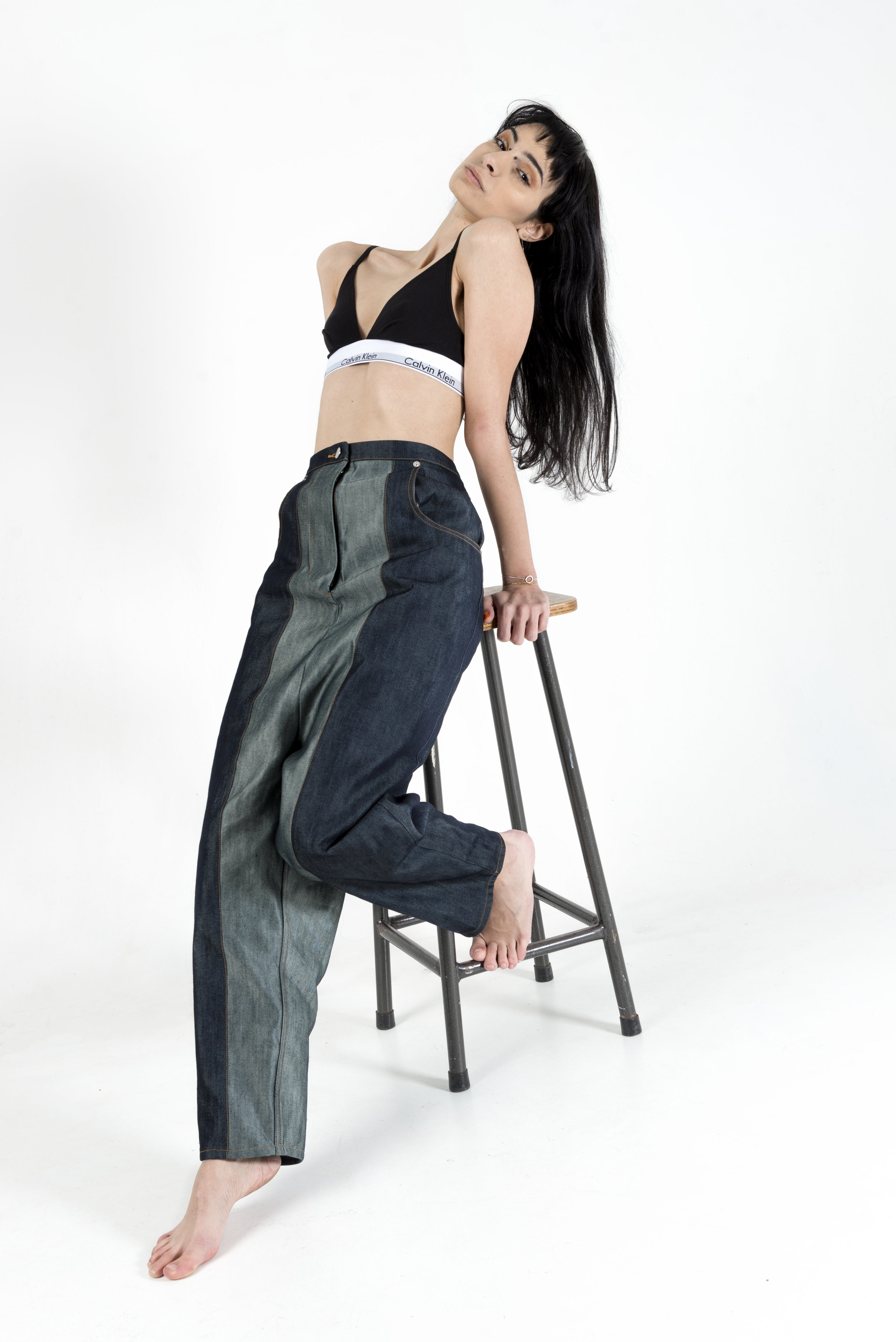
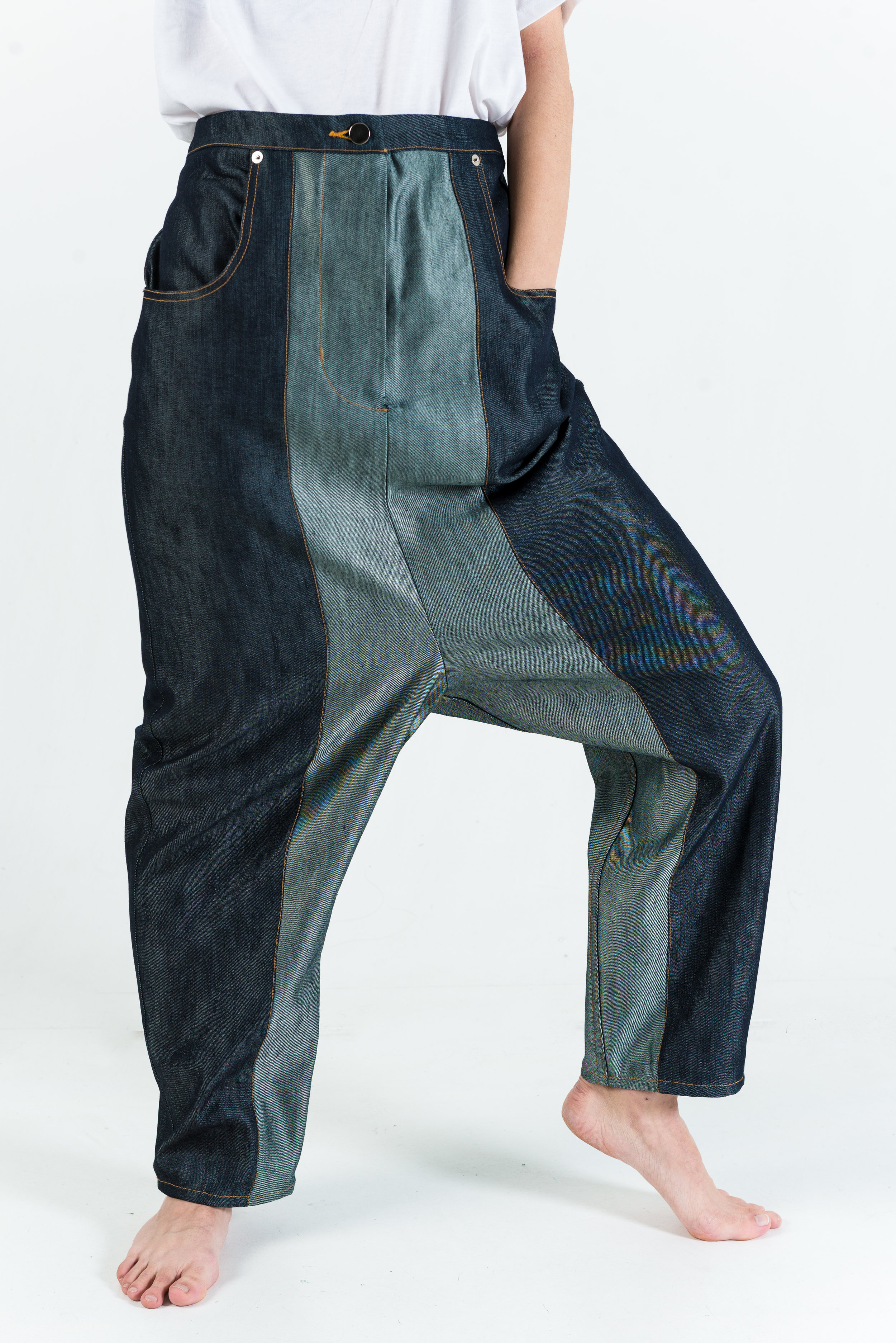
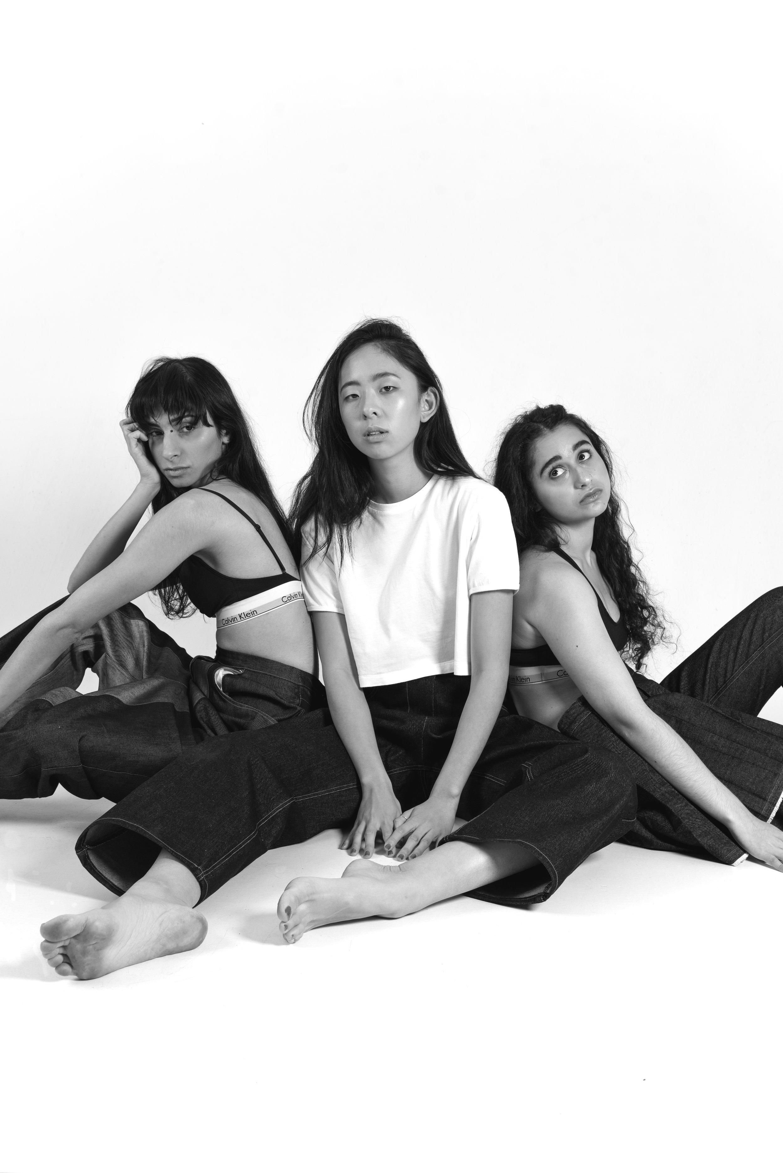
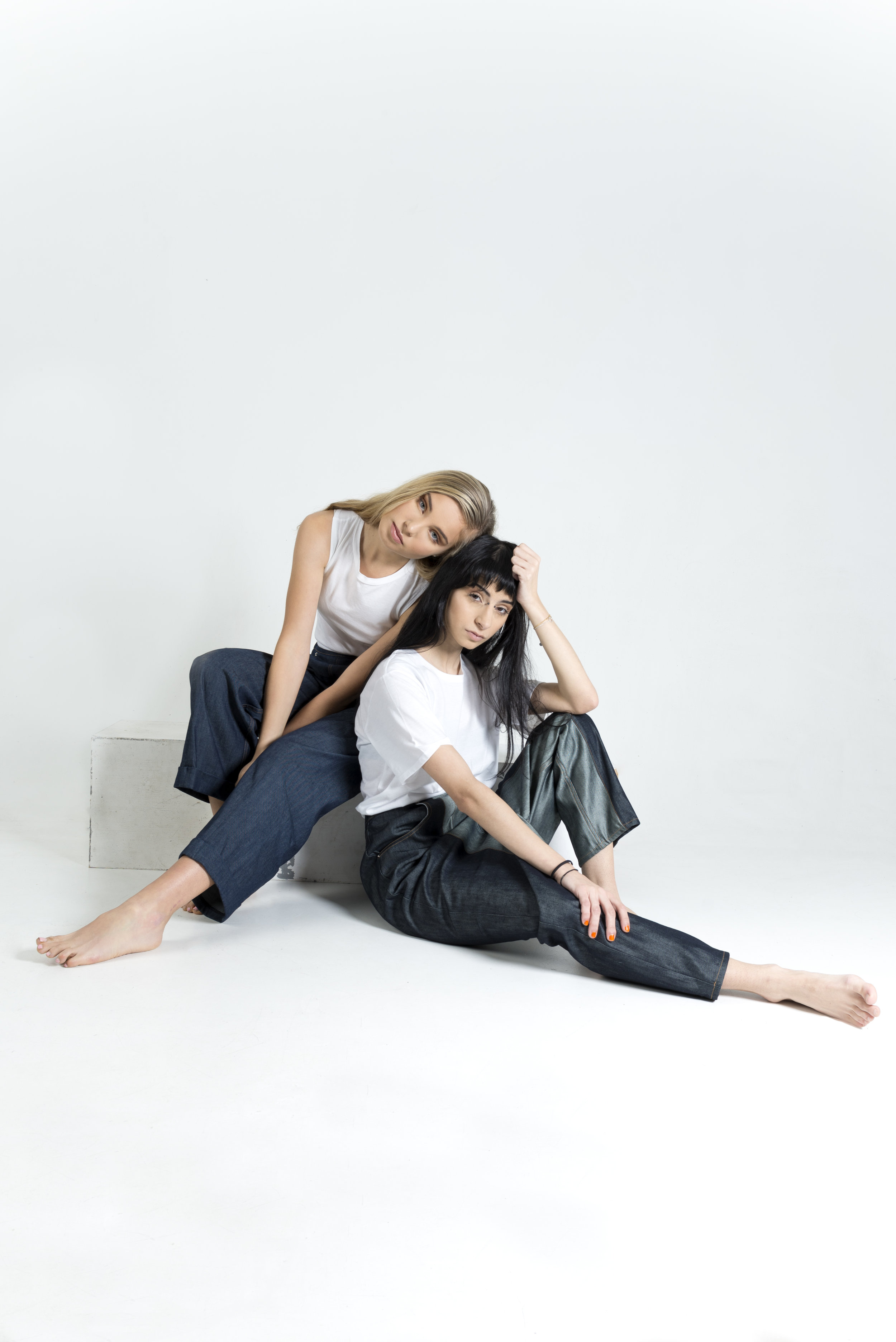
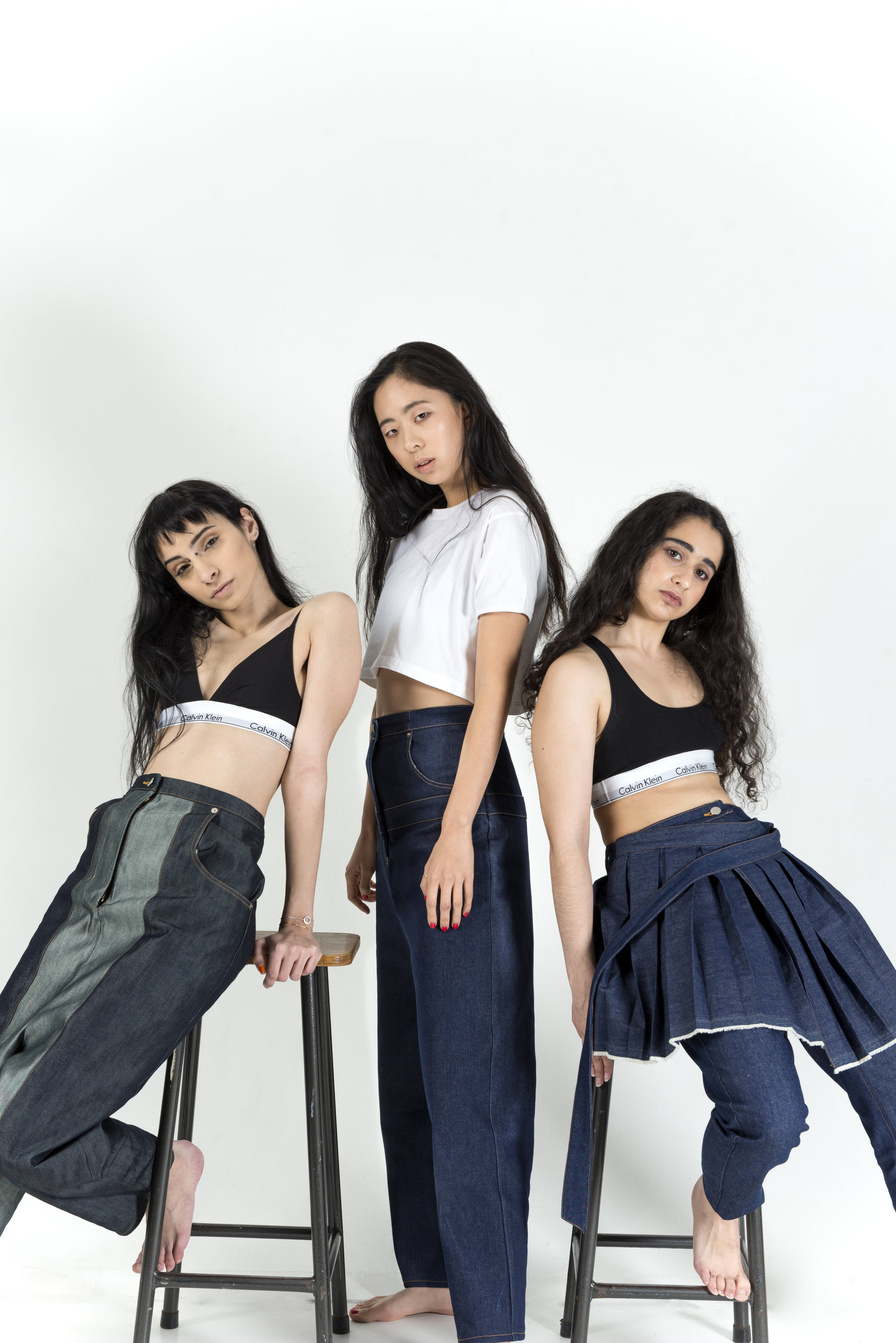
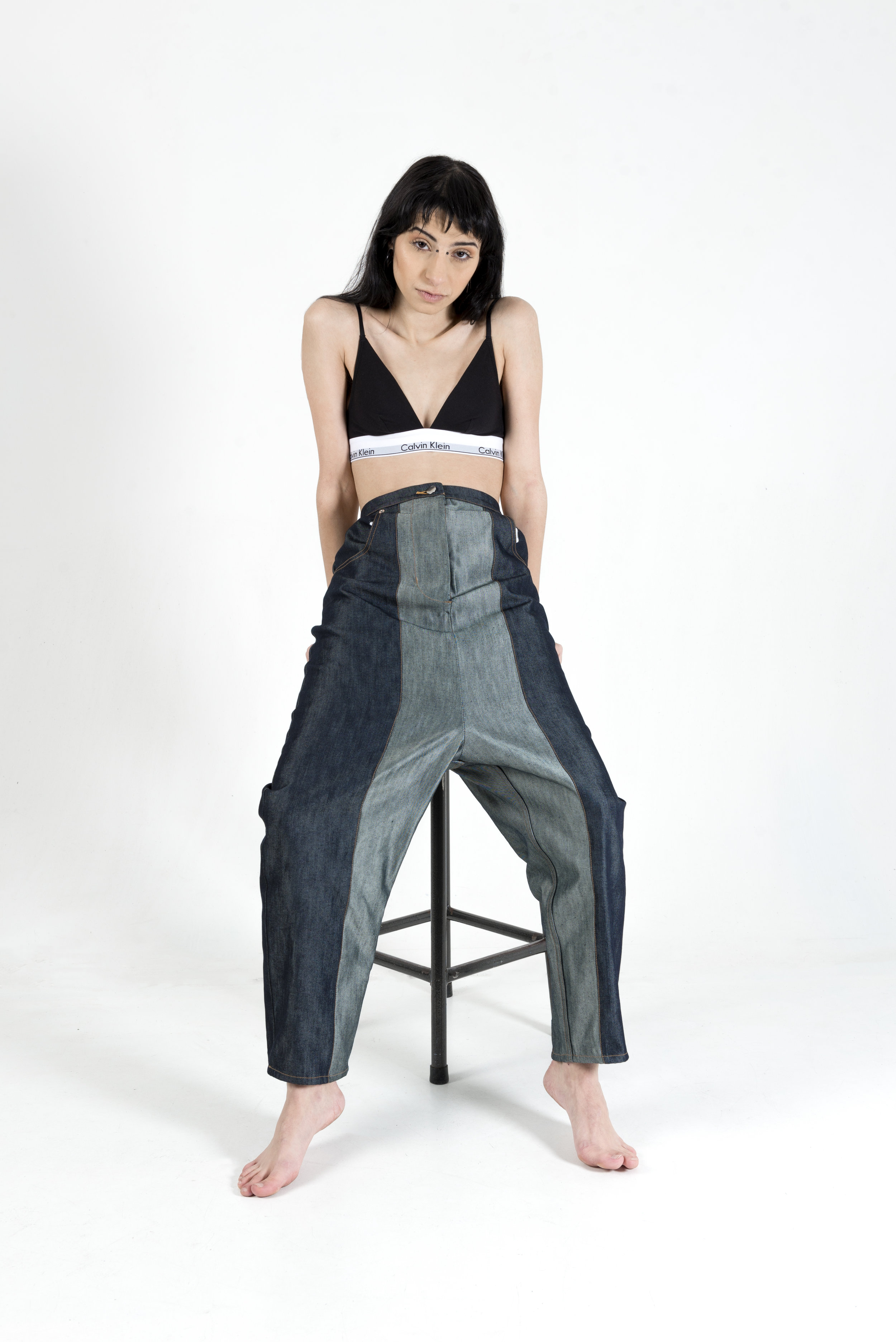
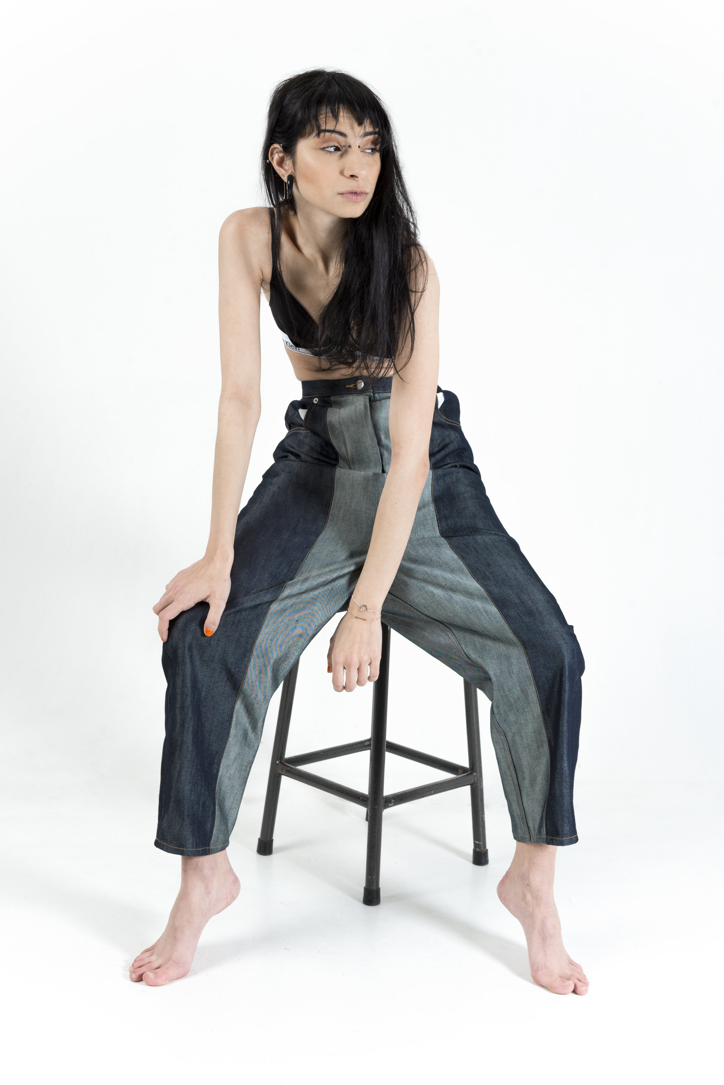
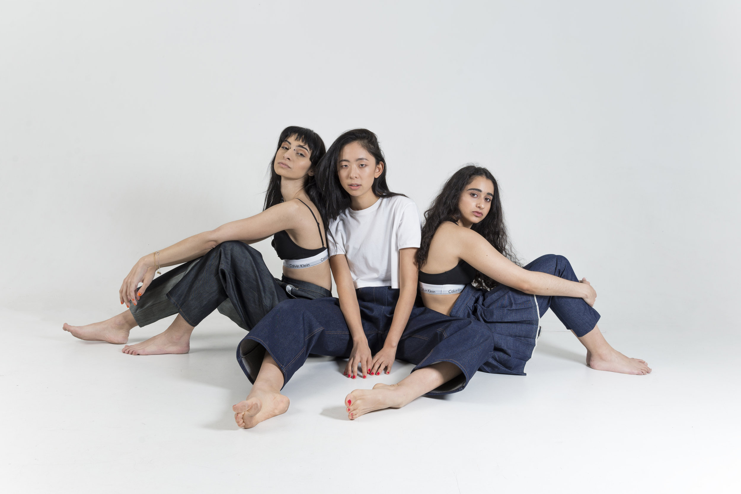
THE SECRET LIFE OF JEANS
PHOTOGRAPHER: WYNONA STOCK
DESIGNER: ASHLEY MARTINIELLO
MAKEUP: LILIANA OPPEDISANO, ZOE CRAWFORD
MODELS: VICTORIA, PHEROZA, ANNA
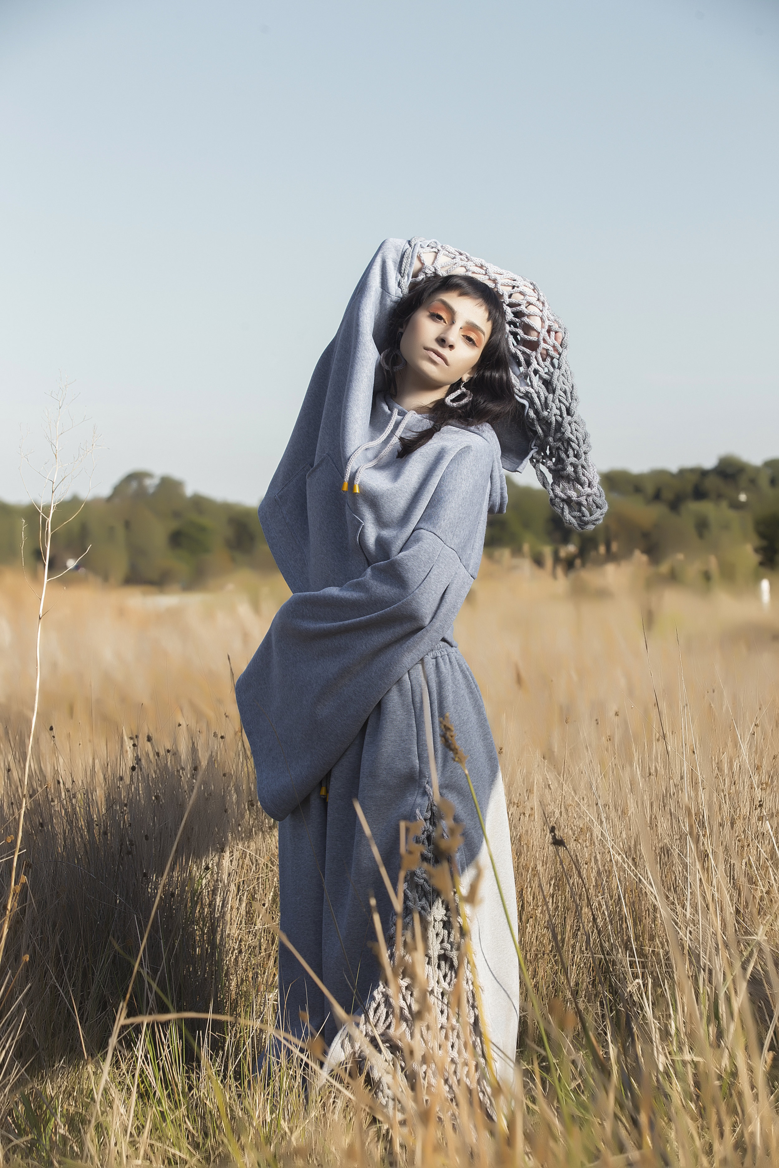
CULTURES OF KINDNESS
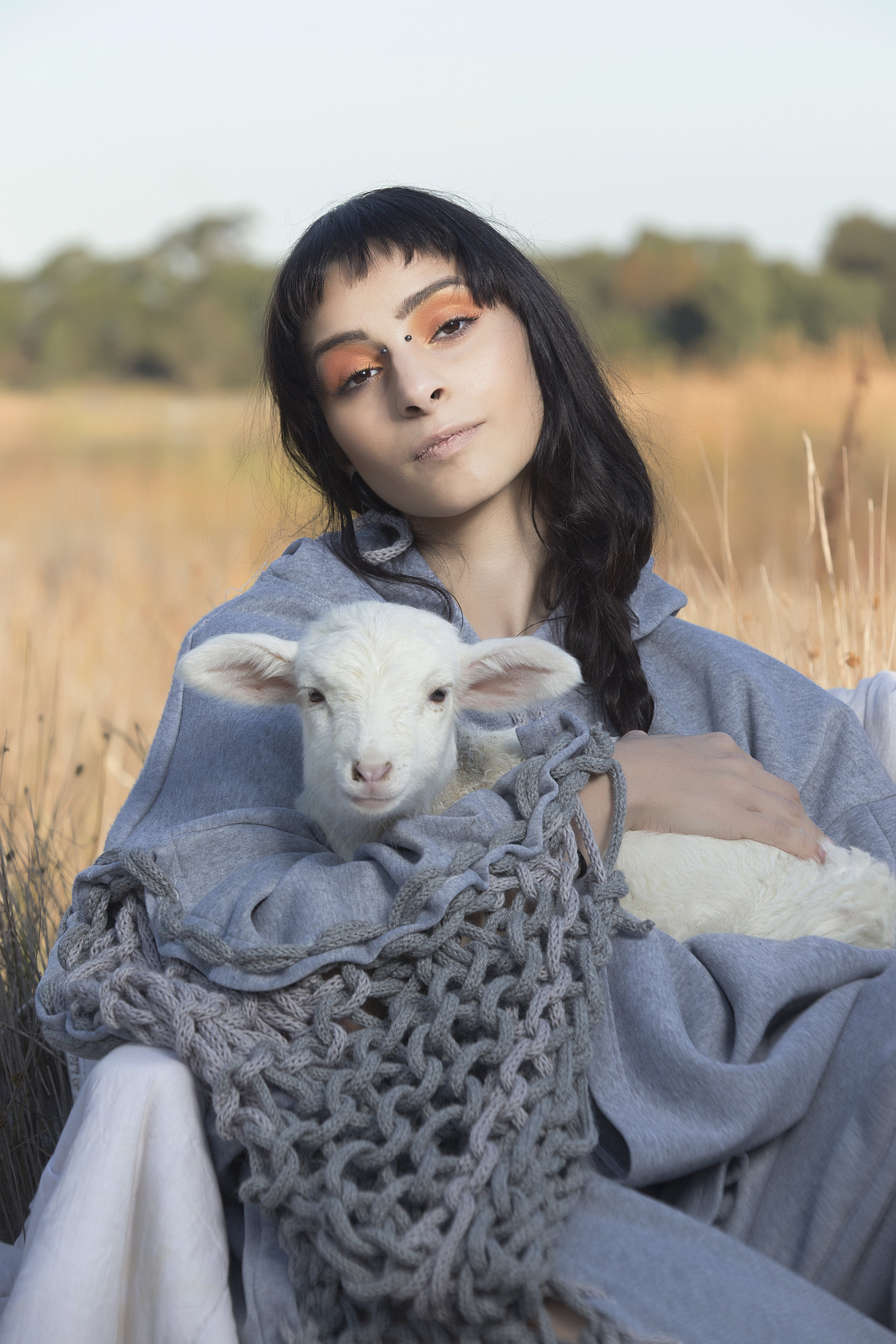
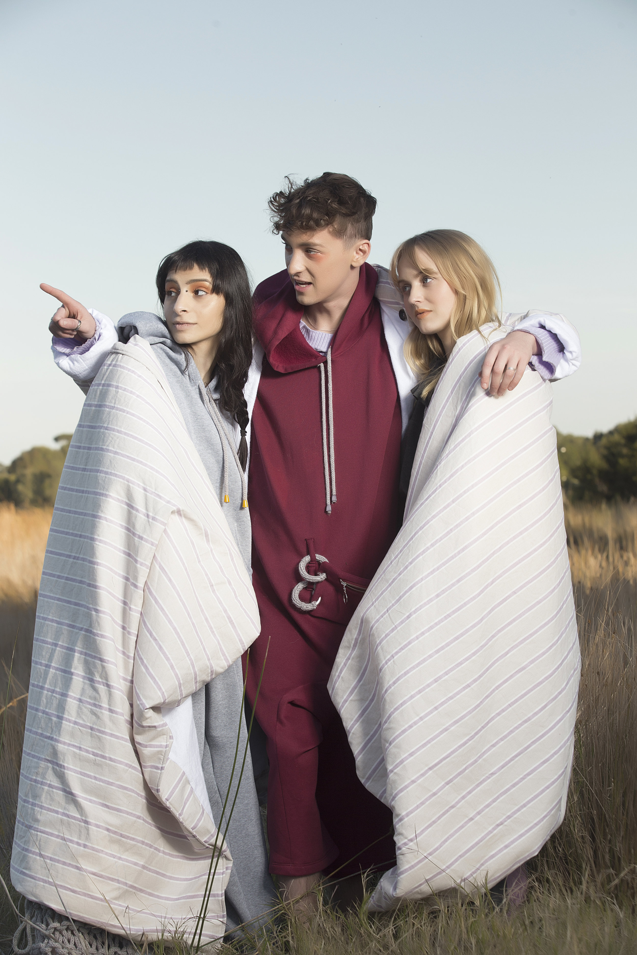
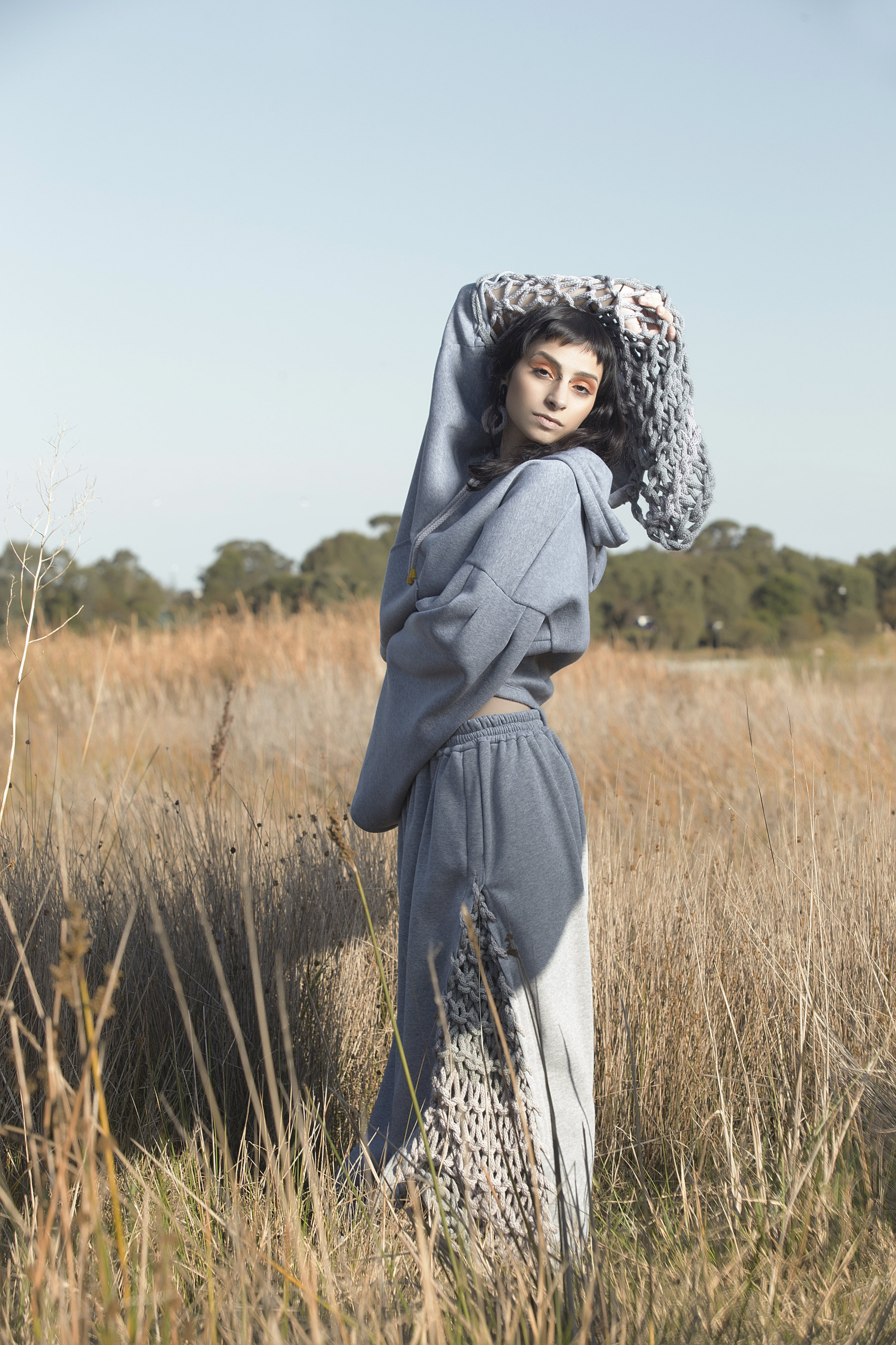
Enter a world where the prevailing culture is kindness, thanks to RMIT Fashion Honours student Sammi Guss and her fondness for the fusion of comfort and innovative design. With garments that envelope you in what can only be comparable to a warm hug, Sammi's oversized silhouettes and feature knit panels combine in this development shoot for her collection Cultures of Kindness. Shot at Moorabin's Karkarook Park on a beautiful Sunday with some surprise animal companions, the positivity and tenderness depicted in this shoot were truly coloured throughout the magical day.
Thank you to this wonderful team for having me!
PHOTOGRAPHER: MICHAEL FOXINGTON
DESIGNER: SAMMI GUSS
MAKEUP: MICHAELINDA PAUL
MODELS: PIERCE AND JASPER
AFTERGLOW
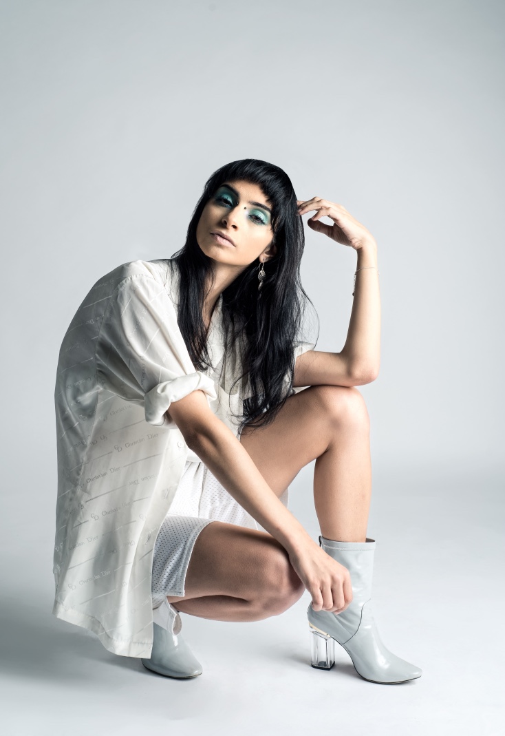
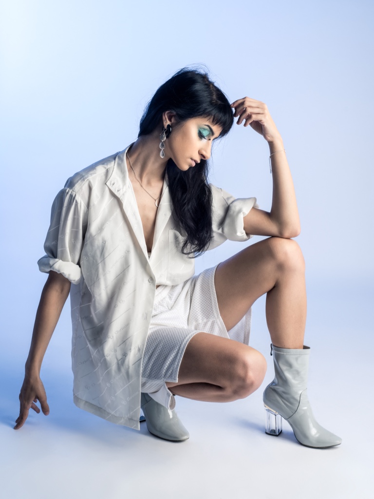
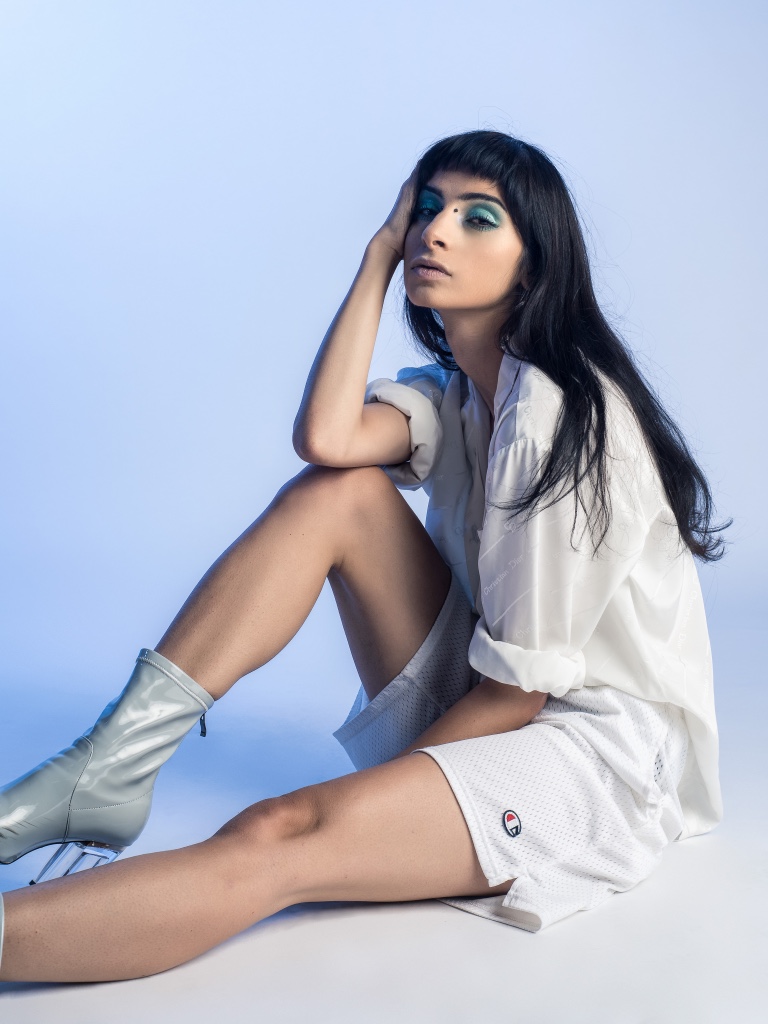
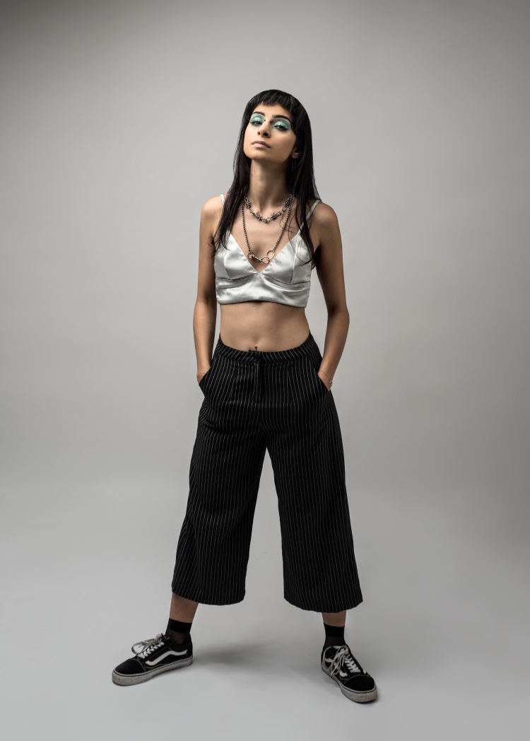
Morning studio antics and getting to style myself; can't go wrong
Photographer: Ethan Dengate
Makeup: Analyce Thomas
CHATTING WITH MARISA MU
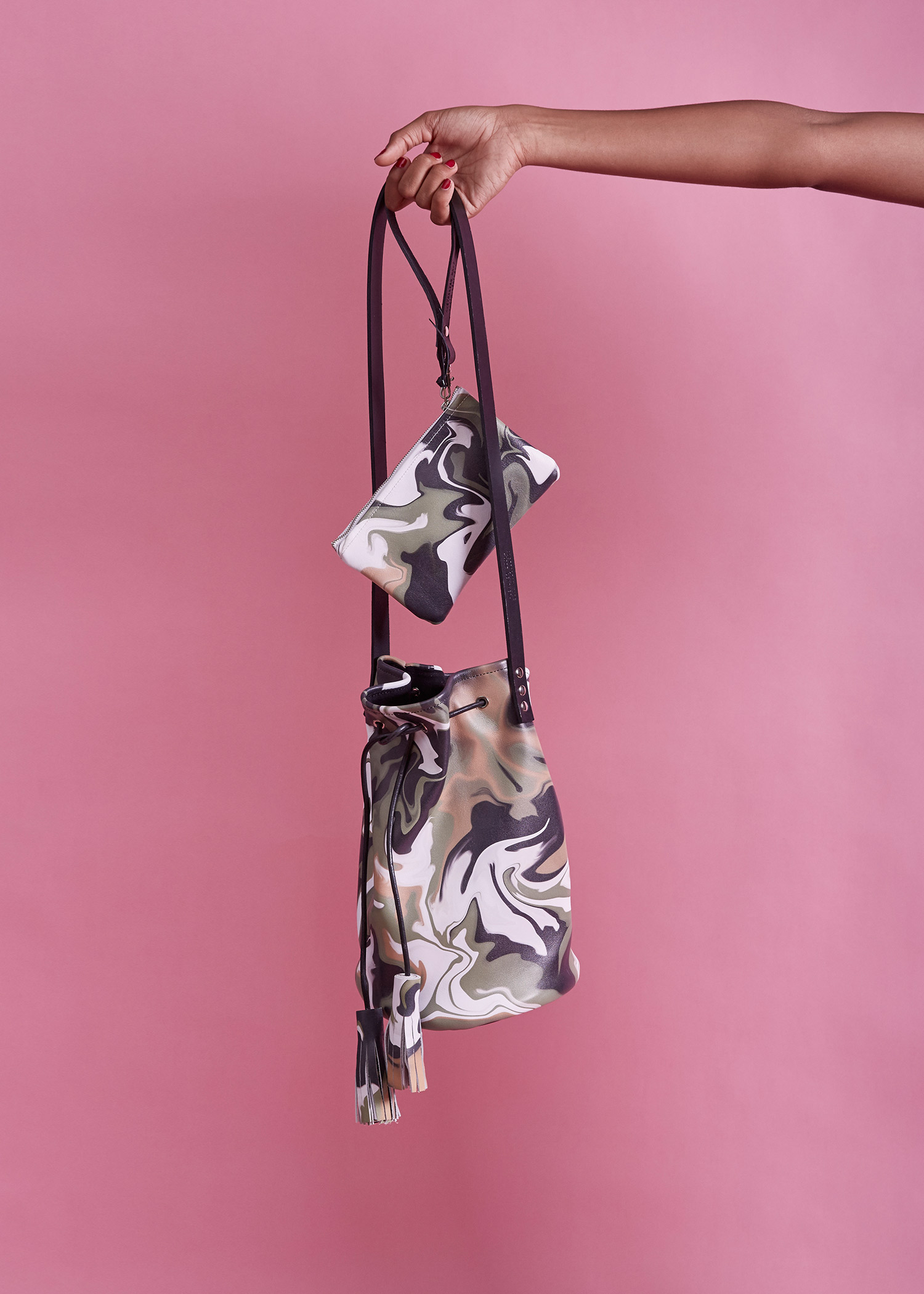
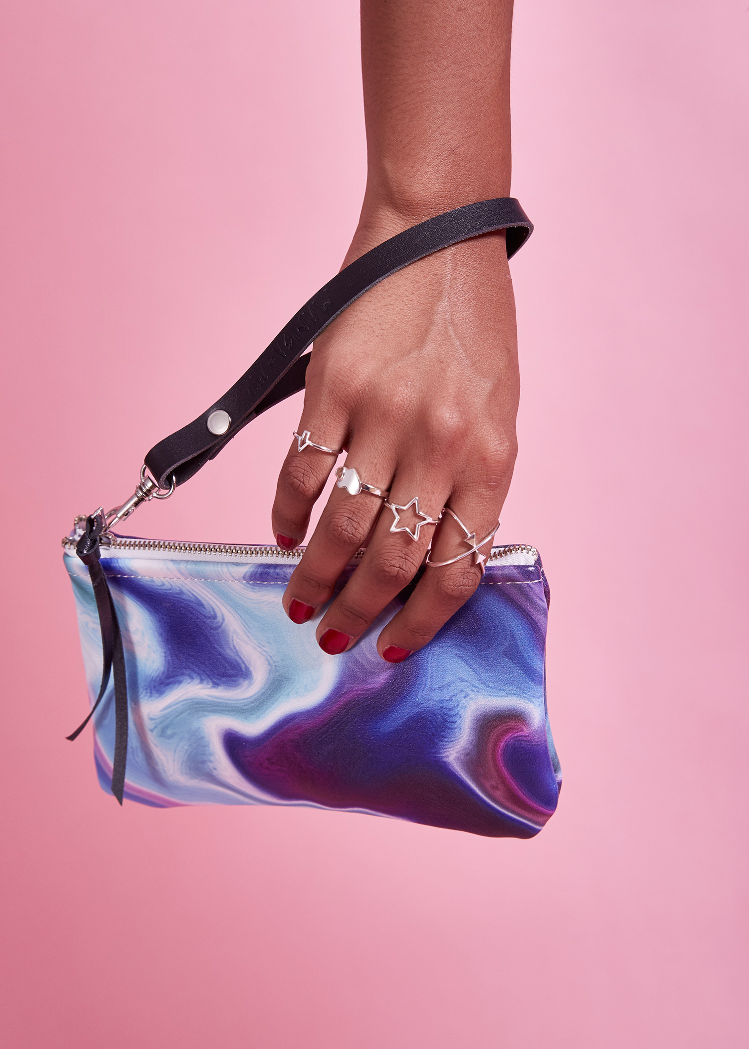
Where functionality, craftsmanship and original design meet, you will find Marisa Mu's vibrant and mesmerising bags and clutches. The thoughtful Sydney-based designer packs careful handiwork and unique technique into each item, using a studio-based process to create each 100% Italian cowhide piece. Having collaborated with a number of creatives and working in Melbourne Fashion Week, Marisa's journey is one to pay close attention to.
Tell us about your background in design and how you first became inspired to start your line;
I always knew I wanted to be an artist when I was a little girl but wasn't sure what creative direction I would eventually undertake. After finishing high school, I was adamant I wanted to be working within the textiles industry and after studying a degree within Design at COFA - my love for pattern design and working with the tactile quality of leather became a true obsession. That was a turning point for me when I made the connection between the love I have for colourful abstract patterning and the unique nature of leather skin. Playing with colours and textures and the changing nature of leather is what inspired me to undergo my current practice of creating unique colourful leather goods that are proudly Australian-made. I also knew from a young age that I was not going to be the type of person that could live a life of routine where I worked in an office doing the 9-5 for the next 40 or so years. Starting my creative practice enabled me to channel my energies into something that was giving me a sense of purpose and fed my creative soul and sanity. I see creativity and art as a therapeutic practice for me and I have overcome plenty of personal hardships because I turned to what I love most - creating art. I believe too many of us don't take that leap of committing to do something for ourselves - that is the core underlying reason behind why I decided to just bite the bullet and start my own line.
Your designs are quite a playful take on elements like shape, texture and colour - tell us about your creative process, and how your designs manifest;
My creative process is very organic and revolves predominantly around colour. The power of colour and the way in which hues and contrasting colours create an abstract wonderland is what I strive to achieve within my work. I chase the feeling of knowing I have created a wonderful colour combination and then allow the colours to bleed within one another and create their own special story. Working with leather is amazing as the skin itself had its own story - a past life that is now undergoing the process of becoming recreated and then forwarded to a new forever home. I use premium Italian cowhide and the beautiful textures make for a perfect contrasting canvas for the fluid aesthetic of the patterns. It is about creating sentimental pieces that hold layers of beauty and wonder.
Is there a specific piece from your collection that is your own personal favourite?
I go through phases and each design has held title of 'favourite' at some point. I am currently in the 'Smokey Camo' phase as the colours are a bit more muted from the usual bright and bold patterns. It's understated but still very much a statement piece. I will be releasing this pattern as a Bucket Bag style by the end of the week which is very exciting!
You place a particular emphasis on functionality and practicality as well as style in your products; tell us about your vision to incorporate both aspects in your work;
Leather goods are seen as a long lasting investment. They stand the test of time due to the tactile and durable quality of being a skin - the colourful artworks are a reflection of how I perceive what is around me - colourful beauty. I want to implement my love for colour and pattern with simple silhouettes and bags that hold your daily essentials. I want to keep the bags simple and to not be excessive - it is about being a canvas for the artworks that we integrate within our daily lives. I strive to create long lasting works of art that we choose to carry with us. Something that brightens our days but also hold a key role of protecting and holding our valuables. It is a simple vision but a deeply soulful one.
If your label was a song - which song would it be?
It would be 'True Colours' by Kasey Chambers. I believe the spirit of my brand revolves around being someone that is individual, strong minded and colourful. I want my brand to be an embodiment of who I am and to empower others to be a statement maker within their everyday. To show your true colours, and to not be afraid to do so.
CHATTING WITH JOANNE T.
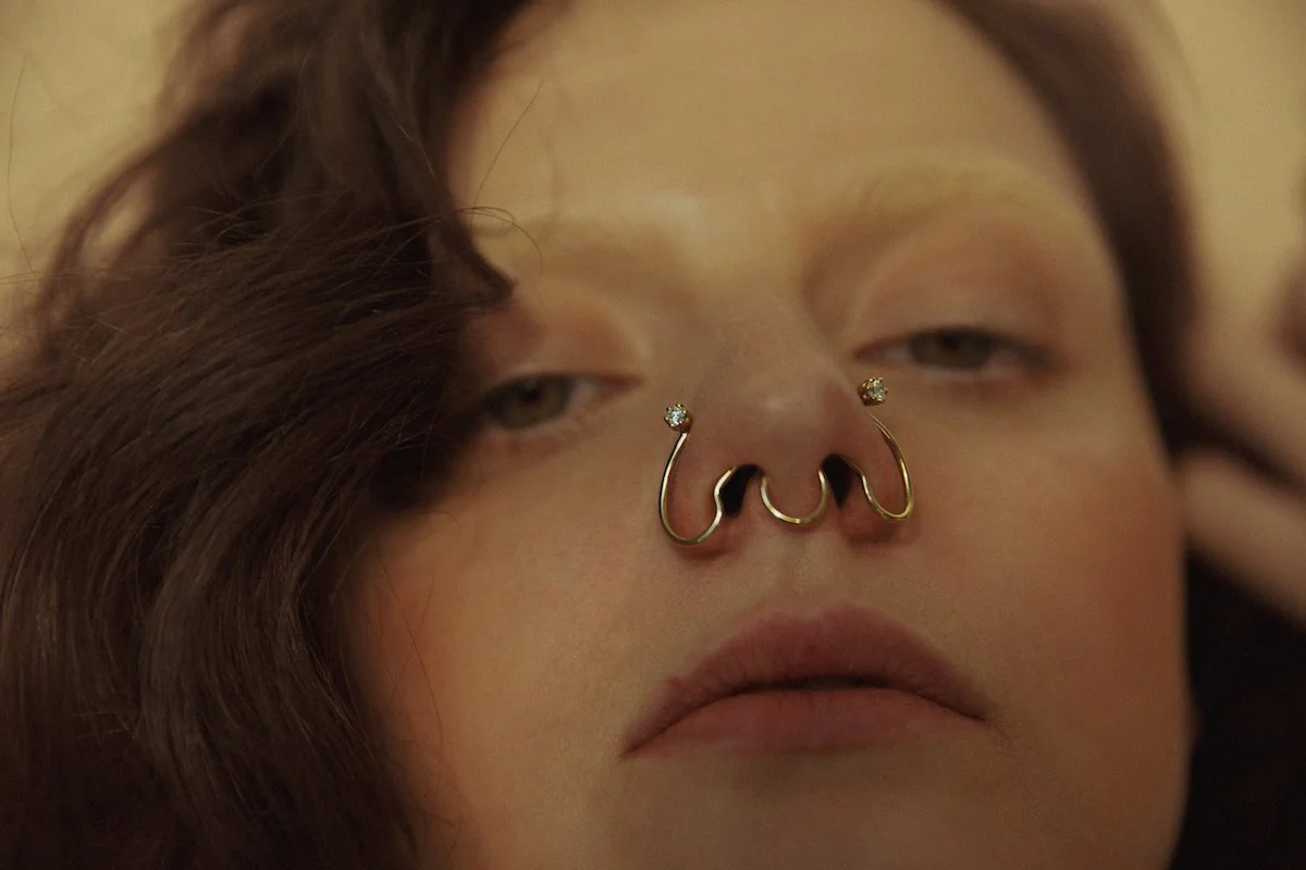
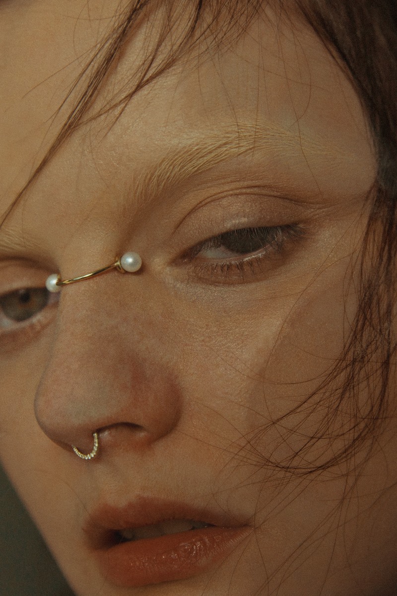
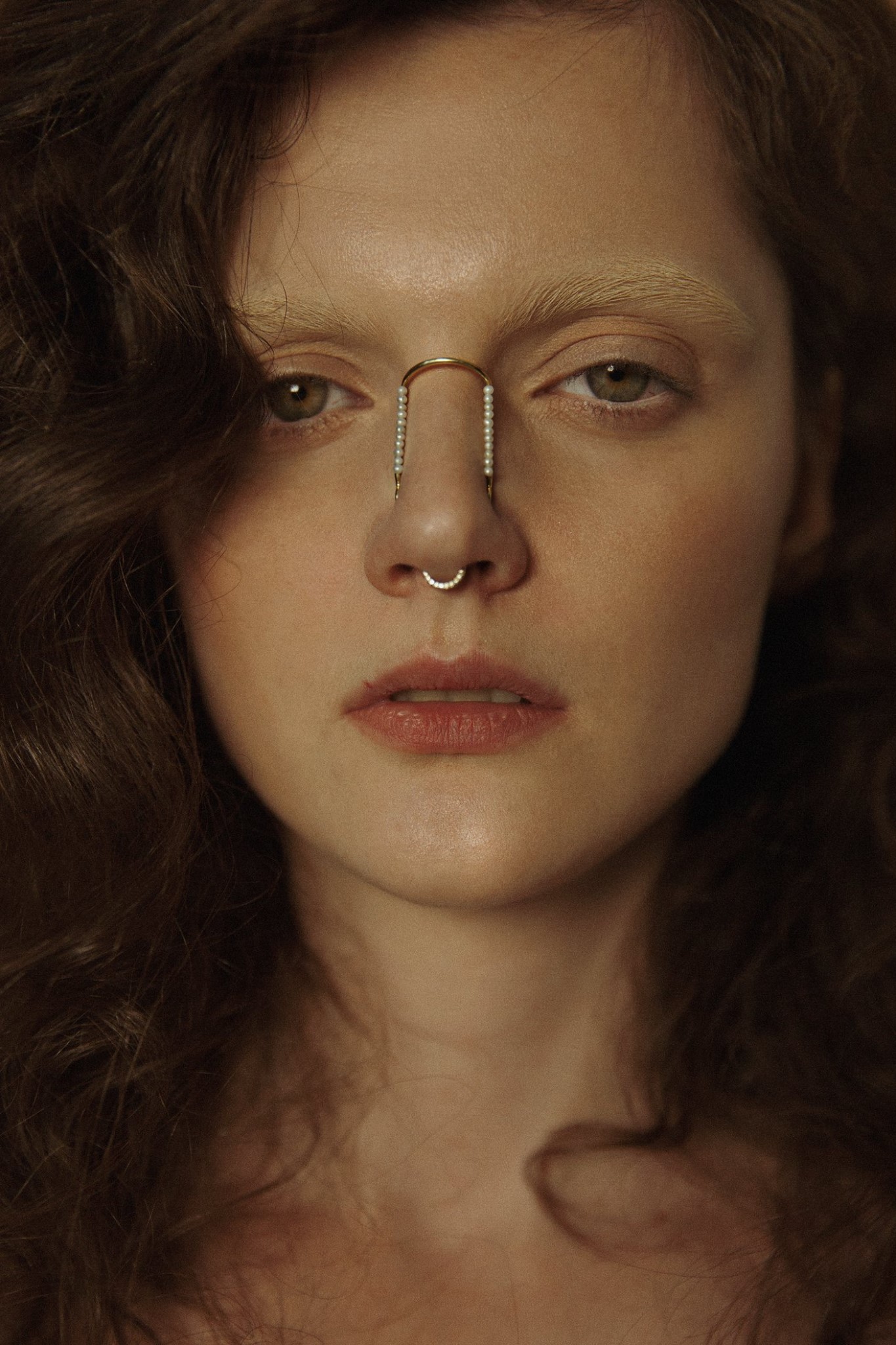
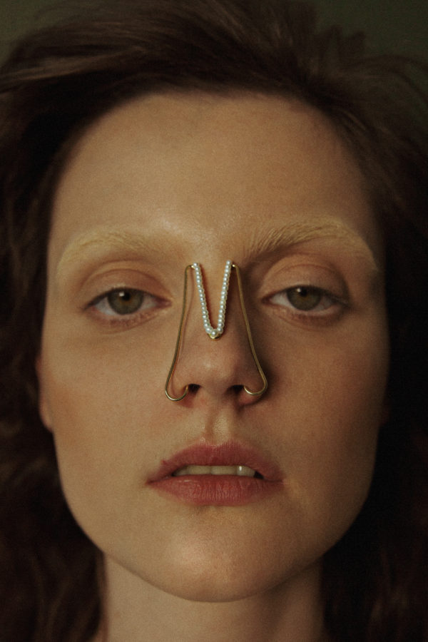
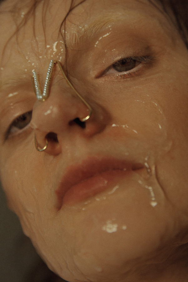
Jewellery design grad Jo Tan has taken the internet by storm with her refreshing, tribal-influenced take on nose jewellery. I was lucky enough to chat with Jo about her label Joanne T. to find out more about the fascinating Central Saint Martins graduate and her intriguing debut collection.
Tell us a bit about your artistic background, where you’re currently based, and how you came to work with jewellery.
I graduated from Central Saint Martins, London last summer. Currently I am based in Malaysia. Since [I was] young, I have always been interested in objects that interact with the human body and I believe art and design are one of the ways that I could express myself without any restriction. During my year in Foundation studies, I was allowed to try out different design pathways. Jewellery design is among one of the subjects that I tried out and I found that I enjoy craftsmanship. Thus, I decided to pursue this field.
Your graduate collection’s title, “Not Your Average Beauty”, lends itself to ideas regarding identity and the value we place on beauty conventions - tell us about the thematic direction of your work, and what you most would want the public to take away from your work.
My works are concept driven and my design development uses a topical approach. My design revolves around the idea of "In jewellery I ensure dialogue". Using minimal and subtle design, I create visual impacts, conversation and interaction through or with jewellery.
Your nose cuffs have garnered considerable attention on the internet, and were covered by Vogue France. What was your design process like for these avant-garde pieces, and what motivated the idea behind your elaborate take on nose jewellery in particular?
While I was working on the collection, I was interested in the topic of beauty and plastic surgery. I notice that it is a huge trend, especially in Asia where I come from. This then made me start to research plastic surgery and experiment with different structures and shapes that could be placed on the face. The nose was chosen because it is one of the most common facial [features] for plastic surgery. Thus, the creation of nose pieces emerged.
How important has social media and an online presence been for you to establish your name in jewellery - or in wider terms, fashion?
Both social media and an online presence have really helped me in exposing my works to any possible audience out there, since information can be easily accessed and spread through the internet these days.
You incorporate classic stones, diamonds and pearls into your pieces. What was your process like in sourcing quality materials and elements to put together your creations?
When it came to sourcing materials and elements for the creations, I spent time in both research and talking/meeting people from the jewellery industry to gain information and knowledge. The opportunity to study in London and travelling around different parts of the world have also allowed me to gain relevant information and knowledge in material sourcing.
Tell us about where you see yourself moving forward from here - continuing jewellery, or maybe expanding into other areas?
Currently, I am working on developing my own brand and establishing a client base. I look forward to collaboration opportunities with people from a different design background. Jewellery would be the core in my design career, however, I am always open to any new opportunities.
Photographer: Zhonglin
Stylist: Yii
MUA: Alicia
Model: Andrea B
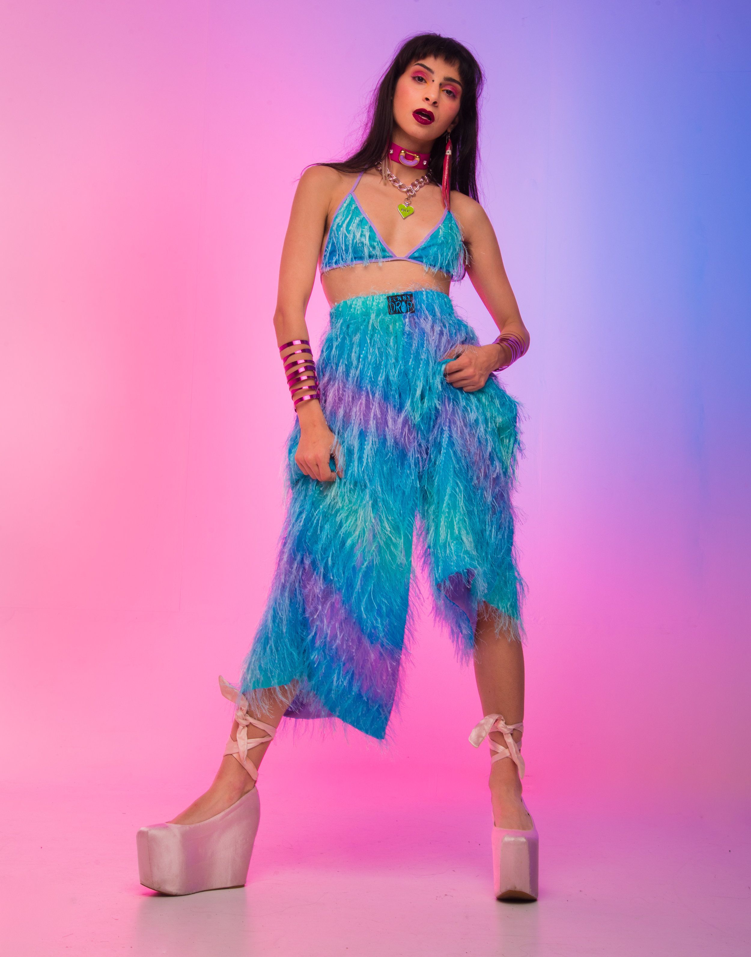
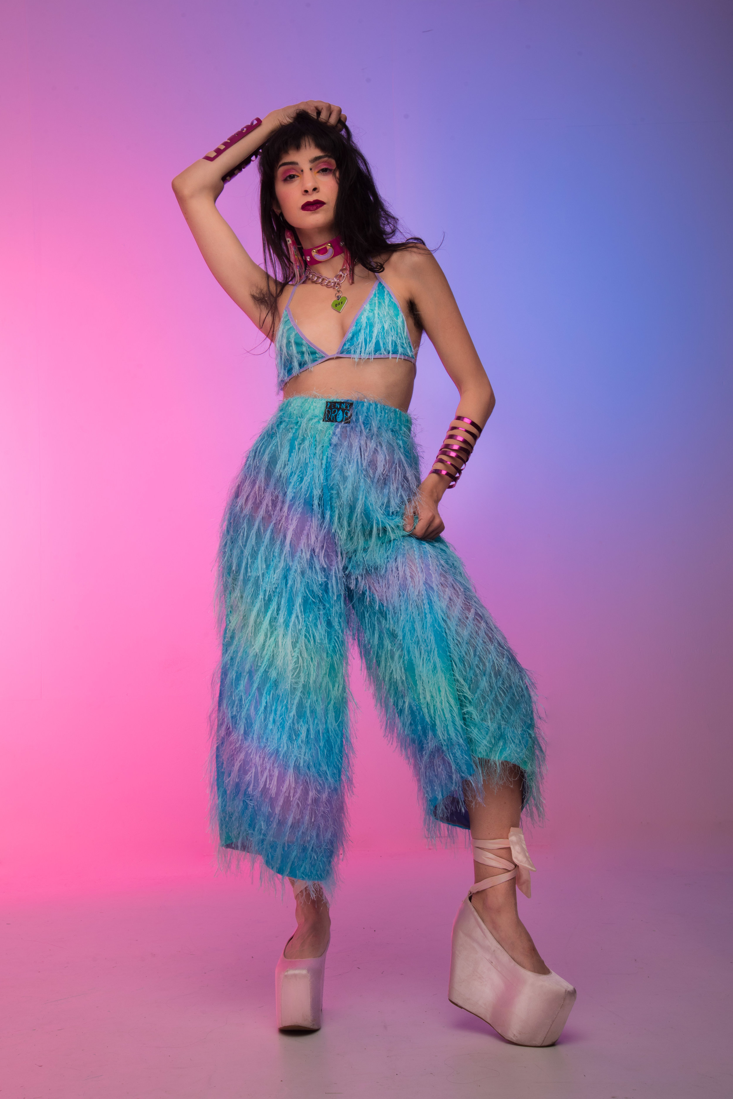
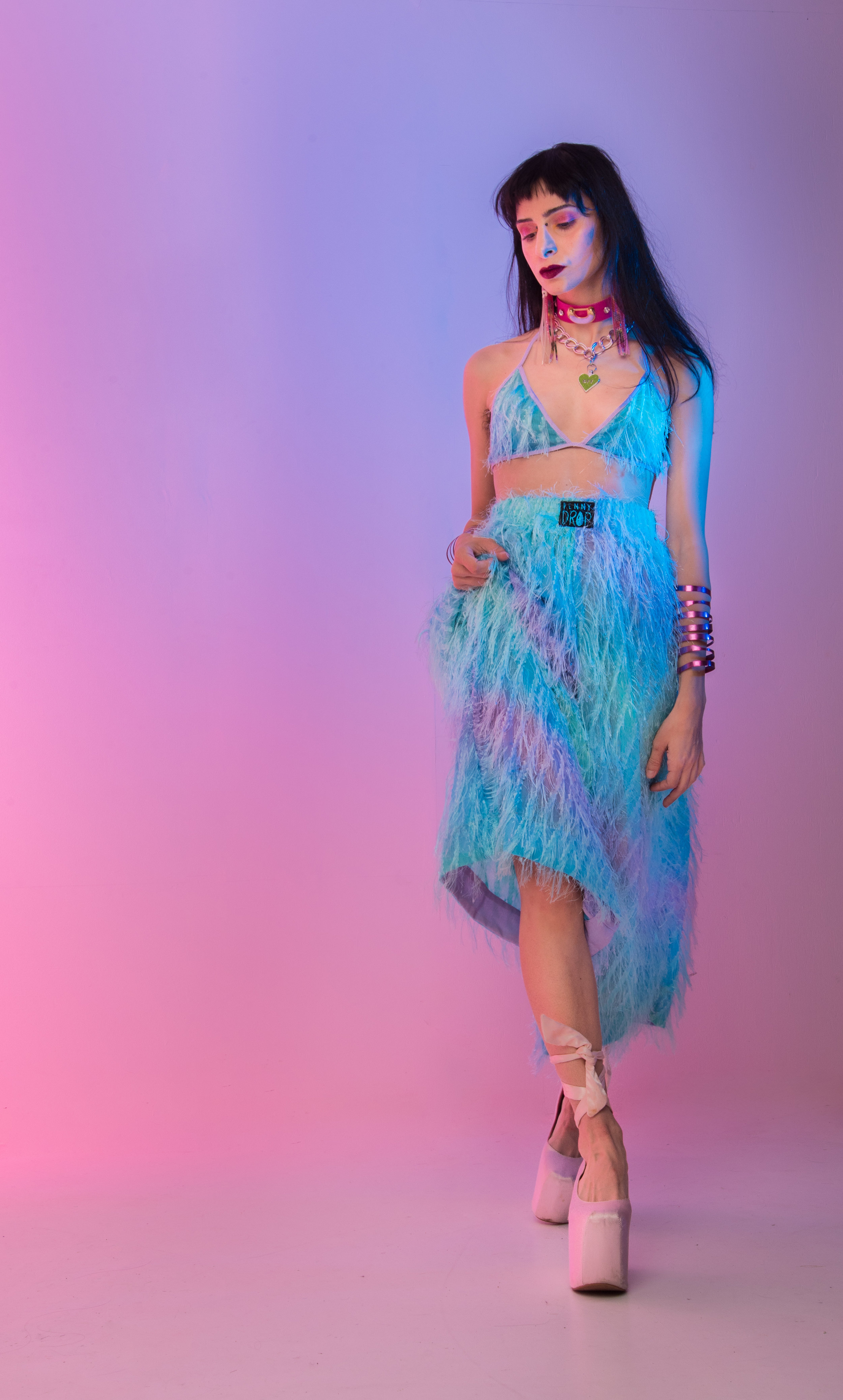
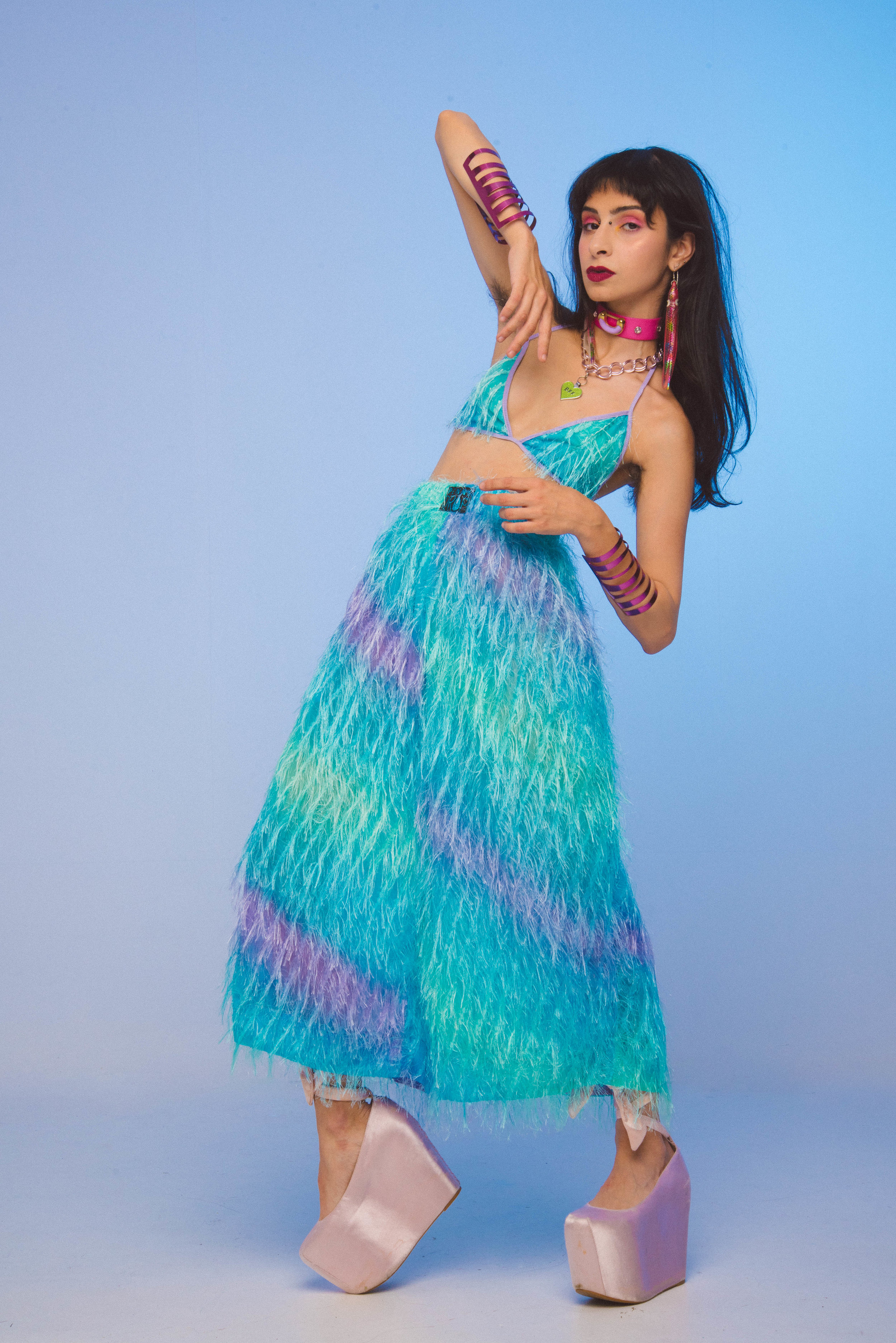
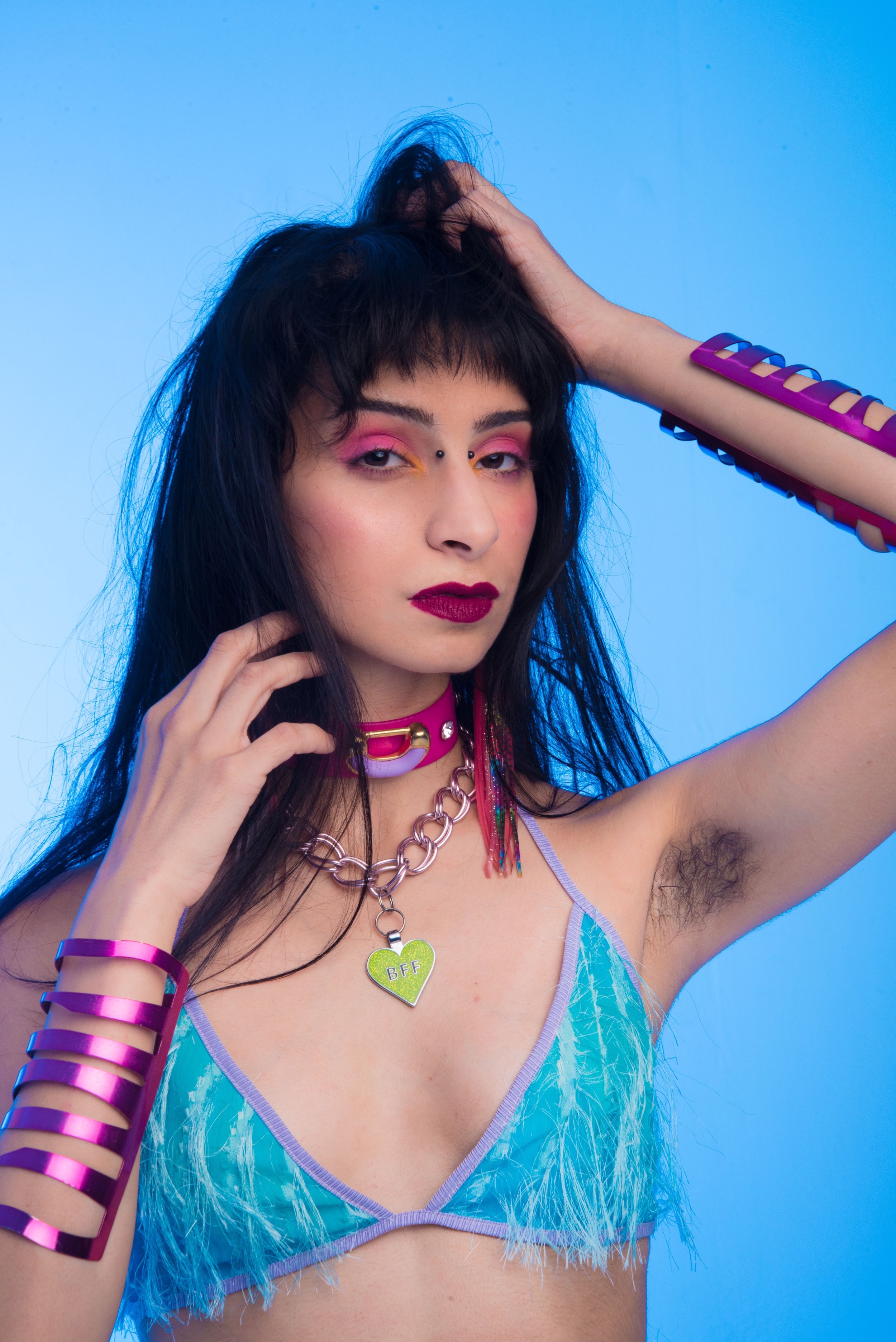
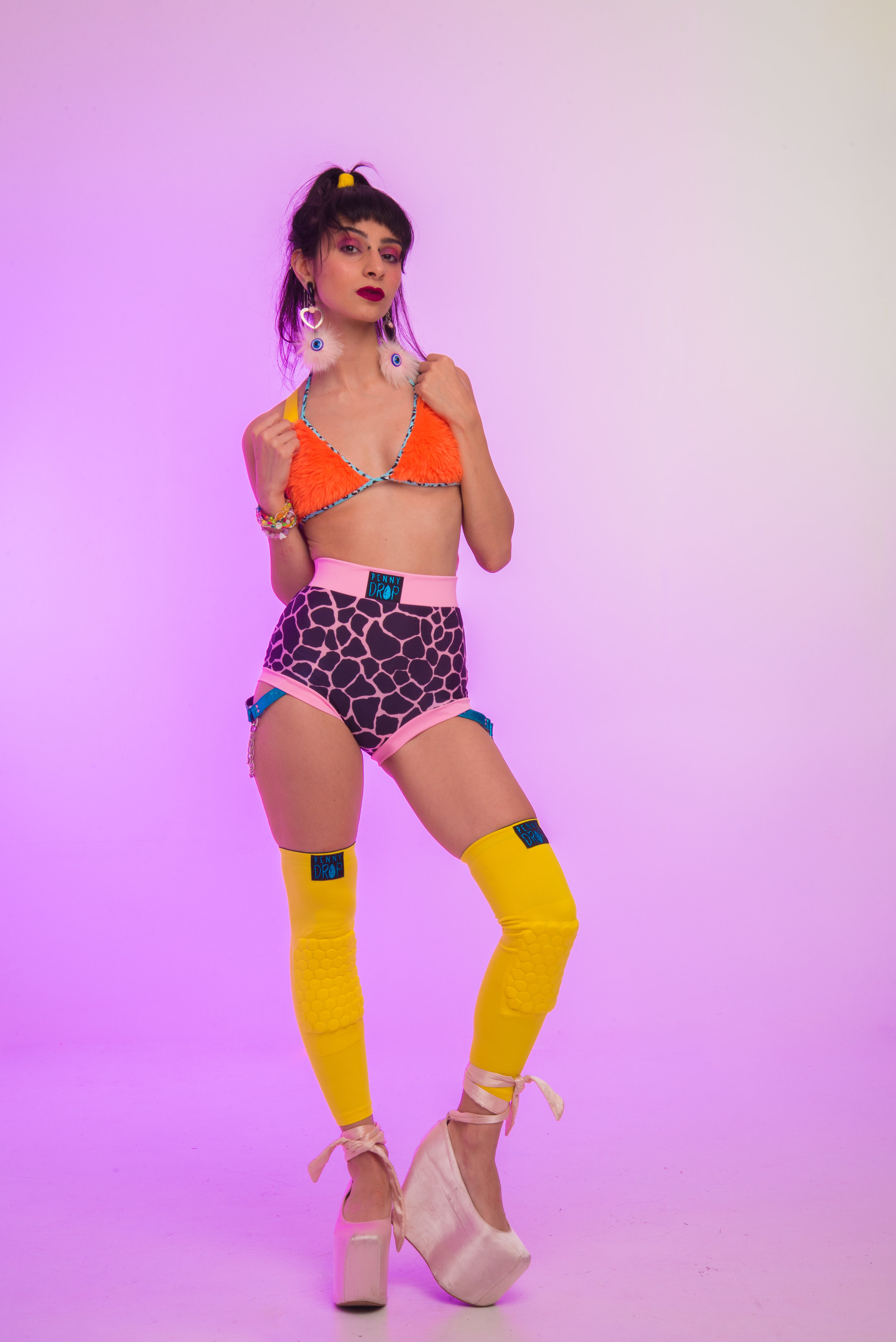
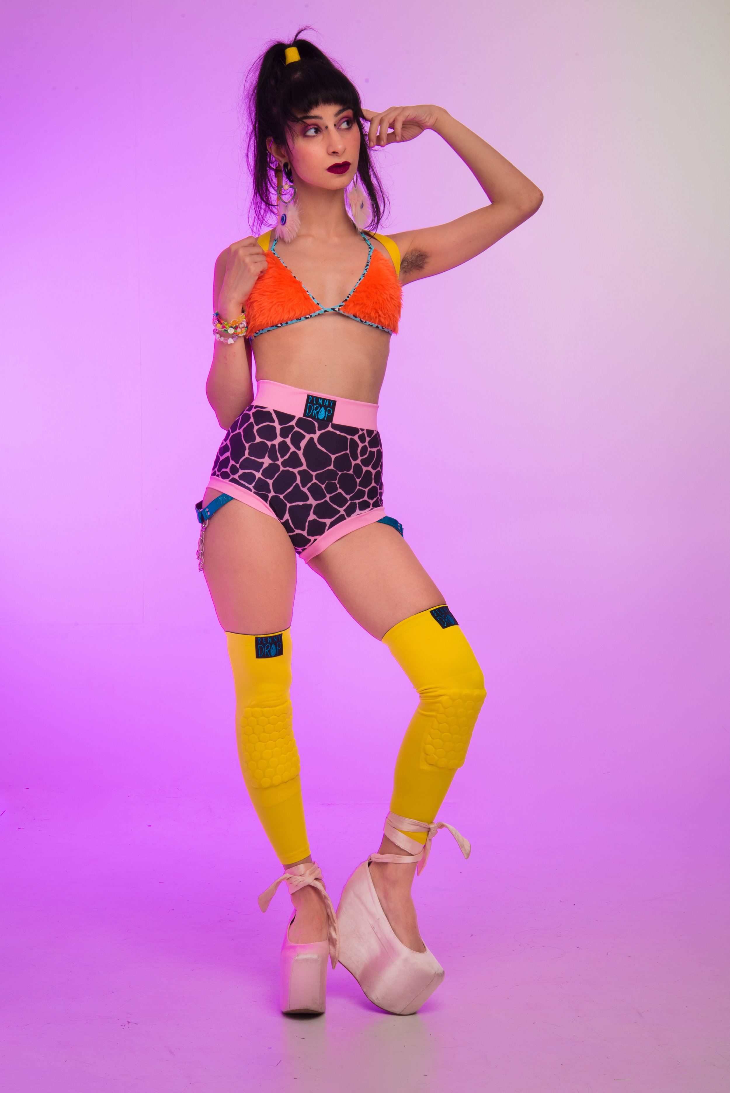
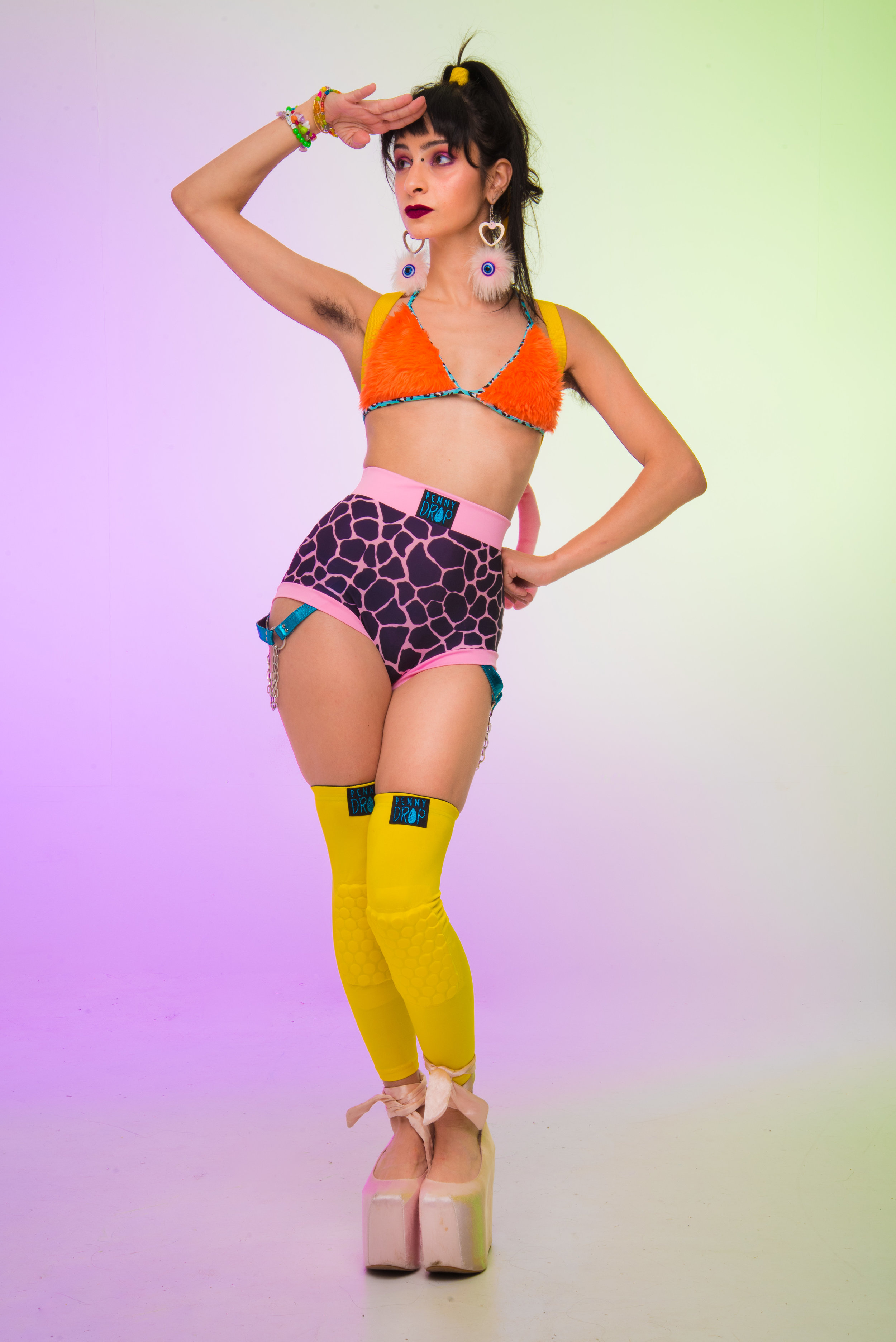
PENNY DROP x EFP
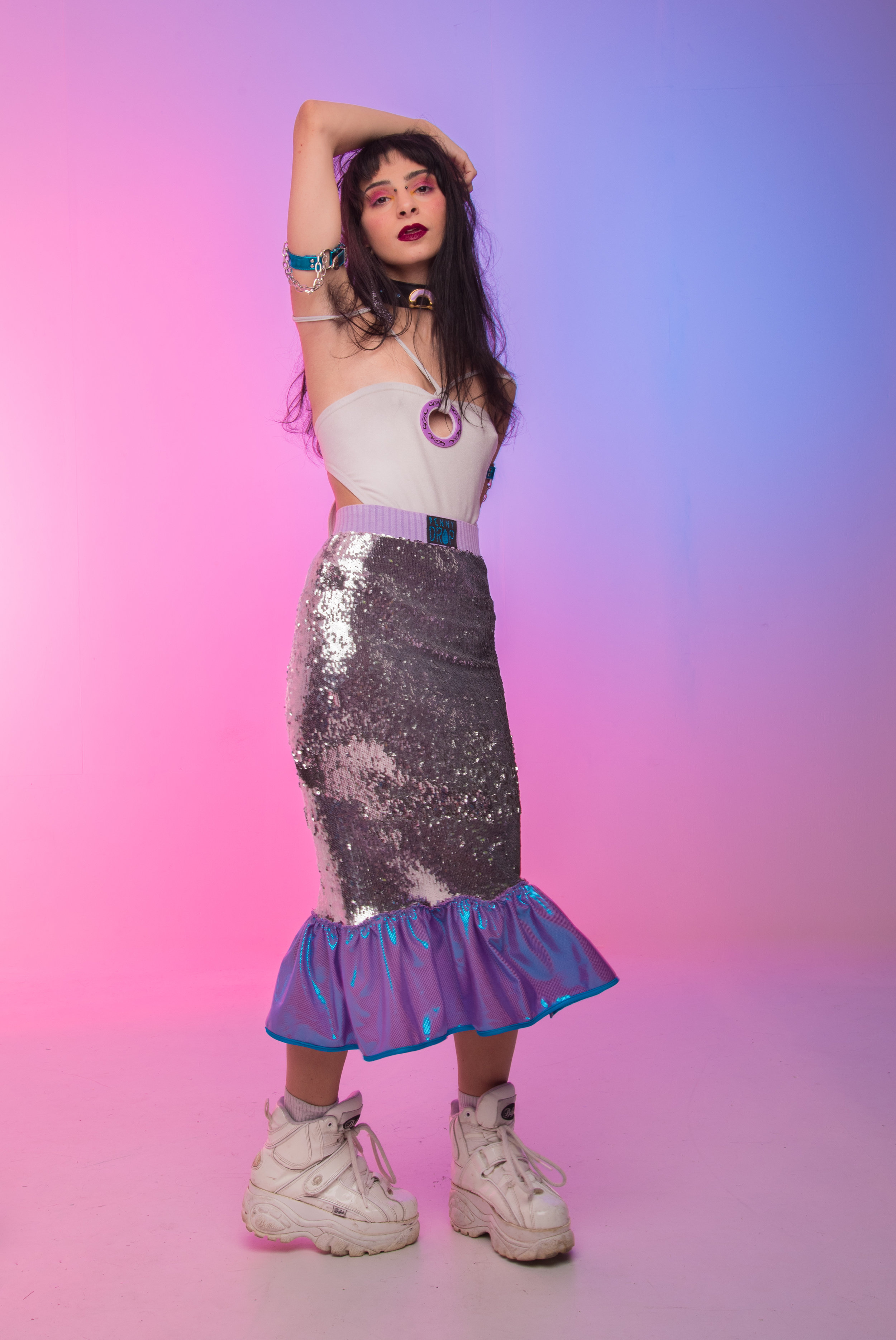
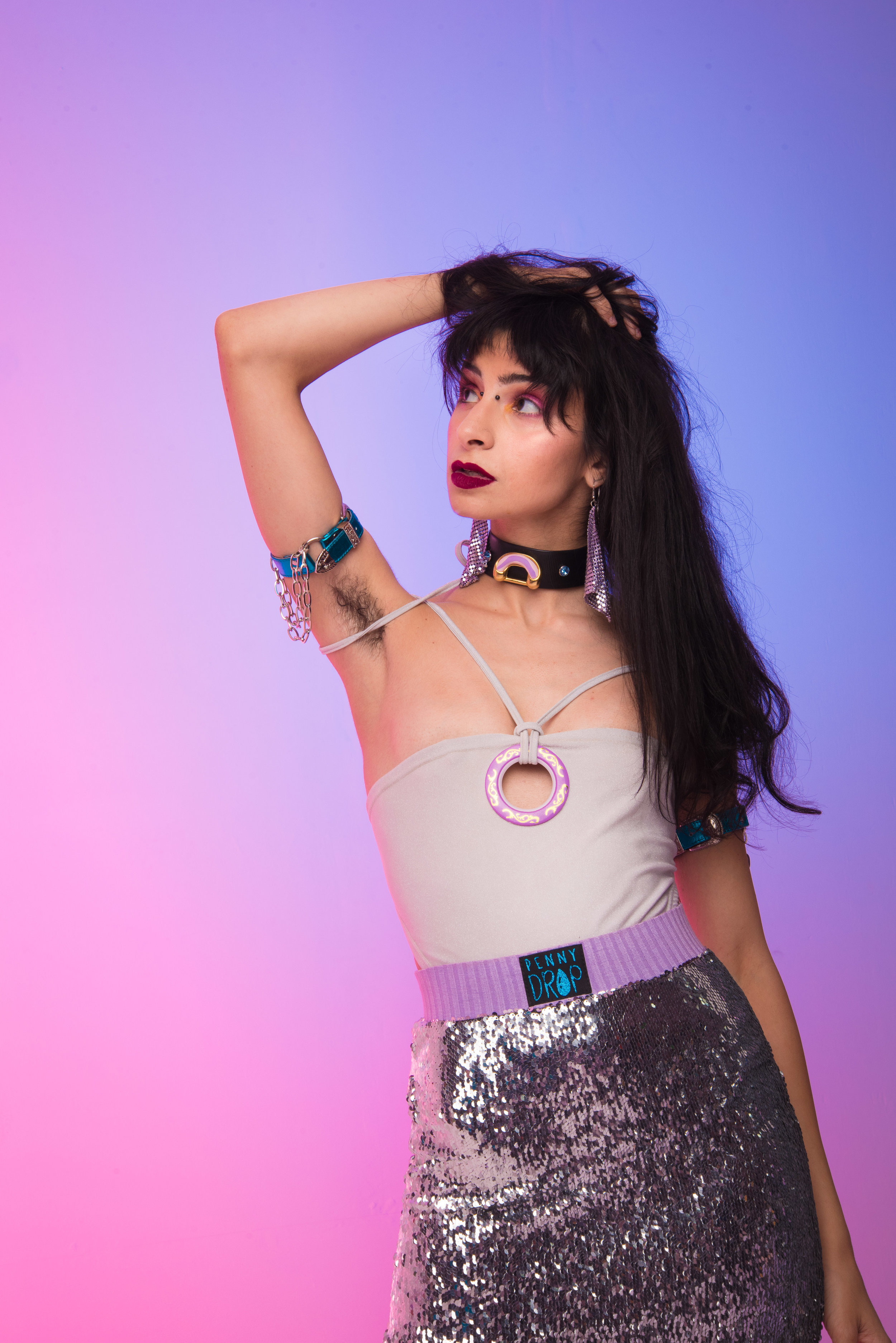
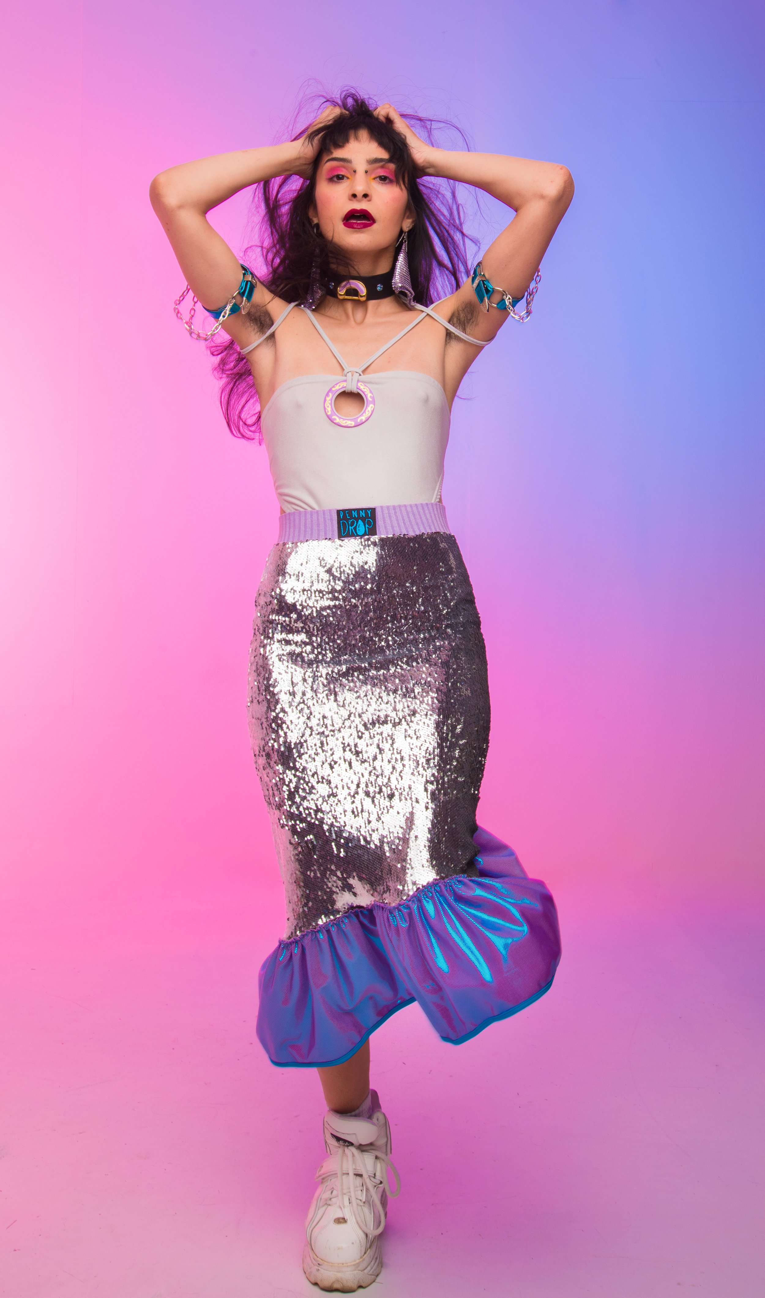
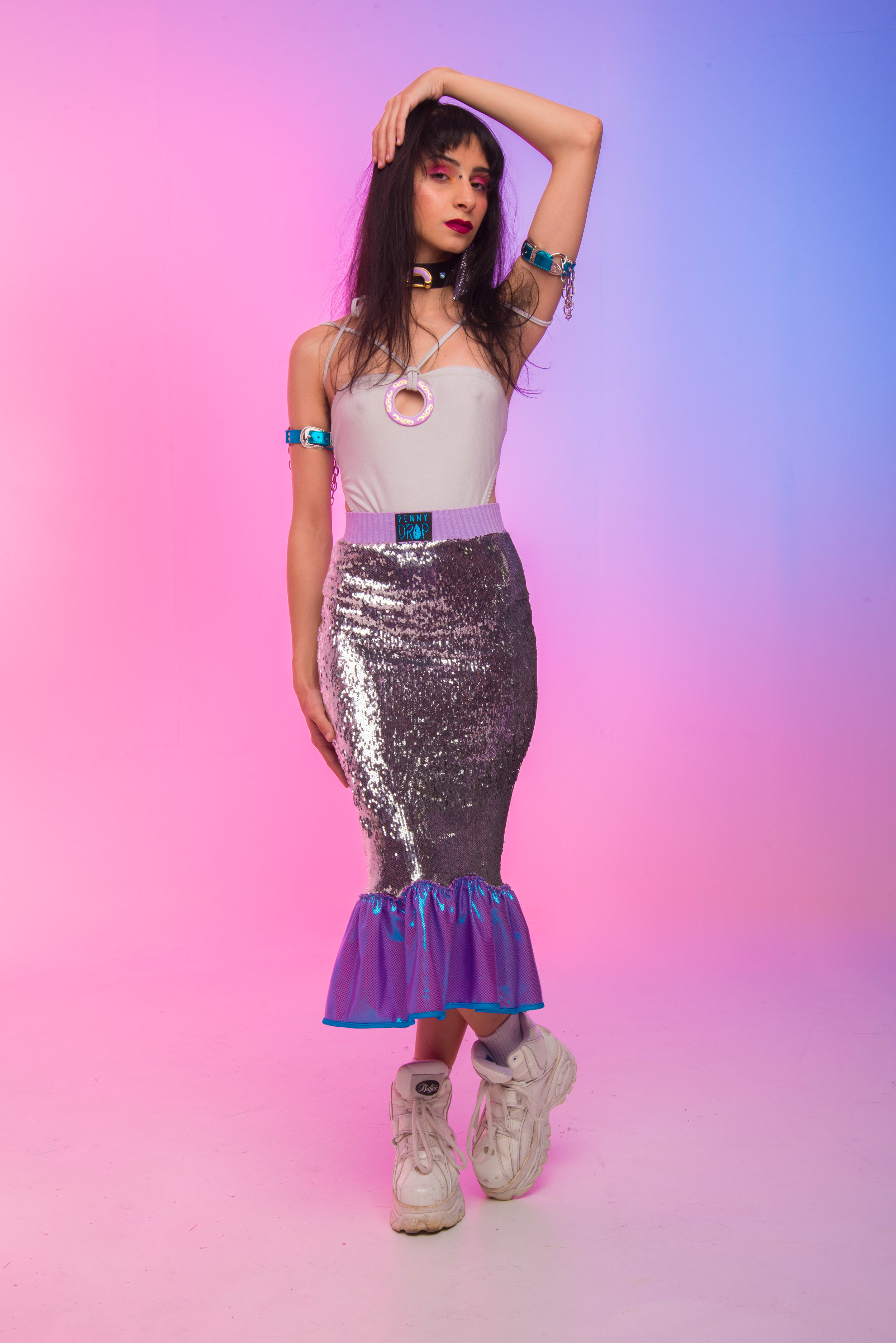
If Barbie took a bunch of LSD and rode her unicorn to the strip club, you’d probably find her adorned in Penny Drop. Enjoy these wonderfully whimsical images, created by a team of super talented and passionate creatives.
Photographer: Evan Fowler Photography
Designer: Penny Drop
Makeup: Lauren Dell'Arciprete
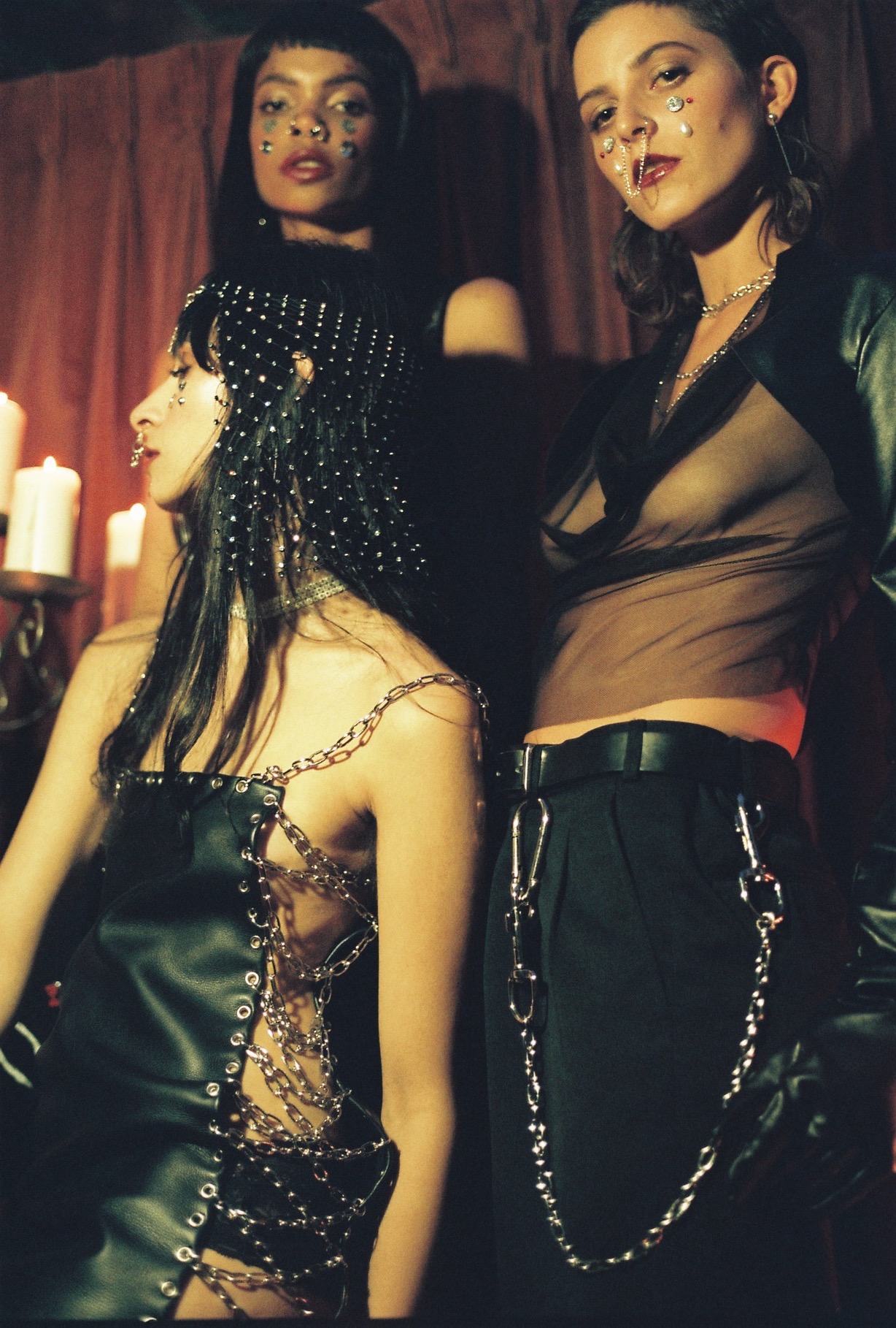
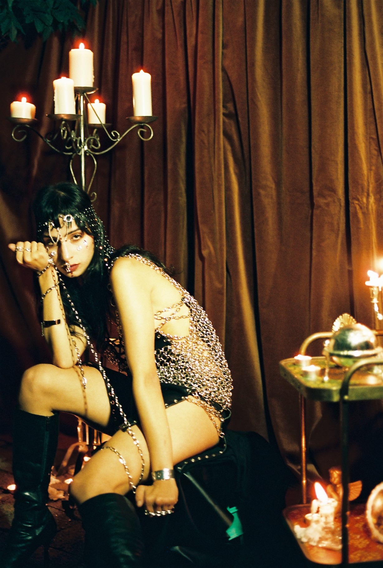
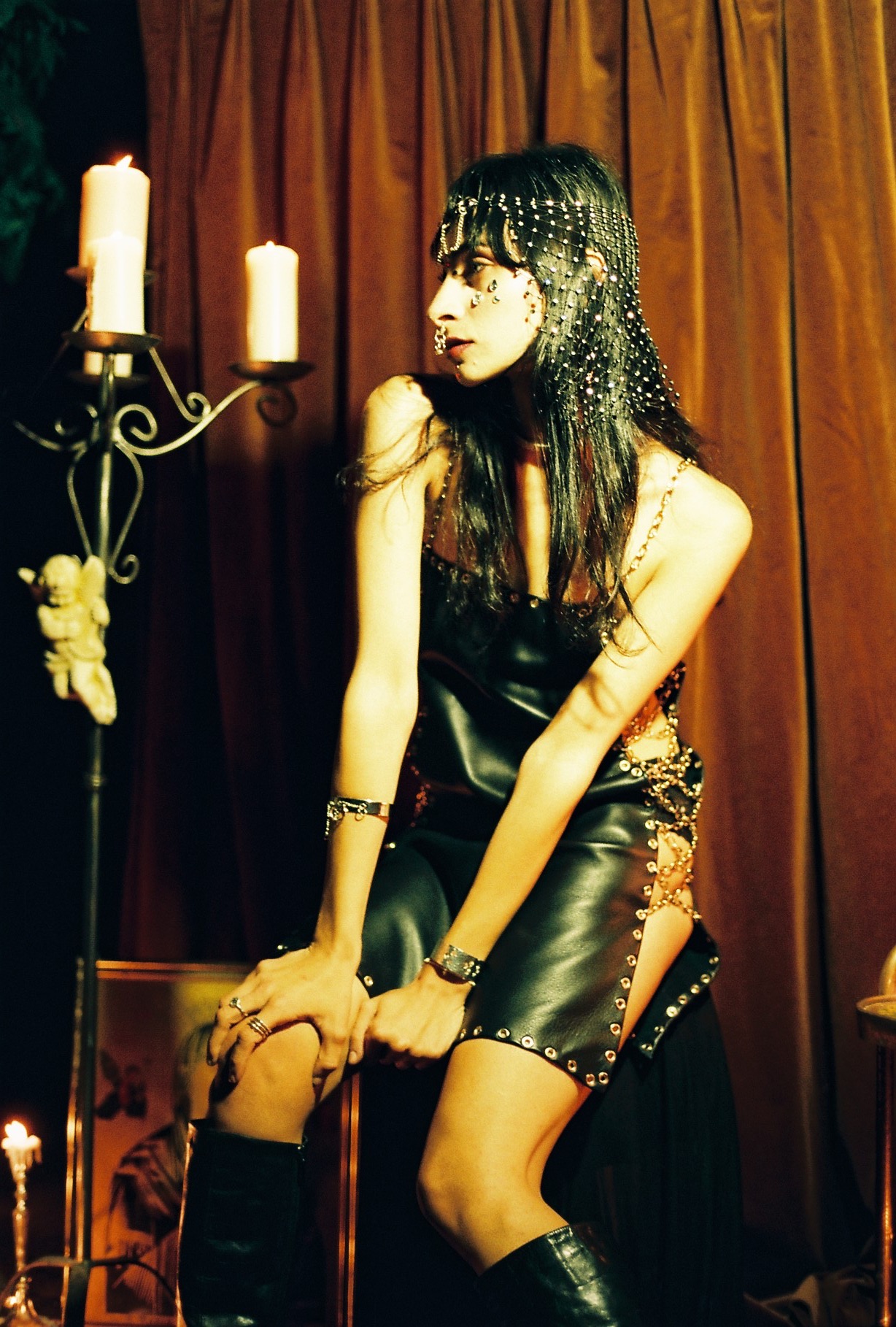
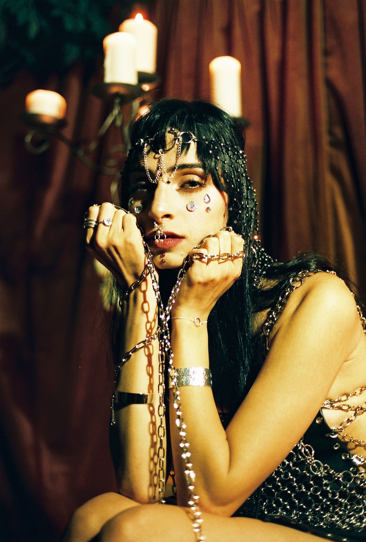
WASTELAND WARRIOR
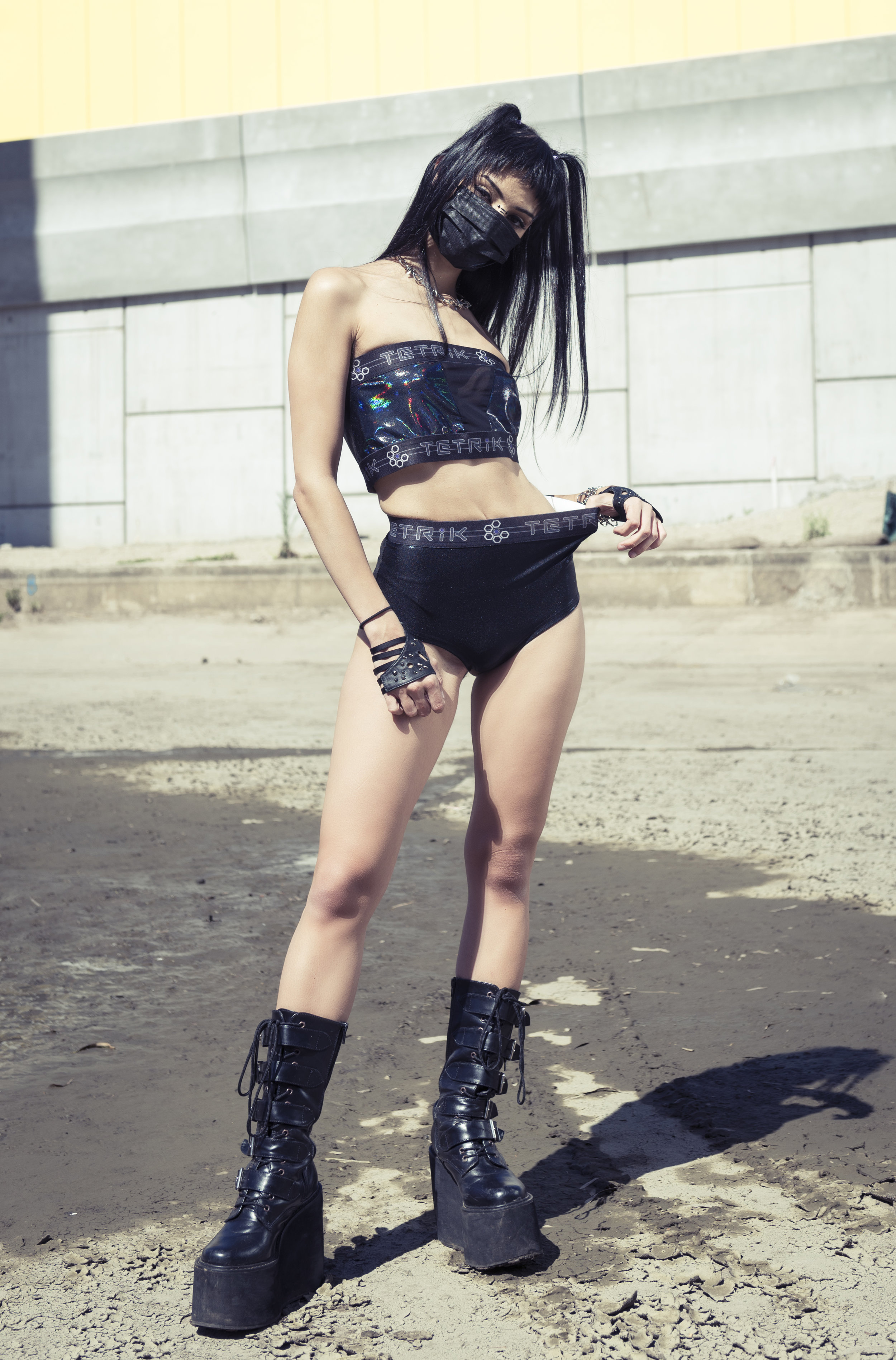
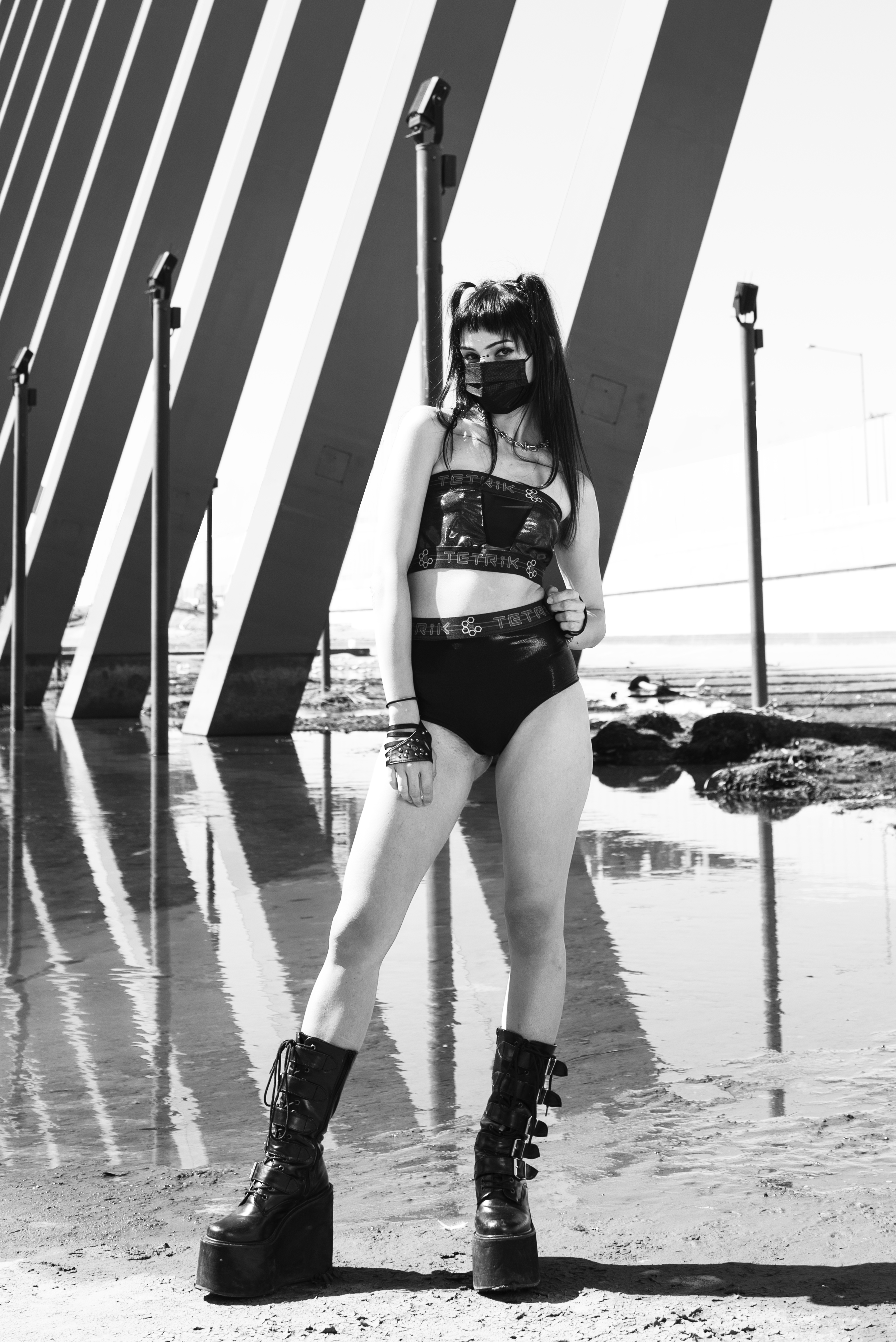
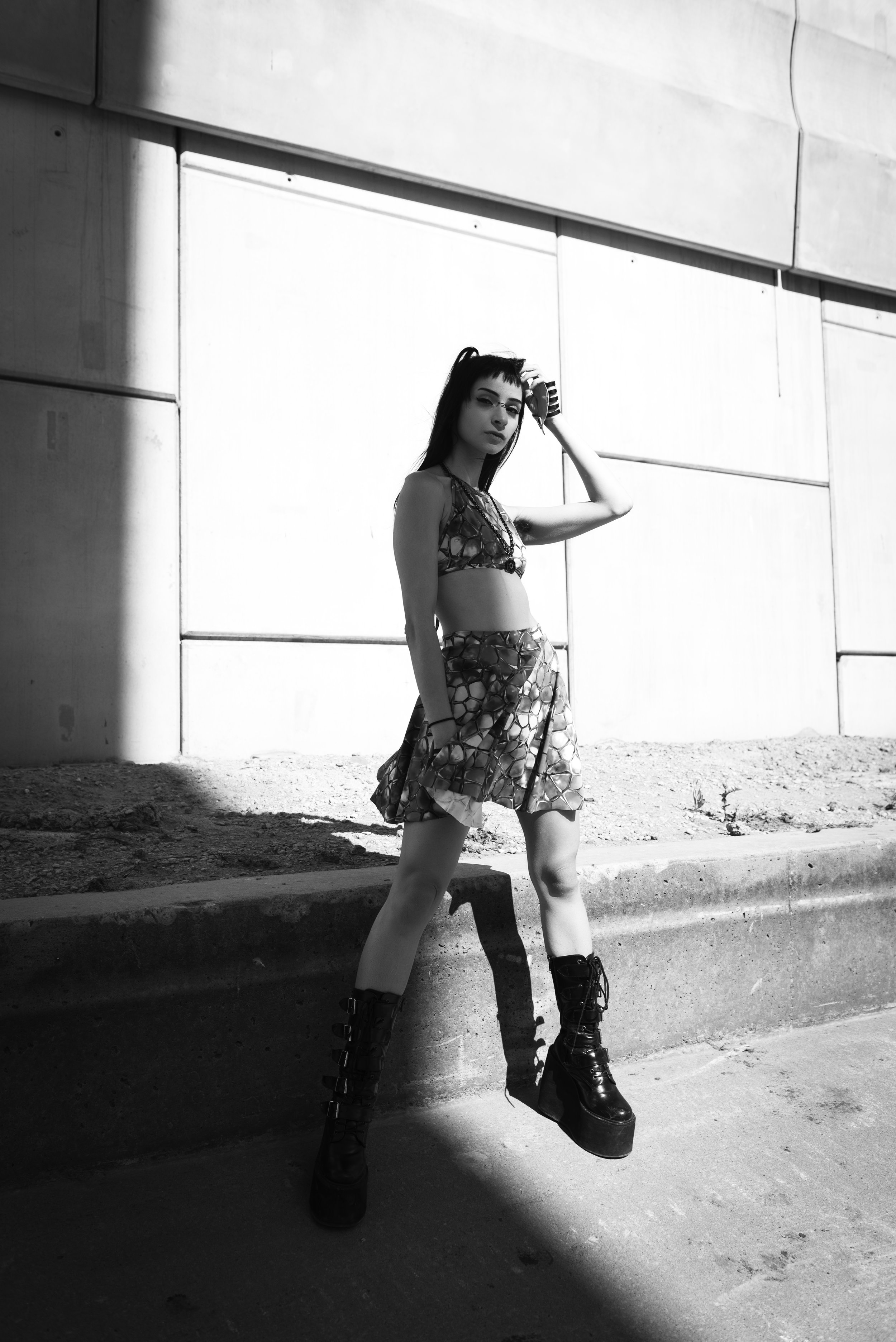
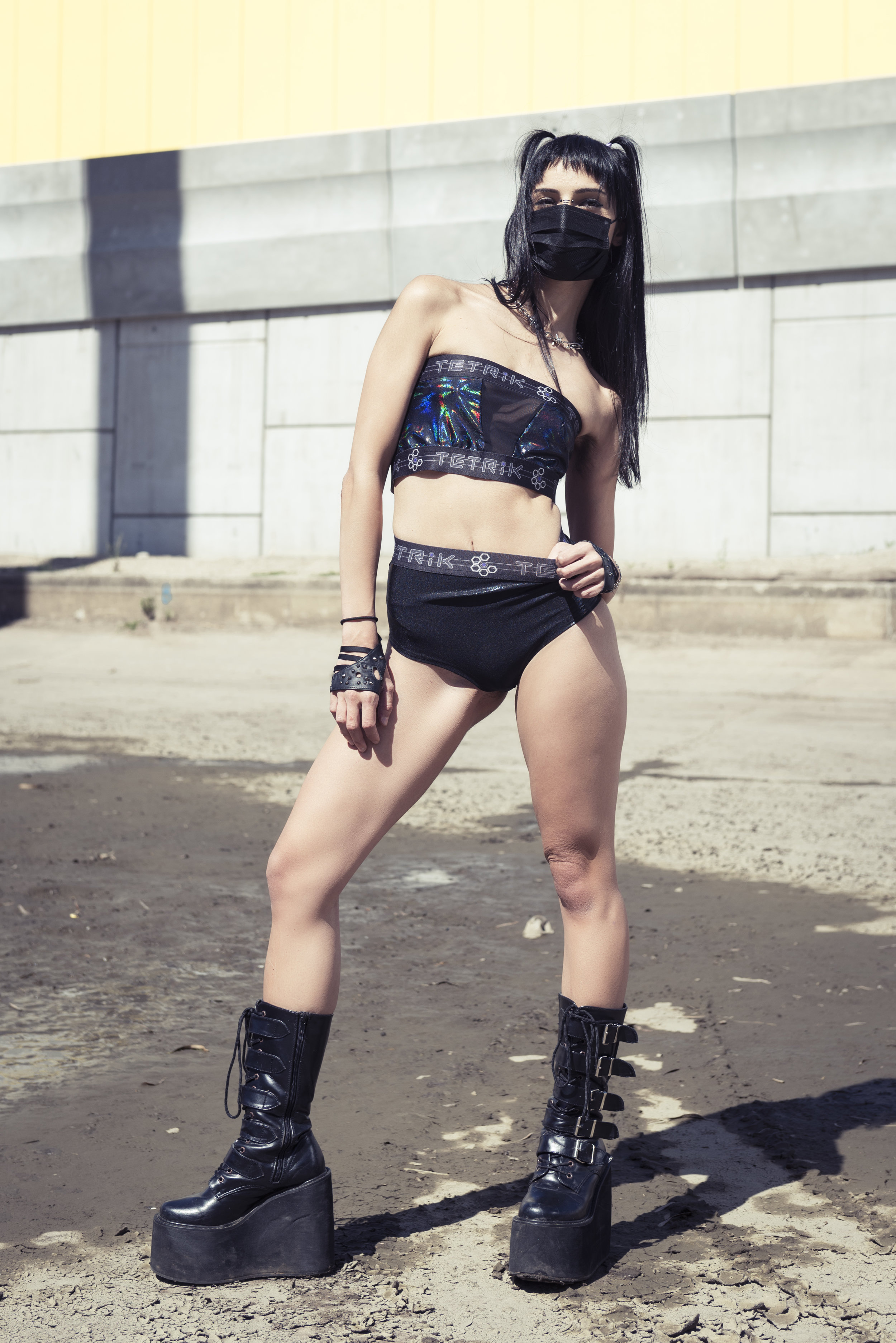
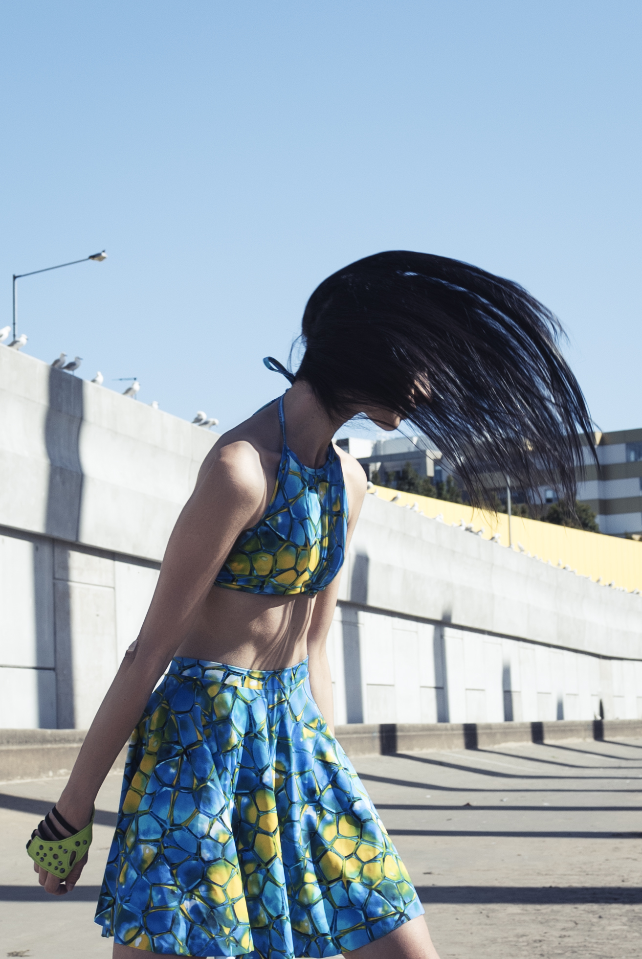
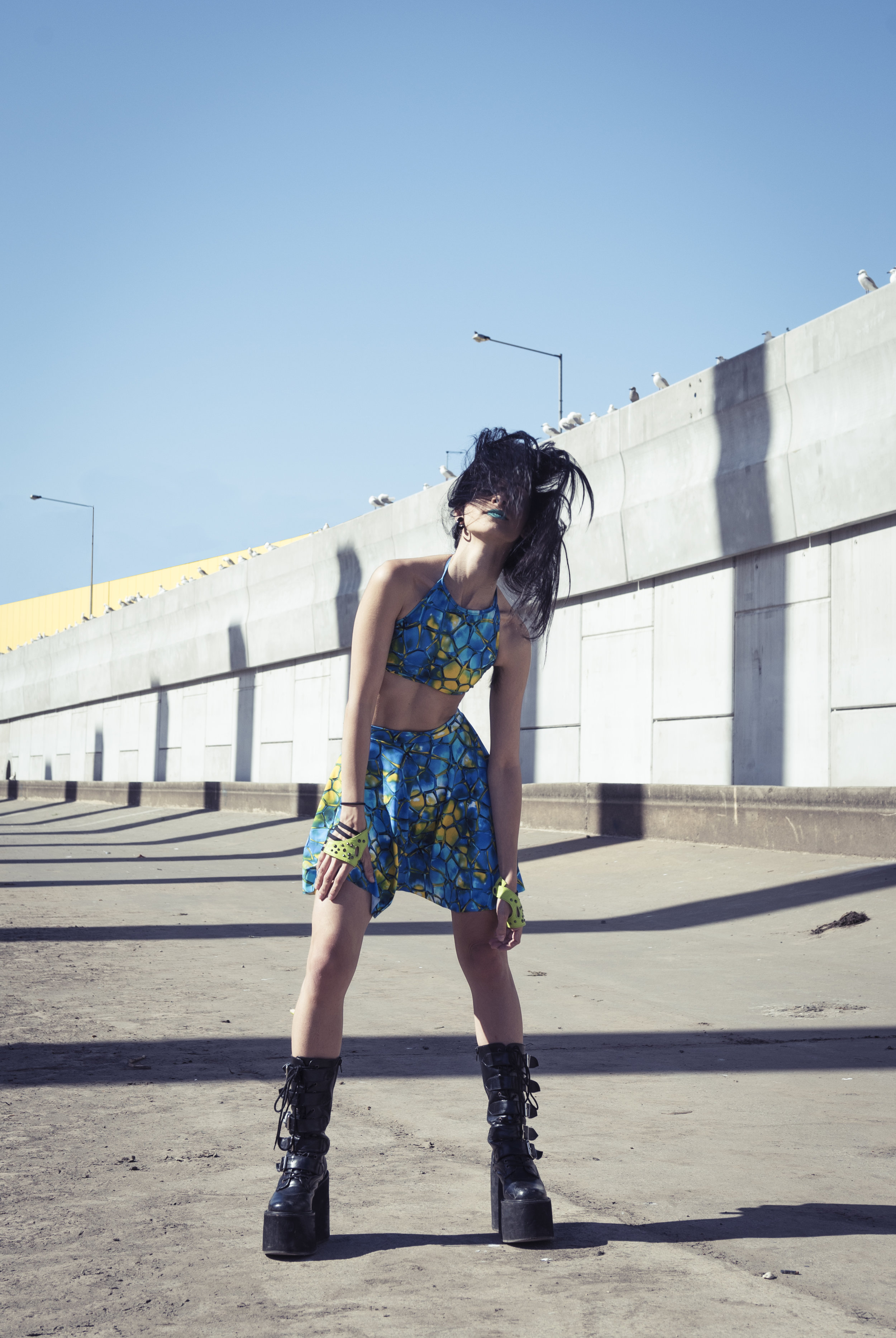
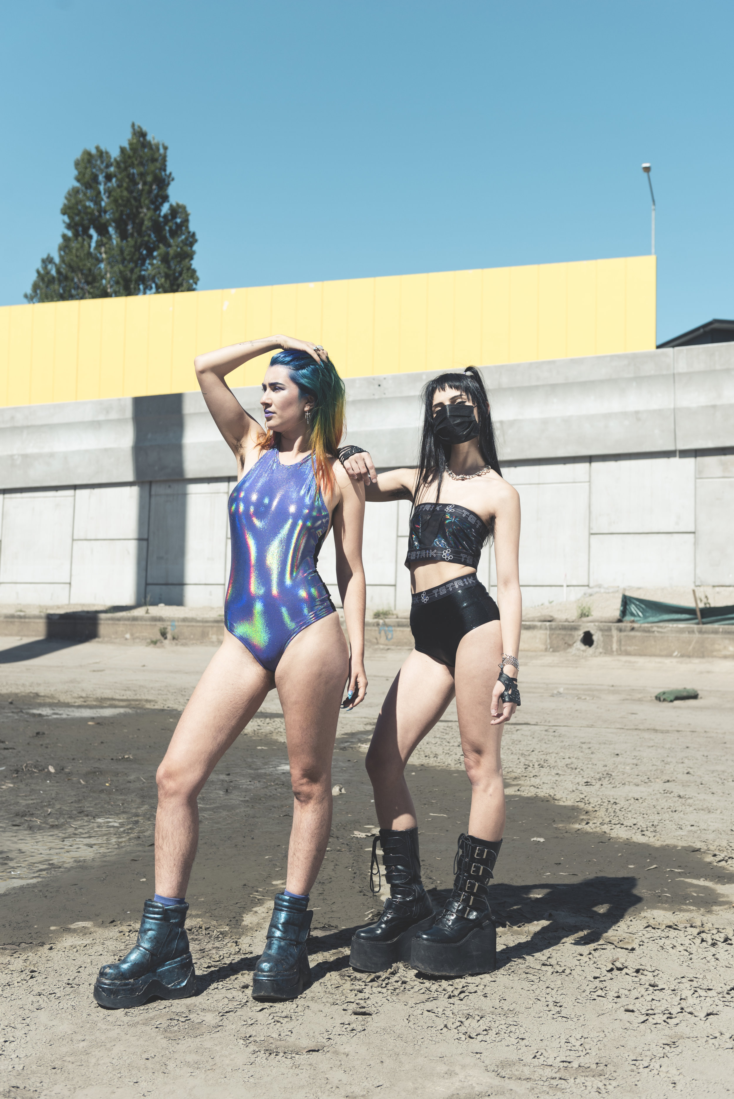
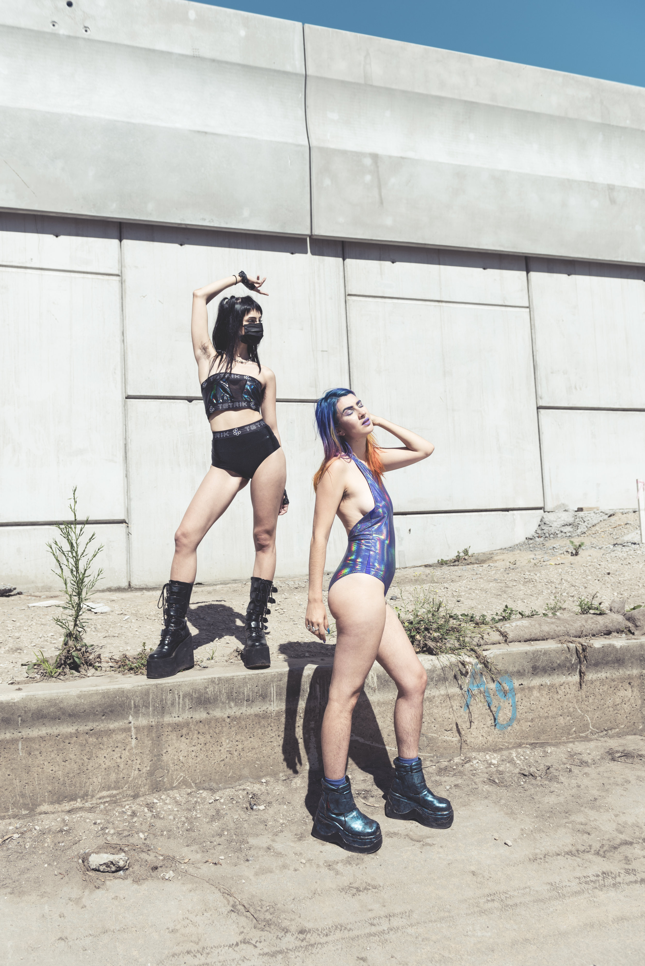
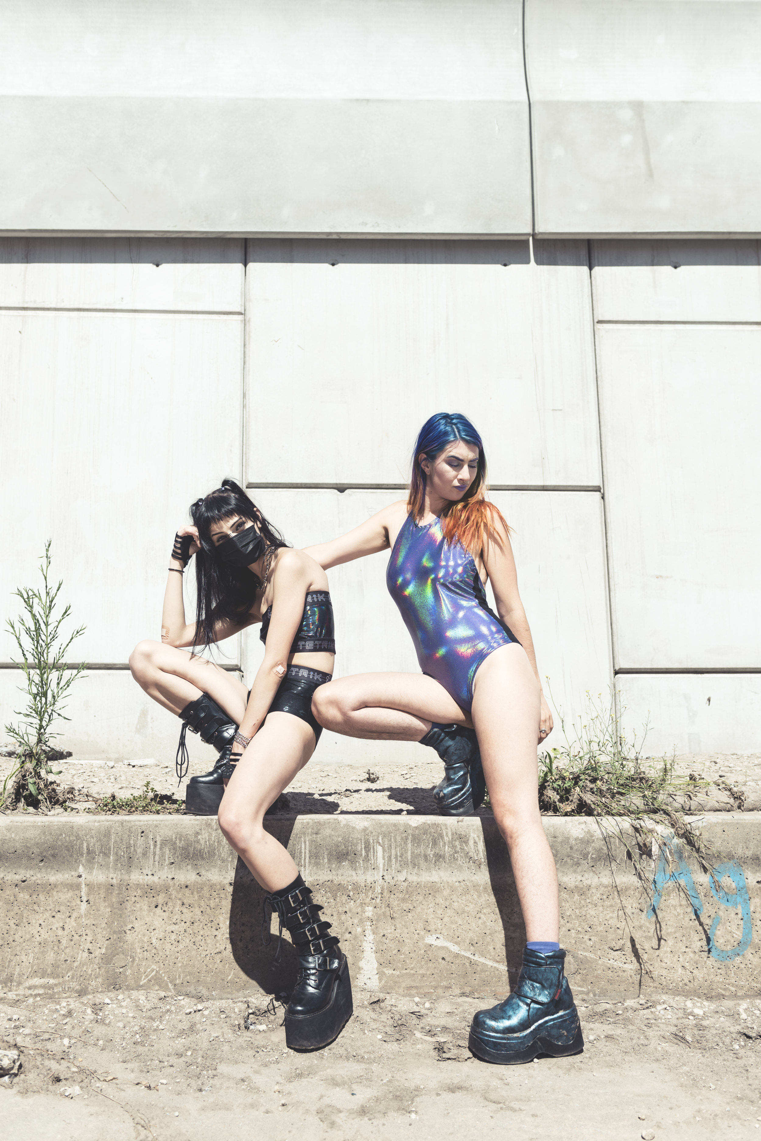
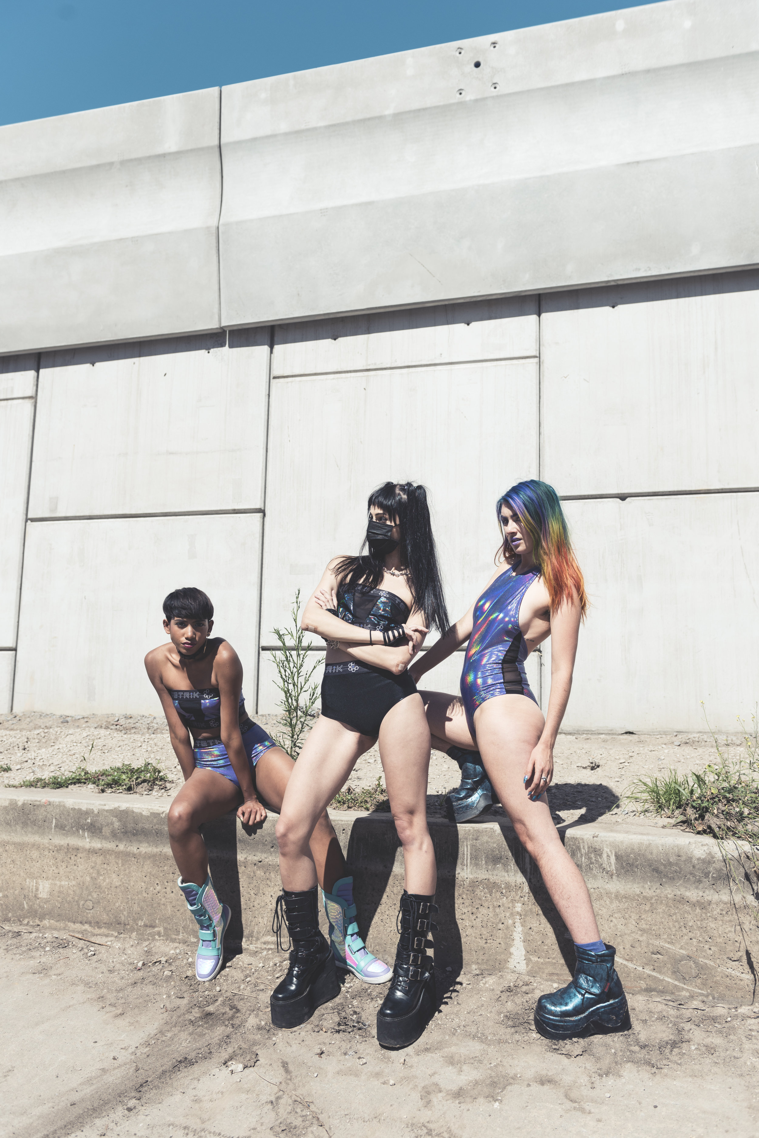
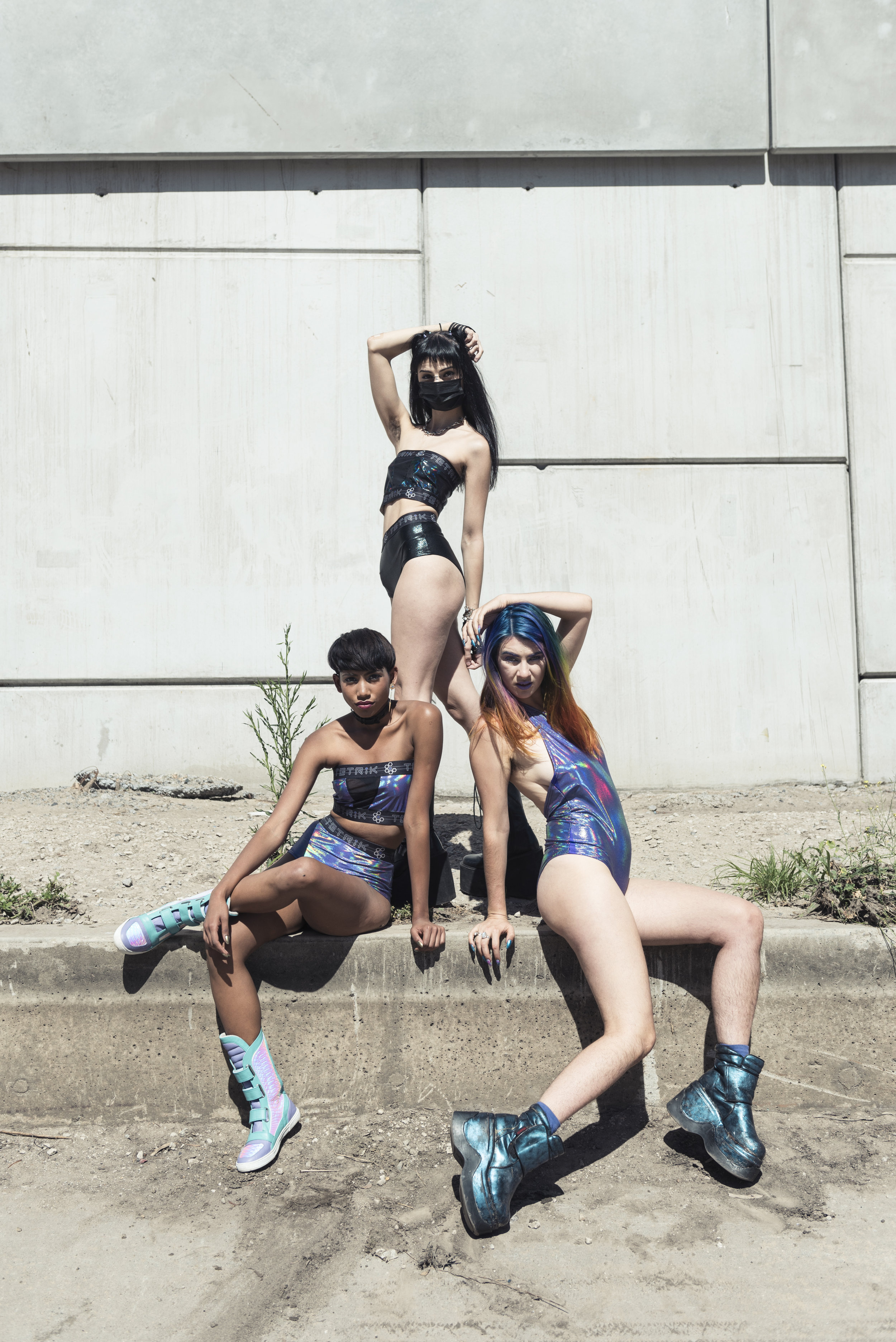
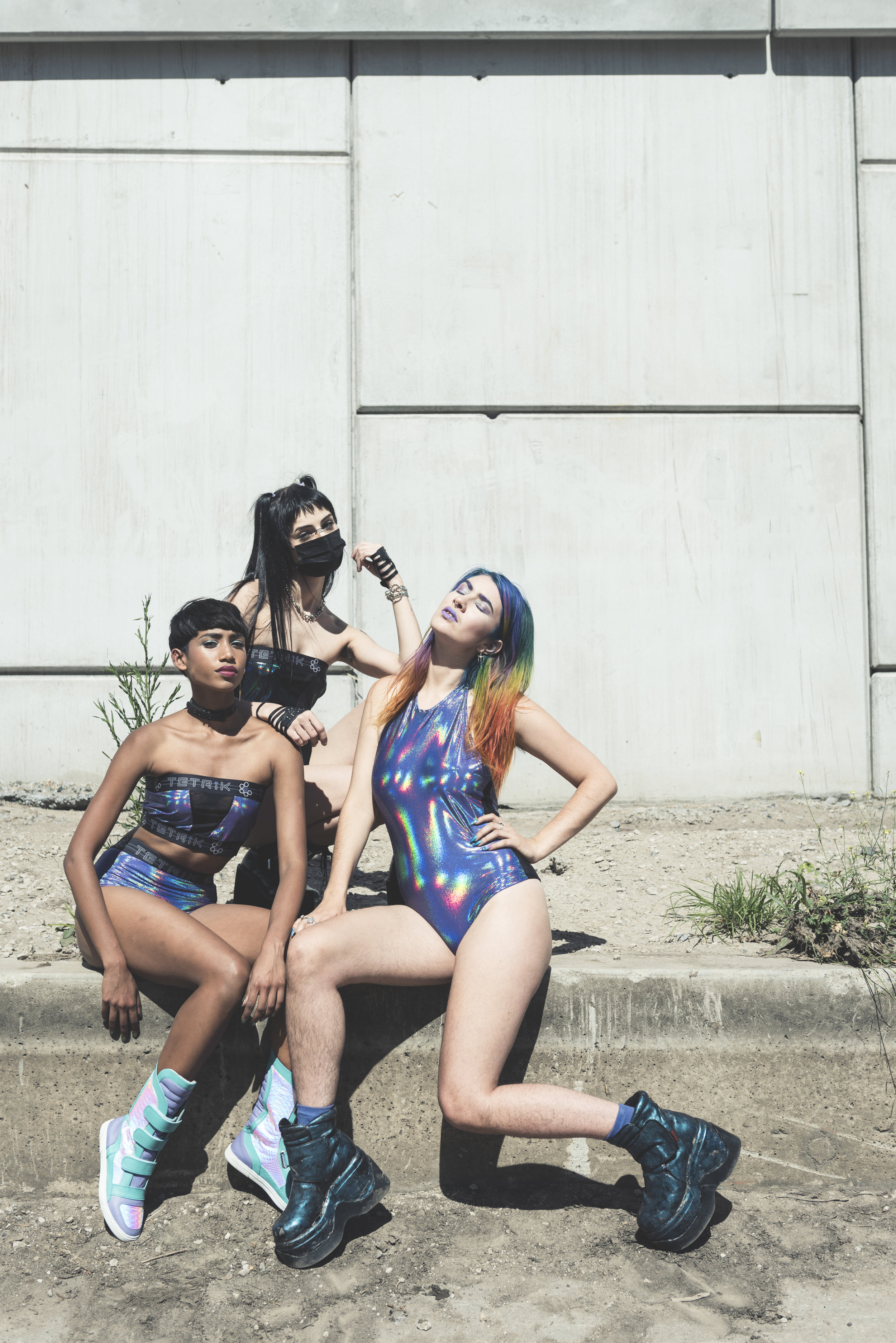
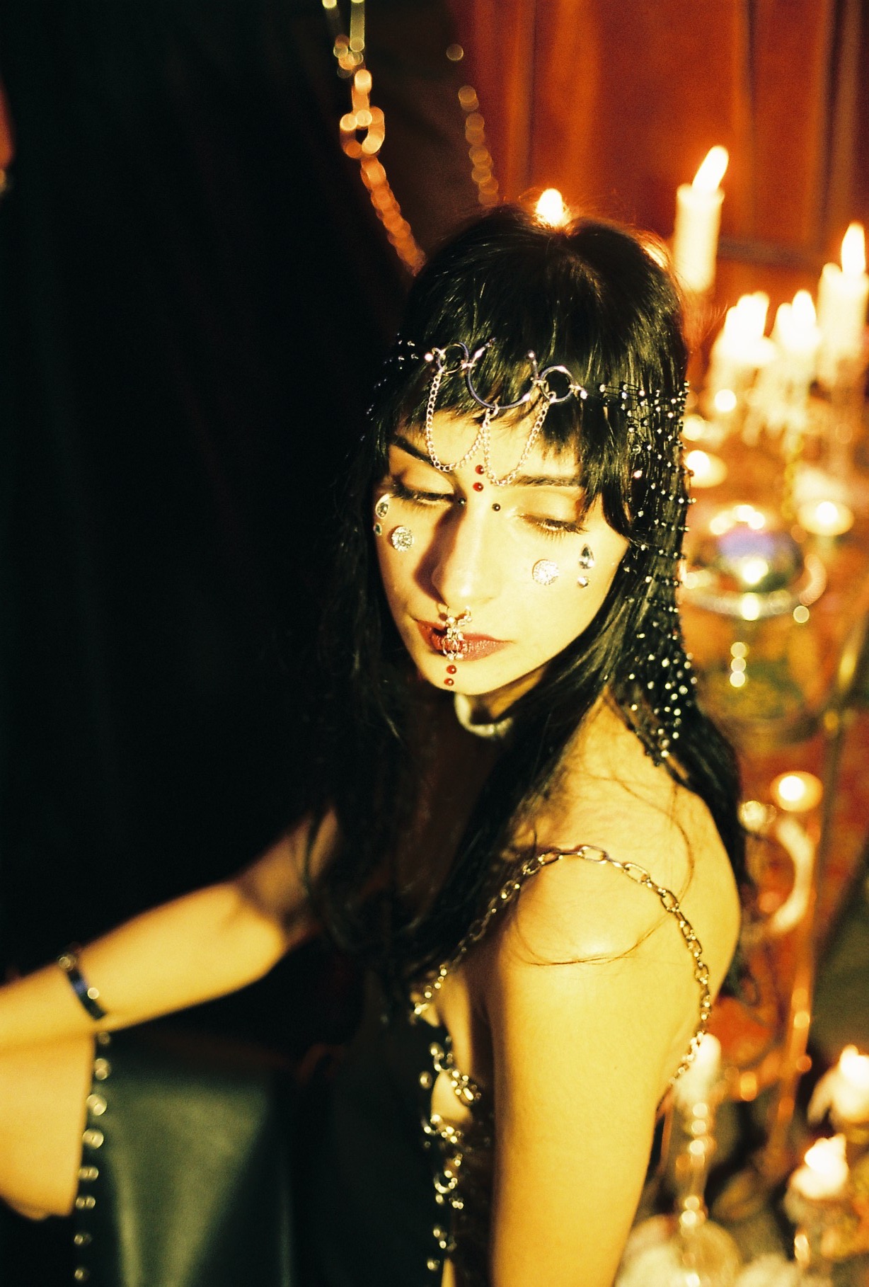
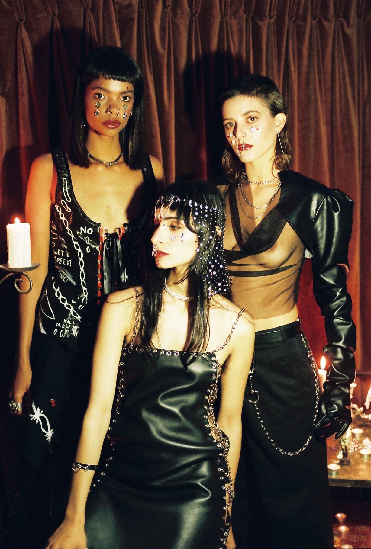
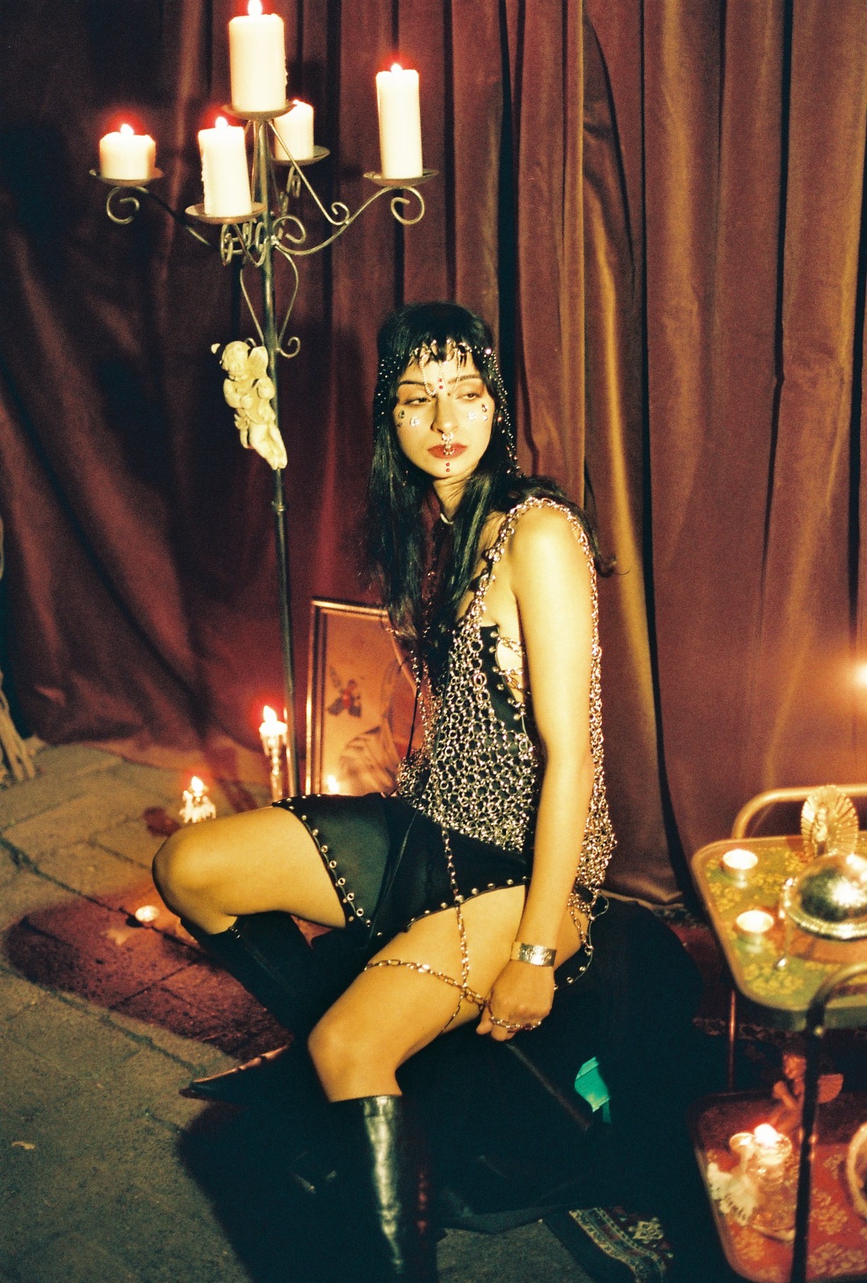
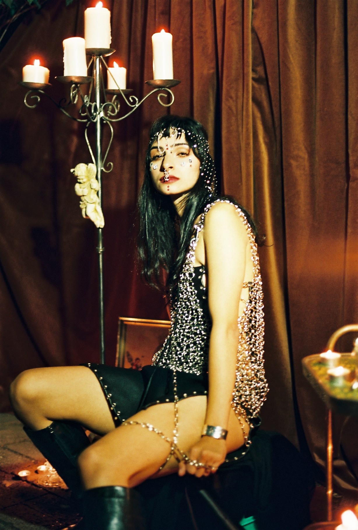
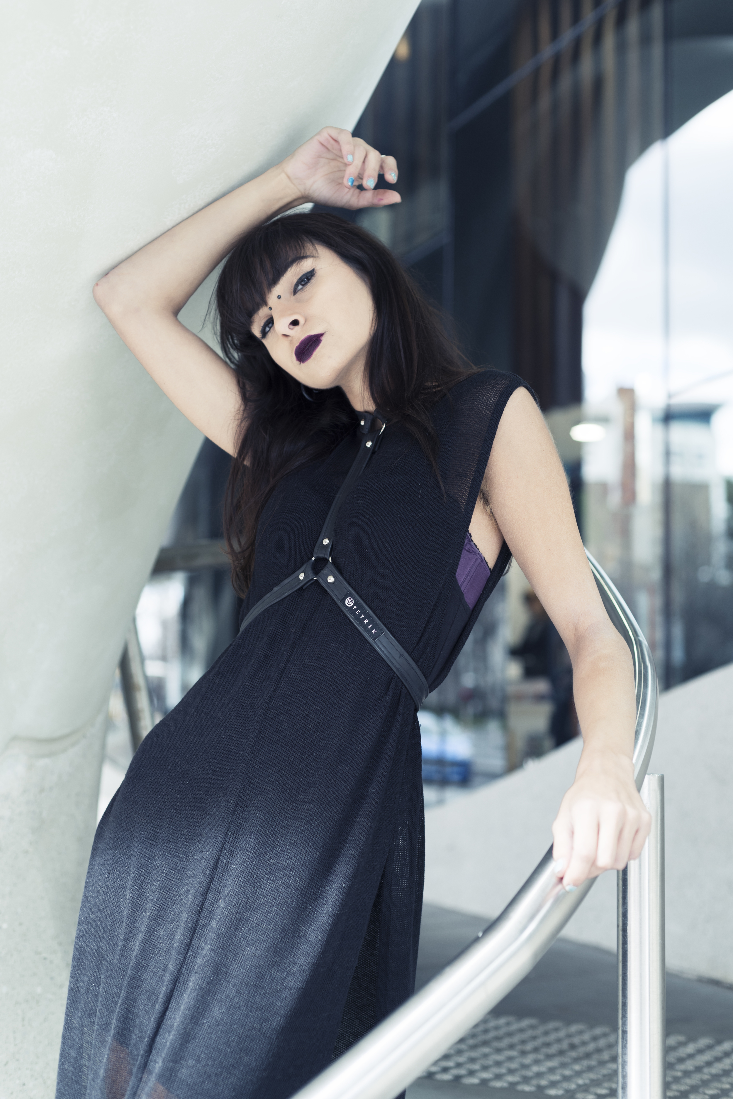
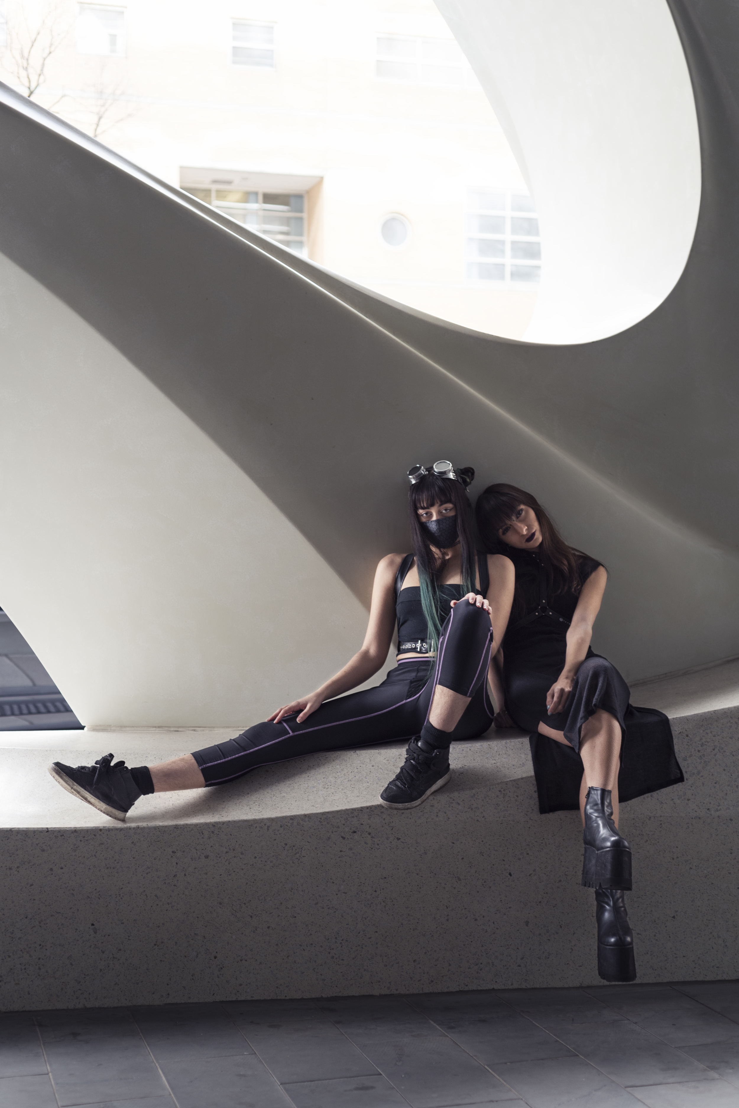
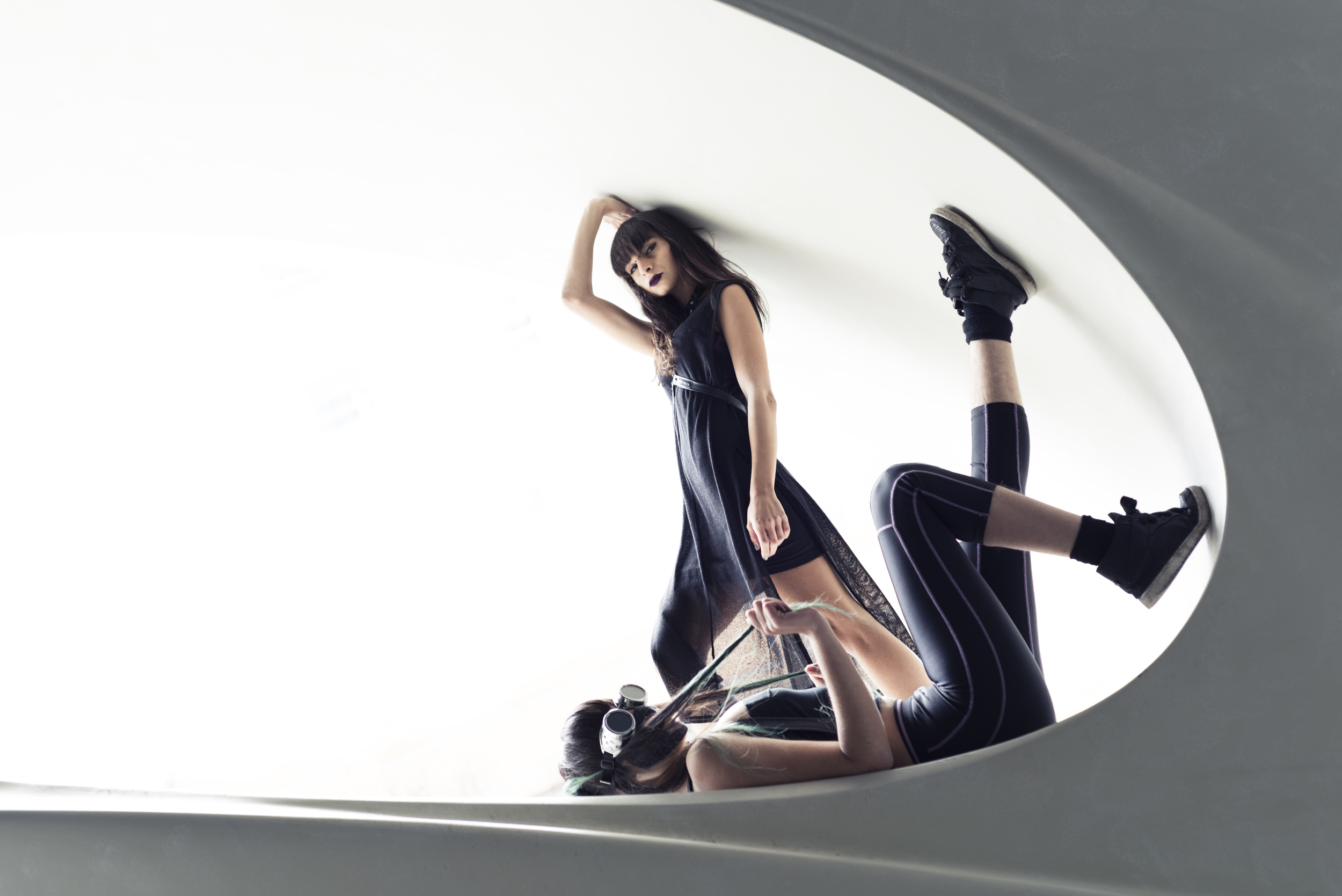
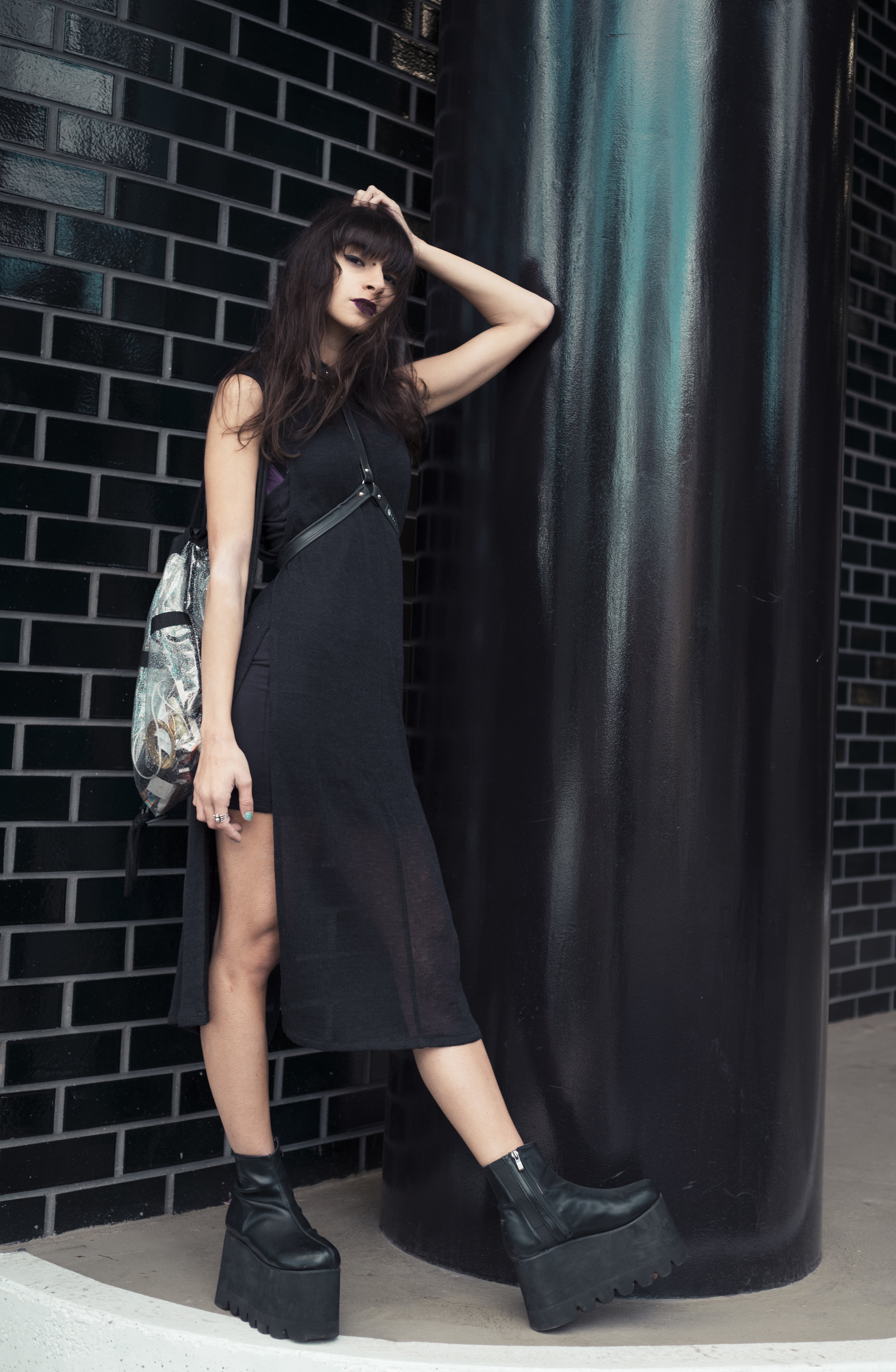
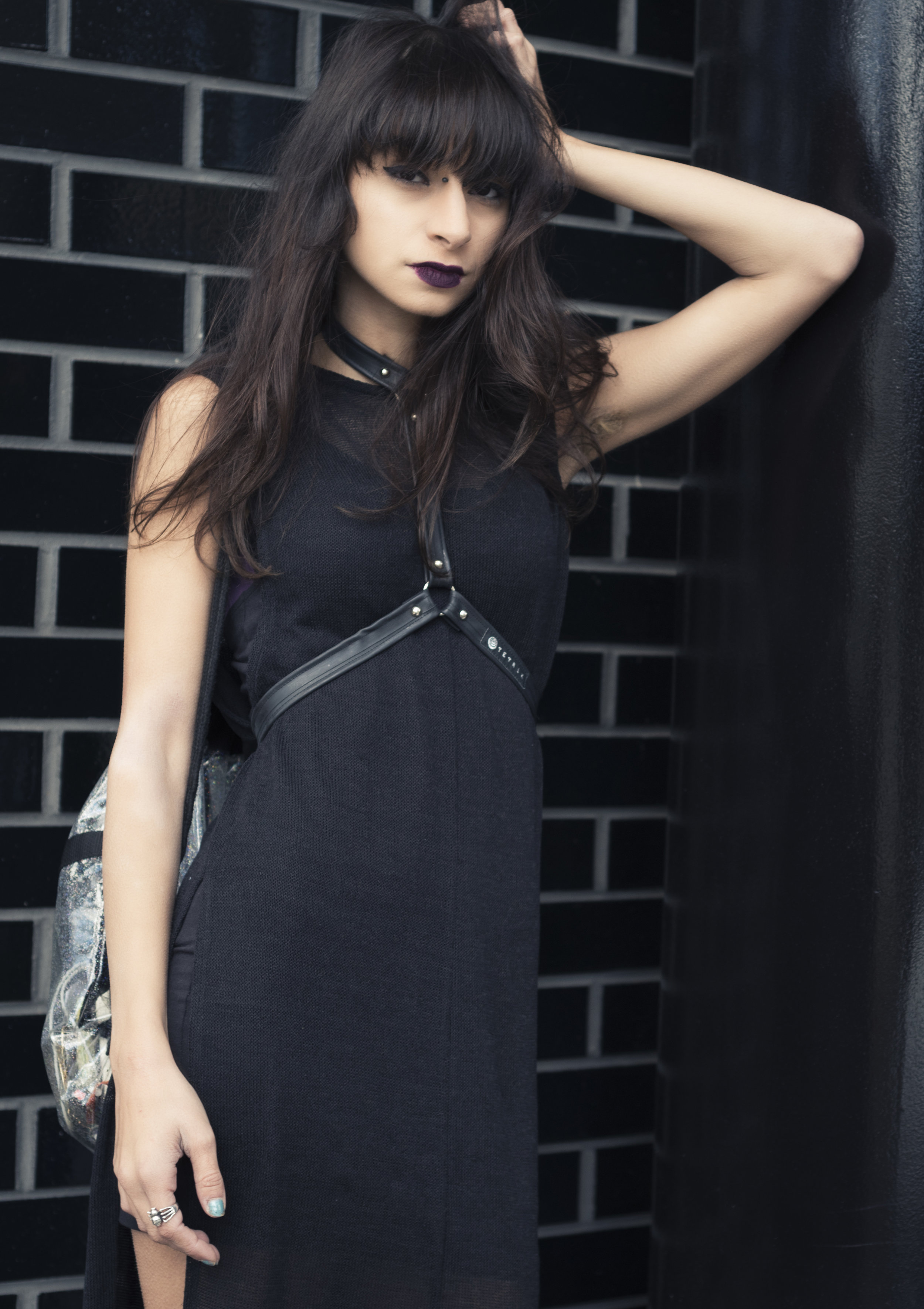
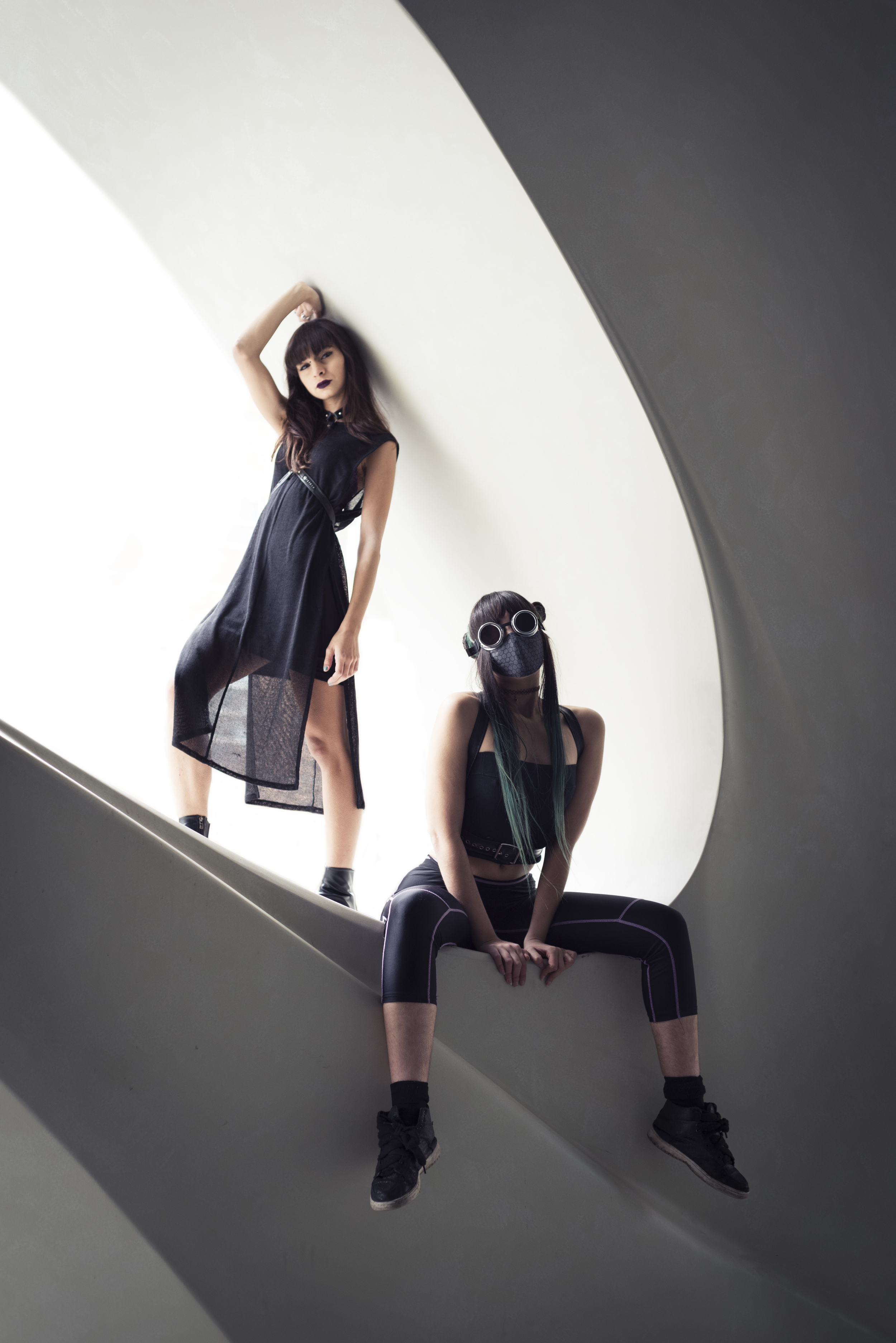
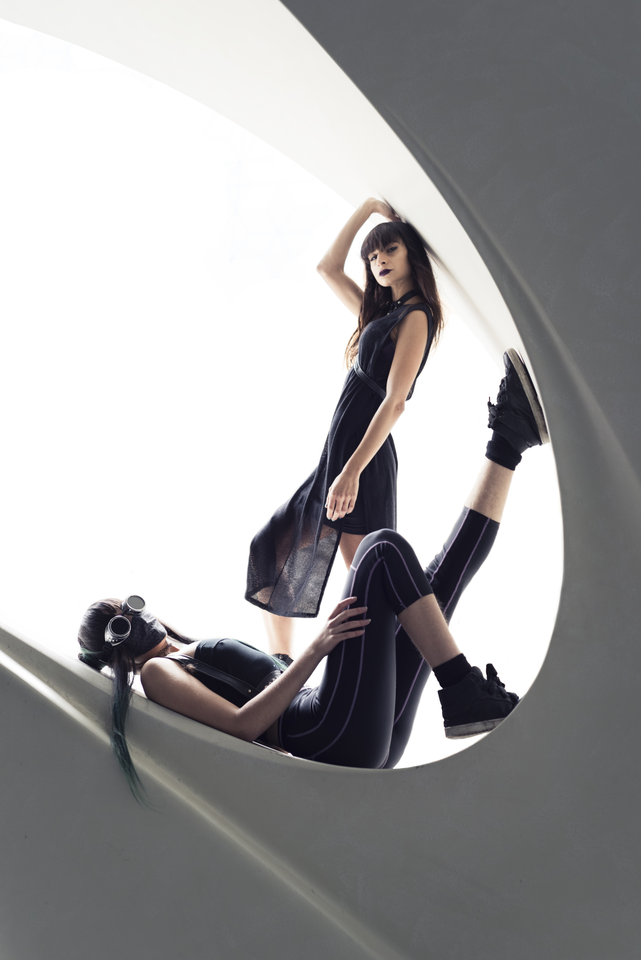
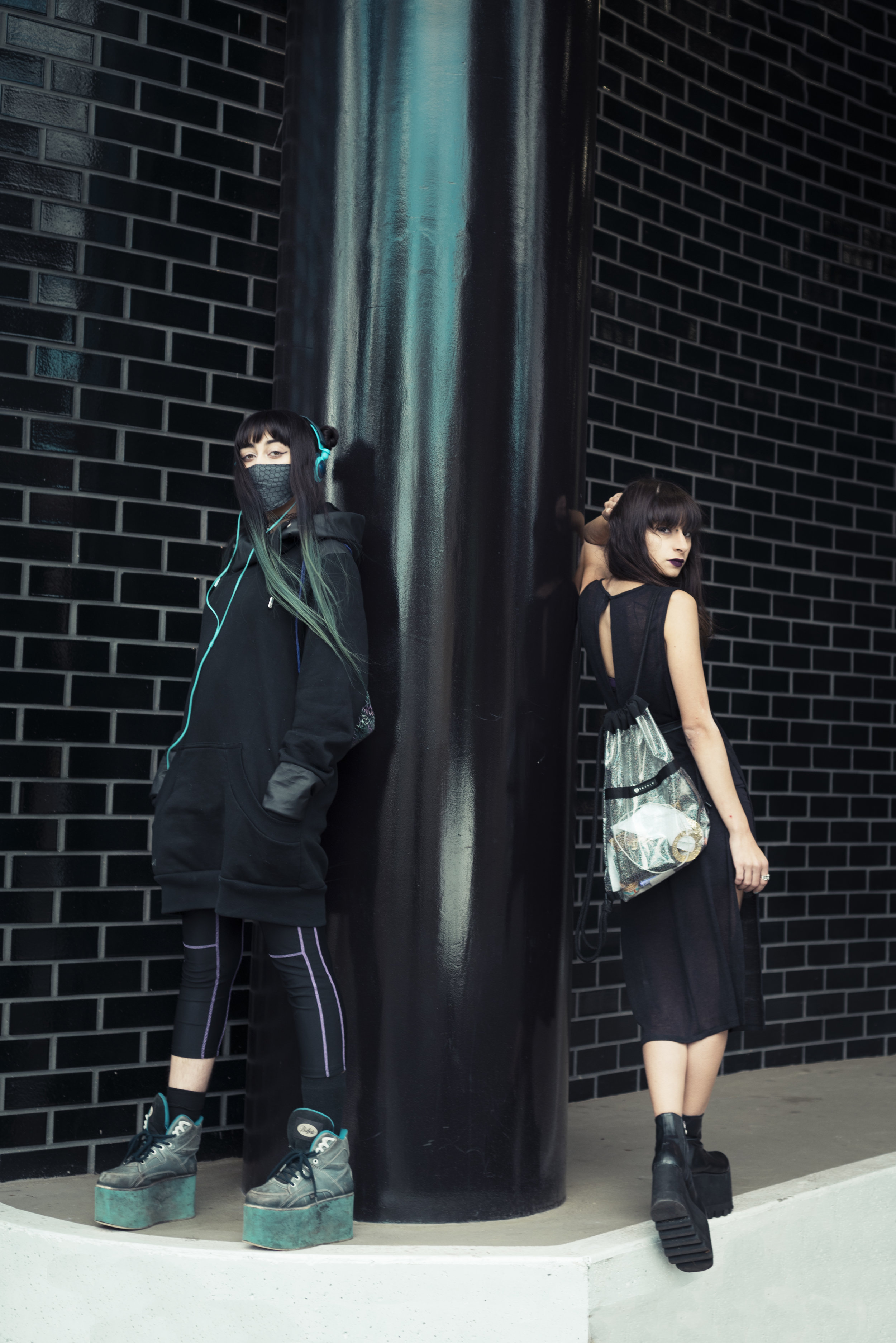
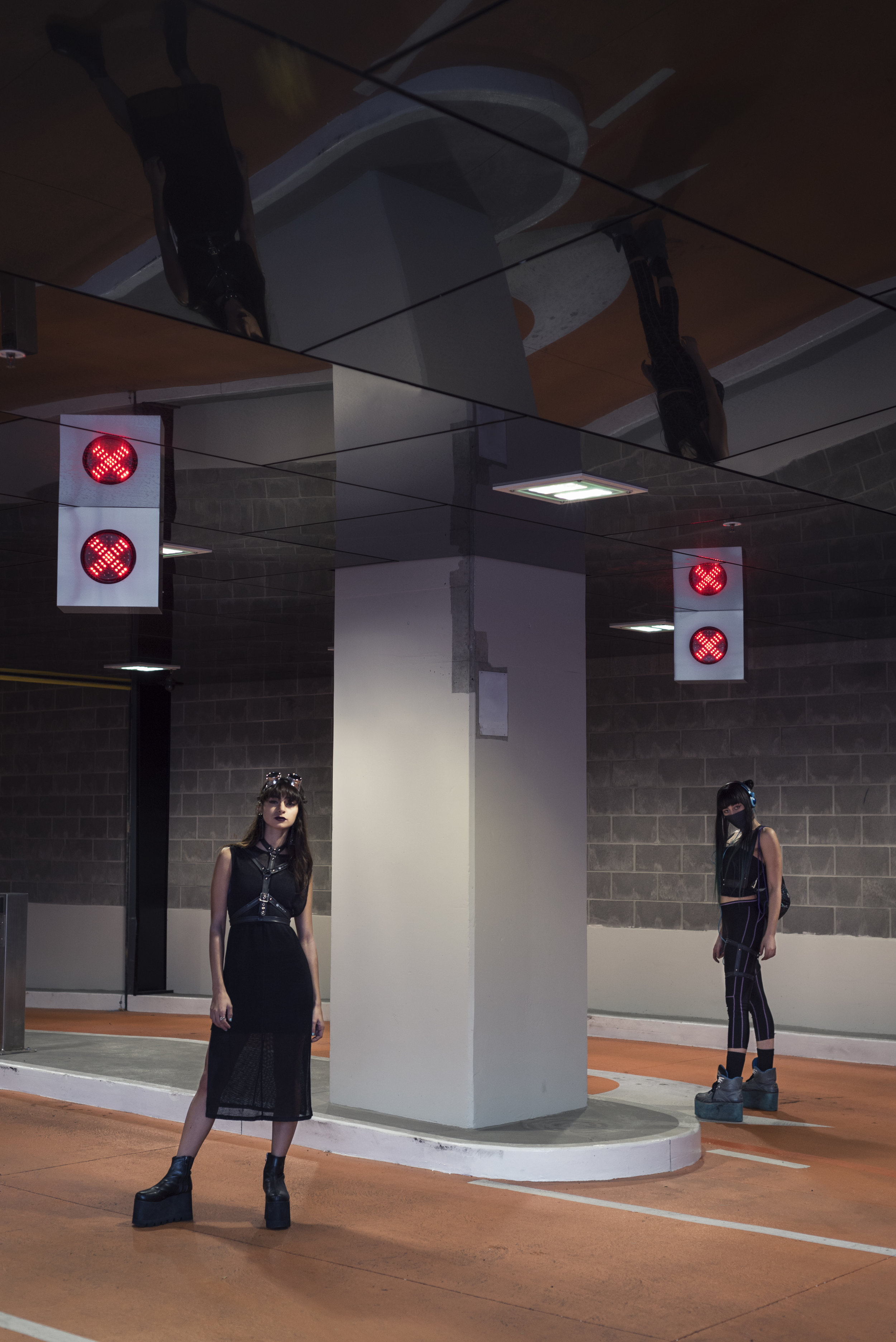
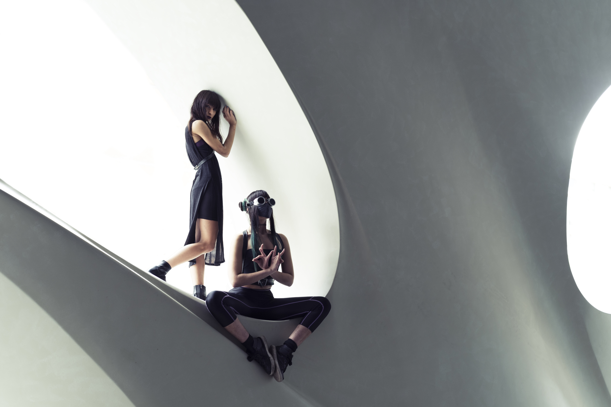
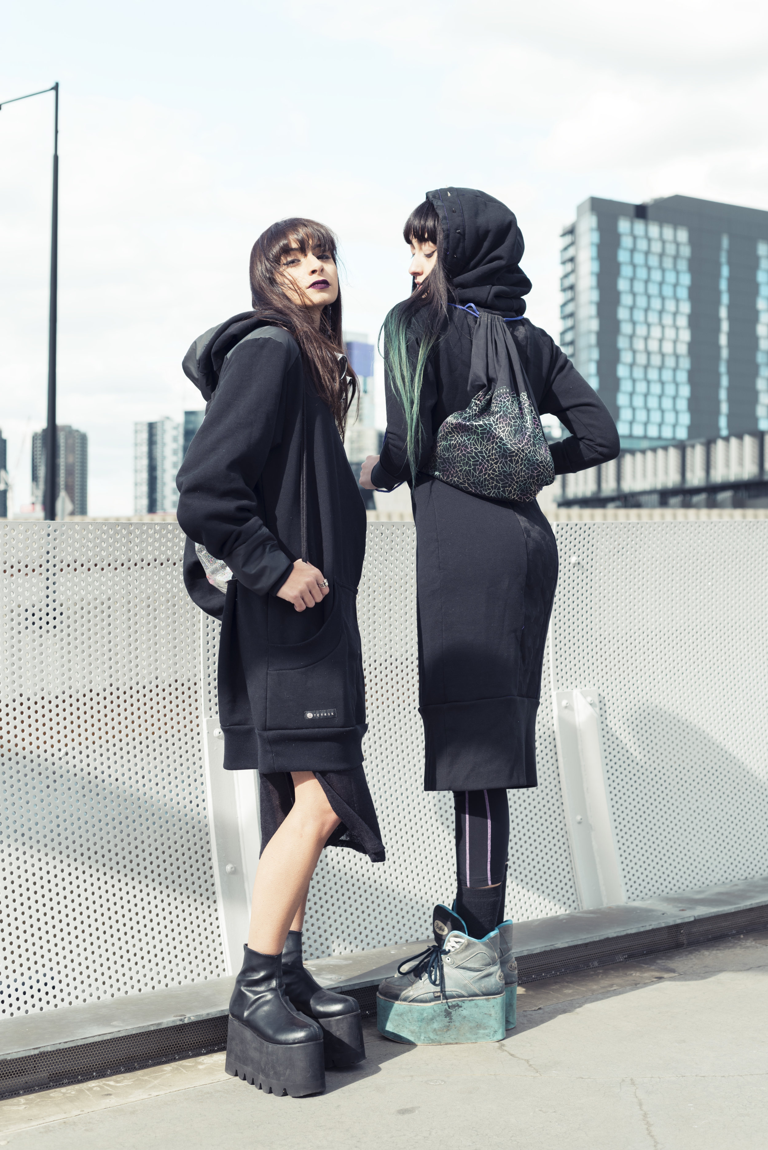
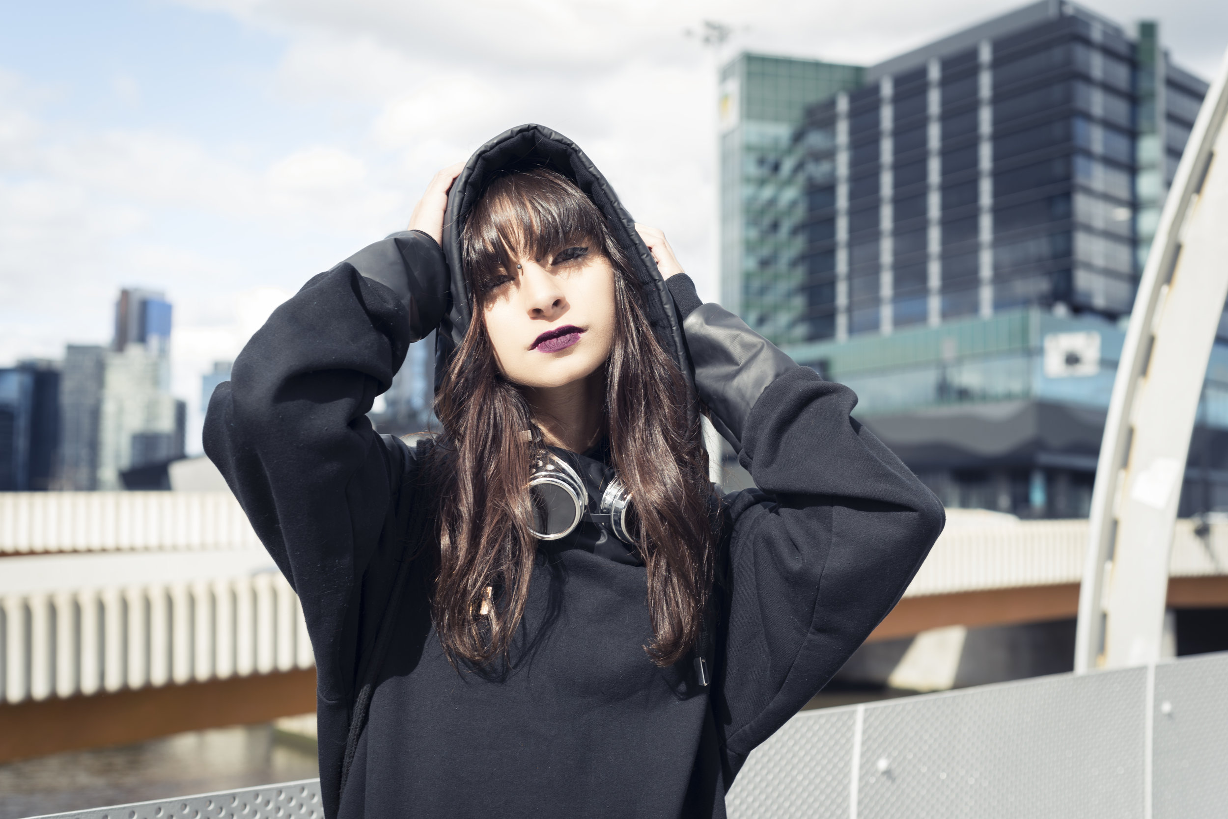
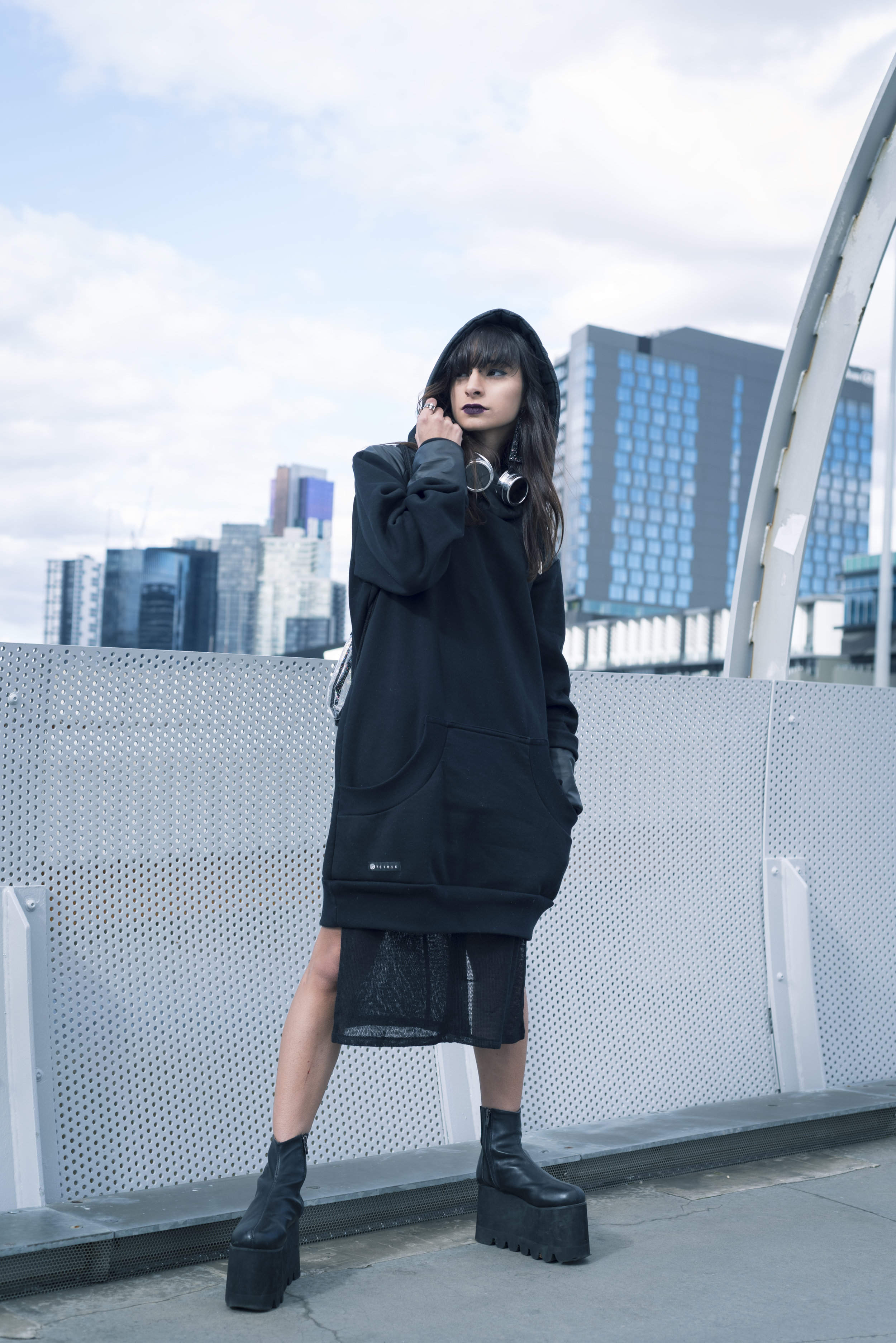
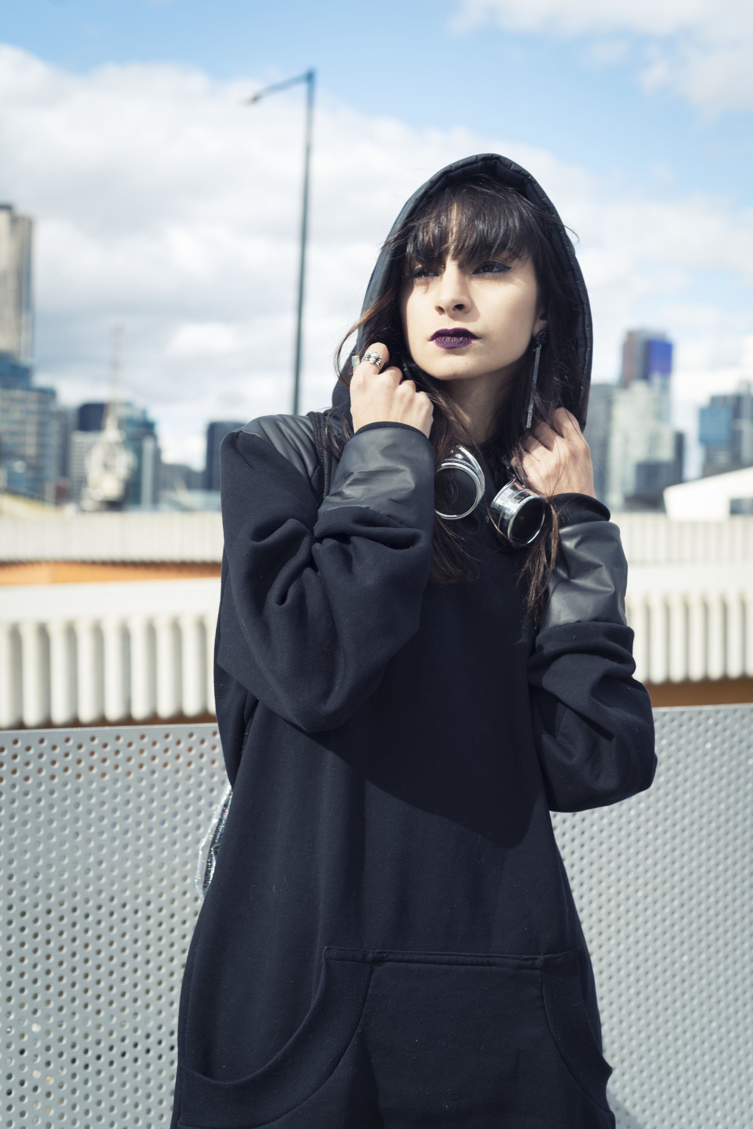
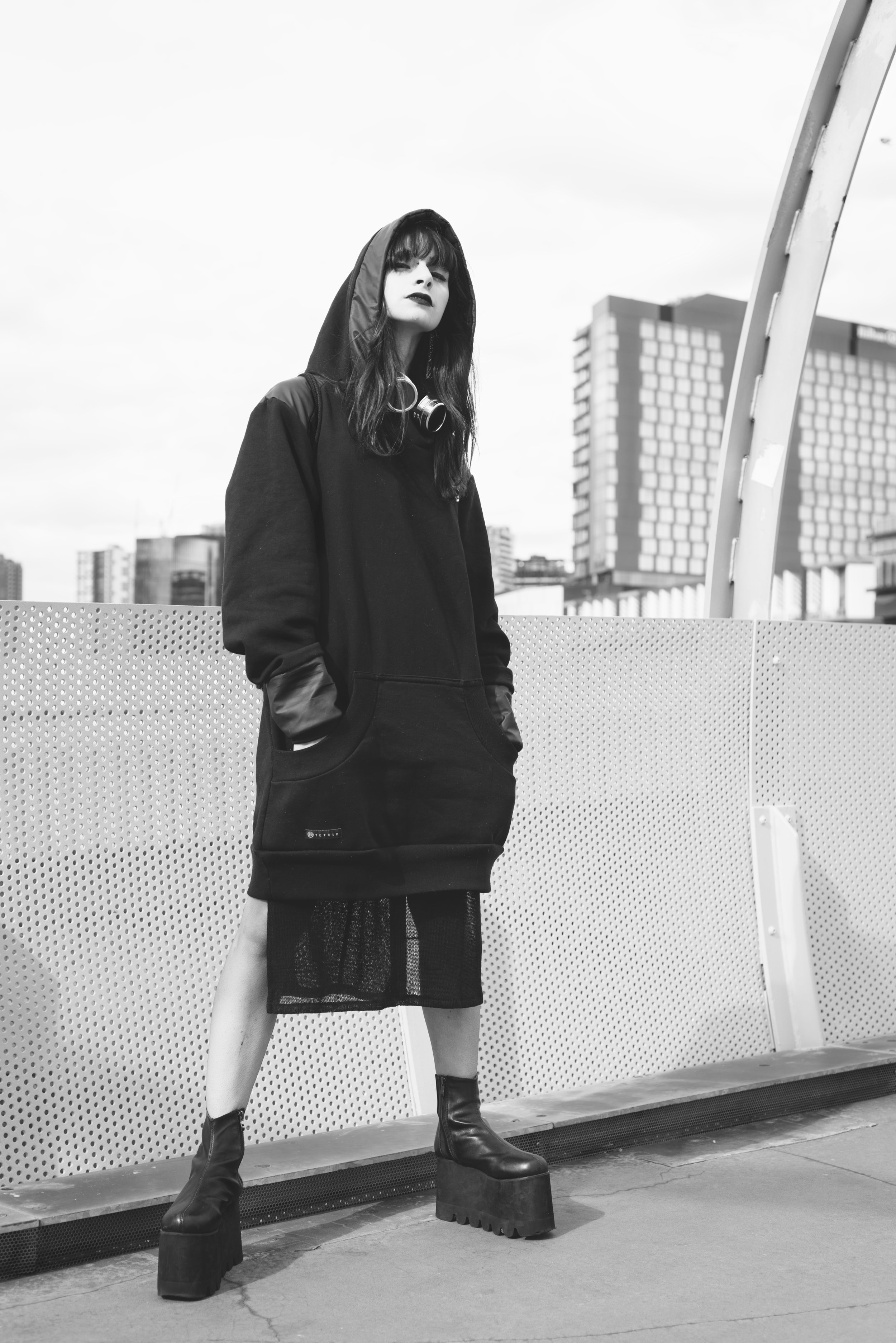
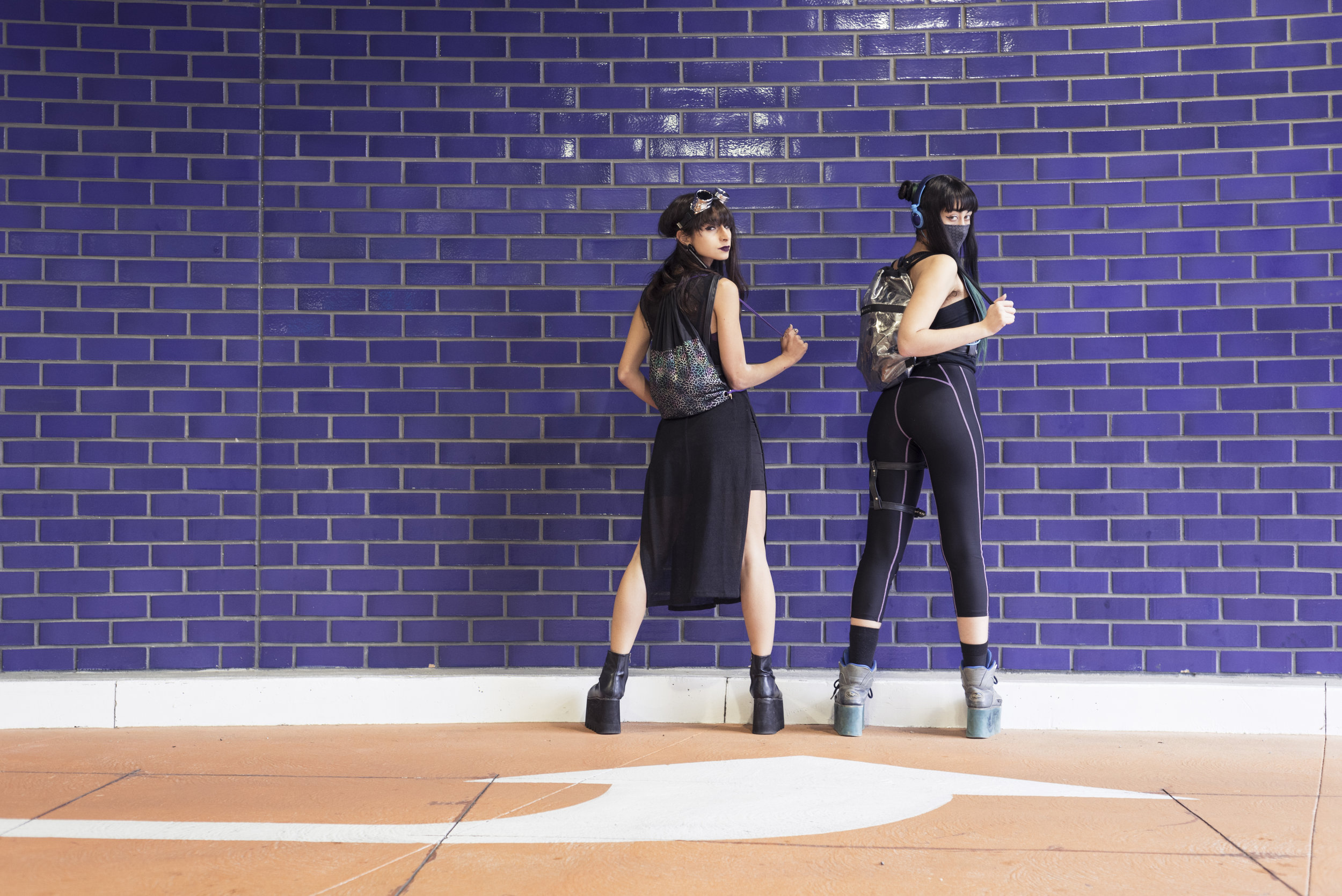
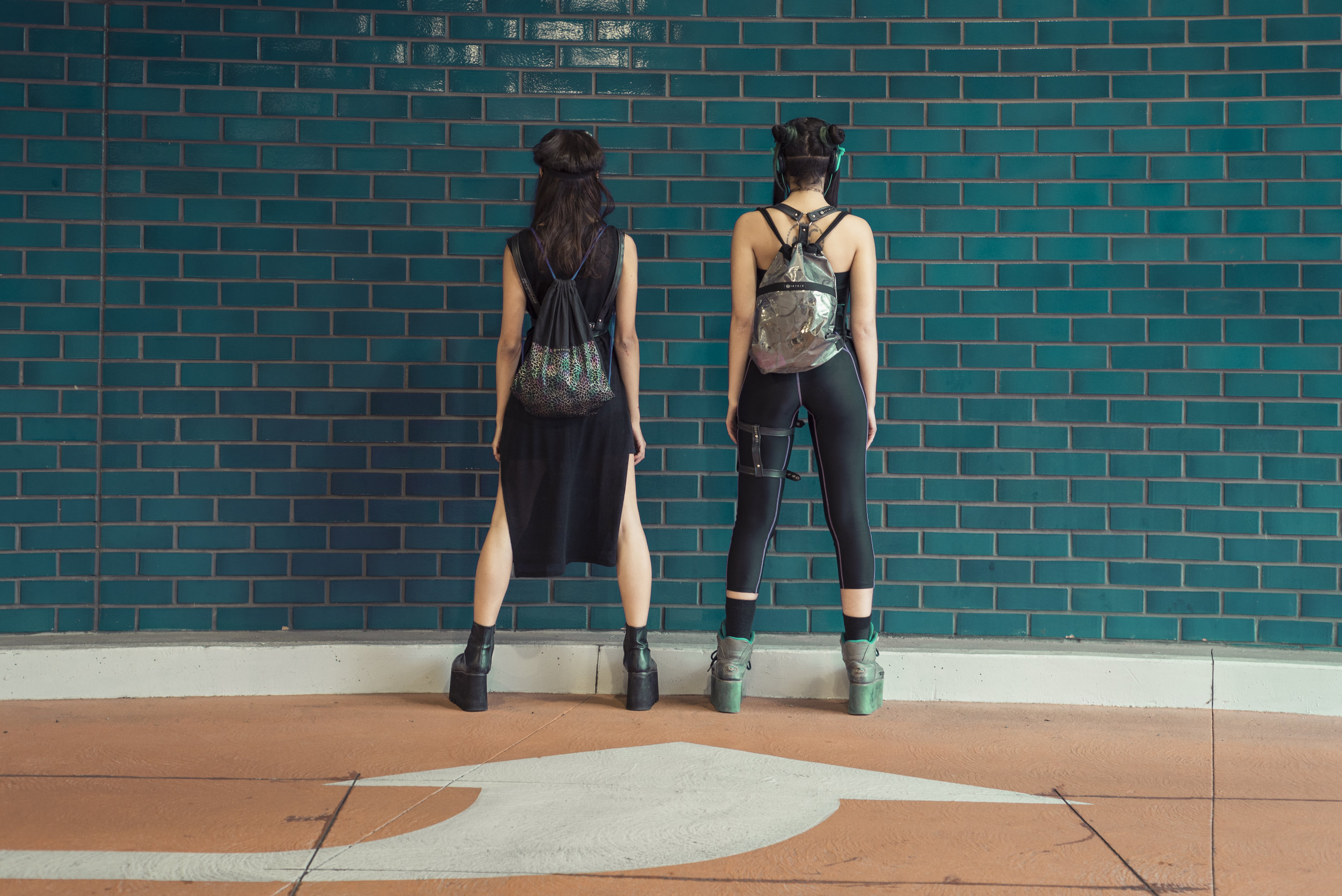
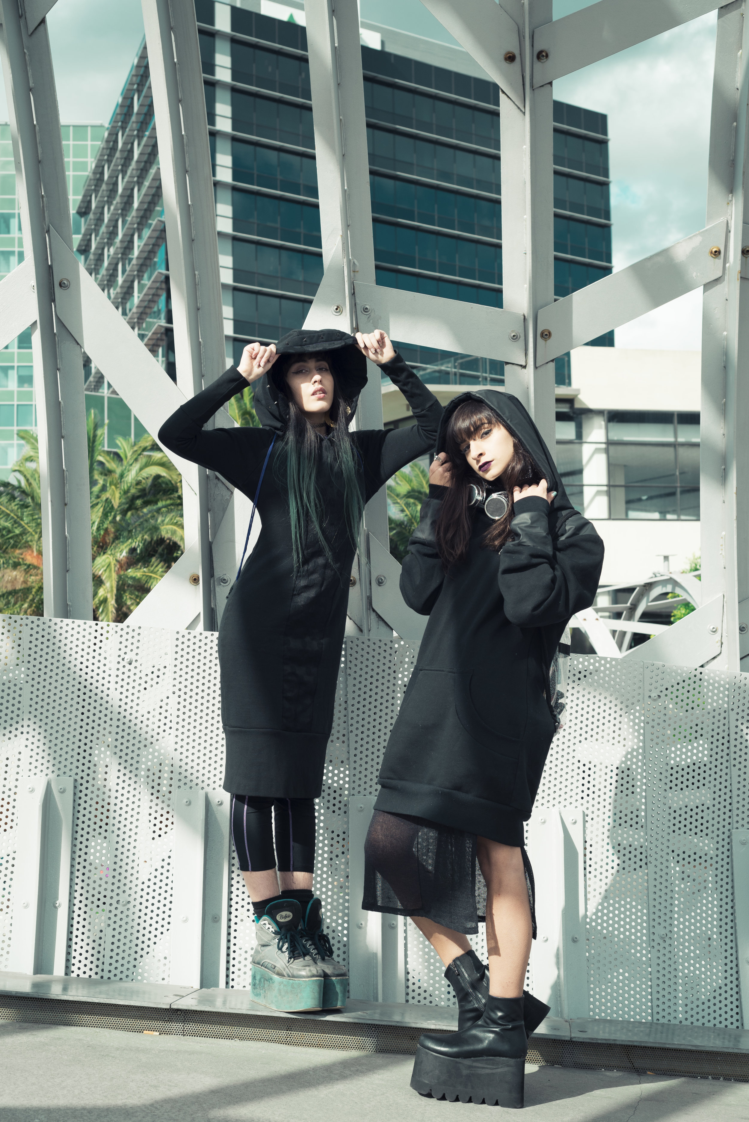
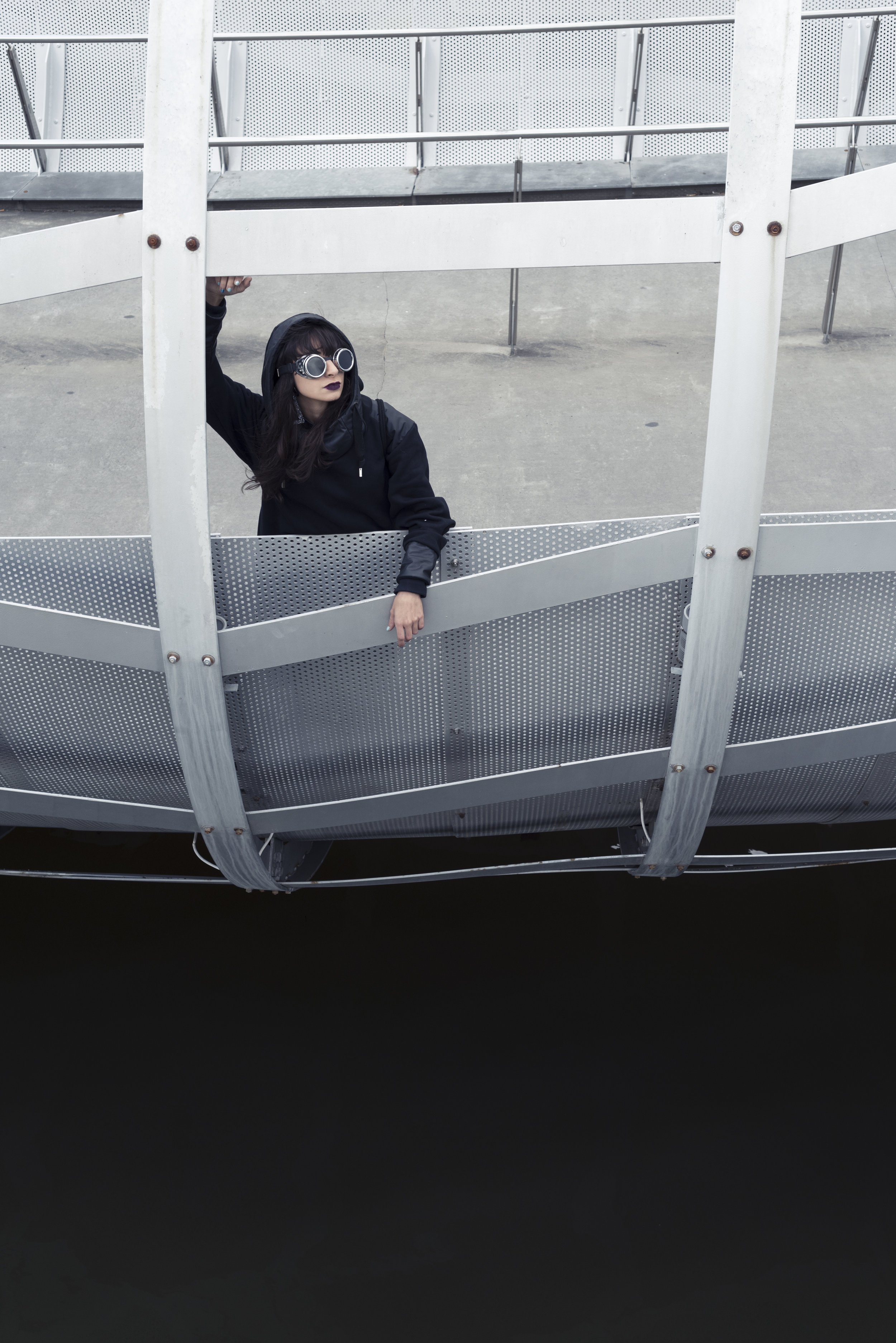
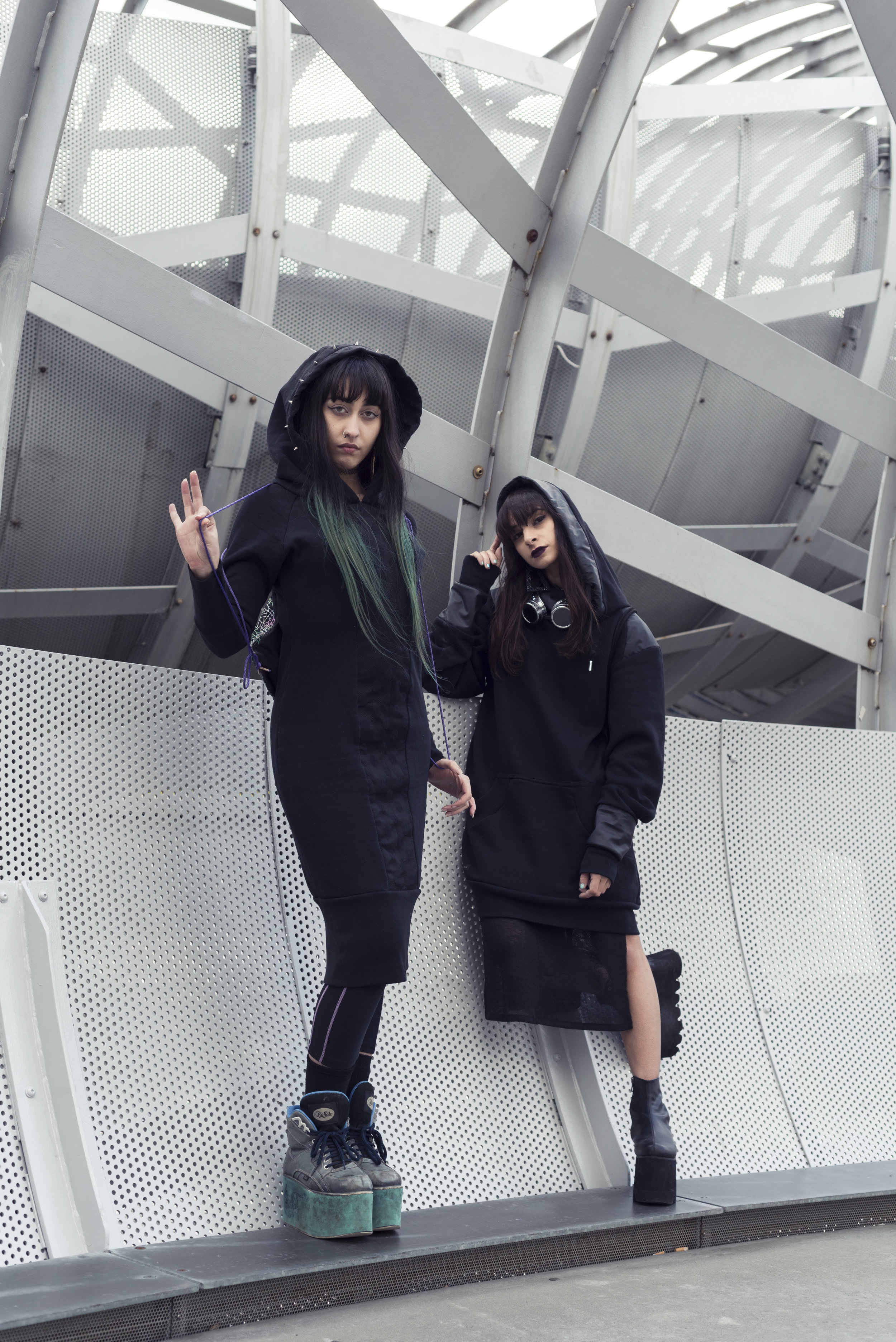
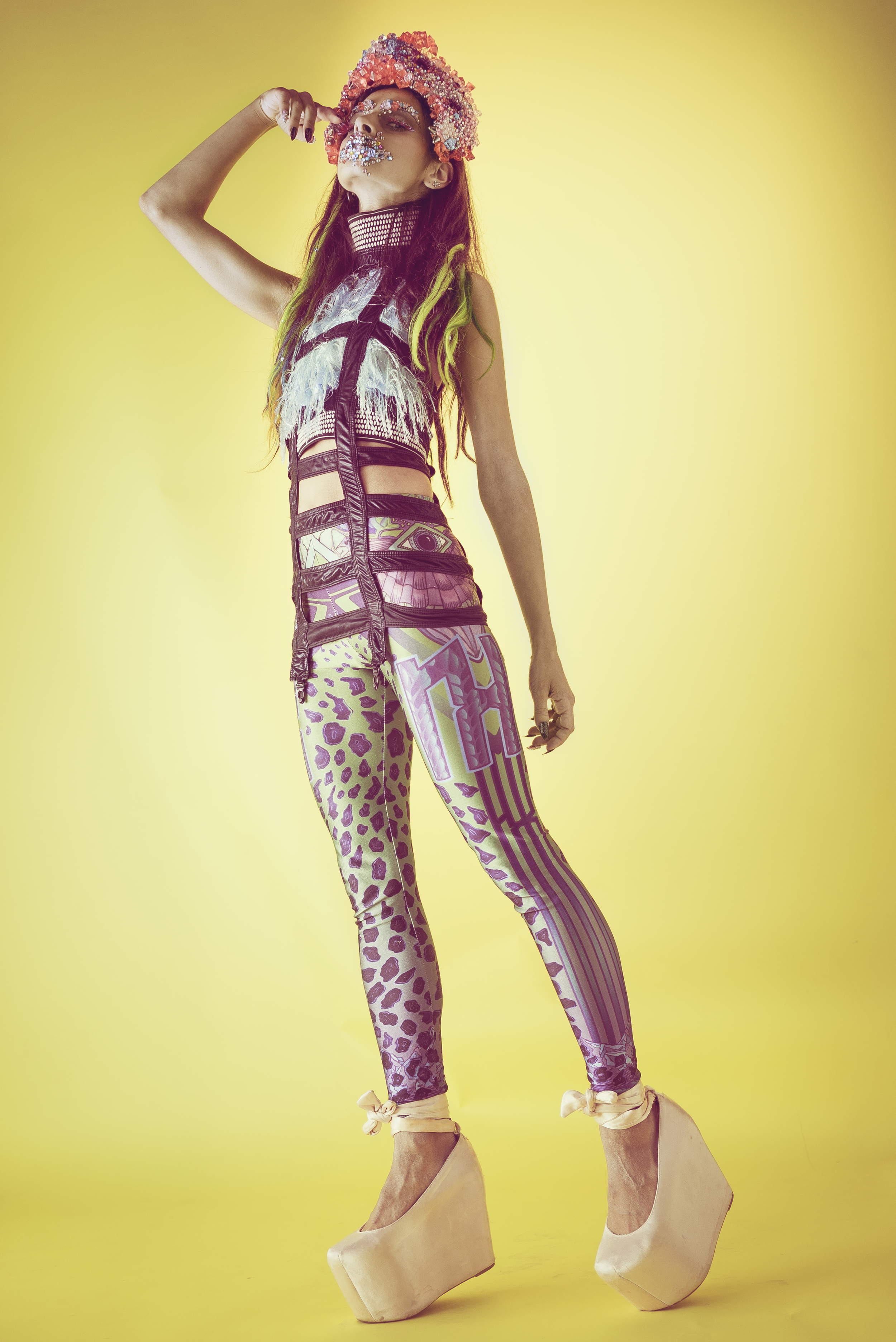
Like so many of the shoots I'm incredibly lucky to work on, this one was an adventure in complete and utter babe-town. Playing in the comfiest, most badass sets and big-bad-boots in this local wasteland is something I'd do again any day. Letting out my inner nu-cybergoth never felt so right, so a huge thanks to the dolls who invited me to be apart of this fun project!
And big love to Kim and Bri for letting me play in some Tetrik for the camera again -
Tetrik is definitely one of my fav local labels, and it totally hits the nail on the head when it comes to that cyber neogoth industrial oil slickin' dark pixie vibe (oh hell yeah) so support your locals and shop Tetrik today.
For the more colourful bubblegum pixies, you can support your locals too - make sure to check out Goo Life and Creatura, also pictured above.
Photographer: Briannagh Clare Photography
Models: Fox and Sham
HIKARI
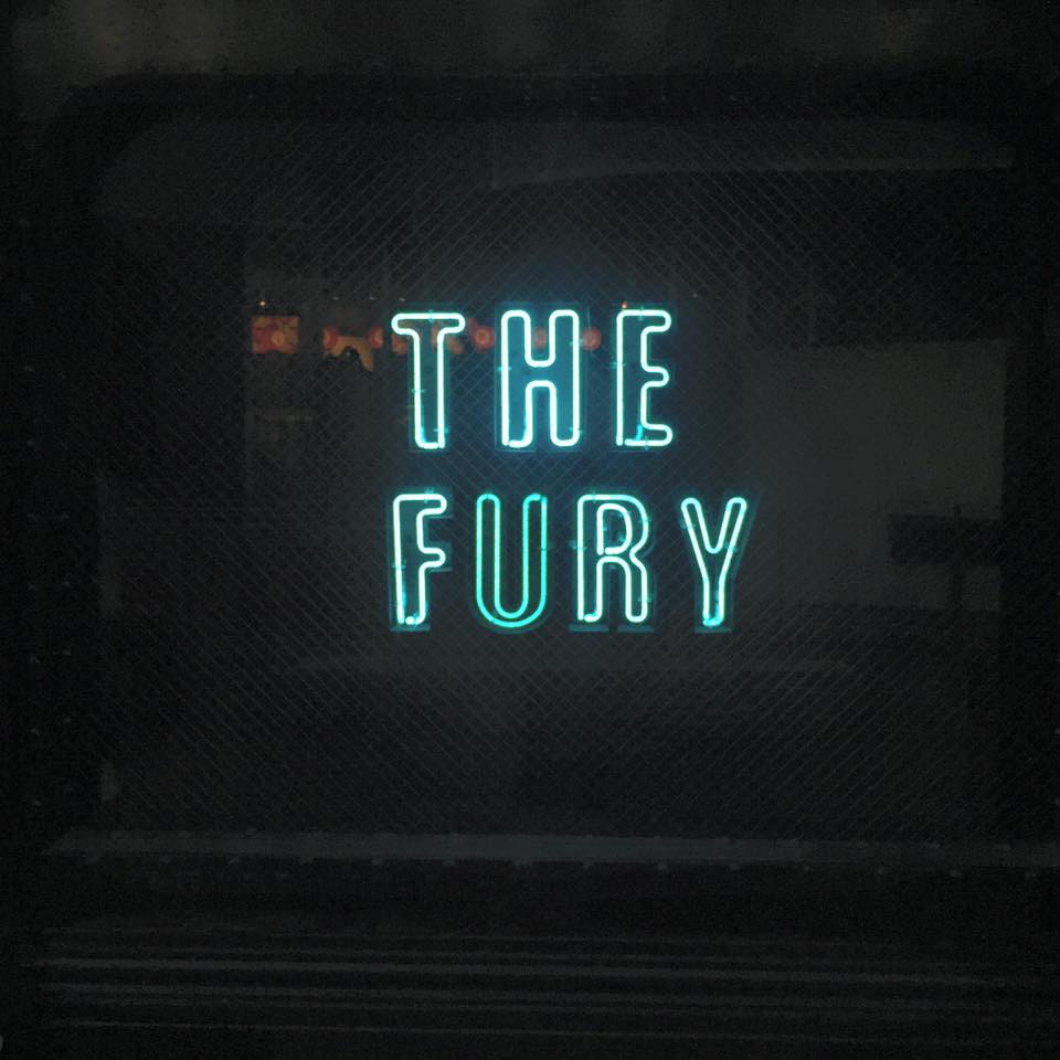
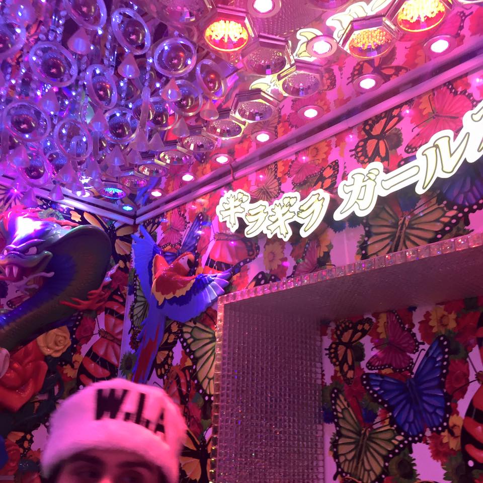
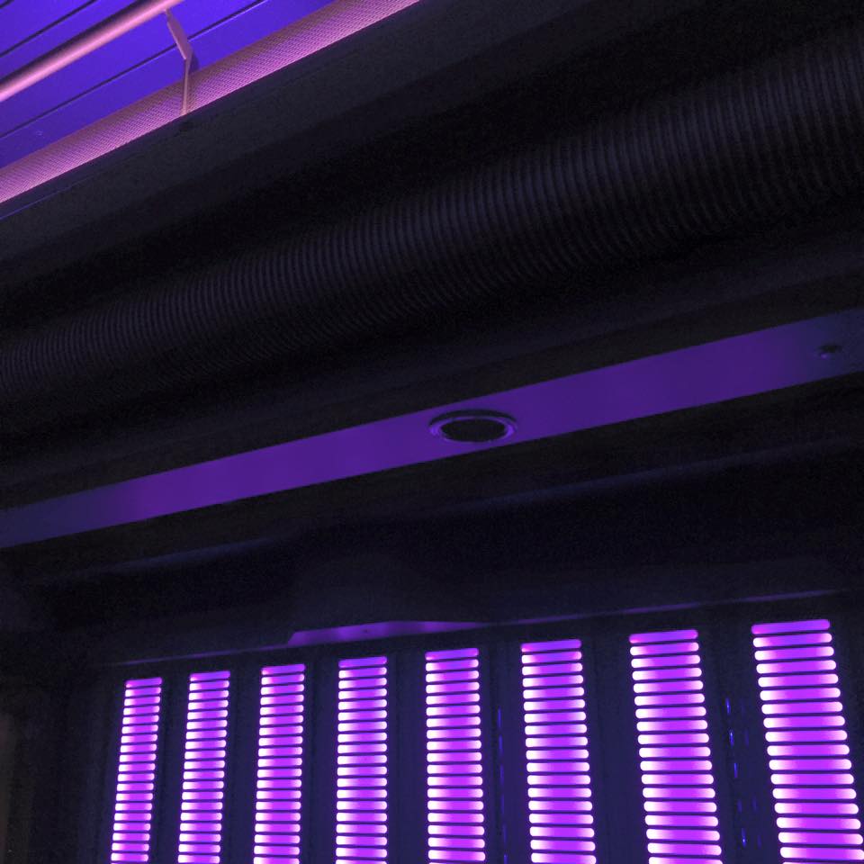
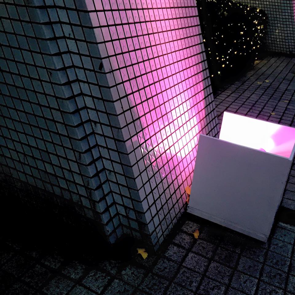
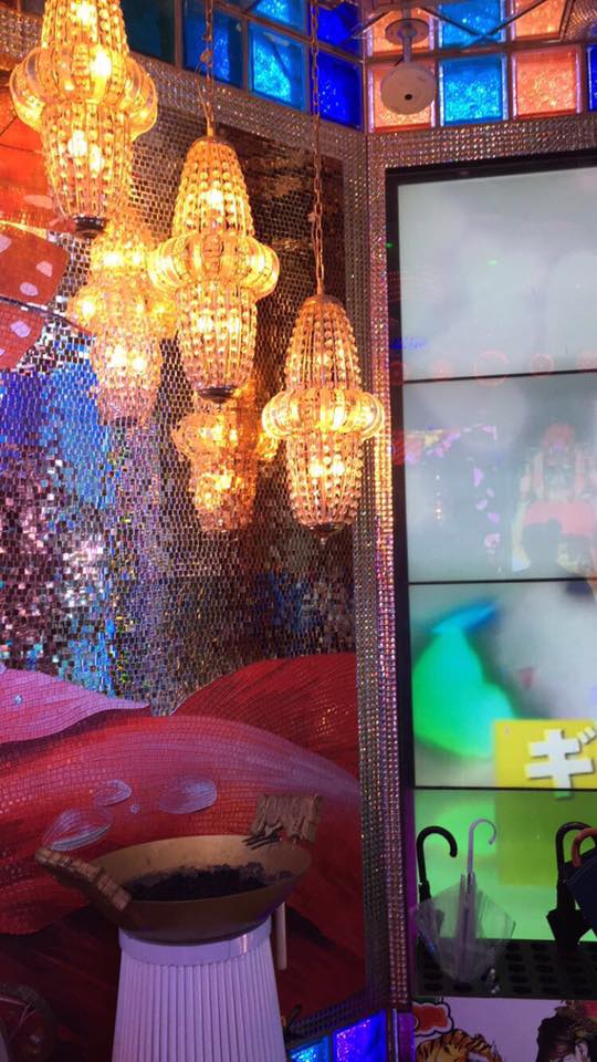
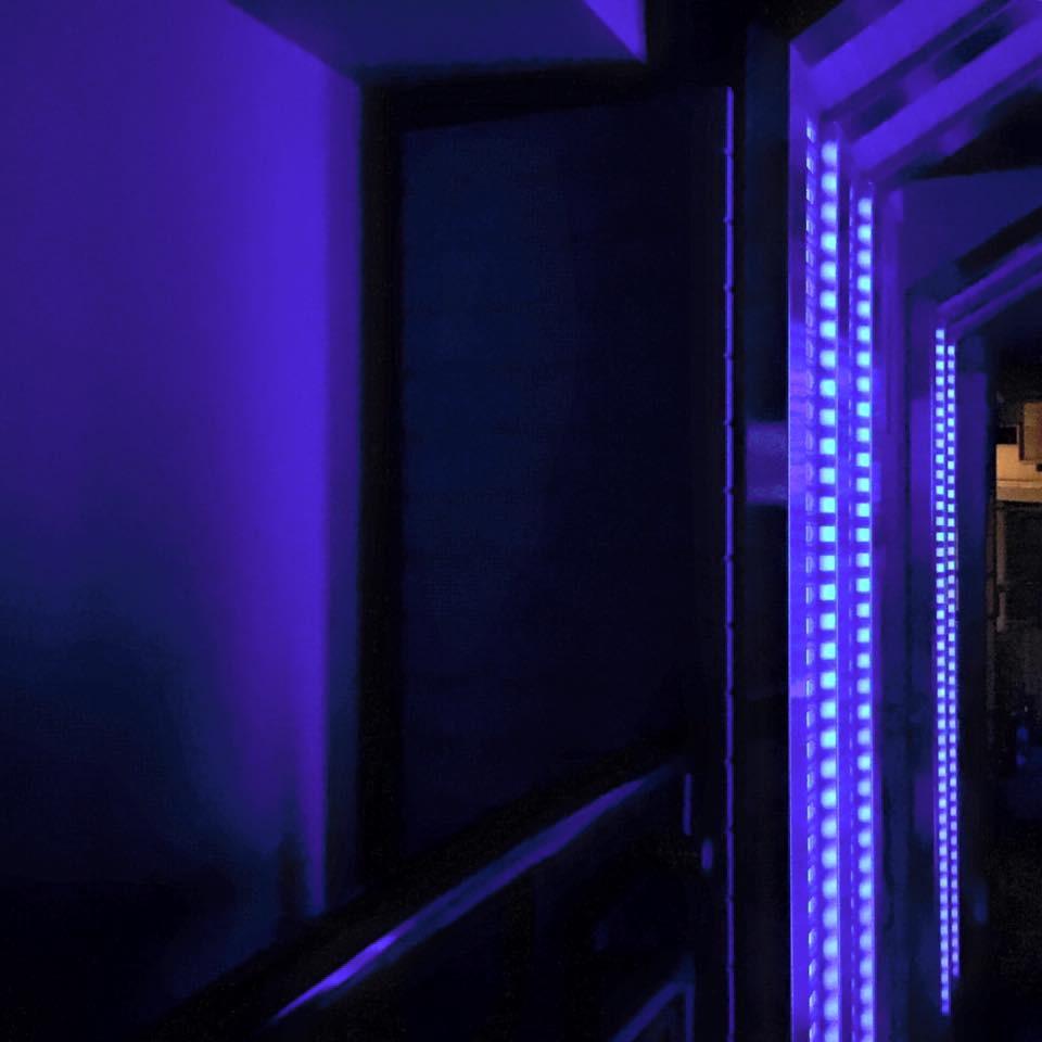
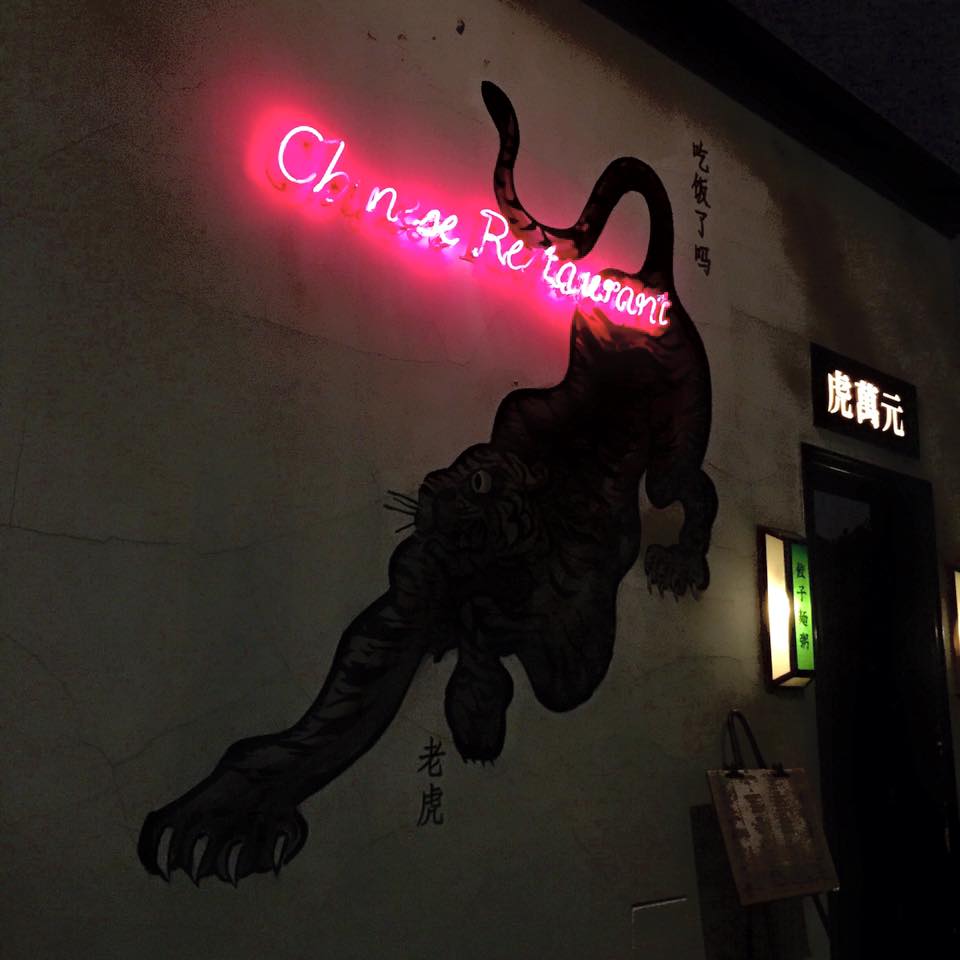
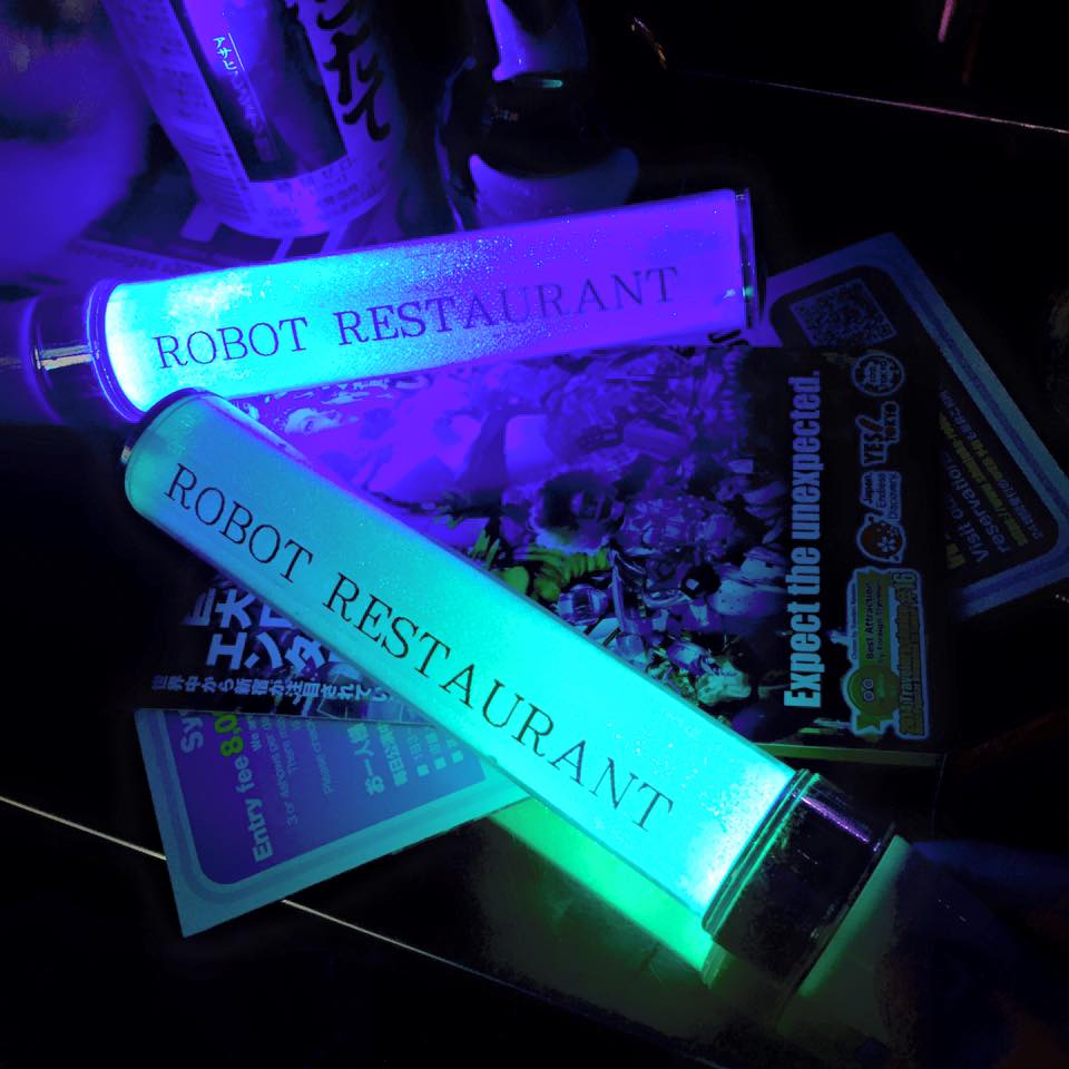
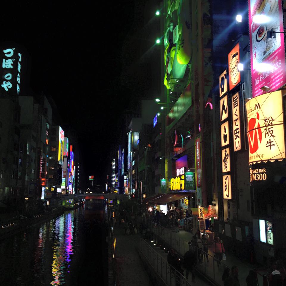
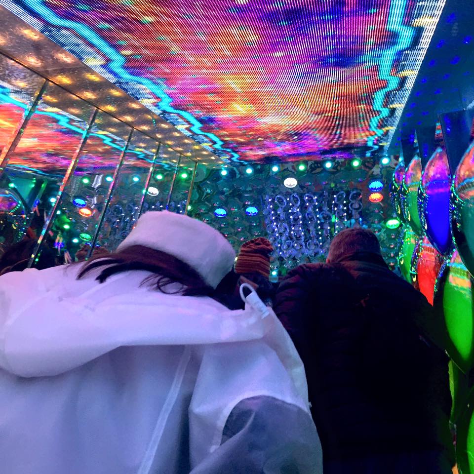
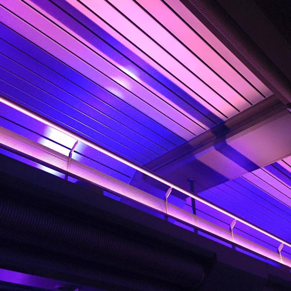
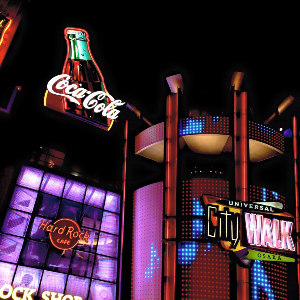
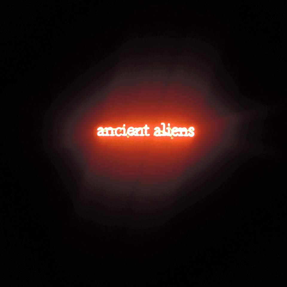
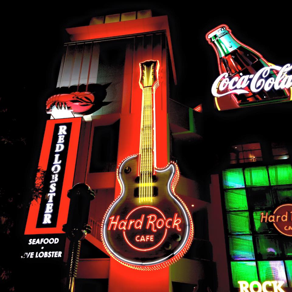
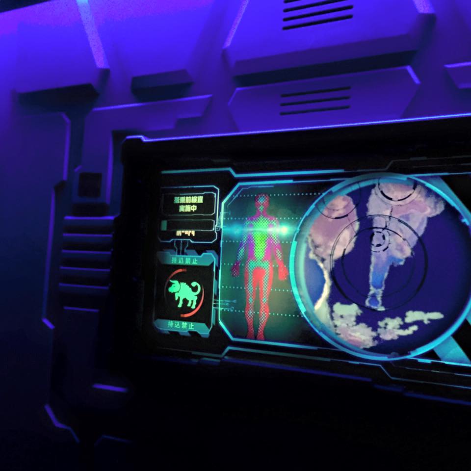
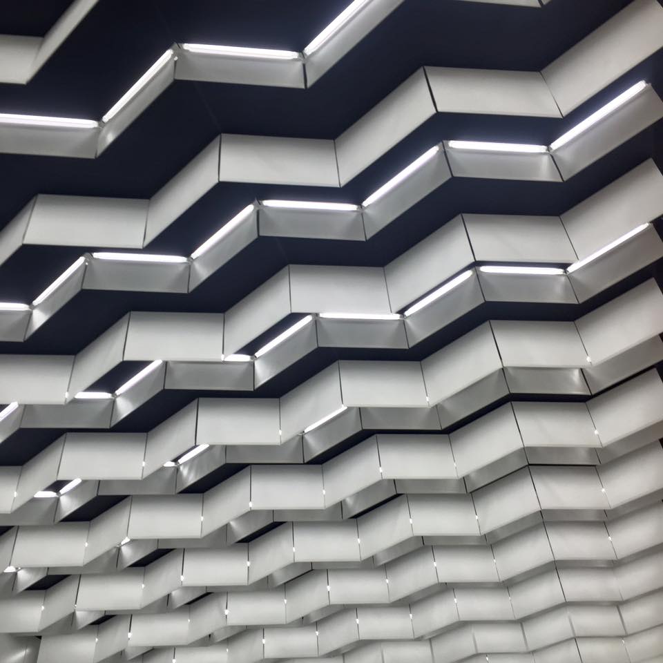
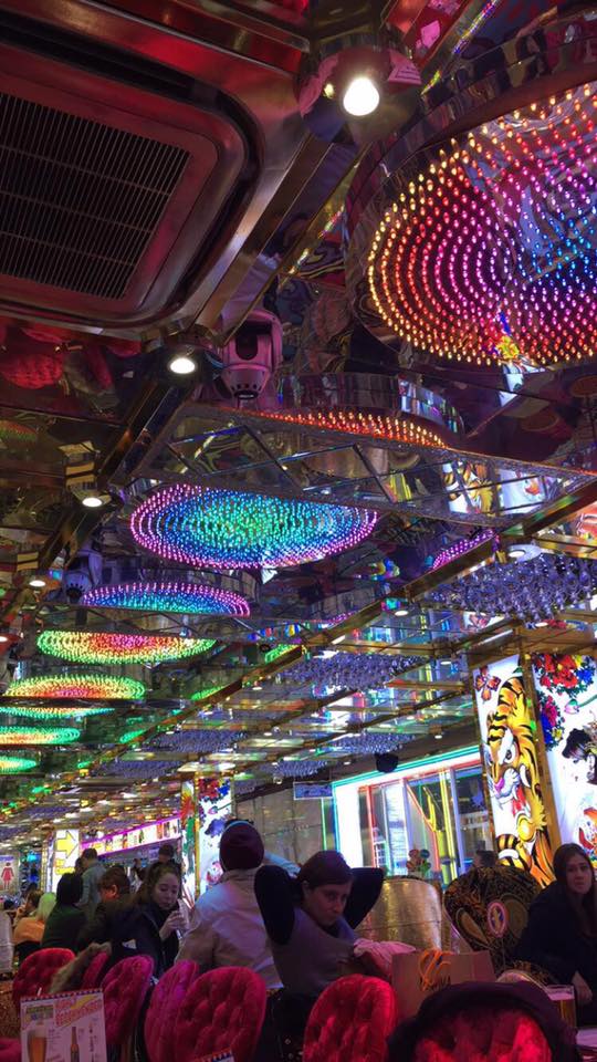
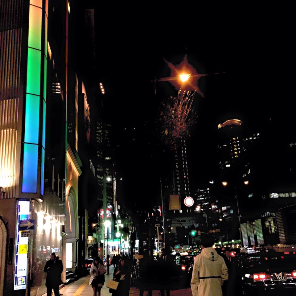
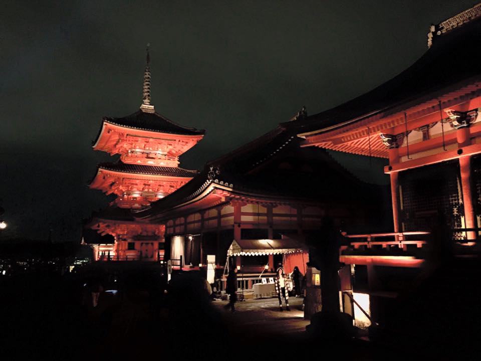
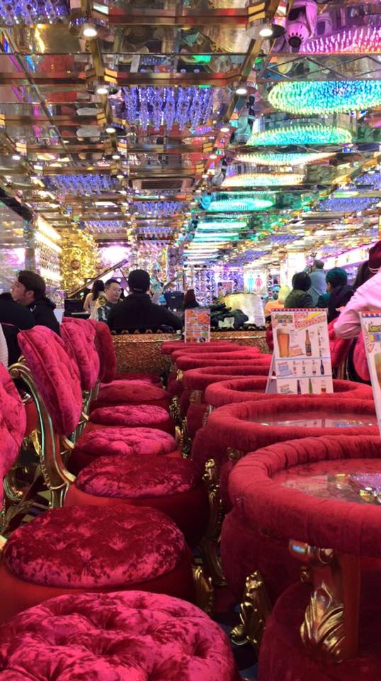
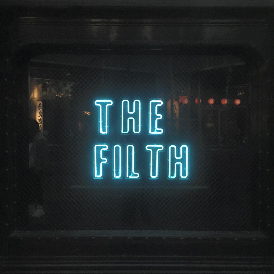
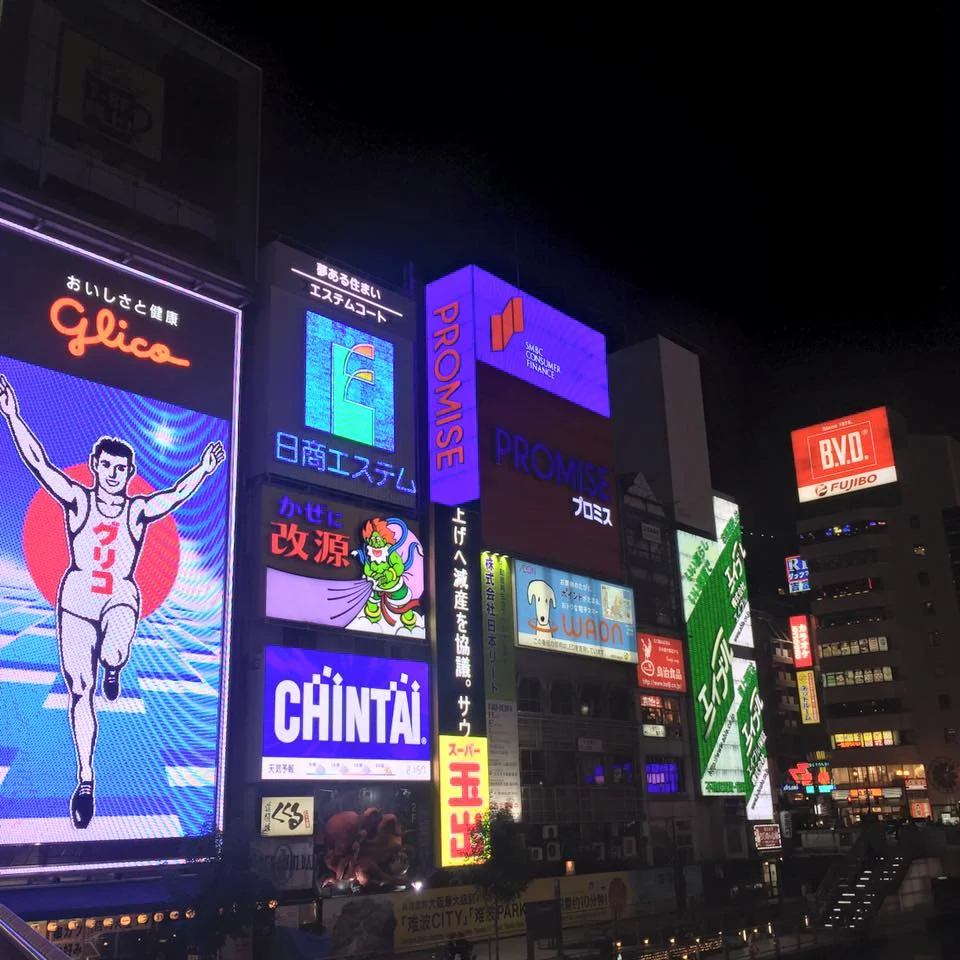
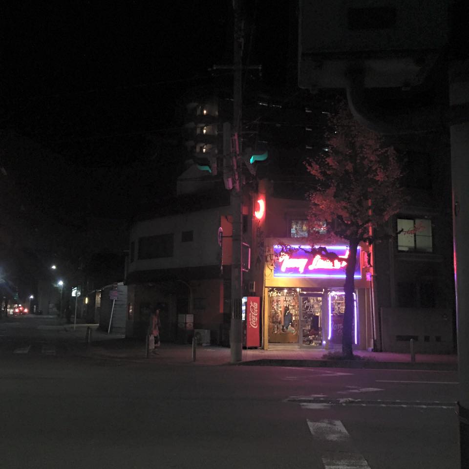
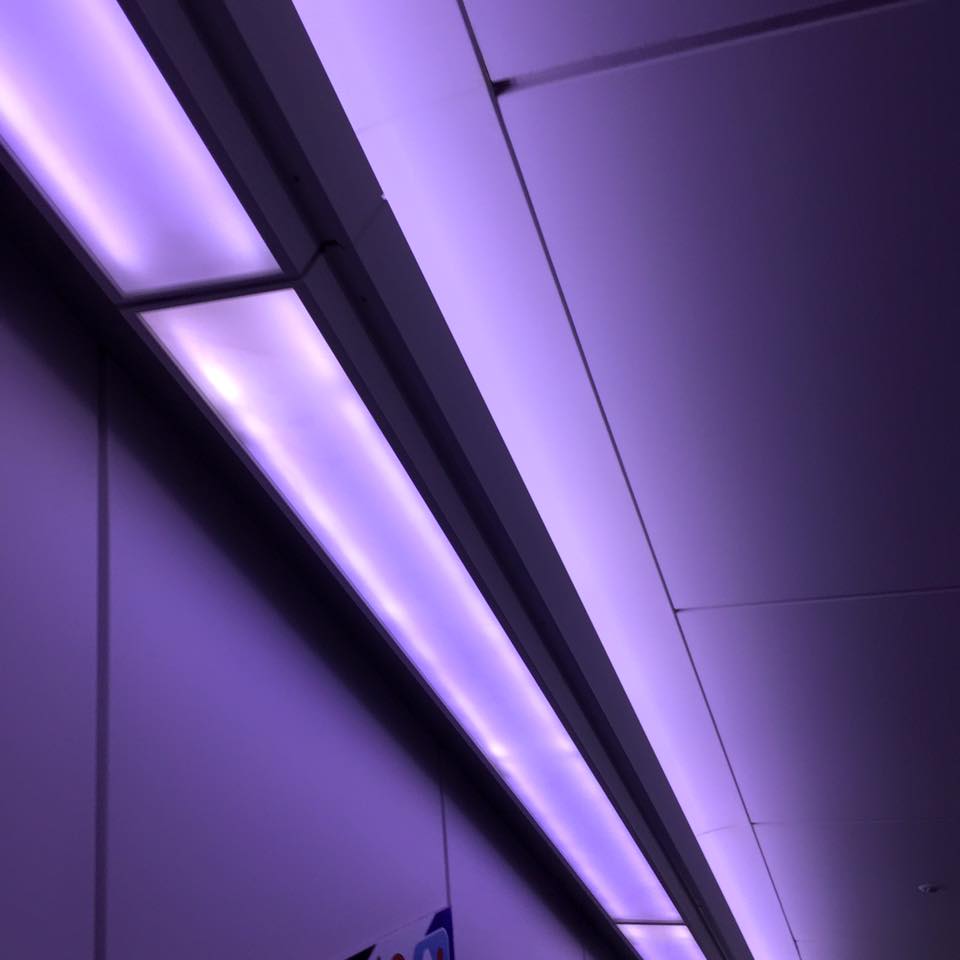
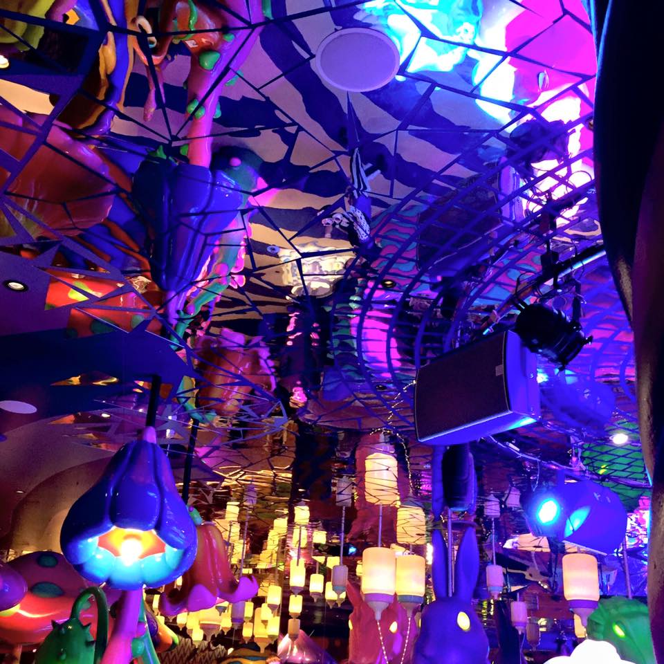
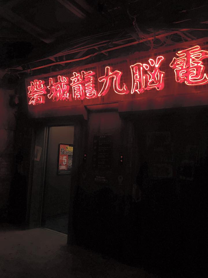
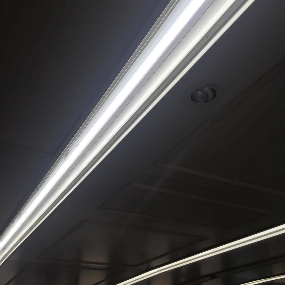
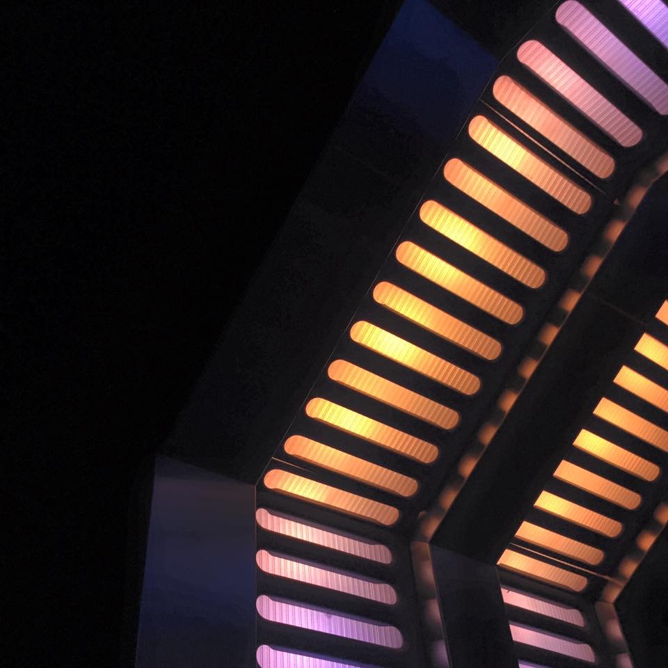
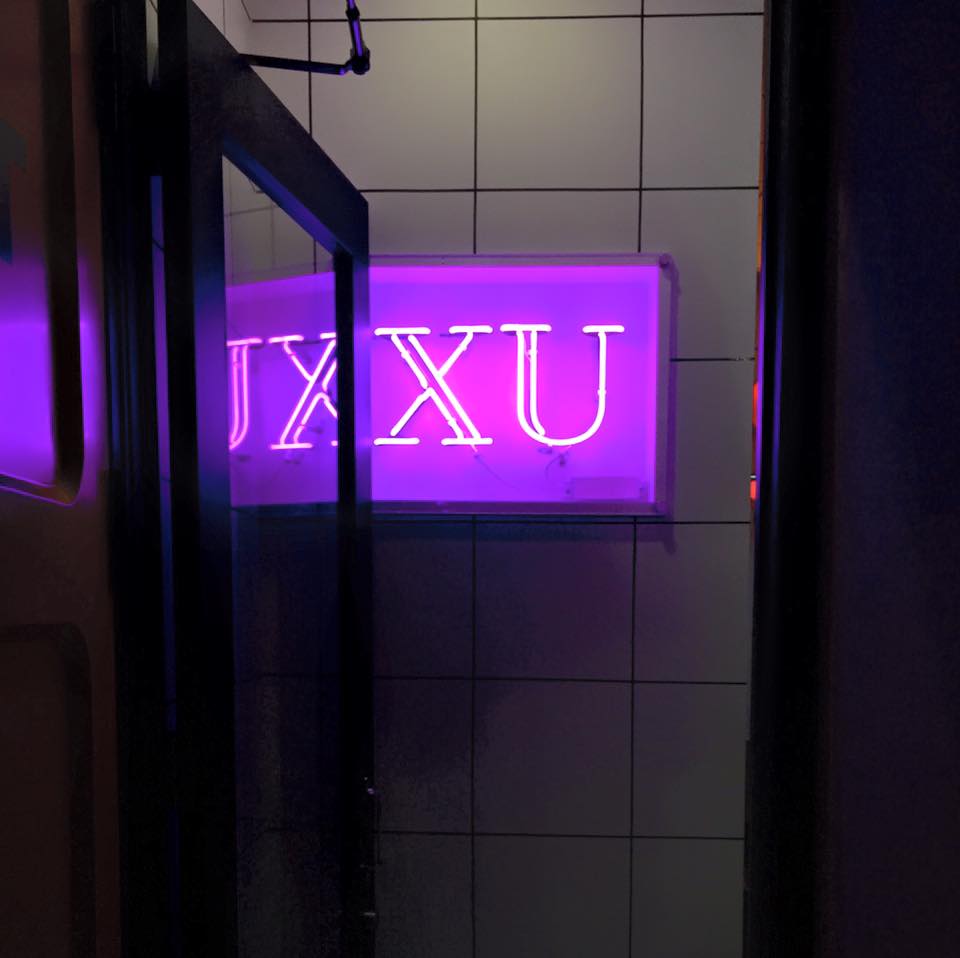
If there is one incredibly striking element to Japan, no matter which of it's bright cities you find yourself in, it's the lights. From the neon green tubing in Osaka's Dotonbori, to the blinding white screens of Shibuya Crossing, to the musical water fountain shows complete with violet and fuchsia illuminations outside of Kyoto Railway Station, you can't help but allow yourself to be drenched in the over-saturation, over-stimulation of Japan's obsession with lights.
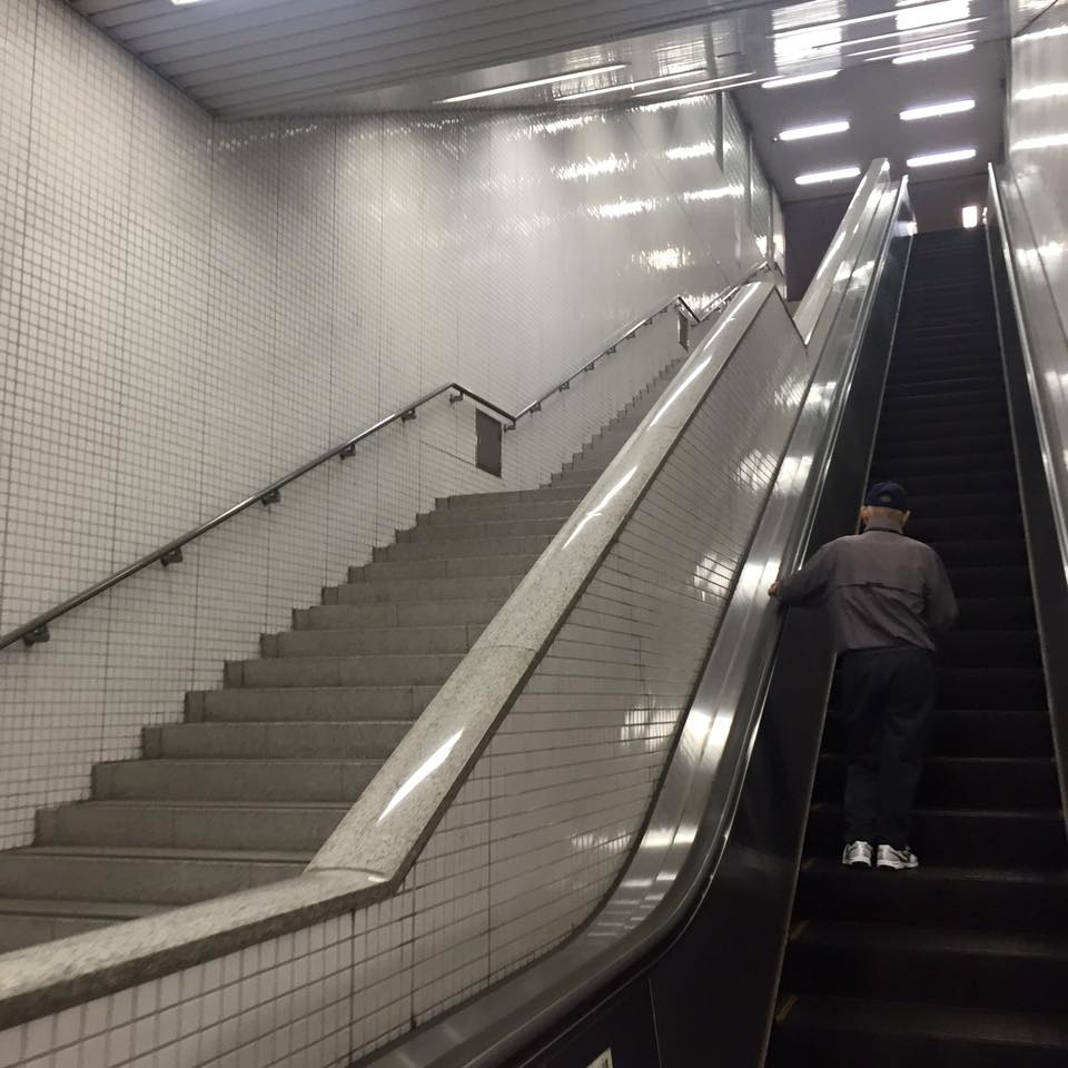
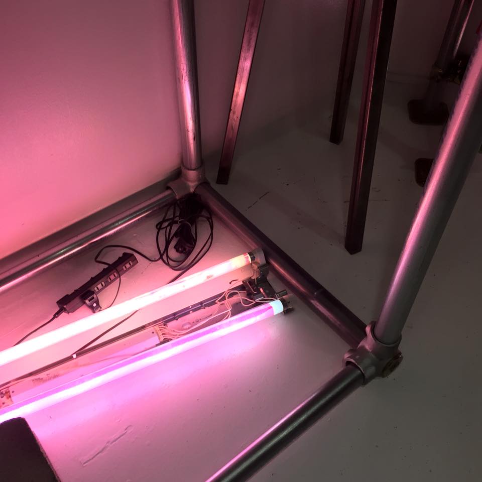
Hikari is my photo series of iPhone-shot imagery from throughout my trip across Japan in November to December of 2016. I hope you enjoy these squared close-crops of the most beautiful, sometimes intricate, oft-impacting lights of this country like no other.
BEAÚT
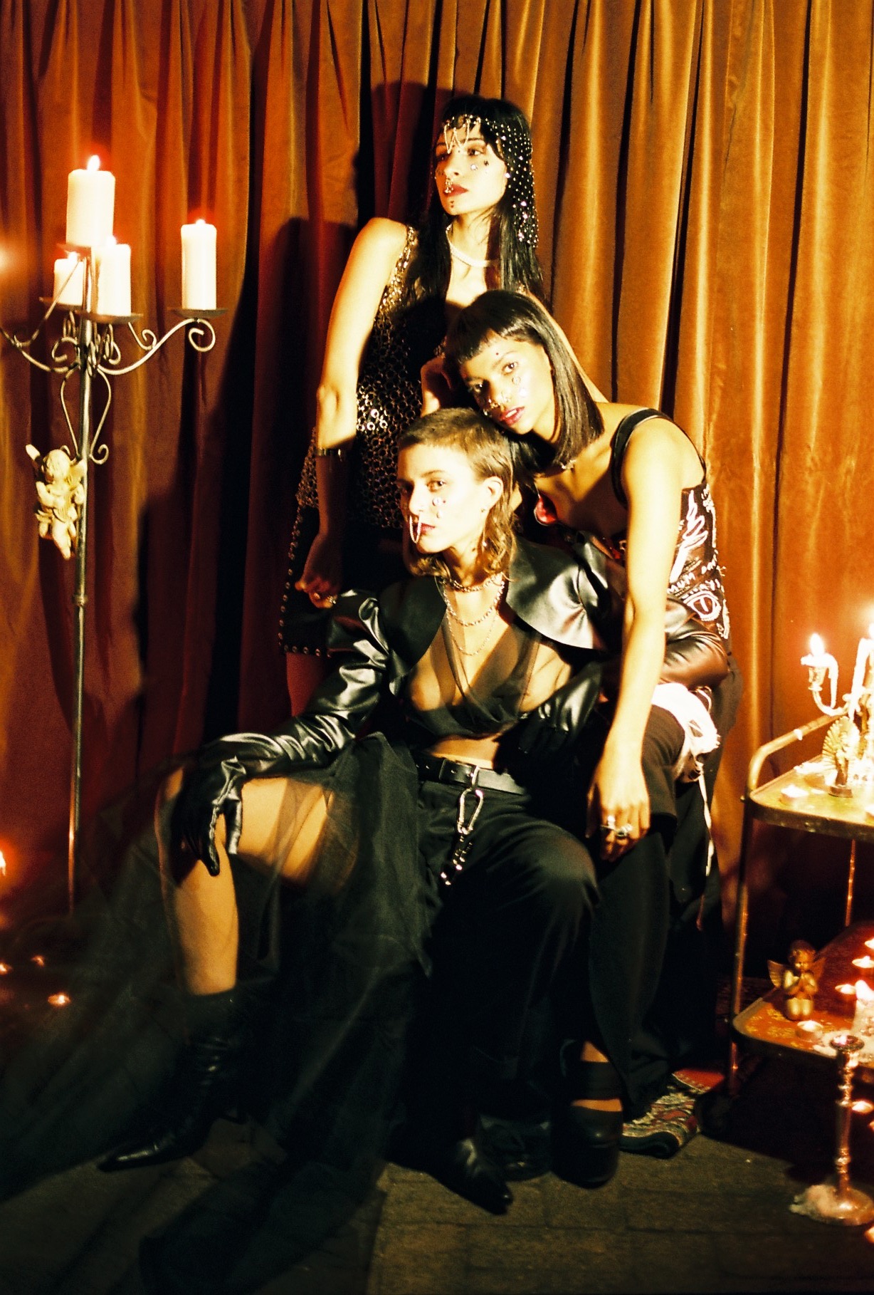
This darkly romantic, nu-goth nostalgia-fest was a concept just begging to be executed - and so it was, in the most stunning way imaginable by a team of superstar creative babes.
Photographer: Hannah Alexander
Designers/Stylists/Directors: Lucy Dickinson, Emily Andersson, Steph Schafer
HMUA: Chloe Rose and Gabby Webb
Models: Georgie and Kristen
Photography by Bryn DC
Hair, makeup, styling by Helena Regina Smythe
HYPERMNESIA 99
This was my second time working with Bryn and third with Helena, and they’re the sort of people you can’t help but look forward to shooting with. Bryn’s meticulous brand of photography is inimitable, emphasising the story elements behind the characters he dreams up and develops. Gritty, dark, empowered - it’s an honour to be chosen to portray these kinds of strong and dynamic women. Not to mention, the skillful handiwork that goes behind creating the costumes and makeup looks in collaboration with Helena - it’s hard to not admire creatives who are really able to tap into multiple fields to bring their vision to life. The many intricate pieces of armour and costume I wore came together terrifically, as did the various hair and makeup details (how killer are those green extensions?!). Helena created dimension and texture by griming me up with Essence of Parisienne, which I swear smelled delicious in a very unexpected way, and Bryn’s keen eye for detail brought these cinematic, impactful images to life. Having the chance to work with these two incredibly talented individuals is not something to take for granted!
Thank you both for having me!
LIPT
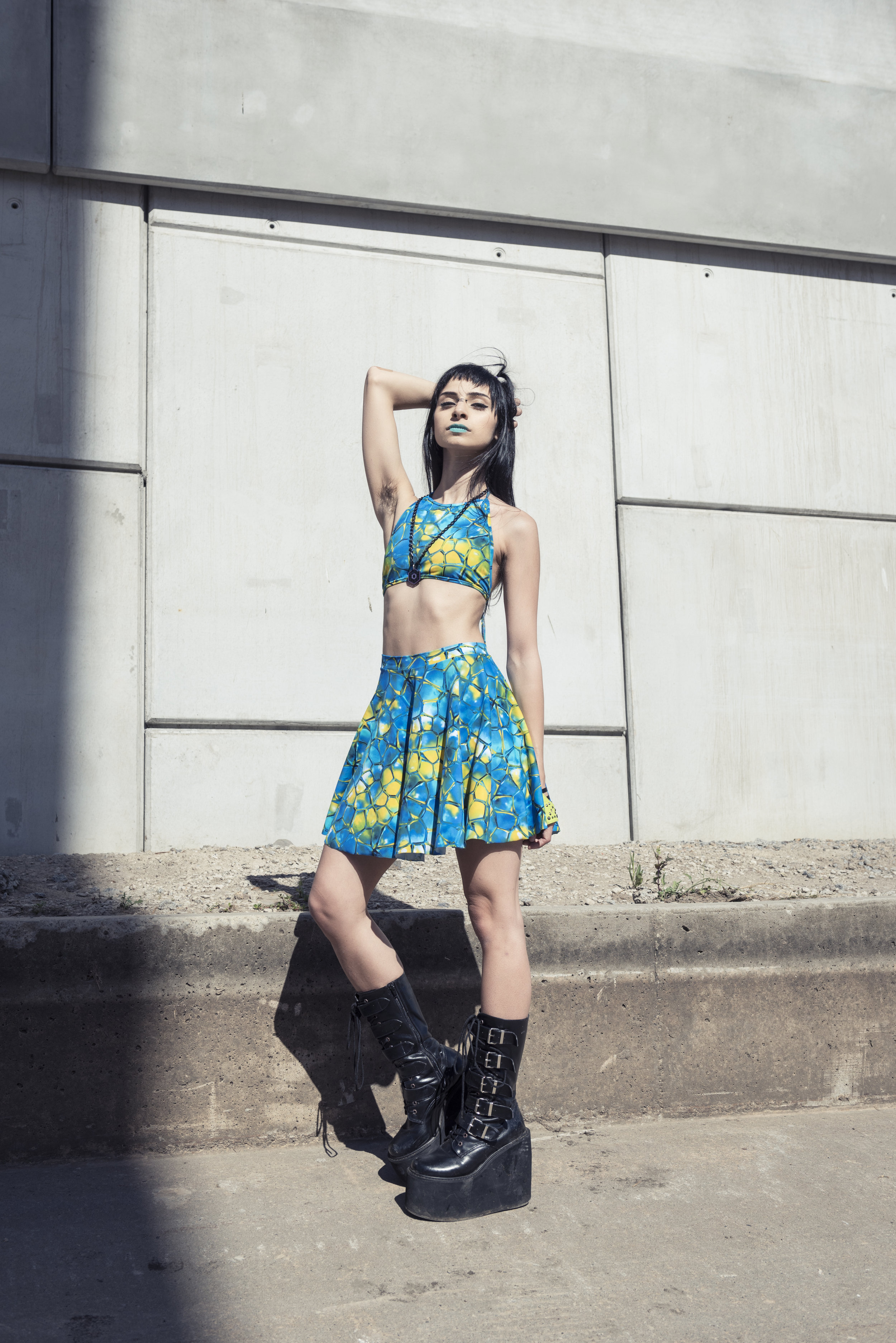
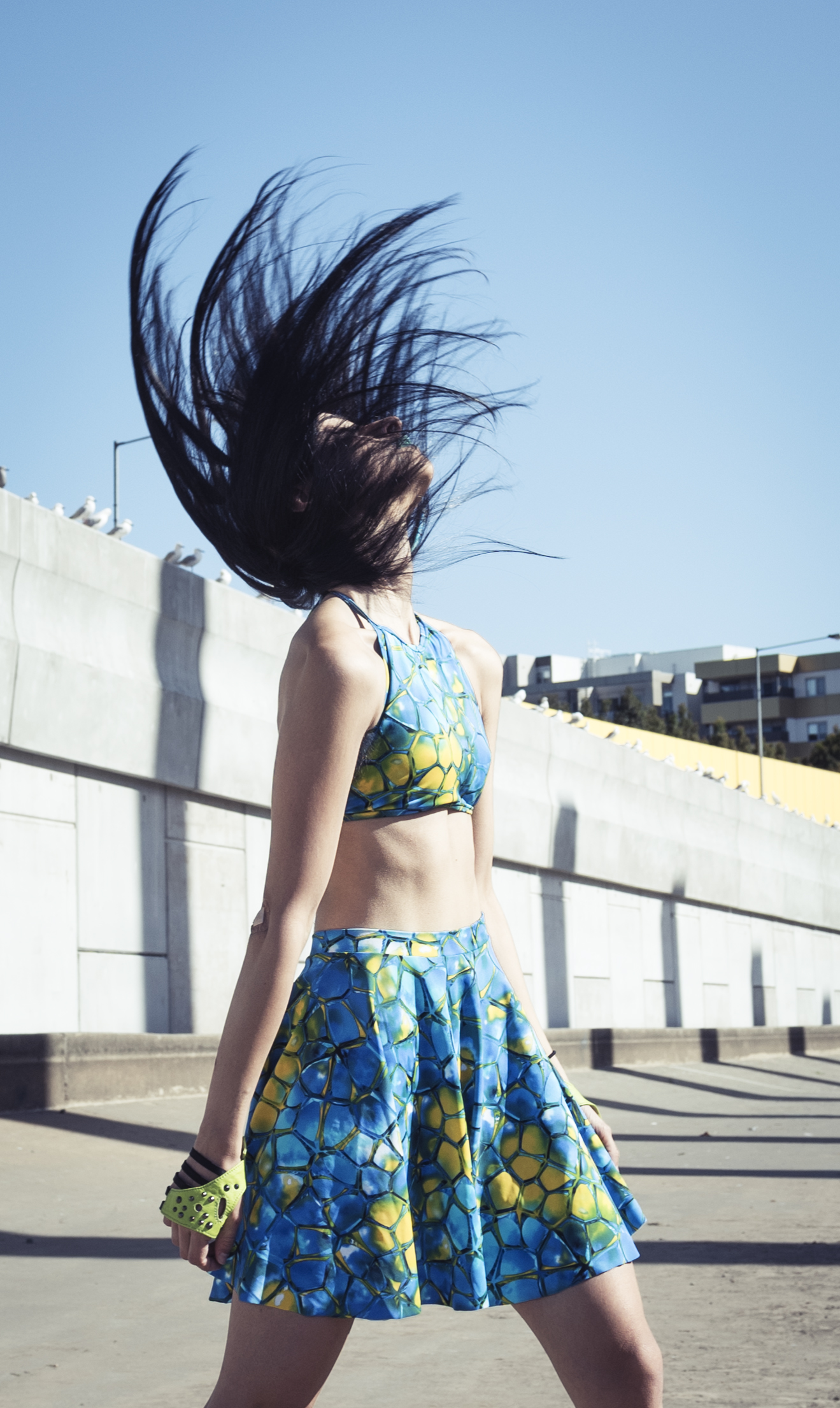
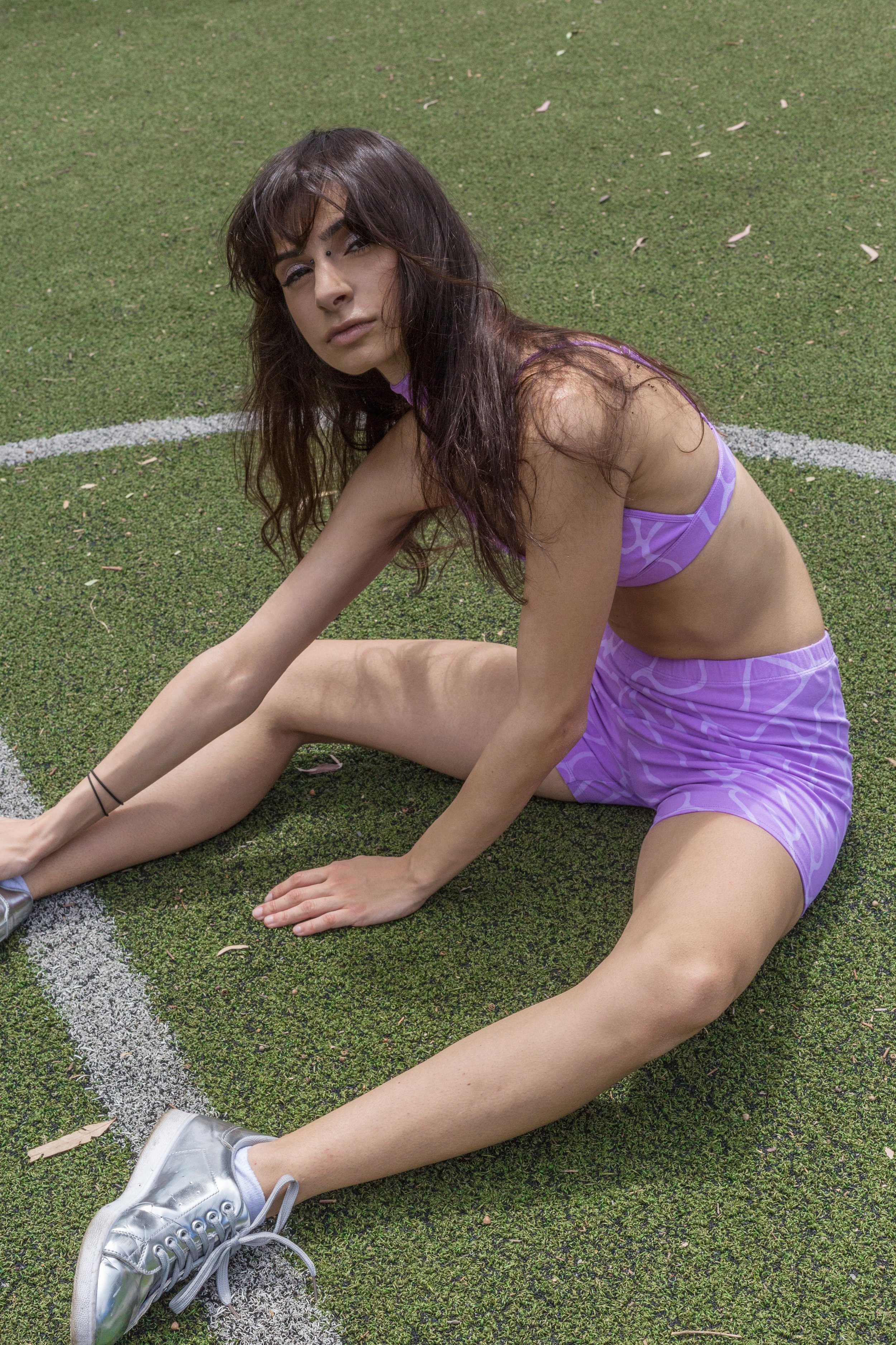
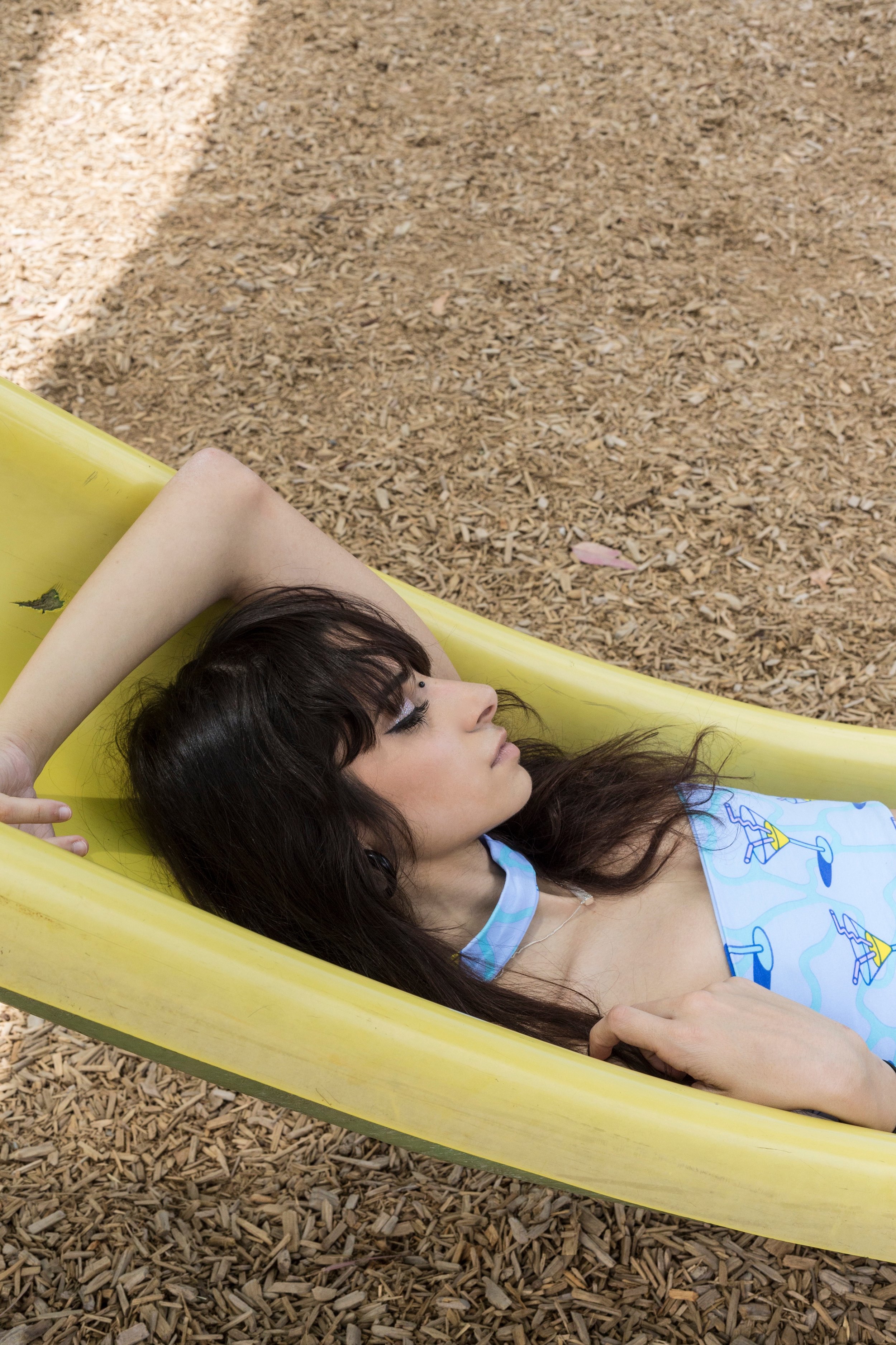
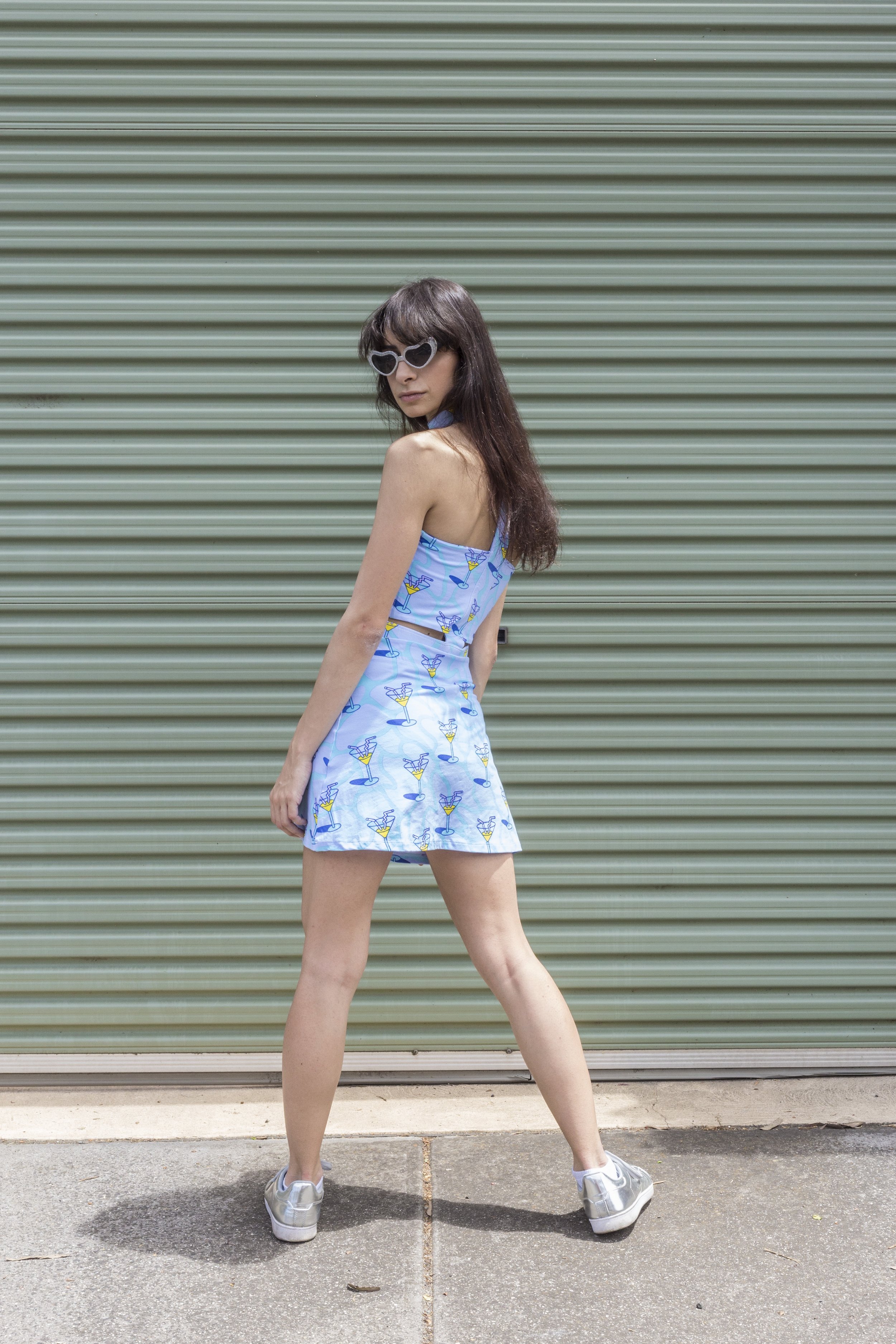
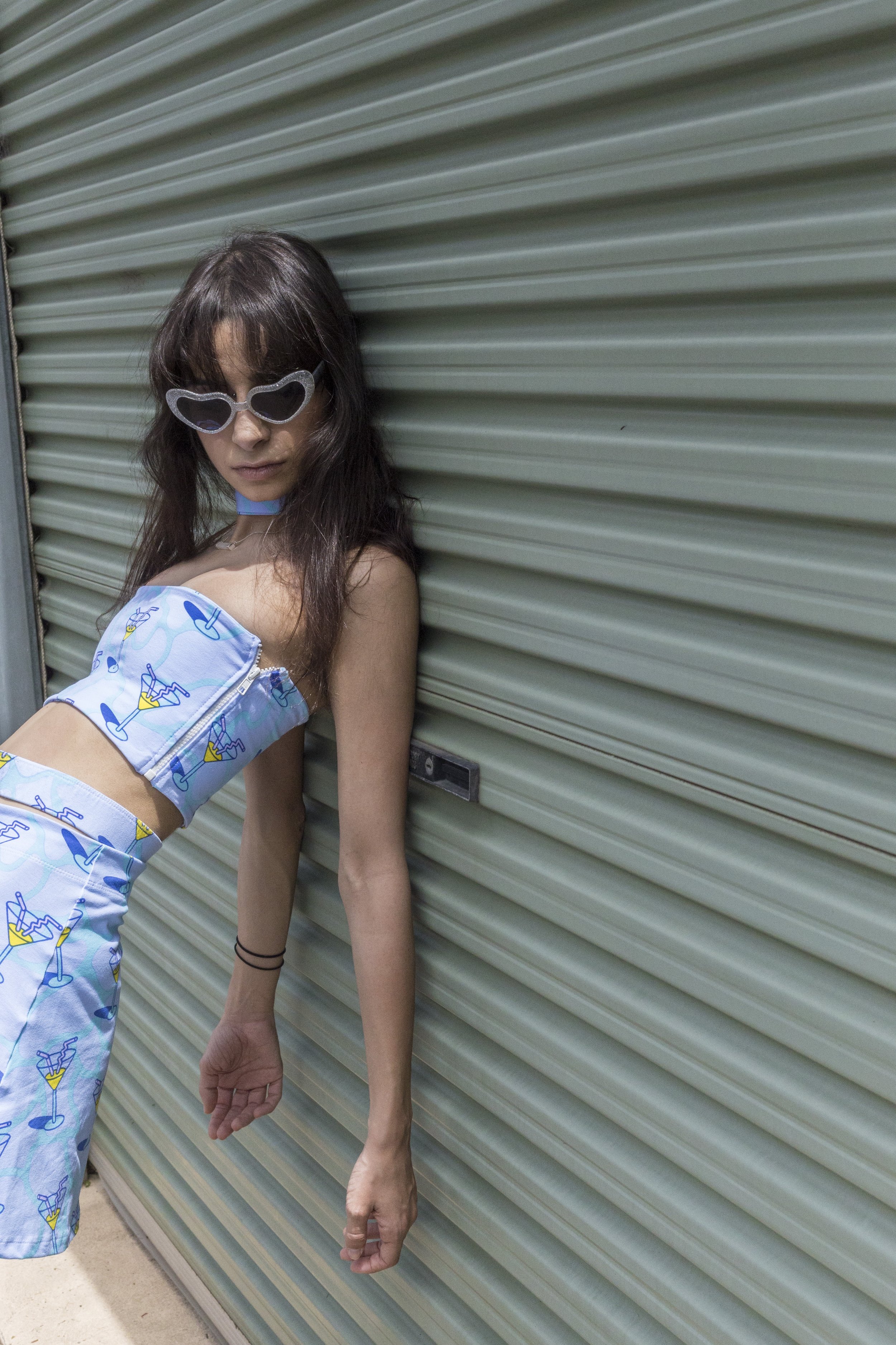
We shot on a scorcher of a day, but working with this killer team of babes around the Abbotsford area was a great way to enjoy the sunshine. I loved playing around in LIPT's über-cute signature printed garments, some of the comfiest co-ords and dresses I've had the pleasure to play dressups with. After hearing Jodie's (one of the masterminds behind LIPT) story about the brand's fruition (the label's name has it's roots in Perth slang, who knew? Well, I didn't anyway), you have to give props to their nationwide hustle. LIPT's been seen on some of the most kickass young female DJs of the country, so naturally I was stoked to shoot in these colourful pieces.
Thanks for having me, babes!
Photographer: Bianca Lamont
Designer/Stylist/Director: Jodie Ruoso
HMUA: Kaelie Todorovski
SHOP LIPT THE LABEL
JACKIE
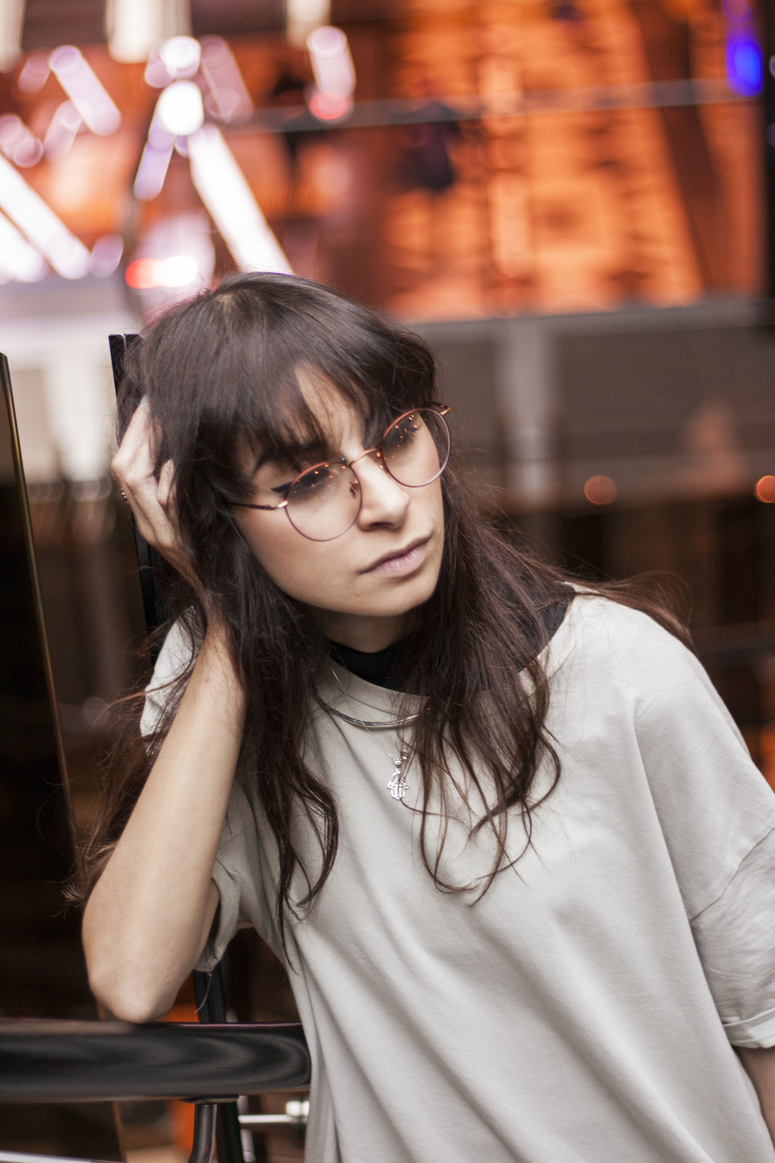
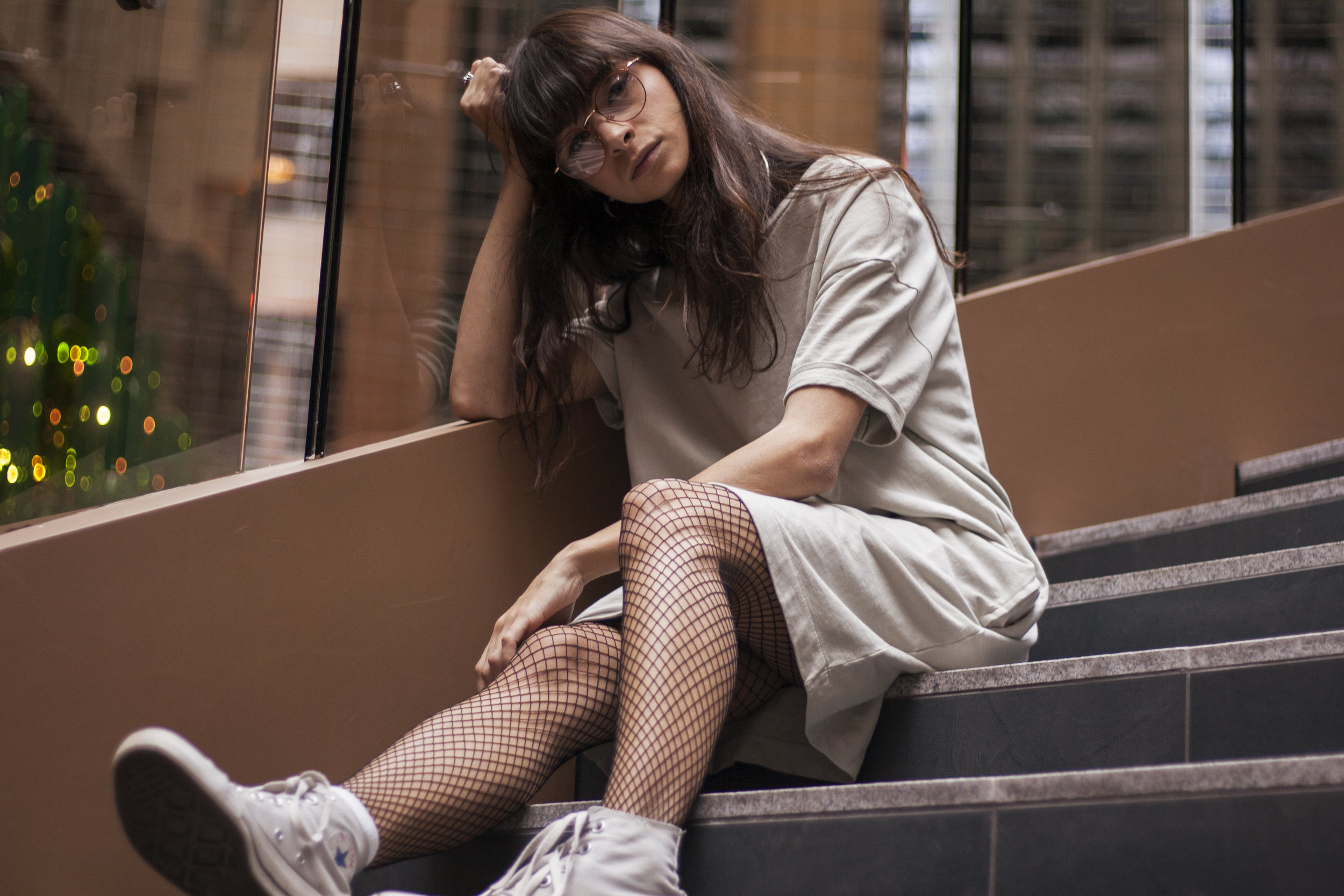
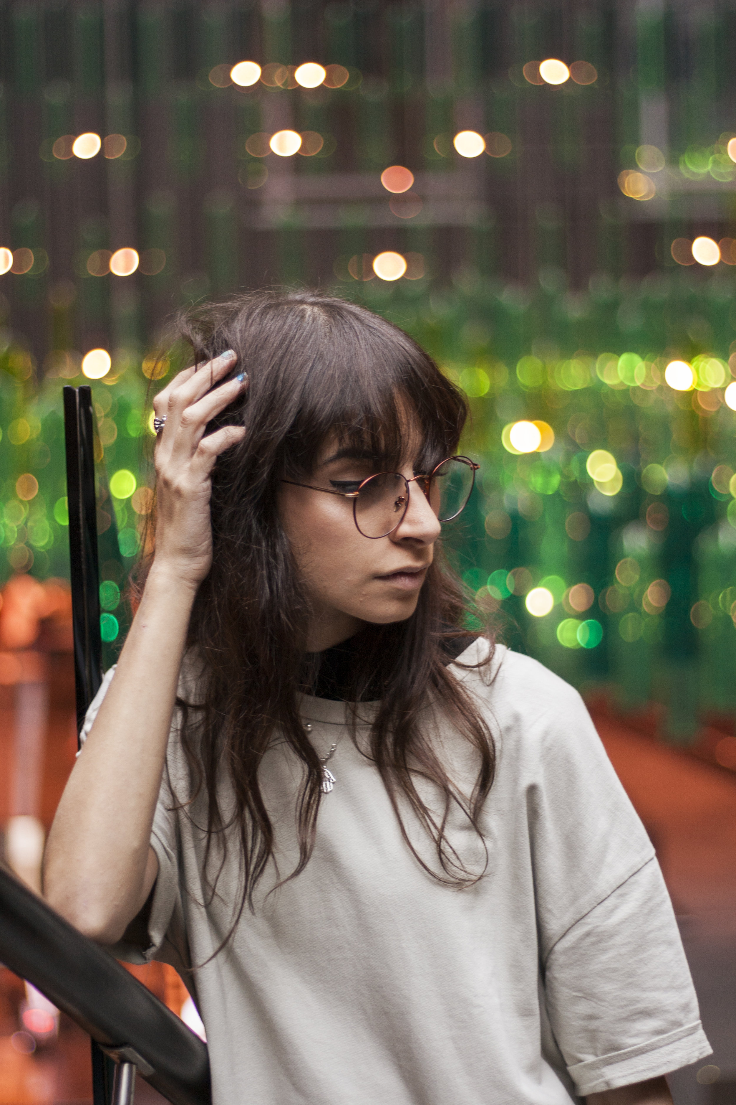
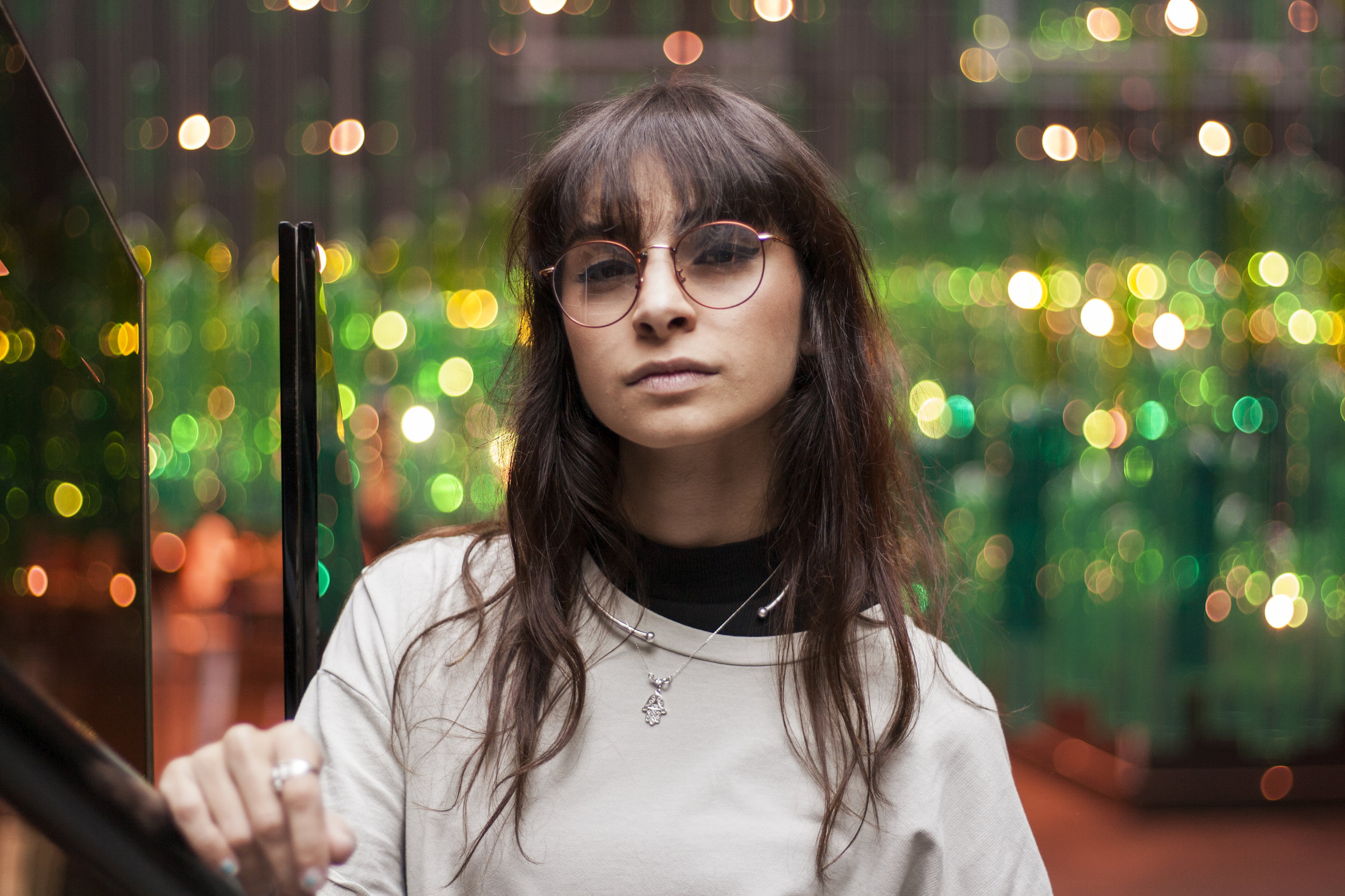
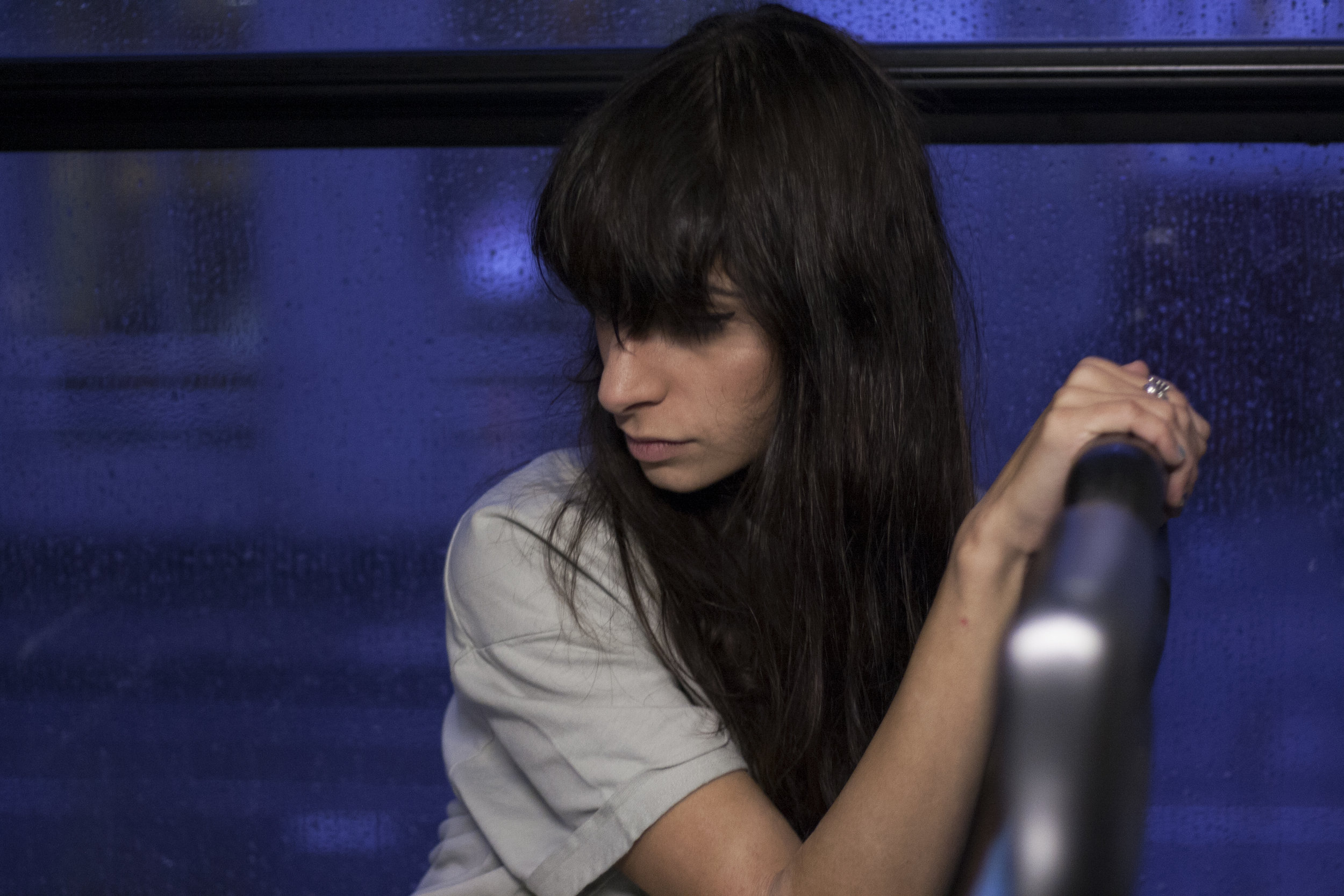
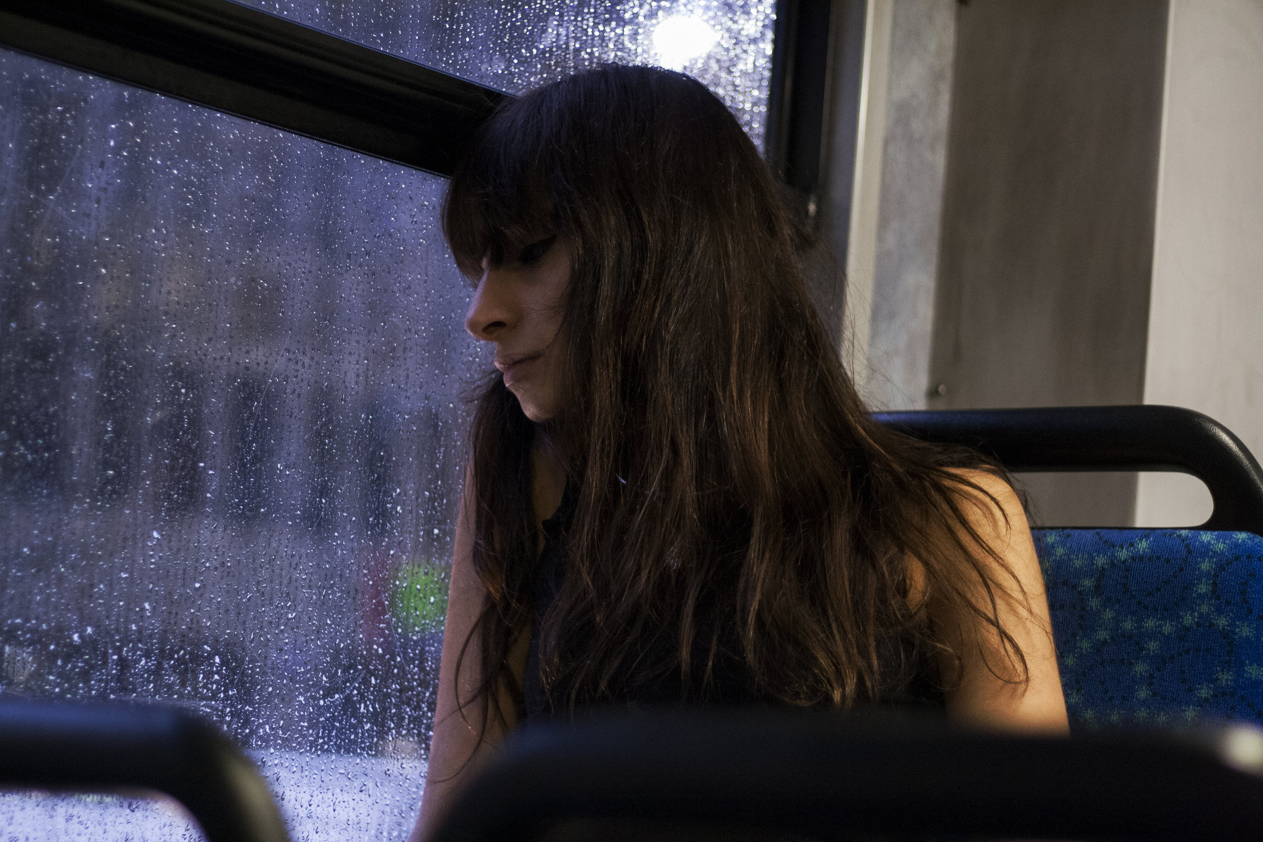
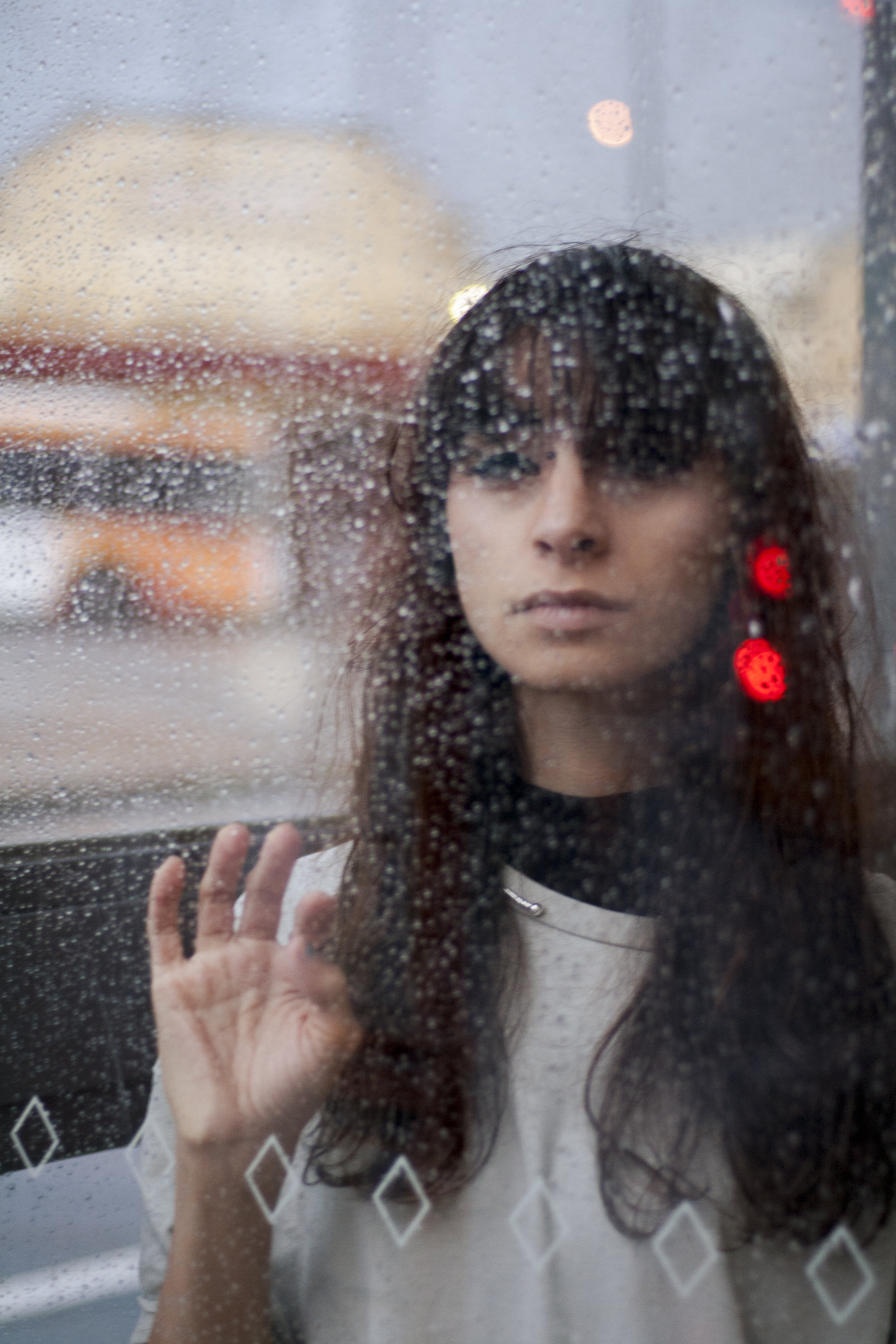
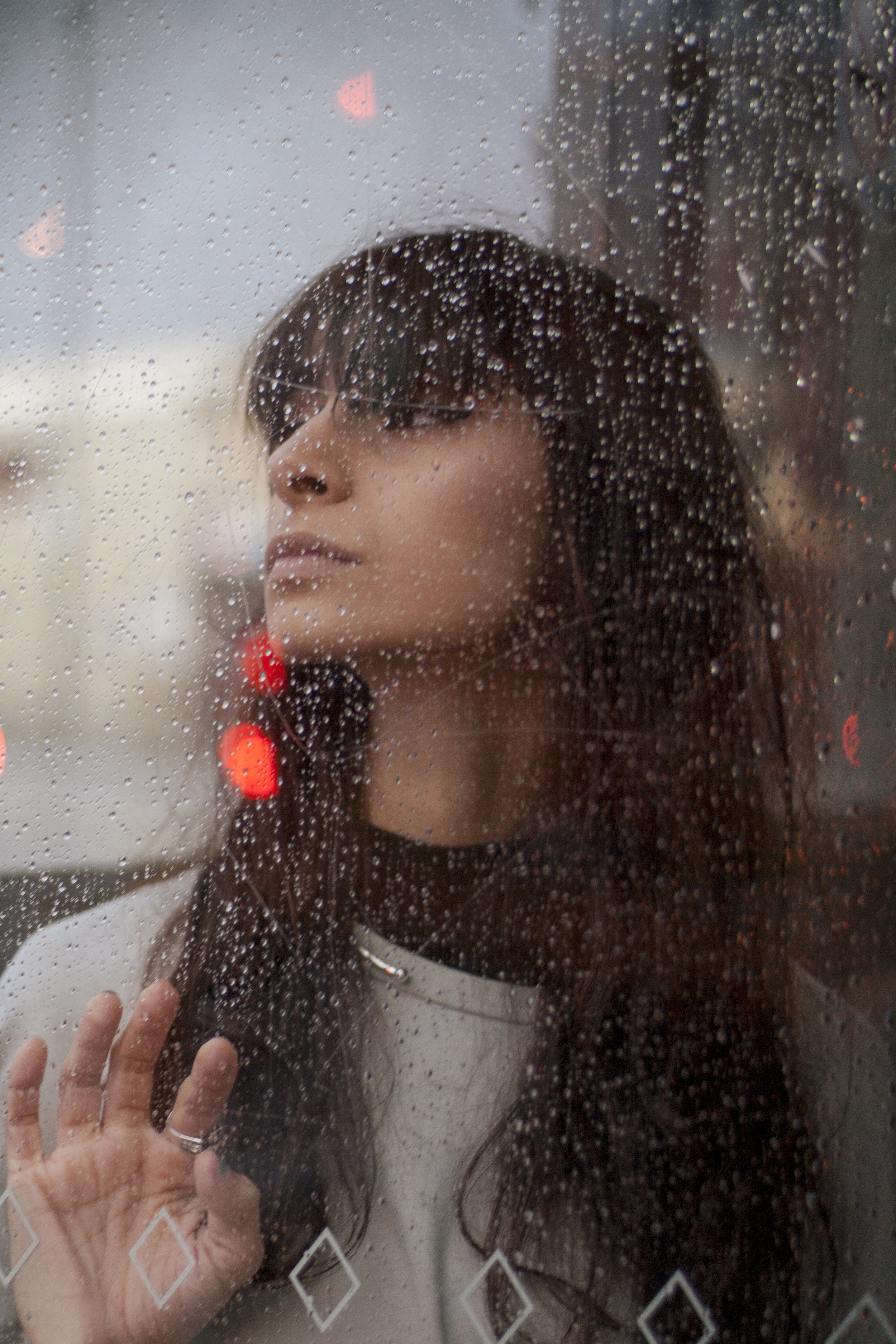
Thank you Jackie, for taking these beautiful portraits of me - although I often love reverting to strong poses and strong presences in front of the camera, the softness and moodiness of this shoot is something that I've fallen in love with. Thank you for coaxing out my vulnerable side - this is one of the only times I've been able to appreciate Melbourne in it's native rainy state.
PS. I'm totally obsessed with these glasses from TIJN Eyewear!
TETRIK
Every once in a while, you have the good grace and fortune to work with people who are full of light, positivity and creativity, and every time you do you get to know that the resulting works will be stunning no matter what. This is what I was able to experience working on this Tetrik shoot with Bri and Kim - it’s what makes shoots feel like fun instead of work, and reminds me why I love shooting.
I’m madly obsessed with these gorgeous threads by Tetrik, it’s the ultimate combo of comfort and style, which is a line I’ve really been toeing lately (I’m sorry that I keep wearing what could probably pass for pyjamas to uni, but also, I’m really not sorry at all). Everything’s black so obviously, I die for it.
Photographer: Briannagh Clare Photography
Models: Myself and Kim Little
SHOP TETRIK
OTHERWORLD
Photography by Bryn DC
Hair, makeup, styling and headpiece by Helena Regina Smythe
#OTHERWORLD21 ...if you know, you know...
A huge thanks to the incredible Bryn, Helena and Izzy who took the time out of their day to help bring this otherworldly creation together!
GIRLHOOD
This shoot was definitely one of the more fun creative projects I’ve had the pleasure to be a part of. A true girl gang of six talented women came together for this day in the sun, and Ellen, the creative director behind the shoot, actually made and brought pink lemonade vodka - I'm pretty sure that's all I need to say to indicate how high the vibes were on this one.
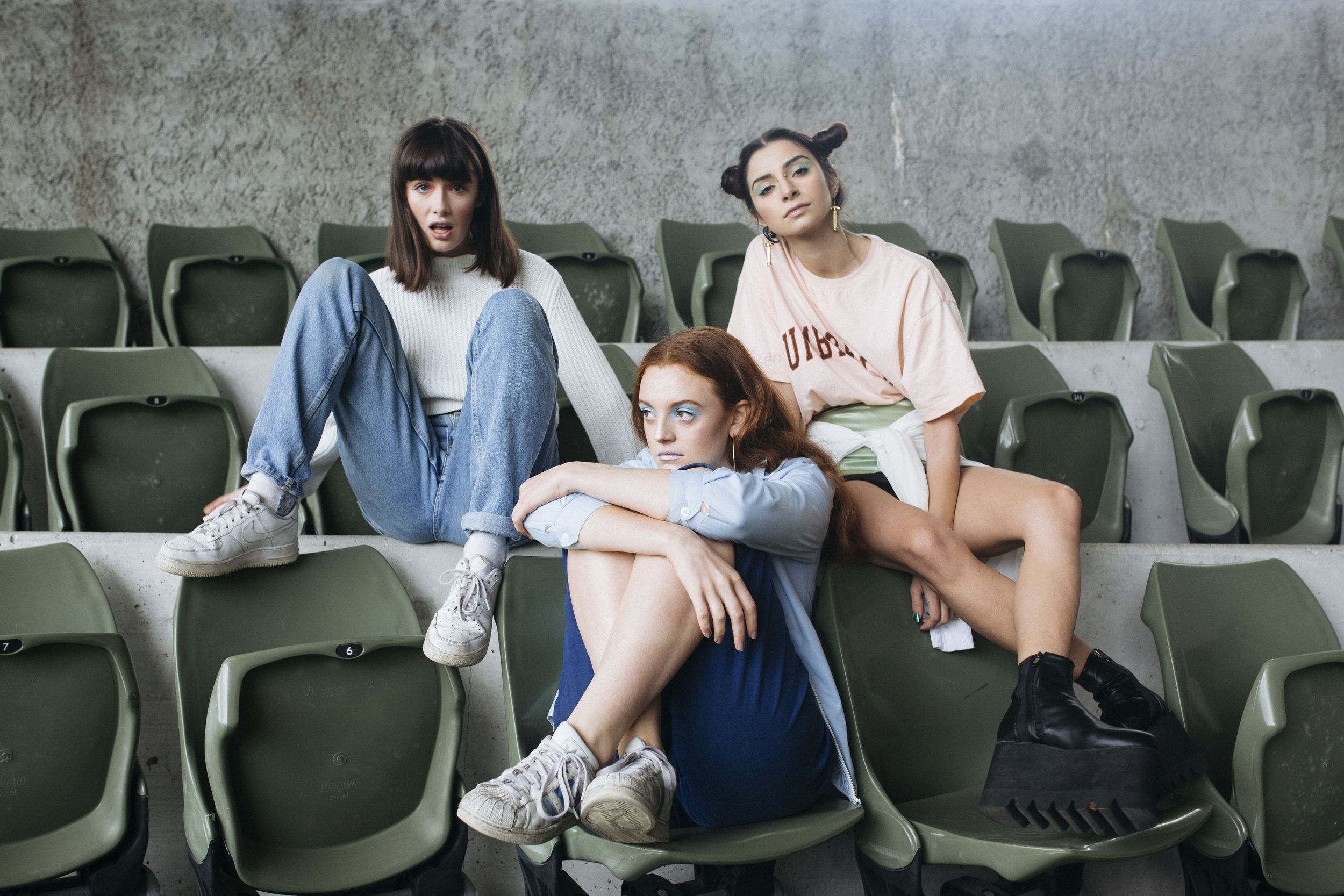
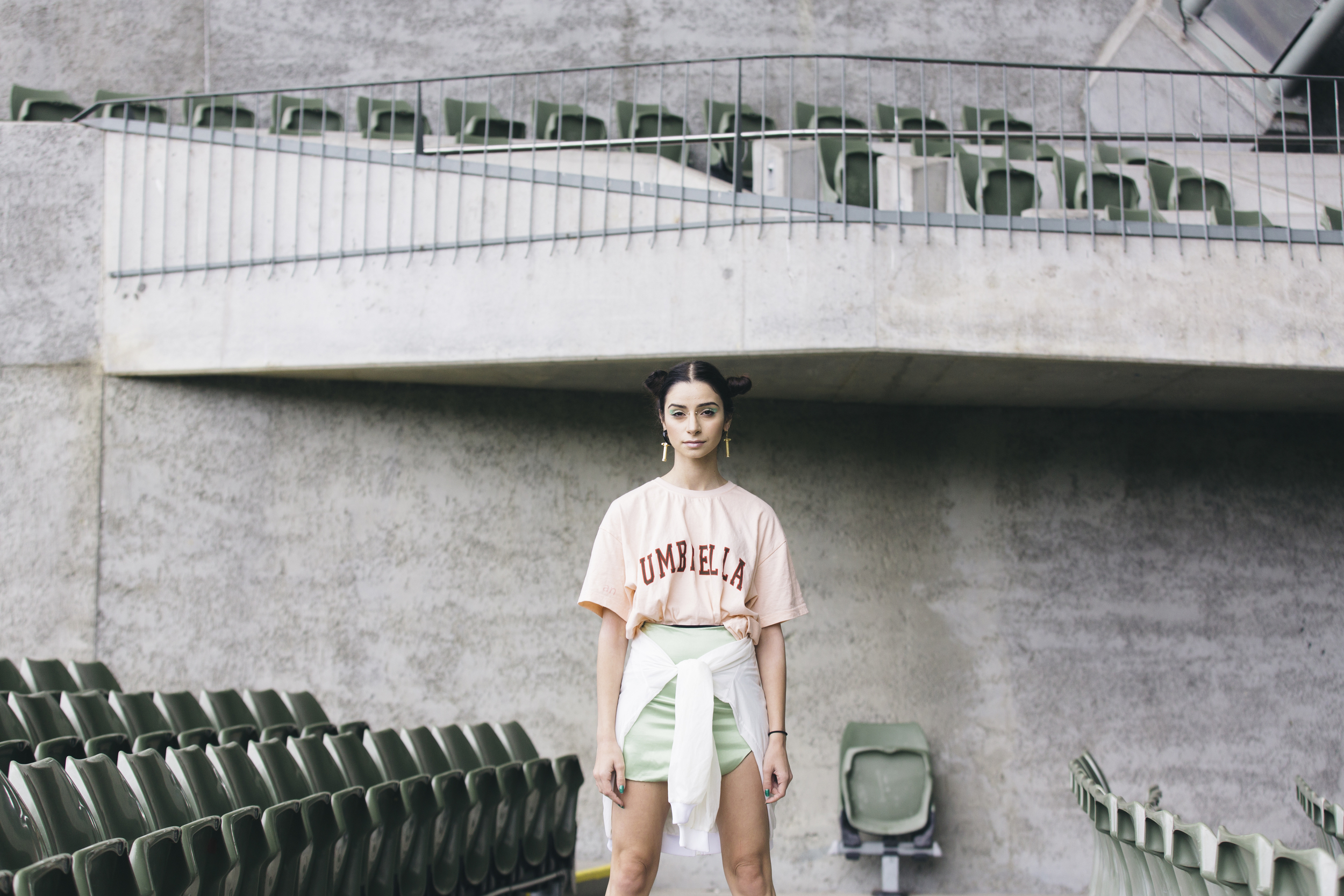
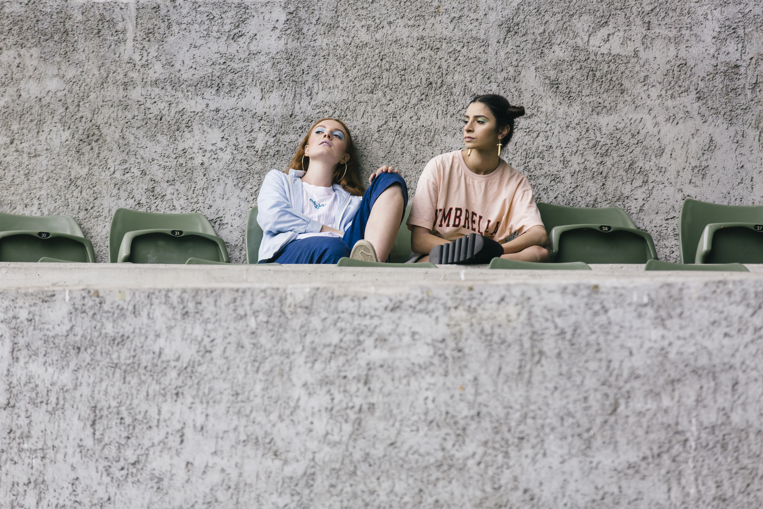
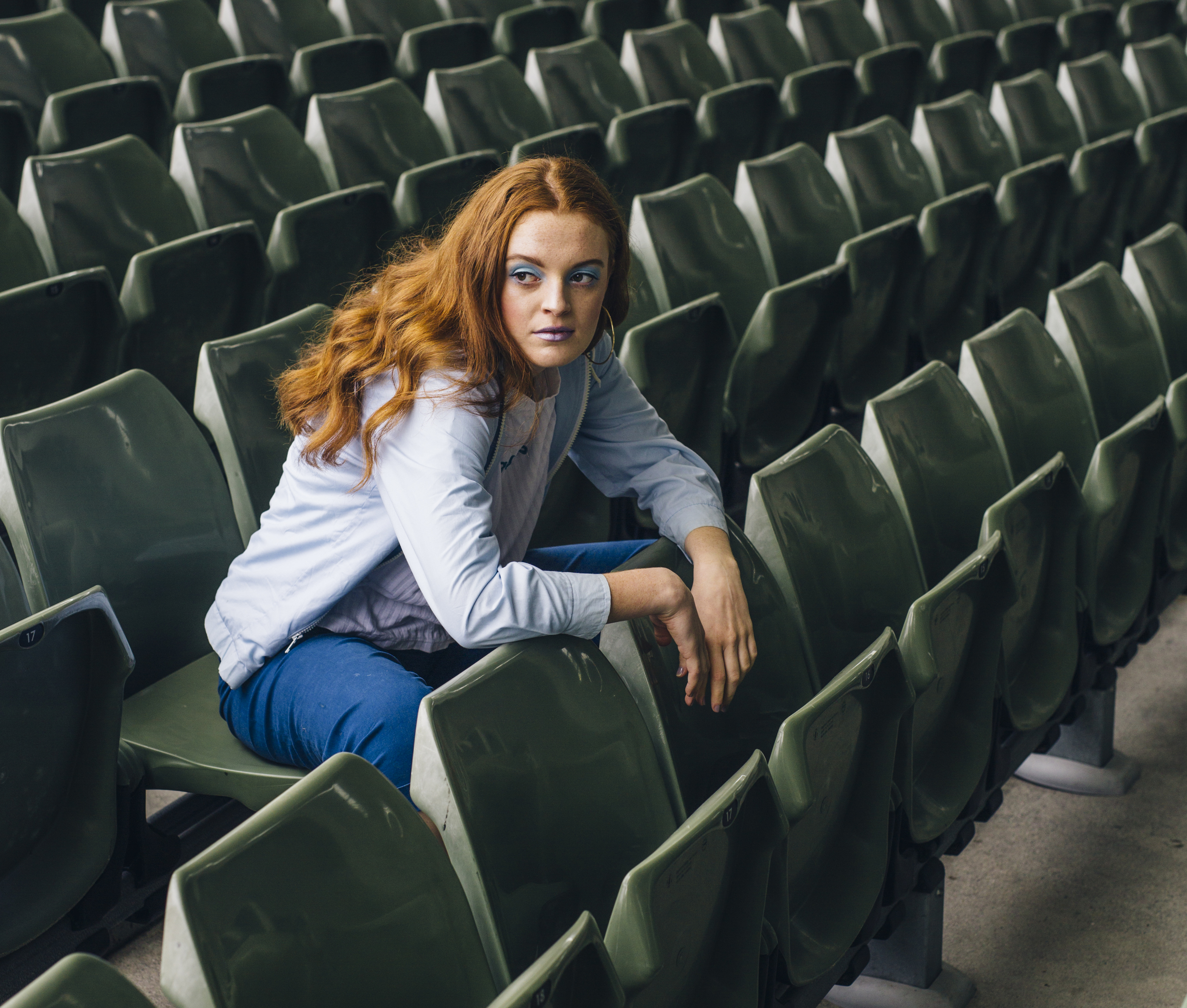
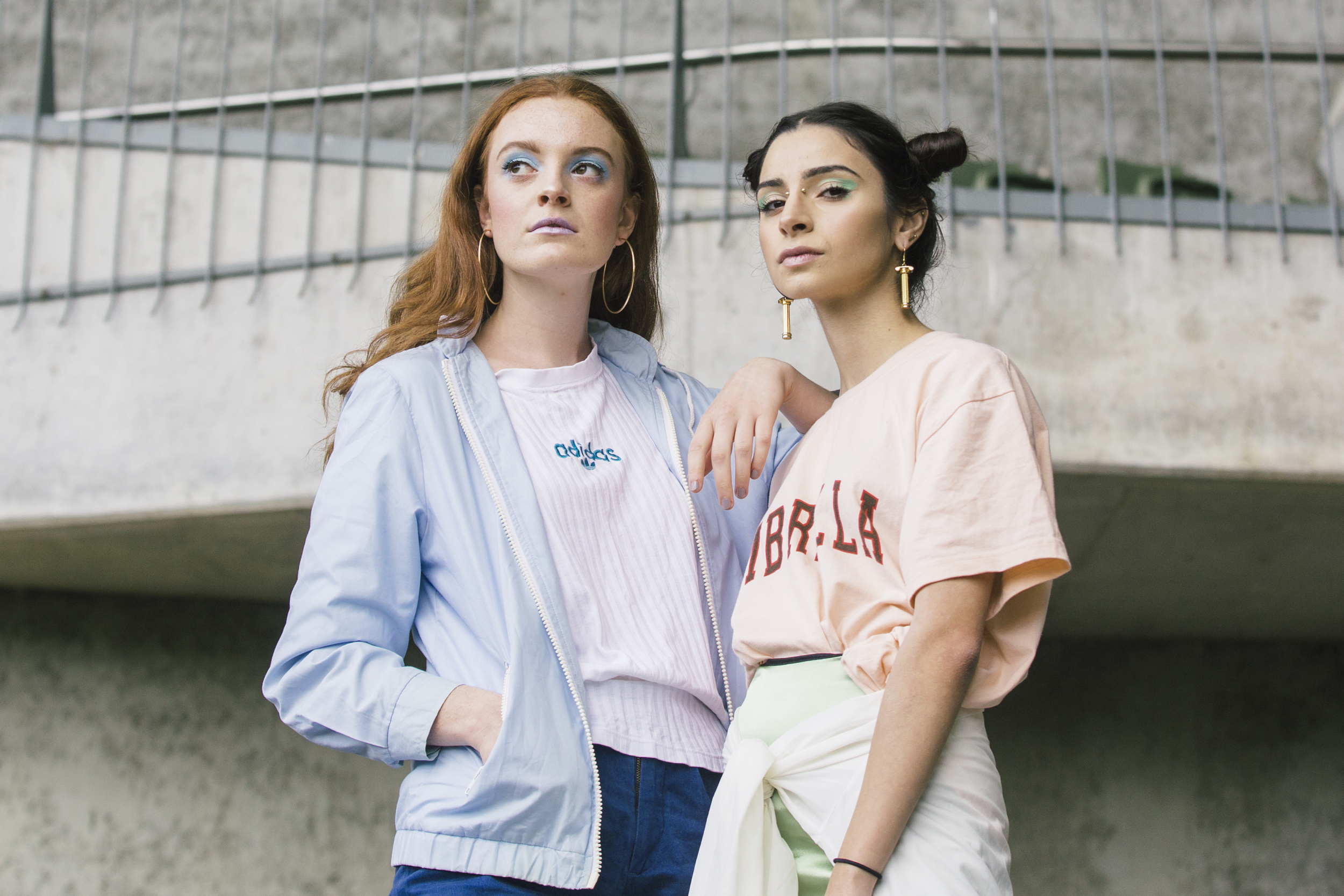
I loved the way the idea behind this shoot seemed to marry a youthful innocence along with the tenacity of rebellion in the feminine adolescence. Pastel-ized babes smoking in the school bleachers, with peeks and pops of late 90s/early 2000s influence in the styling gave this shoot a definite charm and nostalgic feel. The second look ramped up the maturity and edge of the project, with black outfits and angular city building backdrops. I loved this look because of the capacity it granted to embrace a stronger presence in front of the camera, extending upon the idea of teenage girls on the brink of womanhood.
It was fabulous to work with the extremely talented and fun Missa and Chloe again, both of whom I was lucky enough to work with for the launch of Illicit Empress (check it out here).
Photographer: Melissa Cowan
Models: Myself, Ellen and Caitlyn
HMUA: Chloe Rose, Claudia Leahy
DUALITY
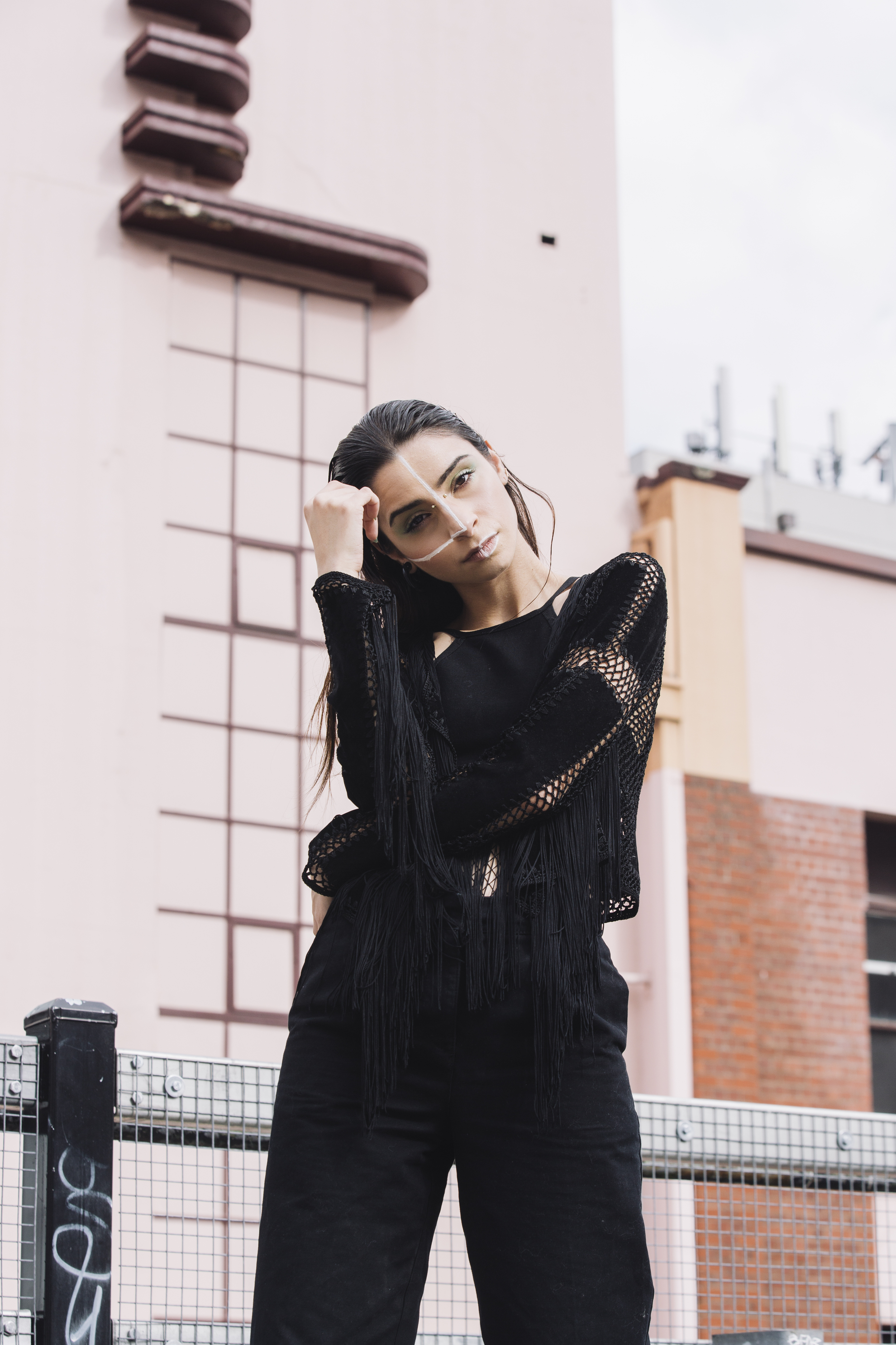
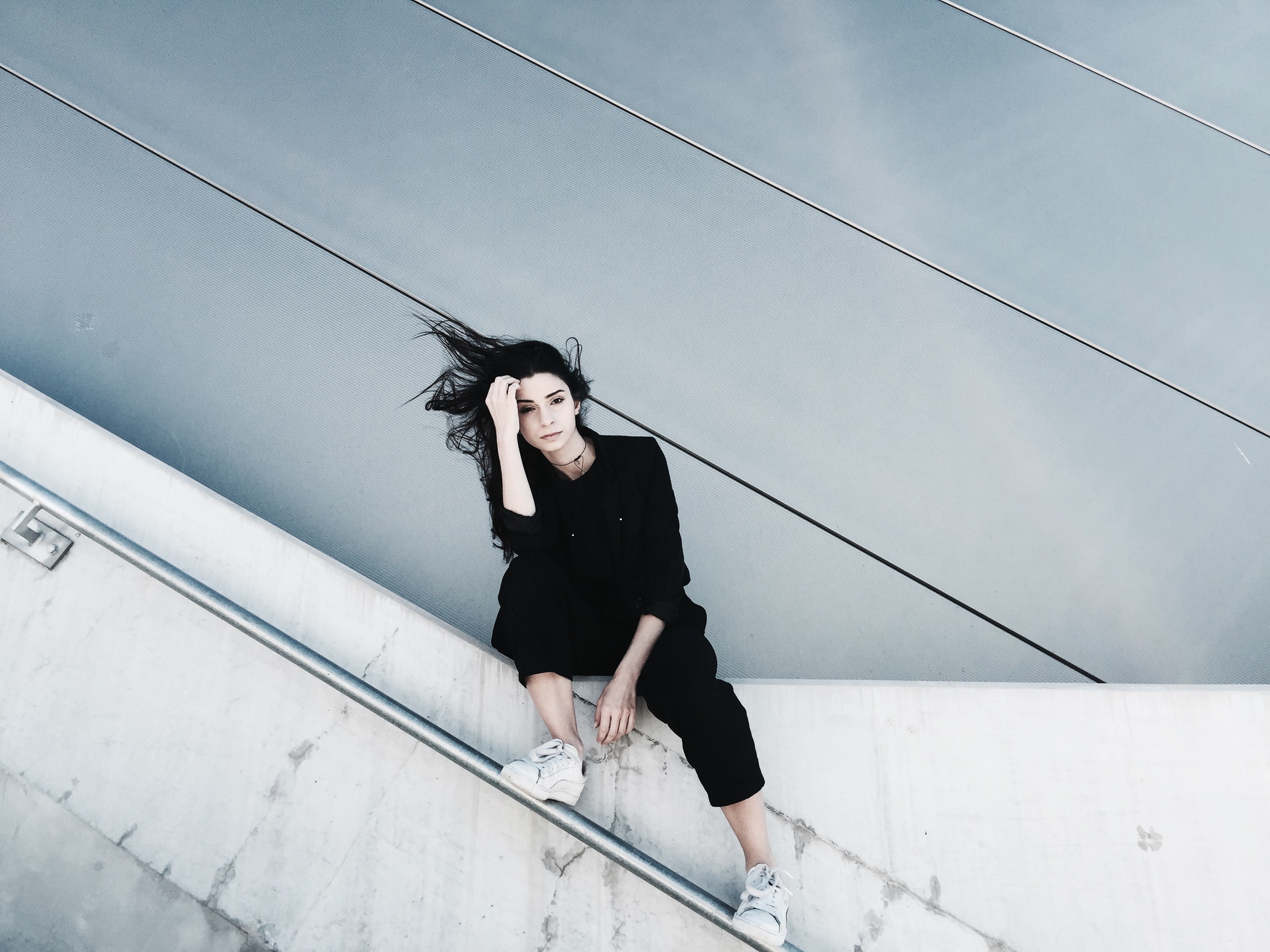
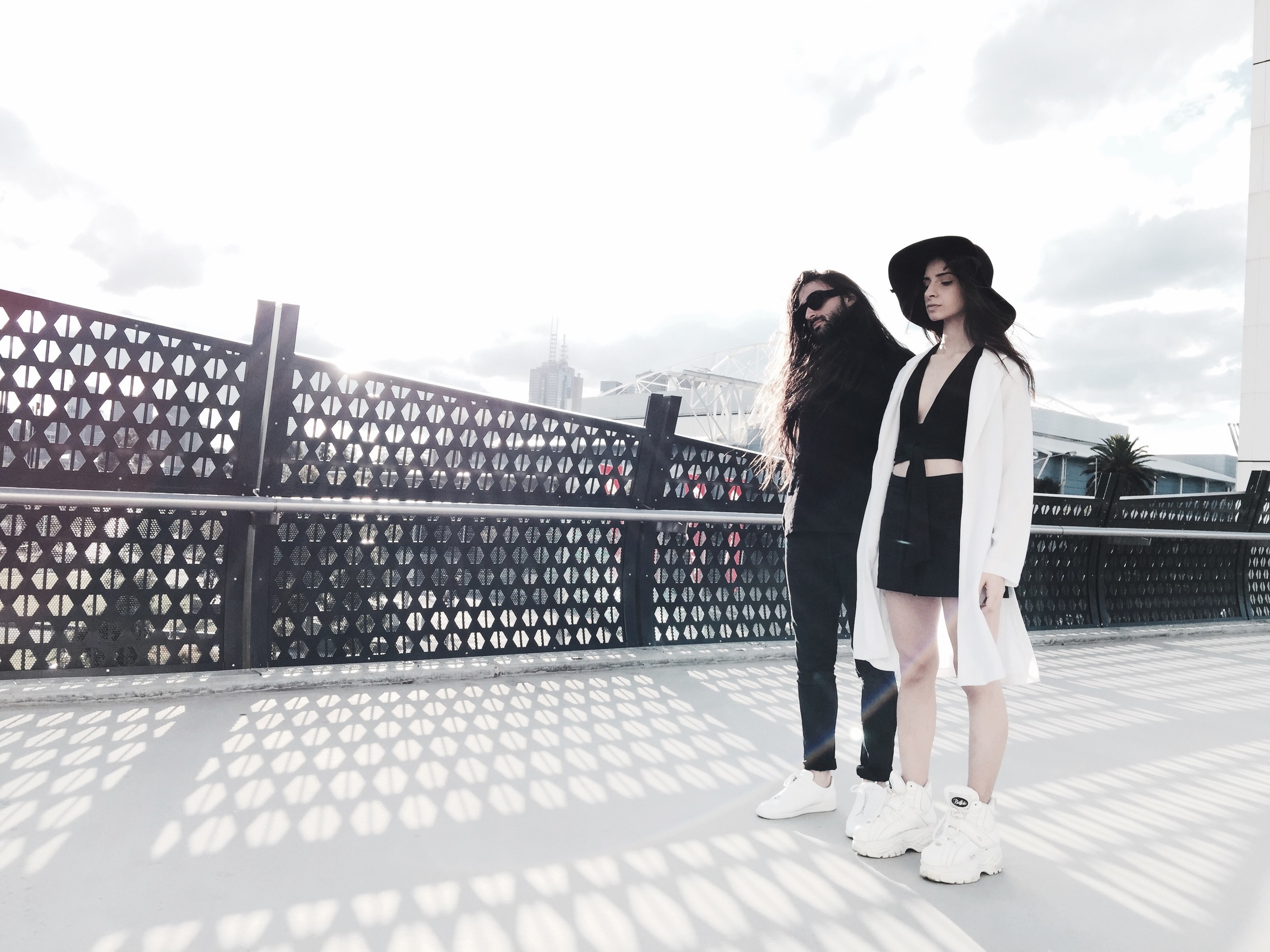
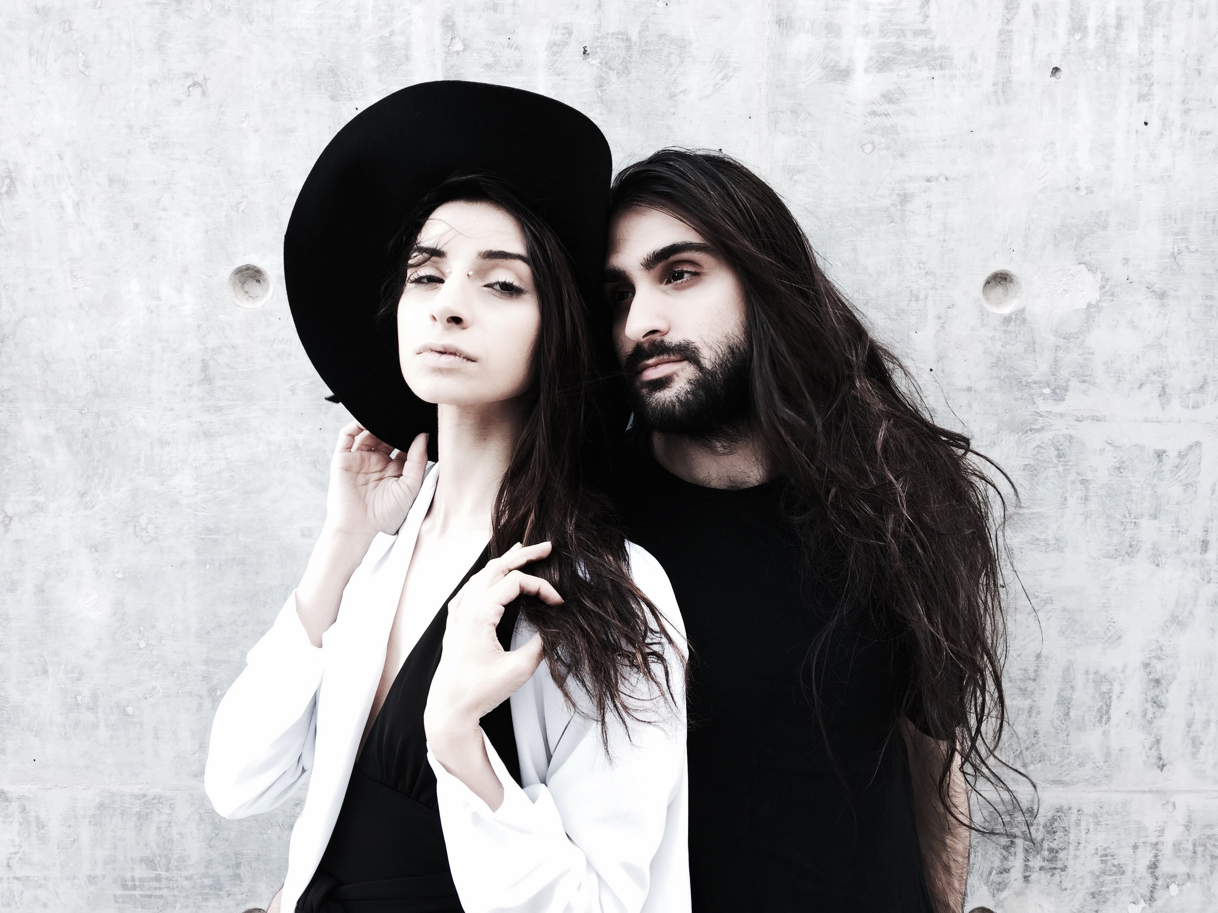
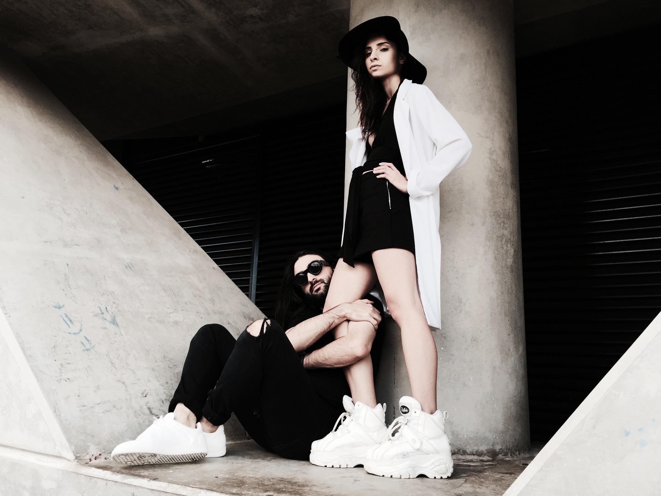
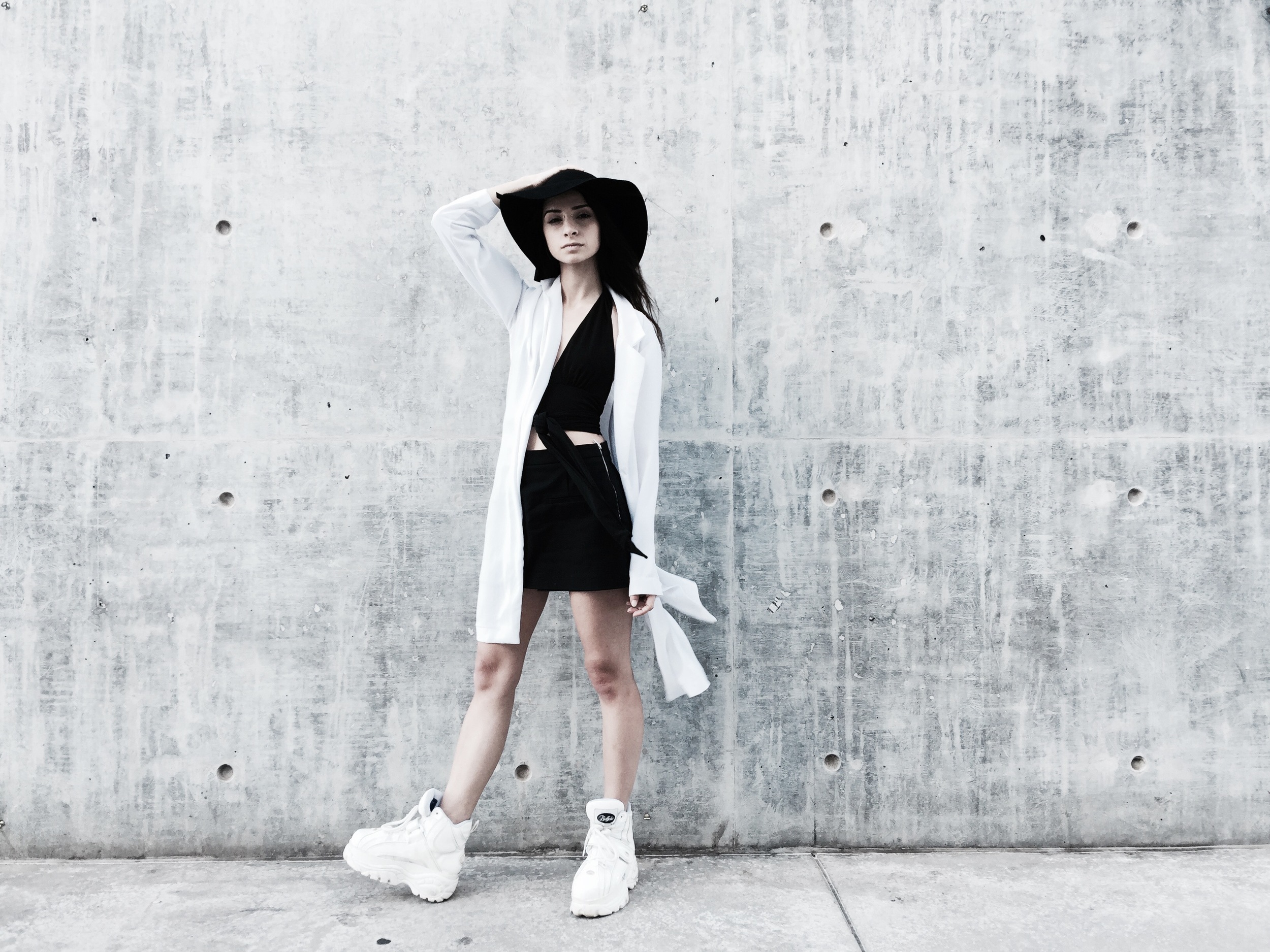
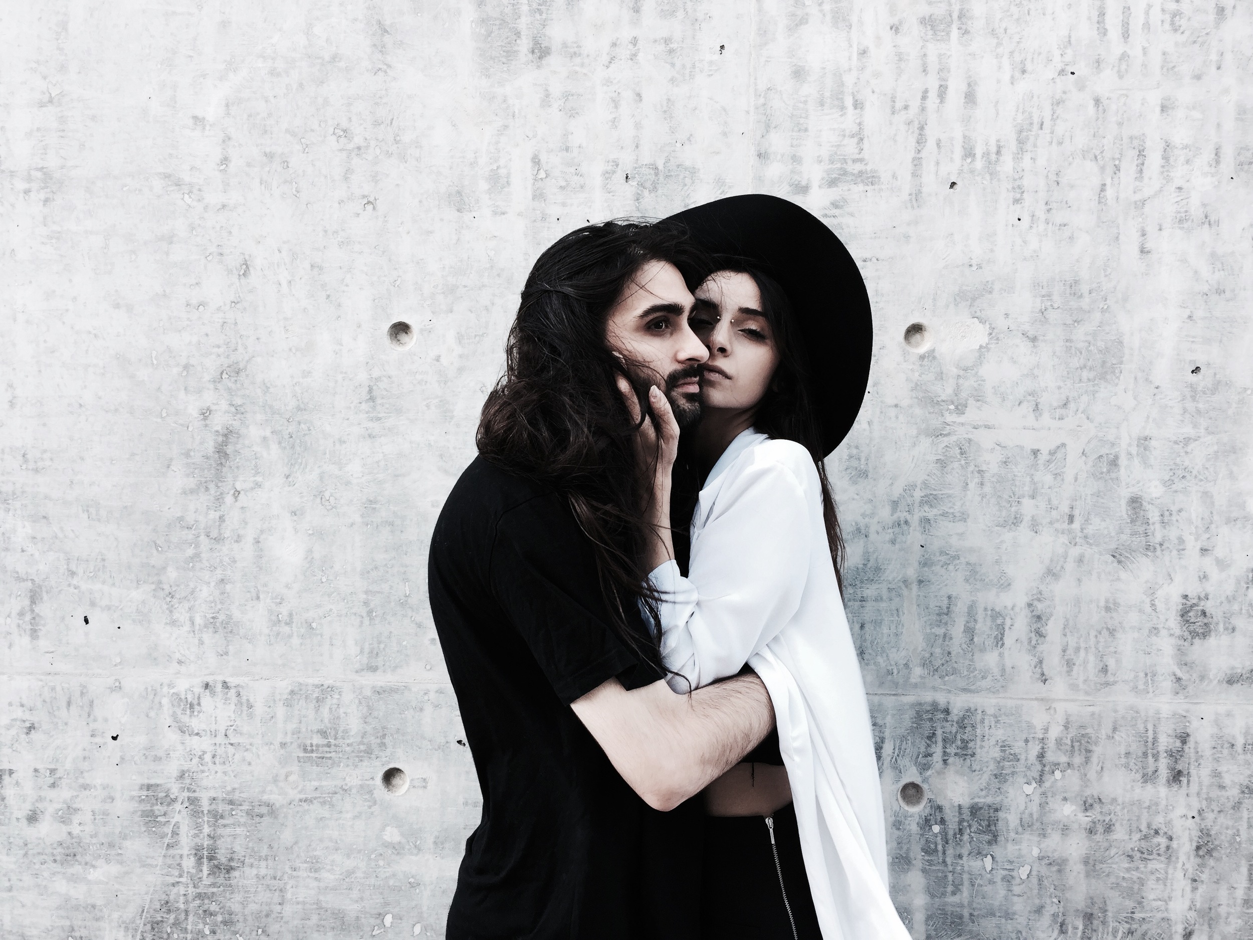
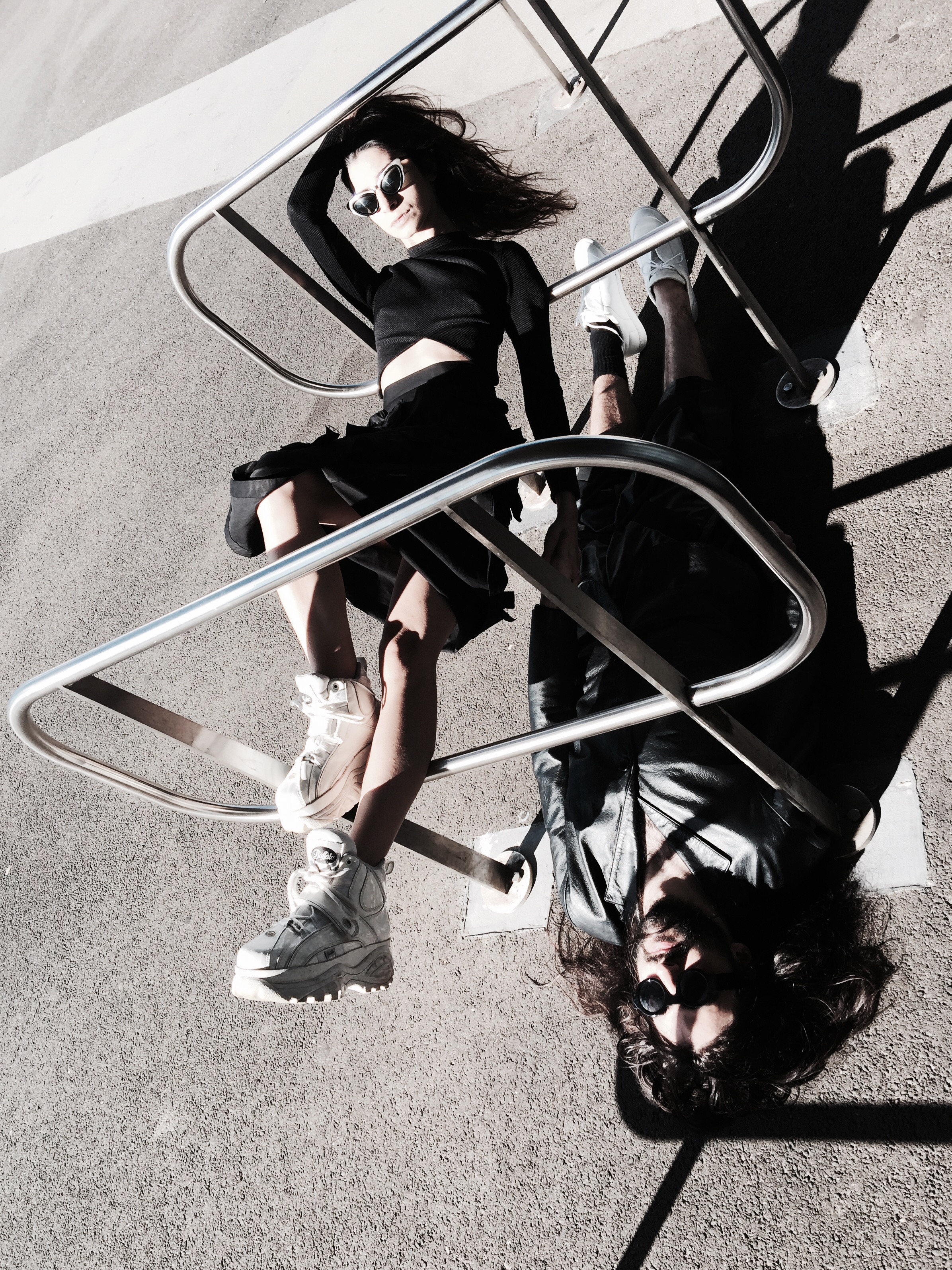
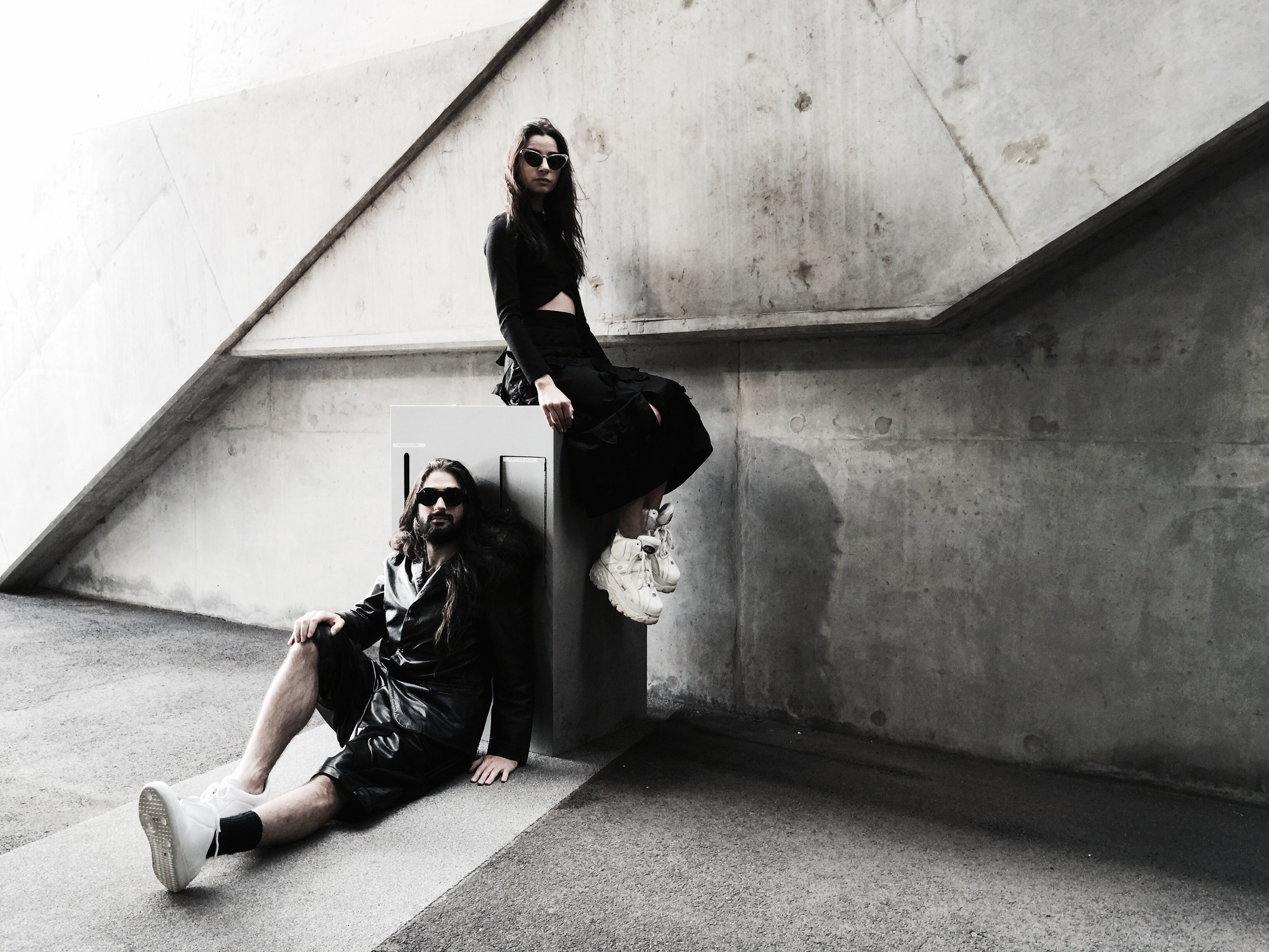
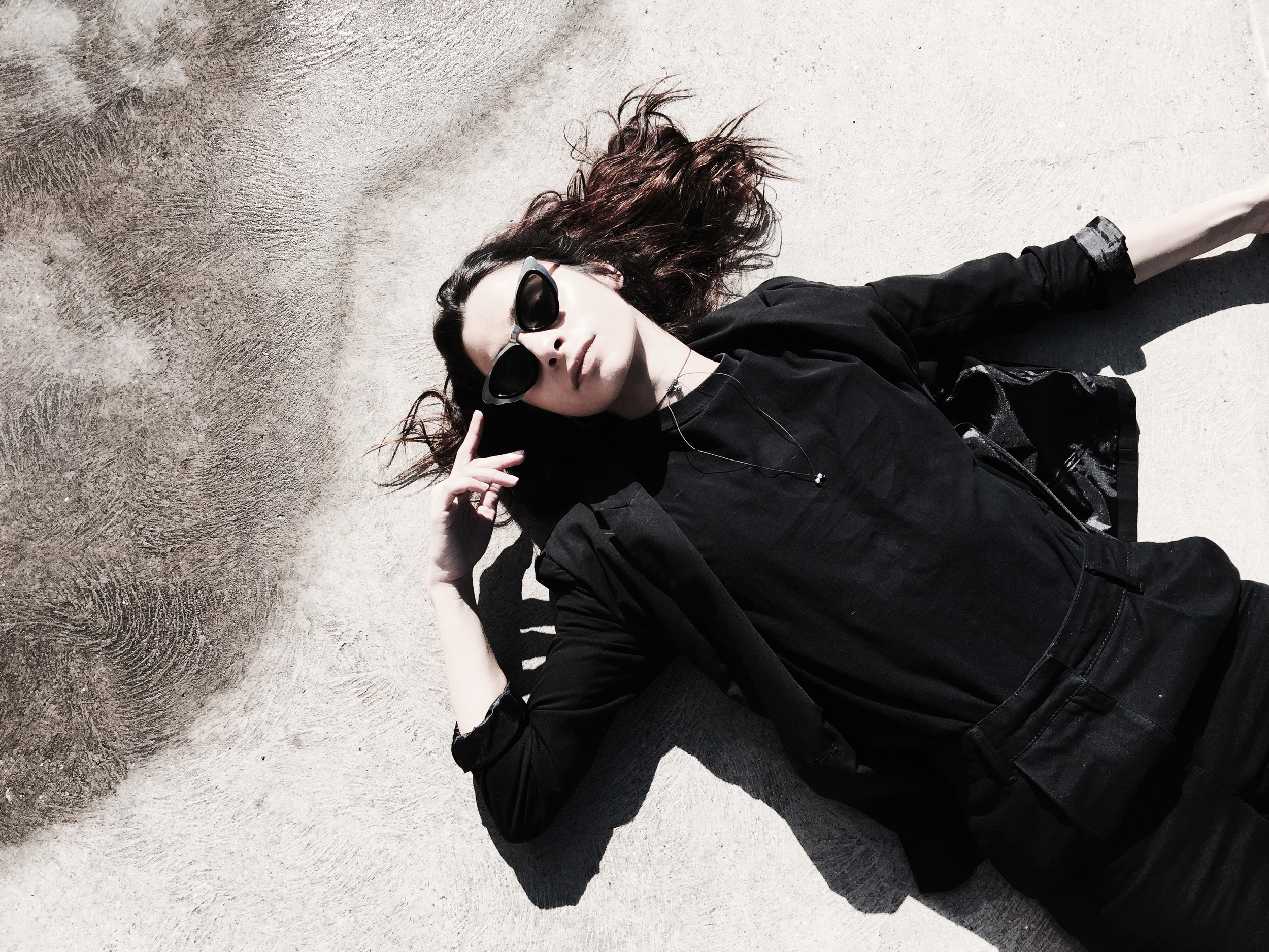
The concept for this shoot was born out of a desire to capture the very unique relationship I have with Paul - we are two individuals who are often either exactly the same, or polar opposites. At the risk of this sounding too much like a stars-in-my-eyes love letter, I wanted to visually explore the ways our personas both overlap and balance each other out. Wilson's trademark desaturated, minimalistic palette was something that complemented this idea immensely, in that - in combination with his brand of subtle yet effective styling - our true characters were able to take centre stage in these stunning images. Included in this photo set are some bonus images of myself in London, where Wilson and I had the good fortune to meet up and check out the Tate Modern's newest building on it's first day of being open - the Switch House. It is thanks to both Wilson's consistent stylistic choices as a photographer, as well as the intriguing similarity of Melbourne and London as cities, that it becomes near indistinguishable which photos are from which shoot.
Enjoy Duality x
